[style]
.container {
position: absolute;
width: 200px;
height: 200px;
padding: 5px;
border: 5px solid rgb(118,218,255);
top: 50%;
left: 50%;
transform: translate(-50%,-50%);
border-radius: 50%;
overflow: hidden;
}
.wave {
position: relative;
width: 200px;
height: 200px;
background-color: rgb(118,118,255);
border-radius: 50%;
}
.wave::before,.wave::after {
content: ” “;
position: absolute;
width: 400px;
height:400px;
top: 0;
left: 50%;
background-color: rgba(255,255,255,.1);
// 要与 animation 动画的值(100%)保持一致
transform: translate(-50%,-70%) rotatae(0);
animation: rotate 6s linear infinite;
z-index: 10;
}
@keyframes rotate {
50% {
transform: translate(-50%,-73%) rotate(180deg);
}
100% {
transform: translate(-50% , -70%) rotate(180deg);
}
}
[/style]
[ view class=”container” ]
[view class=”wave”]2 [/view]
[/view]
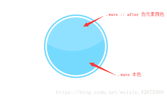
效果图: