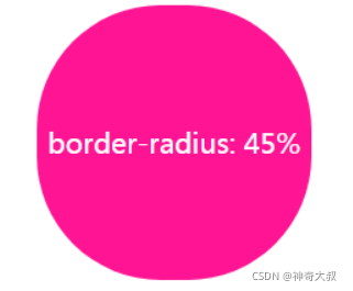
波浪核心:让border-radius没到50%再滚动起来,再用其覆盖背景,背景设置overflow:hidden;


代码示例:
div {


    position: relative;
    align-items: center;
    min-height: 100vh;
    background-color: rgb(118, 218, 255);
    overflow: hidden;
}

    div::before, div::after {

      //生成两个border-radius不为50%的图形
        content: "";
        position: absolute;
        left: 50%;
        min-width: 300vw;
        min-height: 300vw;
        background-color: #fff;
        animation-name: rotate;
        animation-iteration-count: infinite;
        animation-timing-function: linear;
    }

    div::before {


        bottom: 15vh;
        border-radius: 45%;
        animation-duration: 10s;
    }

    div::after {

    	//低一点的形成波浪厚度
        bottom: 12vh;
        opacity: .5;
        border-radius: 47%;
        animation-duration: 10s;
    }

@keyframes rotate {


    0% {


        transform: translate(-50%, 0) rotateZ(0deg); //rotate和rotateZ等效
    }
    50% {


        transform: translate(-50%, -2%) rotateZ(180deg);
    }
    100% {


        transform: translate(-50%, 0%) rotateZ(360deg);
    }
}
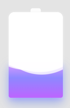
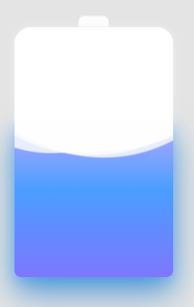
充电桩效果图:
.container {


    position: relative;
    width: 140px;
    margin: auto;
}

.header {


    position: absolute;
    width: 26px;
    height: 10px;
    left: 50%;
    top: 0;
    transform: translate(-50%, -10px);
    border-radius: 5px 5px 0 0;
    background: rgba(255, 255, 255, .88);
}

.battery-copy {


    position: absolute;
    top: 0;
    left: 0;
    height: 220px;
    width: 140px;
    border-radius: 15px 15px 5px 5px;
    overflow: hidden;
}

.battery {


    position: relative;
    height: 220px;
    box-sizing: border-box;
    border-radius: 15px 15px 5px 5px;
    box-shadow: 0 0 5px 2px rgba(255, 255, 255, 0.22);
    background: #fff;
    z-index: 1;

    &::after {


        content: "";
        position: absolute;
        left: 0;
        right: 0;
        bottom: 0;
        top: 80%;
        background: linear-gradient(to bottom, #7abcff 0%, #00BCD4 44%, #2196F3 100%);
        border-radius: 0px 0px 5px 5px;
        box-shadow: 0 14px 28px rgba(33, 150, 243, 0), 0 10px 10px rgba(9, 188, 215, 0.08);
        animation: charging 10s linear infinite;
        filter: hue-rotate(90deg);
    }
}

.g-wave {


    position: absolute;
    width: 300px;
    height: 300px;
    background: rgba(255, 255, 255, .8);
    border-radius: 45% 47% 44% 42%;
    bottom: 25px;
    left: 50%;
    transform: translate(-50%, 0);
    z-index: 1;
    animation: move 10s linear infinite;
}

.g-wave:nth-child(2) {


    border-radius: 38% 46% 43% 47%;
    transform: translate(-50%, 0) rotate(-135deg);
}

.g-wave:nth-child(3) {


    border-radius: 42% 46% 37% 40%;
    transform: translate(-50%, 0) rotate(135deg);
}

@keyframes charging {


    50% {


        box-shadow: 0 14px 28px rgba(0, 150, 136, 0.83), 0px 4px 10px rgba(9, 188, 215, 0.4);
    }

    95% {


        top: 5%;
        filter: hue-rotate(0deg);
        border-radius: 0 0 5px 5px;
        box-shadow: 0 14px 28px rgba(4, 188, 213, .2), 0 10px 10px rgba(9, 188, 215, 0.08);
    }
    100% {


        top: 0%;
        filter: hue-rotate(0deg);
        border-radius: 15px 15px 5px 5px;
        box-shadow: 0 14px 28px rgba(4, 188, 213, 0), 0 10px 10px rgba(9, 188, 215, 0.4);
    }
}

@keyframes move {


    100% {


        transform: translate(-50%, -160px) rotate(720deg);
    }
}


<div class="container">
    <div class="header"></div>
    <div class="battery">
    </div>
    <div class="battery-copy">
        <div class="g-wave"></div>
        <div class="g-wave"></div>
        <div class="g-wave"></div>
    </div>
</div>