四大布局方式
今天要介绍的布局方式有线性布局(LinearLayout)、相对布局(RelativeLayout)、帧布局(FrameLayout)、表格布局(TableLayout)。前两者是常用的,所以今天就着重的讨论一下LinearLayout。
在Android开发的几种布局方式当中,你不许指定控件的坐标点,也就是说你不许指定控件的位置,因为特定的布局方式有其特定计算控件坐标点的方法。但是在不同的布局方式中你需要为控件指定宽、高。接下来具体的介绍一下Android开发中的布局方式。
1. LinearLayout (线性布局)
说到LinearLayout, 我想说一下流式布局。其实LinearLayout就是流式布局,流式布局有个特点,就是下一个控件的坐标原点由上一个控件来决定,你可以沿水平方向或者垂直方向上来排列你的控件。 如果你的控件是垂直排列的,那么你可以给控件指定水平的居中方式(这一点可能说起来抽象,下方会通过实例来进行介绍)。接下来将通过一系列的实例来介绍一下LinearLayout。
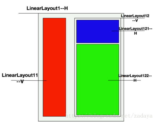
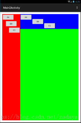
(1) 下方有张效果图,我们想实现下方布局方式,如果使用LinearLayout来实现该如何去做呢。

(2) 首先我们先分析布局方式,把每个块进行拆分,分析,然后通过LinearLayout进行组合在一块即可。我们对上述布局方式进行拆分,并且对使用的LinearLayout进行命名,并且指定子视图的布局方式(V-垂直,H-水平),具体的请看下图。最下方我们使用了一个水平布局的LinearLayout1, 在LinearLayout01上又有两个高度等于父视图高度的LinearLayout11和LinearLayout12,两者子控件的布局方式都设置为垂直排列。在LinearLayout12中又有两个子线性布局LinearLayout121和LinearLayout122, 这两个子布局沿垂直方向排列于父布局之上,并且宽度与父布局相等。
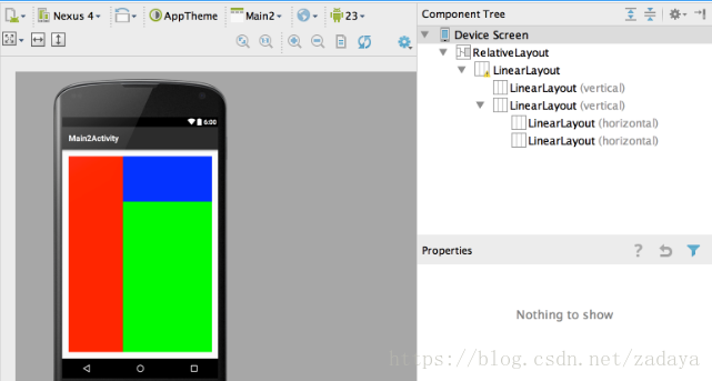
(3) 上方说了这么多了,那么接下来看一下上面布局的具体实现方式吧,其布局层次结构图如下所示
具体实现xml如下,在实现中你可以通过android:orientation属性来设置是水平(horizontal)线性排列还是垂直(vertical)线性排列。关于pt等这种单位,下篇博客会给大家详细的介绍一下。
<RelativeLayout xmlns:android="http://schemas.android.com/apk/res/android"
    xmlns:tools="http://schemas.android.com/tools" android:layout_width="match_parent"
    android:layout_height="match_parent" android:paddingLeft="@dimen/activity_horizontal_margin"
    android:paddingRight="@dimen/activity_horizontal_margin"
    android:paddingTop="@dimen/activity_vertical_margin"
    android:paddingBottom="@dimen/activity_vertical_margin"
    tools:context="com.example.lizelu.userinterfacedemo.Main2Activity">
    <LinearLayout
        android:layout_width="match_parent"
        android:layout_height="match_parent">

        <!--垂直线性布局方式-->
        <LinearLayout
            android:layout_width="60pt"
            android:layout_height="match_parent"
            android:background="#ff0000"
            android:orientation="vertical">
        </LinearLayout>

        <LinearLayout
            android:layout_width="match_parent"
            android:layout_height="match_parent"
            android:orientation="vertical">

            <LinearLayout
                android:layout_width="match_parent"
                android:layout_height="50pt"
                android:background="#0000ff"
                android:orientation="horizontal">
            </LinearLayout>

            <LinearLayout
                android:layout_width="match_parent"
                android:layout_height="match_parent"
                android:background="#00ff00"
                android:orientation="horizontal">
            </LinearLayout>
        </LinearLayout>
    </LinearLayout>
</RelativeLayout>
(4) 垂直布局控件的对齐方式(Left, Center, Right)。垂直布局的控件,我们可以对其指定水平方向的对对齐方式。为了说明这个问题我还是想画个图来解释一下这个看似简单的问题。我们可以通过控件的android:layout_gravity属性来指定对其方式。在垂直布局中,垂直方向的对齐方式(top, center, bottom)是不起作用的,因为垂直方向的位置已经有垂直线性布局所决定了,所以layout_gravity就不起作用了。
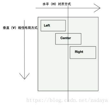
原理就先到这儿,接下来就是实现了,我们将在LinearLayout11布局中添加下方的子控件。每个子控件都指定了水平的对齐方式,具体代码如下所示:
<Button
                android:layout_width="wrap_content"
                android:layout_height="wrap_content"
                android:layout_gravity="left"
                android:text="aa"/>
            <Button
                android:layout_width="wrap_content"
                android:layout_height="wrap_content"
                android:layout_gravity="center"
                android:text="bb"/>
            <Button
                android:layout_width="wrap_content"
                android:layout_height="wrap_content"
                android:text="cc"
                android:layout_gravity="right"/>
添加代码后运行效果如下:

(5) 水平布局控件的对齐方式(Top, Center, Bottom)。如果控件是以水平的方式进行排列的,那么我们就可以对其指定垂直方向的对齐方式,即Top, Center和Bottom。也是通过android:layout_gravity属性来指定的。为了说明一下原理呢,我还是想用一张图来表达一下:
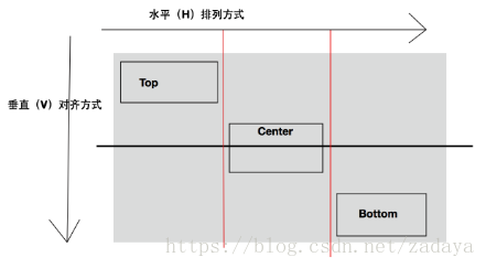
原理看完了,接下来按照上面的套路,我们以上面的布局和对齐方式,在LinearLayout121上添加三个上述布局的Button. 具体代码如下所示:
<Button
                    android:layout_width="wrap_content"
                    android:layout_height="wrap_content"
                    android:layout_gravity="top"
                    android:text="aa"/>
                <Button
                    android:layout_width="wrap_content"
                    android:layout_height="wrap_content"
                    android:text="bb"
                    android:layout_gravity="center" />
                <Button
                    android:layout_width="wrap_content"
                    android:layout_height="wrap_content"
                    android:layout_gravity="bottom"
                    android:text="cc"/>
接下来就该运行了,下方是运行出来的结果:
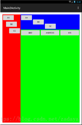
(6)在线性布局中有一个不得不提的属性就是android:layout_weight, 该属性允许你以比例的形式来指定控件的大小。接下来我们要做的就是在LinearLayout122中添加三个水平方向上等分的按钮。使用android:layout_weight属性,很容易就可以实现,因为原理比较简单,就不画原理图了,下方是具体的xml实现:
<Button
                    android:layout_width="0pt"
                    android:layout_height="wrap_content"
                    android:layout_weight="1"
                    android:text="你好"/>

                <Button
                    android:layout_width="0pt"
                    android:layout_height="wrap_content"
                    android:layout_weight="1"
                    android:text="Android"/>

                <Button
                    android:layout_width="0pt"
                    android:layout_height="wrap_content"
                    android:layout_weight="1"
                    android:text="iOS"/>
具体运行效果如下所示:
线性布局就先到这儿,因为线性布局方式在Android开发中经常使用到,所以介绍的会多一些。线性布局还有好多其他的用法,等后边博客中用到的时候会详细的介绍。
2.RelativeLayout (相对布局)
上面也说了一下相对布局, 相对布局的本质就是以不变应万变。也就是说相对布局可以根据已经固定的控件来确定其他新加控件的位置。相对布局用的还是蛮多的,接下来我们将通过一个实例来介绍一下RelativeLayout。
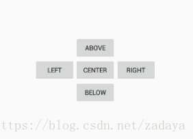
首先我们先来看一下我们要实现的效果,实现思路是我们先根据父视图的中心位置来确定center_button的位置,然后再由Center和Parent的位置来确定出其他按钮的位置,这就是相对布局。
在相对布局中,你可以设置的属性如下所示,还是蛮多的。在本篇博客中就不做一一介绍了,其用法都差不多。
实现上述效果的xml代码如下所示,相对布局使用起来和理解起来还是比较简单的。
<RelativeLayout xmlns:android="http://schemas.android.com/apk/res/android"
    xmlns:tools="http://schemas.android.com/tools"
    android:layout_width="match_parent"
    android:layout_height="match_parent"
    tools:context="com.example.lizelu.userinterfacedemo.Main3Activity">

    <Button
        android:id="@+id/button_center"
        android:layout_width="wrap_content"
        android:layout_height="wrap_content"
        android:layout_centerInParent="true"
        android:text="center"/>

    <Button
        android:id="@+id/button_above"
        android:layout_width="wrap_content"
        android:layout_height="wrap_content"
        android:layout_above="@+id/button_center"
        android:layout_centerInParent="true"
        android:text="above"/>

    <Button
        android:id="@+id/button_below"
        android:layout_width="wrap_content"
        android:layout_height="wrap_content"
        android:layout_below="@+id/button_center"
        android:layout_centerInParent="true"
        android:text="below"/>

    <Button
        android:id="@+id/button_left"
        android:layout_width="wrap_content"
        android:layout_height="wrap_content"
        android:layout_toLeftOf="@+id/button_center"
        android:layout_centerVertical="true"
        android:text="left"/>

    <Button
        android:id="@+id/button_right"
        android:layout_width="wrap_content"
        android:layout_height="wrap_content"
        android:layout_toRightOf="@+id/button_center"
        android:layout_centerVertical="true"
        android:text="right"/>

</RelativeLayout>
3.帧布局 (FrameLayout)
说到帧布局, 就比较简单了,而且比较好理解,并且帧布局的用处不是很多,但他的存在还是有他的必要性的。FrameLayout中的Frame和iOS中的Frame不是一个概念,在iOS中的Frame你可以指定任意的坐标,而这个坐标点时相对于父视图的。FrameLayout中的Frame的坐标原点是屏幕的左上角,位置固定,你只需为控件指定大小即可。接下来将通过一个实例来搞一下这个FrameLayout。
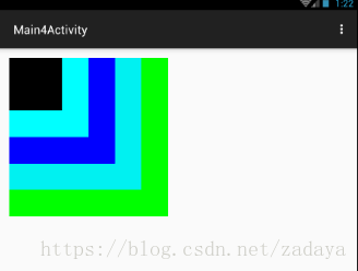
下面是使用FrameLayout做的一个效果,可以看出每块区域中除了大小颜色不一样外,他们的坐标点都是左上角的位置。这也是FrameLayout的特点,下面是运行效果截图:
实现上方布局的xml如下:
<RelativeLayout xmlns:android="http://schemas.android.com/apk/res/android"
    xmlns:tools="http://schemas.android.com/tools" android:layout_width="match_parent"
    android:layout_height="match_parent" android:paddingLeft="@dimen/activity_horizontal_margin"
    android:paddingRight="@dimen/activity_horizontal_margin"
    android:paddingTop="@dimen/activity_vertical_margin"
    android:paddingBottom="@dimen/activity_vertical_margin"
    tools:context="com.example.lizelu.userinterfacedemo.Main4Activity">

   <FrameLayout
       android:layout_width="120pt"
       android:layout_height="120pt"
       android:background="#00ff00">
       <FrameLayout
           android:layout_width="100pt"
           android:layout_height="100pt"
           android:background="#00f0f0">
       </FrameLayout>

       <FrameLayout
           android:layout_width="80pt"
           android:layout_height="80pt"
           android:background="#0000ff">
       </FrameLayout>

       <FrameLayout
           android:layout_width="60pt"
           android:layout_height="60pt"
           android:background="#00ffff">
       </FrameLayout>

       <FrameLayout
           android:layout_width="40pt"
           android:layout_height="40pt"
           android:background="#000000">
       </FrameLayout>

   </FrameLayout>

</RelativeLayout>
4、表格布局(TableLayout)
如果你接触过Web前端的东西的话,虽然常用的时div + css , 但是Web前端也是有表格布局的。在安卓开发中的表格布局和Web前端中的表格布局的概念类似,也就是通过画表表格的方式来实现布局。 在表格布局中,整个页面就相当于一张大的表格,控件就放在每个Cell中。接下来我们就使用表格布局来画一个表格,感受一下表格布局。接下来我们将会使用表格布局来实现一个比较经典的“登录”页面,下方是简单画的要实现效果图:
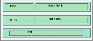
由上图我们容易看出,上面就是一个表格结构。Table中有3行两列,登录按钮占了一个整行,其余控件都占了一列。上面的布局还是蛮简单的,说白了,再复杂的布局也是从简单做起的。下方是实现上面布局的XML代码。
<TableLayout
        android:layout_width="match_parent"
        android:layout_height="match_parent"
        android:stretchColumns="1">
        <TableRow>
            <TextView
                android:layout_width="wrap_content"
                android:layout_height="wrap_content"
                android:text="用户名:"/>
            <EditText
                android:layout_width="match_parent"
                android:layout_height="wrap_content"
                android:hint="请输入用户名"/>
        </TableRow>

        <TableRow>
            <TextView
                android:layout_width="wrap_content"
                android:layout_height="wrap_content"
                android:text="密   码:"/>
            <EditText
                android:layout_width="match_parent"
                android:layout_height="wrap_content"
                android:hint="请输入密码"
                android:inputType="textPassword"/>
        </TableRow>

        <TableRow>
            <Button
                android:layout_height="wrap_content"
                android:layout_width="wrap_content"
                android:text="登录"
                android:layout_span="2"/>
        </TableRow>

    </TableLayout>
其中android:stretchColumns="1"属性,表示让第一列(列数从零开始算起)拉伸,以达到视频屏幕的目的。所以你看到的输入框是充满后边整个屏幕的。登录按钮中这个属性android:layout_span="2" ,表明登录按钮跨两列。上述布局xml运行后的效果如下:

到此4种布局方式已介绍完毕,其实再复杂的布局也是从简单的开始。复杂的布局页面有可能上述四种布局方式都会用到。由简单到复杂这需要一个过程的,基础的会了之后,接下来就是如何去运用基础来构造更为复杂的布局方式。
附:Demo源码