react-native-custom-textInput
react-native-custom-input,一个自定义的输入组件
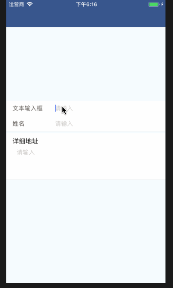
The final rendering
Installation:
npm install --save react-native-custom-inputExample usage:
1.basic
import Input from react-native-custom-input;

   ...
  render() {
    return (
        <Input />
    );
  }
Props:
| Props | Explain | type | require | default |
|---|---|---|---|---|
| label | 输入框的名称 | string | no | 文本输入框 |
| value | 输入框的值 | any | yes | ” |
| labelTextStyle | 输入框的名称的样式 | string | no | { width: 100,flexDirection: ‘row’,justifyContent: ‘flex-end’, alignItems: ‘center’,marginLeft: 15,} |
| required | 是否显示必输标志 | boolean | no | false |
| mode | 输入框的模式,具体有简单输入框还是输入域 | string | no | 简单文本输入框,值为(’Input’,’TextArea’)两者之一 |
| textInputStyle | 输入框的样式 | object | no | {fontSize: 14, color: ‘#332f2b’} |
| isUpdate | 是否可编辑,true为可编辑 | boolean | no | true |
| suffix | 输入框后面的后缀,值得注意的是length大于3的时候将不会显示 | string | no | ” |
| placeholderTextColor | 占位符文字的颜色 | string | no | ‘#ccc8c4’ |
| autoCapitalize | 首字母是否自动大写 | string | no | ‘none’,只能是[‘characters’, ‘words’, ‘sentences’, ‘none’]之一 |
注意: 由于输入框组件是在react-native官方组件的基础上进行封装,所以支持TextInput所有属性,在这里就不一一罗列
Examples from props:
...
  _onChange = (label, value) => {
    this.setState({ [label]: value });
  };

  render() {
    return (
      <View style={styles.container}>
        <Text>
          {this.state.result}
        </Text>
        <Input onChange={(value) => this._onChange('input1', value)} value={this.state.input1 || ''} />
        <Input label={'姓名'} onChange={(value) => this._onChange('input2', value)} value={this.state.input2 || ''} />
        <Input onChange={(value) => this._onChange('input3', value)} mode={'TextArea'} label={'详细地址'} value={this.state.input3 || ''} />
      </View>
    );
  }
...
实现代码:
import React, { Component } from 'react';
import PropTypes from 'prop-types';
import {
  TextInput,
  View,
  Text,
  StyleSheet,
} from 'react-native';

const styles = StyleSheet.create({
  center: {
    justifyContent: 'center',
    alignItems: 'center'
  }
});

class Input extends Component {
  static propTypes = {
    inputStyle: TextInput.propTypes.style,
    labelTextStyle: TextInput.propTypes.style,
    placeholderTextColor: PropTypes.string,
    isUpdate: PropTypes.bool,
    readonly: PropTypes.bool,
    textInputStyle: TextInput.propTypes.style,
    autoCapitalize: PropTypes.oneOf(['characters', 'words', 'sentences', 'none']),
    label: PropTypes.string,
    placeholder: PropTypes.string,
  };

  static defaultProps = {
    placeholderTextColor: '#ccc8c4',
    autoCapitalize: 'none',
    isUpdate: true,
    readonly: false,
    label: '文本输入框',
    placeholder: '请输入'
  };

  constructor(props) {
    super(props);
    this.state = {
      value: props.value || '',
      textAlign: 'right'
    };
  }

  componentWillReceiveProps(nextProps) {
    if (nextProps.value !== this.state.value) {
      this.setState({ value: nextProps.value });
    }
  }

  _onChangeText = (val) => {
    this.setState({ value: val });
    this.props.onChange && this.props.onChange(val.replace(/(^\s*)|(\s*$)/g, ''));
  };

  _onBlur = (e) => {
    const { onBlur } = this.props;
    onBlur && onBlur(e);
    this.setState({
      textAlign: 'right'
    });
  };

  _onFocus = (e) => {
    const { onFocus } = this.props;
    onFocus && onFocus(e);
    this.setState({
      textAlign: 'left'
    });
  };

  _renderInputContent = () => {
    const { textInputStyle, placeholderTextColor, autoCapitalize, isUpdate, suffix } = this.props;
    return (
      isUpdate ?
        <View
          style={[{ flexDirection: 'row', flex: 1, height: '100%' }, styles.center]}
        >
          <TextInput
            {...this.props}
            onChangeText={this._onChangeText}
            onBlur={this._onBlur}
            onFocus={this._onFocus}
            style={[{ textAlign: (this.state.value === 0 || this.state.value) ?
              this.state.textAlign : 'left', flex: 1, fontSize: 14, color: '#332f2b' }, textInputStyle]}
            placeholderTextColor={placeholderTextColor}
            value={String(this.state.value)}
            autoCorrect={false}
            autoCapitalize={autoCapitalize}
            underlineColorAndroid="transparent"
          />
          <Text style={{ marginRight: 10 }}>
            {(suffix && suffix.length > 3) ? '' : suffix}
          </Text>
        </View>
        :
        <View
          style={[{ flexDirection: 'row', flex: 1, height: '100%', backgroundColor: '#f7f6f5' }, styles.center]}
        >
          <Text
            style={{ textAlign: this.state.value ? this.state.textAlign : 'left', flex: 1 }}
          >
            {this.state.value}
          </Text>
          <Text style={{ marginRight: 10 }}>
            {(suffix && suffix.length > 3) ? '' : suffix}
          </Text>
        </View>
    );
  };

  _renderTextAreaContent = () => {
    const { textInputStyle, placeholderTextColor, autoCapitalize, isUpdate } = this.props;
    return (
      isUpdate ?
        <TextInput
          numberOfLines={4}
          {...this.props}
          multiline={true}
          onChangeText={this._onChangeText}
          onBlur={this._onBlur}
          onFocus={this._onFocus}
          style={[{ marginVertical: 5, height: 60, marginHorizontal: 10, textAlign: 'left', flex: 1, },
            textInputStyle,
          ]}
          placeholderTextColor={placeholderTextColor}
          value={String(this.state.value)}
          autoCorrect={false}
          autoCapitalize={autoCapitalize}
          underlineColorAndroid="transparent"
        /> :
        <Text
          style={[{ marginVertical: 5, height: 60, marginHorizontal: 10, textAlign: 'left', flex: 1,
            backgroundColor: '#f7f6f5', }, textInputStyle]}
        >{this.state.value}
        </Text>
    );
  };

  render() {
    const { label, labelTextStyle, required, mode } = this.props;
    if (mode === 'TextArea') {
      return (
        <View
          style={{
            height: 108,
            width: '100%',
            paddingVertical: 10,
            paddingHorizontal: 15,
            borderColor: '#eae6e4',
            marginVertical: 5,
            borderBottomWidth: 0.5,
            backgroundColor: '#fff'
          }}
        >
          <Text style={[{ fontSize: 15 }, labelTextStyle]}>
            {label}{ required ? <Text style={{ fontSize: 16, fontWeight: 'bold', color: '#F00' }}>*</Text> : null }
          </Text>
          { this._renderTextAreaContent() }
        </View>
      );
    }
    return (
      <View
        style={[{
          height: 36,
          width: '100%',
          backgroundColor: '#fff',
          flexDirection: 'row',
          borderColor: '#eae6e4',
          borderBottomWidth: 0.5,
        }, styles.center]}
      >
        <Text style={[
          {
            width: 100,
            flexDirection: 'row',
            justifyContent: 'flex-end',
            alignItems: 'center',
            marginLeft: 15,
            fontSize: 14,
            color: '#514b46'
          },
          labelTextStyle,
        ]}
        >{label}
          { required ? <Text style={{ fontSize: 16, fontWeight: 'bold', color: '#F00' }}>*</Text> : null }
        </Text>
        { this._renderInputContent() }
      </View>
    );
  }
}

export default Input;