前端开发一起交流QQ群:740034288
H5页面开发的必备的几个知识点:
1. 适配:常用的包括分层适配和rem。
2. 加载进度。
3. 页面切换效果:可以参考jquery ui官网。
4. 长按截屏:参考html2canvas插件。
5. 轮播图:swiper插件。
6. 左右菜单联动,上下滚动加载:better-scroll插件。
7. 图片360度旋转:spritespin.js插件。
8. 背景雪花飘落的效果:百度。
9. 游戏框架:createjs和egret.js框架。
10. 动画效果插件:animate.css。
0. 布局样式:
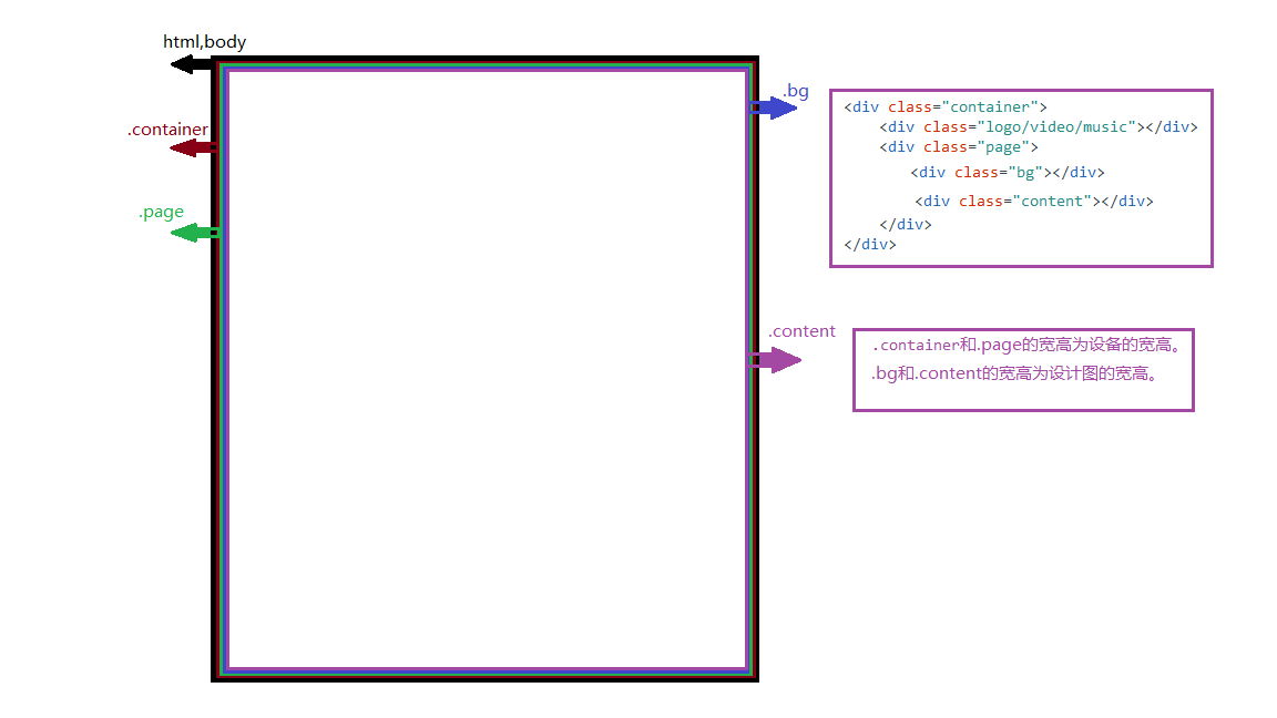
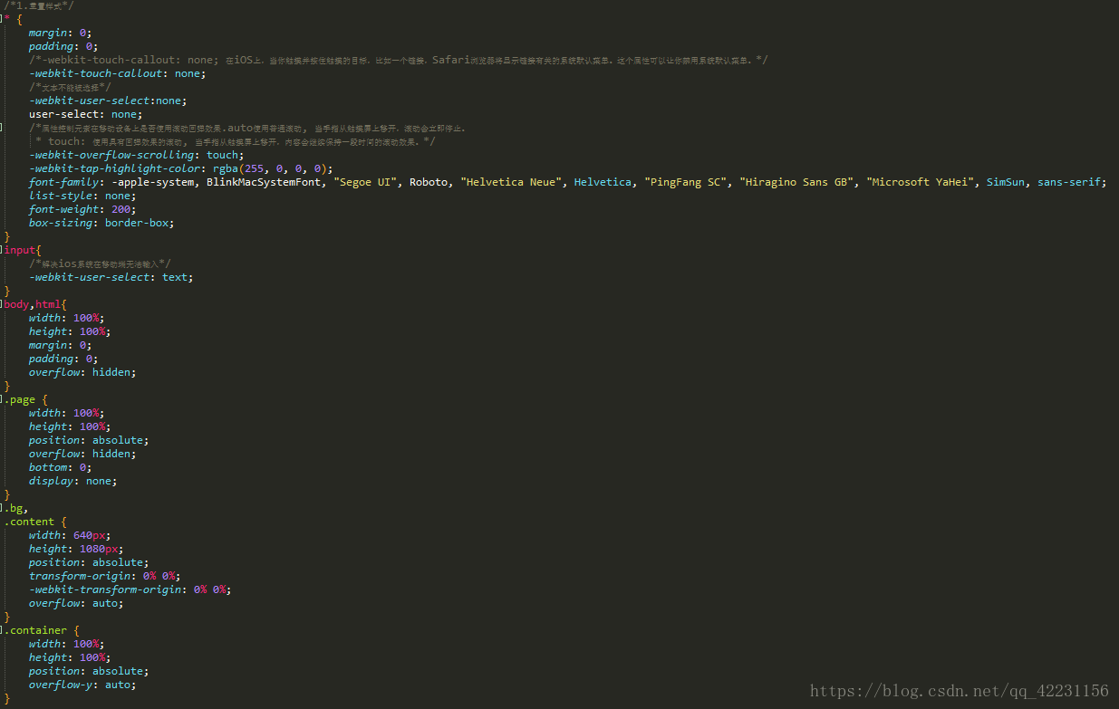
1. 分层视频的重置css样式:
* {
margin: 0;
padding: 0;
-webkit-touch-callout: none;
-webkit-overflow-scrolling: touch;
-webkit-tap-highlight-color: rgba(255,0,0,0);
font-family: -apple-system, BlinkMacSystemFont, "Segoe UI", Roboto, "Helvetica Neue", Helvetica, "PingFang SC", "Hiragino Sans GB", "Microsoft YaHei", SimSun, sans-serif;
}
body {
margin: 0;
padding: 0;
overflow: hidden;
}
.page {
position: absolute;
overflow: hidden;
top: 0;
/* display: none;*/
}
.container {
position: absolute;
}
.hide{
display: none;
}
.scroll-view { //y轴滚动样式
position: absolute;
transform-origin: 0% 0%;
overflow: hidden;
overflow-y: auto;
}
.bg, .content {
position: absolute;
transform-origin: 0% 0%;
}
.show{
display: block;
}
.swiper-container .page{
display:block;
}
.abs {
position: absolute;
}
.h-center { //相对、绝对定义下的左右居中样式
left: 0;
right: 0;
margin: auto;
}
.v-center { //相对、绝对定义下的上下居中样式
top: 0;
bottom: 0;
margin: auto;
}
.fl{
float:left;
}
.fr{
float:right;
}
.clearfloat{zoom:1;}
.clearfloat:after{
content:'';
display:block;
clear:both;
height:0;
overflow:hidden;
visibility:hidden;
}
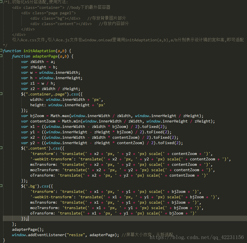
2. 分层视频封装适配adatper函数:
function adatper(zWidth, zHeight, callback) { //zWidth,zHeight为设计图的宽高,callback为适配之后的回调函数。
var w = window.innerWidth; //1. 获取页面设备的宽w,h高。
var h = window.innerHeight;
$('.container, .page, .scroll-view, .swiper-container, .swiper-wrapper, .swiper-slide').css({
width: window.innerWidth + 'px',
height: window.innerHeight + 'px'
}); //2. 设置页面.container,.page的的宽高为设备的宽高。
$('.bg, .content').css({ //3. 设置页面.bg,.content的宽高为设计图的宽高。
width: zWidth + 'px',
height: zHeight + 'px'
})
//4. 设备宽与图纸宽的比值 ,和设备高与图纸高的比值,两个比值的最大值bjZoom是页面背景.bg的缩放比例,
最小值contentZoom 是页面内容.content的缩放比例。
var bjZoom = Math.max(window.innerWidth / zWidth, window.innerHeight / zHeight);
var contentZoom = Math.min(window.innerWidth / zWidth, window.innerHeight / zHeight);
//5. x1,y1是页面背景.bg的x轴,y轴的平移位置。
var x1 = ((window.innerWidth - zWidth * bjZoom) / 2).toFixed(2);
var y1 = ((window.innerHeight - zHeight * bjZoom) / 2).toFixed(2);
//6. x2,y2是页面内容.content的x轴,y轴的平移位置。
var x2 = ((window.innerWidth - zWidth * contentZoom) / 2).toFixed(2);
var y2 = ((window.innerHeight - zHeight * contentZoom) / 2).toFixed(2);
//7. js设置.bg的缩放比例和x轴和y轴的位移,以及浏览器的兼容问题。
$('.bg').css({
'transform': 'translate(' + x1 + 'px, ' + y1 + 'px) scale(' + bjZoom + ')',
'-webkit-transform': 'translate(' + x1 + 'px, ' + y1 + 'px) scale(' + bjZoom + ')',
msTransform: 'translate(' + x1 + 'px, ' + y1 + 'px) scale(' + bjZoom + ')',
mozTransform: 'translate(' + x1 + 'px, ' + y1 + 'px) scale(' + bjZoom + ')',
oTransform: 'translate(' + x1 + 'px, ' + y1 + 'px) scale(' + bjZoom + ')'
});
//7. js设置.content的缩放比例和x轴和y轴的位移,以及浏览器的兼容问题。
$('.content').css({
'transform': 'translate(' + x2 + 'px, ' + y2 + 'px) scale(' + contentZoom + ')',
'-webkit-transform': 'translate(' + x2 + 'px, ' + y2 + 'px) scale(' + contentZoom + ')',
msTransform: 'translate(' + x2 + 'px, ' + y2 + 'px) scale(' + contentZoom + ')',
mozTransform: 'translate(' + x2 + 'px, ' + y2 + 'px) scale(' + contentZoom + ')',
oTransform: 'translate(' + x2 + 'px, ' + y2 + 'px) scale(' + contentZoom + ')'
});
// 宽度缩放
var zoomWidth = window.innerWidth / zWidth;
// y轴滚动
$('.scroll-view').css({
'transform': 'scale(' + zoomWidth + ')',
'-webkit-transform': 'scale(' + zoomWidth + ')',
'width': w / zoomWidth + 'px',
'height' : h / zoomWidth + 'px'
});
// 高度缩放
var hZoom = window.innerHeight / zHeight;
// x轴滚动
$('.content-x-scroll-view').css({
width: window.innerWidth / hZoom + 'px',
height: window.innerHeight / hZoom + 'px',
'-webkit-transform': 'scale(' + hZoom + ')'
});
$('.definezoom').css({
zoom: zoomWidth
});
if (typeof (callback) == 'function') {
callback();
}
}