前言
iPhone X和IOS 11的发布,不仅在许多技术方面造成了一定的冲击,前端也不可以避免地也受到影响,因为iPhone X刘海的影响,在编写前端页面的时候要做一些处理,下面先提出一些新的概念。
iphone介绍
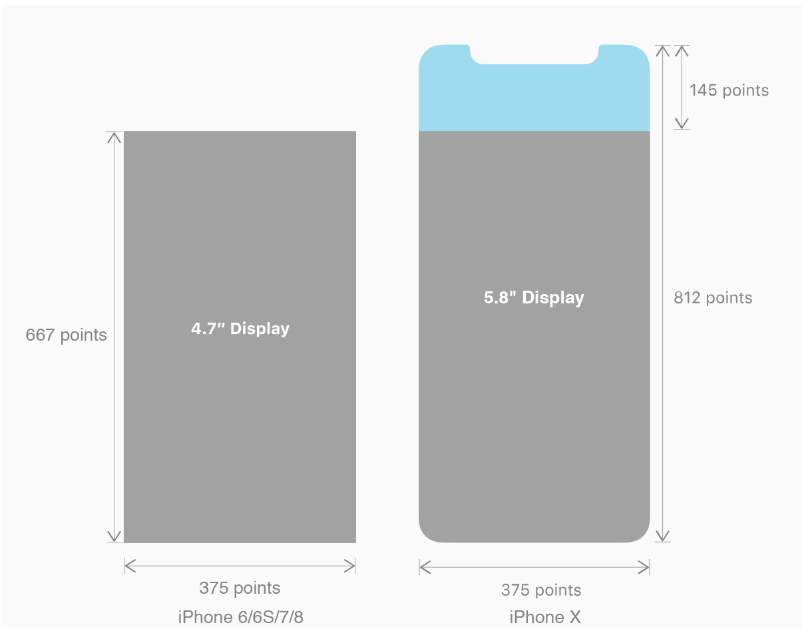
iPhone X 无论是在屏幕尺寸、分辨率、甚至是形状上都发生了较大的改变,下面以iPhone 8作为参照物,看看到底iPhone X的适配我们要怎么考虑。
我们看看iPhone X尺寸上的变化:
概念
一、刘海屏
刘海屏也有其它叫法:凹凸屏、头凹屏、覆盖屏、挖孔屏等等,这里统一按刘海屏命名,虽然都在吐槽IPhoneX的刘海屏,但是各大安卓厂商还是不停的争相模仿,使用起来也是挺不方便的,颜值上升,操作感下降,尤其是单手握住屏幕的边缘时会有极大的不便。
苹果IOS的还好,但是安卓的厂商有小米、华为、oppo、vivo等都相应的出了自己的刘海屏,各大厂商也出了自己兼容刘海屏的方案,我们在另外一篇文章中会提及到安卓全家桶——各大厂商的刘海屏解决方案。
二、安全区域
因为刘海的关系,所有的展示都会放在一个叫做safe-area的区域,如下图,主要是为了防止显示的内容被刘海传感器(house sensor),圆角边框(rounded corners)所遮挡,这样对用户来说是不友好的,但是如果全部内容被放置在默认的安全区域,显示的内容就会被压缩,这个时候需要做一些处理,既然页面能够正常显示,又能够不被安全区域遮挡。
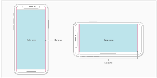
核心内容应该处于 Safe area 确保不会被设备圆角(corners),传感器外壳(sensor housing,齐刘海) 以及底部的 Home Indicator 遮挡。也就是说 我们设计显示的内容应该尽可能的在安全区域内;
iPhoneX的适配------适配方案viewport-fit
一、CSS3新特性viewport-fit
PhoneX的适配,在iOS 11中采用了viewport-fit的meta标签作为适配方案
在w3c.org官方给出的关于圆形展示(Round display)的标准中, 提到了viewport-fit这一属性,这个属性表明了对于某些屏幕并不是矩形形状的设备的时候浏览器该如果进行显示。传送门:viewport-fit官方参考文档
viewport-fit取值如下:
| auto | 默认 |
| contain | 页面内容显示在safe area内同auto |
| cover | 页面内容充满屏幕 |
eg:<meta name="viewport" content="width=device-width,initial-scale=1.0, minimum-scale=1.0, maximum-scale=1.0, user-scalable=no, viewport-fit=cover">
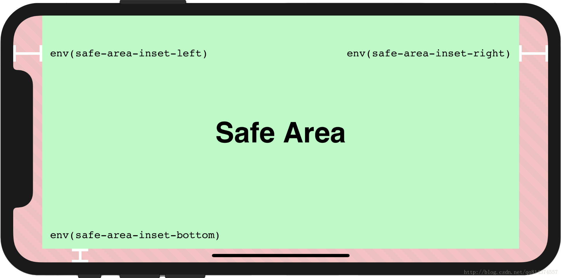
二、CSS3新特性env()、constant()以及预定义变量safe-area-inset-left, safe-area-inset-right, safe-area-inset-top和 safe-area-inset-bottom
在定义viewport-fix以后, 浏览器会自动生成四个padding变量,即用来将页面向内挤压到可以正常显示的位置。这个时候需要用到env或者constant来将变量转换成CSS属性值并且赋值给属性。ps:env好像还在开发中,好像只支持IOS 11.2及以上。目前比较稳妥的方法就是constant和env一起使用。传送门:var预定义变量官方参考文档
注意
1)当我们设置viewport-fit:contain,也就是默认的时候;设置safe-area-inset-left, safe-area-inset-right, safe-area-inset-top和 safe-area-inset-bottom等参数时不起作用的
2)当我们设置viewport-fit:cover时:设置如下
body {
    padding-top: constant(safe-area-inset-top); //为导航栏+状态栏的高度 88px
         padding-left: constant(safe-area-inset-left); //如果未竖屏时为0
         padding-right: constant(safe-area-inset-right); //如果未竖屏时为0
         padding-bottom: constant(safe-area-inset-bottom);//为底下圆弧的高度 34px
}
三、开始动手
1、在meta中添加viewport-fit=cover(告诉浏览器要讲整个页面渲染到浏览器中,不管设备是圆角与否,这个时候会造成页面的元素被圆角遮挡)
2、为了处理这些显示的问题,我们需要使用到env,constant还有预定义变量safe-area-inset-top,safe-area-inset-right, safe-area-inset-bottom, safe-area-inset-left。全部使用的这些方法或者变量都是在Safari中全部定义好的,我们就正常使用就行。但是别忘记了还要做一个向下兼容。
 /* 导航栏因为是基于屏幕定位,所以padding要进行单独的计算。env在IOS 11.2中新增的,constant在IOS 11.2 已经被废弃,但是我们要做兼容,所以都要用上。 */
    header {
        position: fixed;
        top: 0;
        left: 0;
        width: 100%;
        display: block;
        box-sizing: border-box;
        /* 因为header导航栏是基于屏幕进行定位,所以要做单独的padding挤压处理 */
        padding-right: constant(safe-area-inset-right);
        padding-left: constant(safe-area-inset-left);
        padding-right: env(safe-area-inset-right);
        padding-left: env(safe-area-inset-left);
        overflow: scroll;
        background-color:#2889e8;
    }

 /* body 在横屏底下和竖屏底下一定要做好定位,不然*/
    /* 竖屏底下的查询 */
    @media screen and (orientation: portrait) {
        body {
            /* 防止页面被刘海遮住 */
            padding-top: constant(safe-area-inset-top);
        }
    }
    /* 横屏底下的查询 */
    @media screen and (orientation: landscape) {
        body {
            /* IOS 11支持*/
            padding-right: constant(safe-area-inset-right);
            padding-left: constant(safe-area-inset-left);
            /*IOS 11.2版本版本支持*/
            padding-right: env(safe-area-inset-right);
            padding-left: env(safe-area-inset-left);
        }
    }
iPhoneX的适配------高度统计

iPhoneX的适配------媒体查询
注意这里采用的是690px(safe area高度),不是812px;
@media only screen and (width: 375px) and (height: 690px){
    body {
        background: blue;
    }
}
iphoneX viewport-fit问题总结
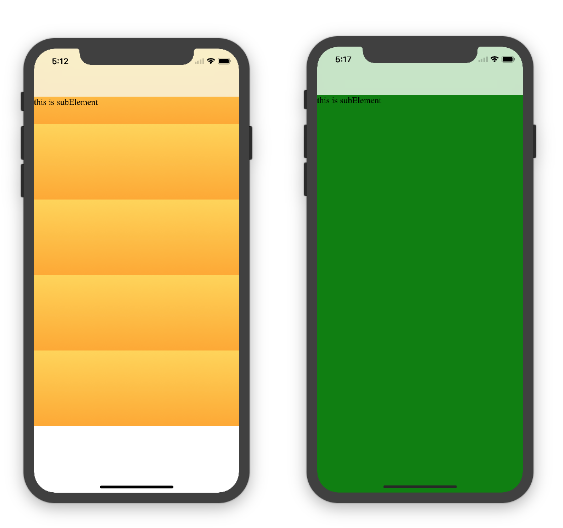
一、iphoneX 页面使用渐变色
设置viewport-fit:cover,如果设置单色会填充整个屏幕,如果设置渐变色那么只会使用子元素的高度去渲染;而且页面的高度只有690px高度,上面使用了padding-top:88px;
代码
<body>
    <div class="content">this is subElement</div>
</body>

// 单色时

     * {
            padding: 0;
            margin: 0;
      }
     body {
            background:green;
            padding-top: constant(safe-area-inset-top); //88px
            /*padding-left: constant(safe-area-inset-left);*/
            /*padding-right: constant(safe-area-inset-right);*/
            /*padding-bottom: constant(safe-area-inset-bottom);*/
     }

// 渐变色

      * {
           padding: 0;
           margin: 0;
       }
       body {
           background:-webkit-gradient(linear, 0 0, 0 bottom, from(#ffd54f),to(#ffaa22));
           padding-top: constant(safe-area-inset-top); //88px
           /*padding-left: constant(safe-area-inset-left);*/
           /*padding-right: constant(safe-area-inset-right);*/
           /*padding-bottom: constant(safe-area-inset-bottom);*/
       }
解决使用渐变色没有填充整个屏幕
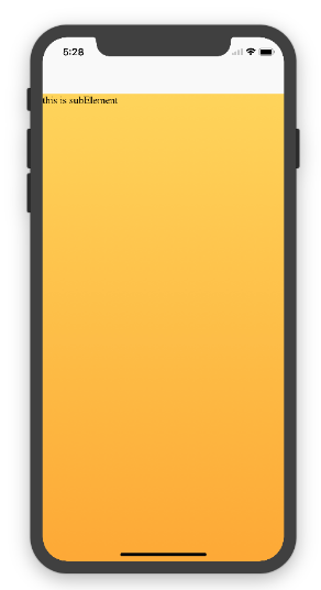
代码
<!DOCTYPE html>
<html>
<head>
   <meta name="viewport" content="initial-scale=1, viewport-fit=cover">
   <title>Designing Websites for iPhone X: Respecting the safe areas</title>
   <style>        * {
       padding: 0;
       margin: 0;
   }
   html, body {
       height: 100%;
   }
   body {
       padding-top: constant(safe-area-inset-top);
       padding-left: constant(safe-area-inset-left);
       padding-right: constant(safe-area-inset-right);
       padding-bottom: constant(safe-area-inset-bottom);
   }
   .content {
       background: -webkit-gradient(linear, 0 0, 0 bottom, from(#ffd54f), to(#ffaa22));
       width: 100%;
       height: 724px;
   }

  </style>
</head>
<body>
<div class="content">this is subElement</div>
</body>
</html>
二、iphoneX页面使用固定定位 {position:fixed;}
这里可能有人会有疑问,为什么非通栏下的页面内容是通到底部的,而按钮却是在安全区域上方呢?
这个问题涉及到安全区域,iOS11 和先前版本的不同之处在于,webview 比较重视安全区域了。这意味着,如果给页面元素设置 top: 0, 它会渲染在屏幕顶部的44px之下,也就是状态栏下面。如果给页面元素设置 bottom: 0, 它会渲染在屏幕底部的34px之上,也就是底部安全区域上面。
情况一:设置viewport-fit:contain/auto时,子元素固定在页面底部,可以看到bottom:0时只会显示在安全区域内;
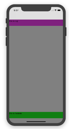
代码
<!DOCTYPE html>
<html>
<head>
   <meta name="viewport" content="initial-scale=1">
   <!--<meta name="viewport" content="initial-scale=1, viewport-fit=cover">-->
   <title>Designing Websites for iPhone X: Respecting the safe areas</title>
   <style>
       * {
           padding: 0;
           margin: 0;
       }
       /*html,body {*/
           /*height: 100%;*/
       /*}*/
       body {
           background: grey;
           /*padding-top: constant(safe-area-inset-top);*/
           /*padding-left: constant(safe-area-inset-left);*/
           /*padding-right: constant(safe-area-inset-right);*/
           /*padding-bottom: constant(safe-area-inset-bottom);*/
       }
       .top {
           width: 100%;
           height: 44px;
           background: purple;
       }
       .bottom {
           position: fixed;
           bottom: 0;
           left: 0;
           right: 0;
           height: 44px;
           color: black;
           background: green;
       }
   </style>
</head>
<body>
   <div class="top">this is top</div>
   <div class="bottom">this is bottom</div>
</body>
</html>
情况二:设置viewport-fit:cover时,子元素固定在页面底部,可以看到bottom:0时只会显示在安全区域内;

代码
* {
    padding: 0;
    margin: 0;
}
/*html,body {*/
    /*height: 100%;*/
/*}*/
body {
    background: grey;
    padding-top: constant(safe-area-inset-top);
    /*padding-left: constant(safe-area-inset-left);*/
    /*padding-right: constant(safe-area-inset-right);*/
    /*padding-bottom: constant(safe-area-inset-bottom);*/
}
.top {
    width: 100%;
    height: 44px;
    background: purple;
}
.bottom {
    position: fixed;
    bottom: 0;
    left: 0;
    right: 0;
    height: 44px;
    color: black;
    background: green;
}
添加html,body {width:100%;heigth:100%}
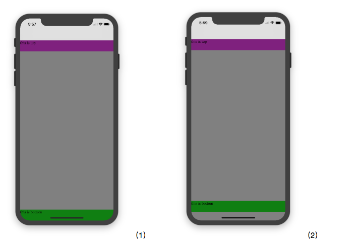
代码(1)
     * {
           padding: 0;
           margin: 0;
       }
       html,body {
           height: 100%;
       }
       body {
           background: grey;
           padding-top: constant(safe-area-inset-top);
           padding-left: constant(safe-area-inset-left);
           padding-right: constant(safe-area-inset-right);
           padding-bottom: constant(safe-area-inset-bottom);
       }
       .top {
           width: 100%;
           height: 44px;
           background: purple;
       }
       .bottom {
           position: fixed;
           bottom: 0;
           left: 0;
           right: 0;
           height: 44px;
           color: black;
           background: green;
       }
代码(2)
     * {
           padding: 0;
           margin: 0;
       }
       html,body {
           height: 100%;
       }
       body {
           background: grey;
           padding-top: constant(safe-area-inset-top);
           padding-left: constant(safe-area-inset-left);
           padding-right: constant(safe-area-inset-right);
           /*padding-bottom: constant(safe-area-inset-bottom);*/
       }
       .top {
           width: 100%;
           height: 44px;
           background: purple;
       }
       .bottom {
           position: fixed;
           bottom: 0;
           left: 0;
           right: 0;
           height: 44px;
           color: black;
           background: green;
       }
参考资料
iPhone X的Web设计(重点)
剖析 iOS 11 网页适配问题(重点)