该文章同步发布在公众号”LinminTech”上,请在本文最后扫码关注,获取更多精彩Android开发文章。
效果图
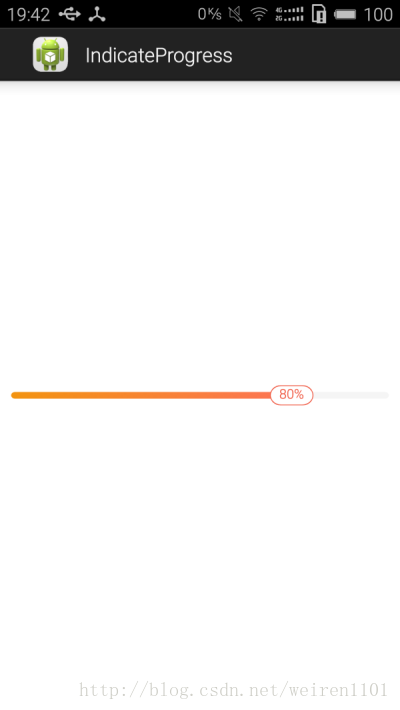
需求
在平时开发过程中,UI经常要求实现如上图所示的ProgressBar,但是Android系统自带的ProgressBar并不能满足我们的要求,这就要求我们自定义实现这样的控件。
基本原理
在网上看到很多类似直接继承系统ProgressBar来实现此控件,但是在实现进度指示器都比较复杂,这里介绍一种比较简单的实现方式。
基本原理:
第一步画Progress默认背景矩形框
此默认背景矩形框铺满我们自己定义的宽度。代码如下
int width = getWidth();
int height = getHeight();

//画背景
RectF backRectF = new RectF(0, height * 2 / 5, width, height * 3 / 5);
backPaint.setColor(backgroundColor);
canvas.drawRoundRect(backRectF, radius, radius, backPaint);
第二步画Progress进度矩形框
此进度矩形框是盖在背景矩形框之上的。
//画进度
RectF progressRectF = new RectF(0, height * 2 / 5, width * getScale(), height * 3 / 5);
LinearGradient lGradient = new LinearGradient(0, height * 2 / 5, width * getScale(), height * 3 / 5, startProgressColor, endProgressColor, Shader.TileMode.MIRROR);
progressPaint.setShader(lGradient);
canvas.drawRoundRect(progressRectF, radius, radius, progressPaint);
第三步画进度百分比指示器矩形框
此进度百分比指示器是盖在进度矩形框之上。
//画指示器边框
float left = width * getScale() - indicateTextPaint.measureText(PERCENT_STR) - defaultIndicateMargin;
float right = width * getScale();
if (getScale() <= 0.5) {
    left = width * getScale() - defaultIndicateMargin;
    right = left + indicateTextPaint.measureText(PERCENT_STR) +   defaultIndicateMargin;
}
if (left <= 0f) {
    left = 0f;
    right = indicateTextPaint.measureText(PERCENT_STR) + defaultIndicateMargin;
}
if (right <= indicateTextPaint.measureText(PERCENT_STR) + defaultIndicateMargin) {
    right = indicateTextPaint.measureText(PERCENT_STR) + defaultIndicateMargin;
}
RectF indicatorRectF = new RectF(left, height / 5, right, height * 4 / 5);
indicateBackPaint.setColor(indicateTextColor);
canvas.drawRoundRect(indicatorRectF, indicatorRadius, indicatorRadius, indicateBackPaint);

//画指示器内部为白色
RectF indicatorContentRectF = new RectF(left + defaultContentMargin, height / 5 + defaultContentMargin,right - defaultContentMargin, height * 4 / 5 - defaultContentMargin);
indicateBackPaint.setColor(Color.WHITE);
canvas.drawRoundRect(indicatorContentRectF, indicatorRadius, indicatorRadius, indicateBackPaint);
第四步画进度百分比文本
此文本是在指示器内部显示。
//画指示器文本
float textX = indicatorContentRectF.centerX() - indicateTextPaint.measureText(indicateText) / 2;
float textY = height * 3 / 5;
canvas.drawText(indicateText, textX, textY, indicateTextPaint);
几个要点说明
这篇文章我介绍的实现方法,比较麻烦的是进度指示器indicator的坐标、进度百分比文本的坐标,以及自定义颜色渐变的实现。这里我们假设定义indicator的宽度为indicator.width。
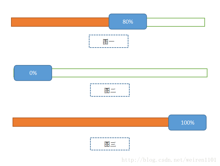
确定进度指示器的坐标
图一:
indicator的最右边与进度条progress最右边重合,所以indicator.x为进度条progress.right - - defaultIndicateMargin(默认间距)。
图二:
indicator在最左端时,indicator.x为0,indicator.right为indicator.width。
图三:
indicator在最右端时,indicator.right为整个view的width,indicator.x为width - indicator.width。
确定进度百分比文本的坐标
以上任一种情况下,进度百分比文本的坐标text.x,text.y是怎样的呢?
text.x = indicatoRectF.centerX - indicatorTextPaint.measure(“百分比文本”) / 2,
因为此文本一直都是垂直居中的(我是整个view的高度分为5等份,进度条占1等份,指示器indicator占3等份,上下空白各占1等份),text.y(text.baseline) = view.height * 3 / 5。
颜色渐变的实现
利用线性颜色渐变LinearGradient来实现,如下:
LinearGradient lGradient = new LinearGradient(0, height * 2 / 5, width * getScale(), height * 3 / 5, startProgressColor, endProgressColor, Shader.TileMode.MIRROR);
progressPaint.setShader(lGradient);
源码下载
扫码关注,获取更多精彩Android开发文章