前言
记得以前自己使用过的ViewPager Indicator有JakeWharton大神的开源库ViewPagerIndicator,v4包自带的PagerTitleStrip以及Android Support Design库的TabLayout。它们基本上可以实现项目中常见的ViewPager指示器的需求,除非你的项目有特色的指示器需求,如指示器不再是tab底部横线,而是一个三角形或是其他形状,亦或是图片。这个时候你可能就需要自己去扩展以上或是去github上search看看有没有现成符合你项目需求的ViewPager Indicator指示器。不过话说回来,以上提到Jake的ViewPagerIndicator,官方的PagerTitleStrip,TabLayout对于指示器扩展来讲并不能符合你项目的需求,这个时候,由于项目需求,我们不得不自己定义ViewPager指示器。这篇文章将会教会大家自己动手实现一个ViewPager图片指示器。先看看将要实现效果图:
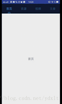
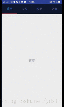
可以看到我们将要实现的效果不仅仅支持图片指示器也支持以前的底部横线指示器,下面我们将动手实现以上的效果。
如何实现?
在自定义ViewPagerIndicator前我们首先需要思考如何才能实现以上的效果,我们不妨先观察观察这个指示器是如何构造的,在这里我给出的答案是其实它就是一个LinearLayout(容器)外加底部绘制的一个图形(图片,颜色或是形状),并在ViewPager的移动过程中改变底部图形及Indicator容器的位置。知道了这个指示器的组成结构后我们就可以开始动手写代码实现它了。
实现
1. 继承LinearLayout并设置好成员变量及自定义属性
/**
 * Created by lt on 2018/4/20.
 */
public class ImagePagerIndicator extends LinearLayout {

    private static final String TAG = "ImagePagerIndicator";
    /**
     * 指示器图片和容器高度比率最大值(为了更好的适配,防止图片过大)
     */
    public static final float DEFAULT_IMAGE_HEIGHT_RADIO = 1/4F;
    /**
     * 默认可见tab的数量
     */
    public static final int DEFAULT_TAB_VISABLE_COUNT = 3;
    /**
     * 选中与没有选中的颜色
     */
    private int mHigh_light_color;
    private int mNumal_color;
    /**
     * 指示器的宽高
     */
    private int mIndicatorHeight;
    private int mIndicatorWidth;
    /**
     * tab标题的宽度
     */
    private int mTabWidth;
    private Paint mPaint;
    /**
     * 指示器初始时的偏移量
     */
    private int mStartTranslateX;
    /**
     * 指示器跟随移动的偏移量
     */
    private int mTranslateX ;
    /**
     * 可见tab标题的数量
     */
    private int mTabVisiableCount = DEFAULT_TAB_VISABLE_COUNT;
    private ViewPager mViewPager;
    private ViewPager.OnPageChangeListener mOnPageChangeListener;

    /**
     * 指示器图片
     */
    private Bitmap mImageBitmap;
    /**
     * 指定图片指示器和容器的最大高度比率
     */
    private float mImageHeightRadio;


    public ImagePagerIndicator(Context context) {
        this(context,null);
    }

    public ImagePagerIndicator(Context context, AttributeSet attrs) {
        this(context, attrs,0);
    }

    public ImagePagerIndicator(Context context, AttributeSet attrs, int defStyleAttr) {
        super(context, attrs, defStyleAttr);
        // 初始化画笔
        mPaint = new Paint();
        mPaint.setAntiAlias(true);
        mPaint.setPathEffect(new CornerPathEffect(3)); // 设置画笔平滑圆角,不然看起来尖锐
        mPaint.setStyle(Paint.Style.FILL);
        mPaint.setColor(Color.BLUE);
        // 获取自定义属性
        TypedArray typedArray = context.obtainStyledAttributes(attrs, R.styleable.ImagePagerIndicator);
        mHigh_light_color = typedArray.getColor(R.styleable.ImagePagerIndicator_tab_select_color, Color.RED);
        mNumal_color = typedArray.getColor(R.styleable.ImagePagerIndicator_tab_unselect_color, Color.GRAY);
        mTabVisiableCount = typedArray.getInteger(R.styleable.ImagePagerIndicator_tab_visiable_count, DEFAULT_TAB_VISABLE_COUNT);
        mImageHeightRadio = typedArray.getFloat(R.styleable.ImagePagerIndicator_image_radio_height, DEFAULT_IMAGE_HEIGHT_RADIO);
        mIndicatorHeight = (int) typedArray.getDimension(R.styleable.ImagePagerIndicator_indicator_height,dp2px(6));
        if(mTabVisiableCount <1){
            mTabVisiableCount = 1; // 指定最小可见数量为1
        }
        Drawable drawable = typedArray.getDrawable(R.styleable.ImagePagerIndicator_tab_indicator);
        // Drawable转Bitmap
        if(drawable instanceof BitmapDrawable) {
            mImageBitmap = ((BitmapDrawable)drawable).getBitmap();
        }else if(drawable instanceof ColorDrawable){
            mImageBitmap = Bitmap.createBitmap(2,mIndicatorHeight,
                    Bitmap.Config.ARGB_8888);
            mImageBitmap.eraseColor(((ColorDrawable) drawable).getColor());//填充颜色
        }
        typedArray.recycle();
    }
在构造方法中我们取得我们自定义的属性,如下:
attrs.xml
<?xml version="1.0" encoding="utf-8"?>
<resources>
    <attr name="tab_select_color" format="color|reference"></attr>
    <attr name="tab_unselect_color" format="color|reference"></attr>
    <attr name="tab_indicator" format="reference|color"></attr>
    <attr name="tab_visiable_count" format="integer"></attr>
    <attr name="image_radio_height" format="float"></attr>
    <attr name="indicator_height" format="dimension"></attr>

    <declare-styleable name="ImagePagerIndicator">
        <attr name="tab_select_color"></attr>
        <attr name="tab_unselect_color"></attr>
        <attr name="tab_indicator"></attr>
        <attr name="tab_visiable_count"></attr>
        <attr name="image_radio_height"></attr>
        <attr name="indicator_height"></attr>
    </declare-styleable>
</resources>
在构造方法中我们在获取图片(Bitmap)的时候需要判断用户设置的是图片还是颜色,所以有如下代码:
Drawable drawable = typedArray.getDrawable(R.styleable.ImagePagerIndicator_tab_indicator);
        // Drawable转Bitmap
        if(drawable instanceof BitmapDrawable) {
            mImageBitmap = ((BitmapDrawable)drawable).getBitmap();
        }else if(drawable instanceof ColorDrawable){
            mImageBitmap = Bitmap.createBitmap(2,mIndicatorHeight,
                    Bitmap.Config.ARGB_8888);
            mImageBitmap.eraseColor(((ColorDrawable) drawable).getColor());//填充颜色
        }
这里你可能会说不严谨,如果用户没设置tab_indicator属性呢,mImageBitmap岂不是为null?当然你可以设置默认为一个color颜色(一样转Bitmap),也就是常见的那种底部横线的指示器,无妨。
2. 在onSizeChanged()方法中获取tab及指示器的宽高
在构造方法中是获取不到我们需要的宽高的(为0),所以我们需要在onSizeChanged()方法中获取,代码如下:
/**
     * 每次view的尺寸发生变化时都会回调
     * @param w
     * @param h
     * @param oldw
     * @param oldh
     */
    @Override
    protected void onSizeChanged(int w, int h, int oldw, int oldh) {
        super.onSizeChanged(w, h, oldw, oldh);
        Log.i(TAG,"onSizeChanged:w"+w+"h"+h+"oldw"+oldw+"oldh"+oldh);
        mTabWidth = w/mTabVisiableCount;
        mIndicatorHeight = mImageBitmap.getHeight();
        mIndicatorWidth = mImageBitmap.getWidth();
        if(mIndicatorWidth > mTabWidth || mIndicatorWidth == 2){
            mIndicatorWidth = mTabWidth;
        }
        int maxIndicatorHeight = (int) (h* mImageHeightRadio);
        if(mIndicatorHeight > maxIndicatorHeight){
            mIndicatorHeight = maxIndicatorHeight;
        }
        Log.i(TAG,"mIndicatorHeight"+mIndicatorHeight);
        mStartTranslateX = mTabWidth/2 - mIndicatorWidth/2;
        changeTabWidth();
    }

    /**
     * 代码改变tab标题的布局宽度,防止布局中为不同的title设置不同的宽度
     */
    private void changeTabWidth() {
        int childCount = getChildCount();
        if(childCount == 0){
            return;
        }
        for(int i=0;i<childCount;i++){
            View child = getChildAt(i);
            LayoutParams layoutParams = (LayoutParams) child.getLayoutParams();
            layoutParams.weight = 0;
            layoutParams.width = getWidth()/mTabVisiableCount;
            child.setLayoutParams(layoutParams);
        }
    }
这里你需要理解的是初始偏移量mStartTranslateX的计算,初始偏移量该为tab的宽度二分一减去指示器宽度的二分之一,这样可以使得我们的指示器与标题横线居中对齐。
3.dispatchDraw()中方法中绘制指示器图形
@Override
protected void dispatchDraw(Canvas canvas) {
    super.dispatchDraw(canvas);
    canvas.save();
    // 平移画布
    canvas.translate(mStartTranslateX +mTranslateX,getHeight()-mIndicatorHeight);
    // 设置图片的裁剪区域,为null则不裁剪
    Rect src = new Rect(0,0,mIndicatorWidth,mIndicatorHeight);
    // 设置图片为画布中显示的区域,由于将画布平移了,这里和图片的裁剪区域一致
    Rect dest = new Rect(0,0,mIndicatorWidth,mIndicatorHeight);
    // 绘制图片
    canvas.drawBitmap(mImageBitmap,src,dest,mPaint);
    canvas.restore();
}
注意是dispatchDraw而不是onDraw()。
4.实现指示器,容器和ViewPager的联动
完成了以上步骤后仅仅是在第一个title下面显示了我们想要的图形指示器,当ViewPager滑动的时候你会看到我们的图形指示器并不会跟随ViewPager联动,所以我们需要实现指示器和ViewPager的联动,代码如下:
/**
     * 实现指示器和布局容器的联动
     * @param position
     * @param offset
     */
    private void scroll(int position, float offset) {
        // 实现指示器的滚动
        mTranslateX = (int) (mTabWidth*(offset+position));
        invalidate();
        // 实现容器联动
        Log.i(TAG,position+"%"+mTabVisiableCount+":"+position%mTabVisiableCount);
        // 什么时候容器需要滚动?
        if(offset > 0 && getChildCount() > mTabVisiableCount && position > (mTabVisiableCount -2)){
            this.scrollTo((position - mTabVisiableCount + 1) * mTabWidth + (int) (offset * mTabWidth), 0);
        }
    }
这个方法在ViewPager传入合适的position和offset参数后会使得我们的指示器跟随ViewPager联动。这里通过改变mTranslateX 并调用invalidate()让ViewGroup重新绘制(调用dispatchDraw)实现图形指示器的移动,通过容器的scrollTo方法实现容器的联动。这里你需要慢慢理解偏移量mTranslateX 的计算和容器什么时候开始滚动及滚动到的x坐标值(向右滑offset由0.0~1.0变化,向左滑offset有1.0~0.0变化,注意offset只会无限逼近1.0)。当然,scroll该由谁来调用呢?总不能是我们自己吧,所以,我们还需要给容器设置ViewPager并通过给ViewPager设置滑动监听器,在监听器的onPageScrolled方法调用我们的scroll方法,这个就将我们的指示器和ViewPager绑定在一起了,ViewPager切换的时候我们的指示器及容器也会跟着移动。代码如下:
/**
     * 设置ViewPager,实现绑定
     * @param viewPager
     * @param pos
     */
    public void setViewPager(ViewPager viewPager, final int pos){
        mViewPager = viewPager;
        mViewPager.addOnPageChangeListener(new ViewPager.OnPageChangeListener() {
            @Override
            public void onPageScrolled(int position, float positionOffset, int positionOffsetPixels) {
                if(mOnPageChangeListener != null){
                    mOnPageChangeListener.onPageScrolled(position,positionOffset,positionOffsetPixels);
                }
                Log.i("onPageScrolled():","positionOffset:"+positionOffset);
                ImagePagerIndicator.this.scroll(position,positionOffset);
            }

            @Override
            public void onPageSelected(int position) {
                if(mOnPageChangeListener != null){
                    mOnPageChangeListener.onPageSelected(position);
                }
                resetTextColor();
                highlightTextColor(position);
            }

            @Override
            public void onPageScrollStateChanged(int state) {
                if(mOnPageChangeListener != null){
                    mOnPageChangeListener.onPageScrollStateChanged(state);
                }
            }
        });
        mViewPager.setCurrentItem(pos);
        resetTextColor();
        highlightTextColor(pos);
        setTabClickListener();
    }
这个方法需要注意的是我们将ViewPager设置给了我们的指示器容器并在里面给ViewPager设置了OnPageChangeListener并在onPageScrolled方法中调用了我们的scroll方法。同时,这里使用了addOnPageChangeListener方法而不是过时的setOnPageChangeListener,两者的区别是前者设置的监听器只是ViewPager众多中的一个,而后者则是覆盖之前设置的监听器(只有一个)。
5. 设置tab标题的点击事件
聪明的你可能已经发现上面的setTabClickListener()方法了,那这个方法我们来看看:
/**
     * 设置tab的点击事件
     */
    private void setTabClickListener(){
        for(int i=0;i<getChildCount();i++){
            final int j = i;
            getChildAt(i).setOnClickListener(new OnClickListener() {
                @Override
                public void onClick(View view) {
                    mViewPager.setCurrentItem(j);
                }
            });
        }
    }
想必,你已经知道该方法的作用了,它实现的是当我们点击我们的tab标题的时候ViewPager也能跟着切换页面(再度绑定)。
6. 其他方法
/**
     * 重置文本颜色
     */
    private void resetTextColor(){
        for(int i=0;i<getChildCount();i++){
            View view = getChildAt(i);
            if(view instanceof TextView){
                ((TextView) view).setTextColor(mNumal_color);
            }
        }
    }

    /**
     * 高亮文本
     * @param pos
     */
    private void highlightTextColor(int pos){
        View view = getChildAt(pos);
        if(view instanceof TextView){
            ((TextView) view).setTextColor(mHigh_light_color);
        }
    }

    public void setOnPageChangeListener(ViewPager.OnPageChangeListener onPageChangeListener) {
            mOnPageChangeListener = onPageChangeListener;
        }

    /**
     * dp转 px.
     * @param value the value
     * @return the int
     */
    public int dp2px(float value) {
        final float scale = getContext().getResources().getDisplayMetrics().densityDpi;
        return (int) (value * (scale / 160) + 0.5f);
    }
ok,到此为止我们已经实现了这个ImagePagerIndicator了,那我们要如何使用呢?
使用
先看看我们的布局文件
<?xml version="1.0" encoding="utf-8"?>
<LinearLayout
    xmlns:android="http://schemas.android.com/apk/res/android"
    xmlns:app="http://schemas.android.com/apk/res-auto"
    xmlns:tools="http://schemas.android.com/tools"
    android:orientation="vertical"
    android:layout_width="match_parent"
    android:layout_height="match_parent"
    tools:context="com.lt.viewpagerindicator.MainActivity">

    <com.lt.viewpagerindicator.ImagePagerIndicator
        android:id="@+id/image_indicator"
        android:background="#131933"
        app:tab_indicator="@mipmap/ic_gear_wheel"
        app:tab_select_color="@color/tab_selected_color"
        app:tab_unselect_color="@color/tab_unselected_color"
        app:tab_visiable_count="4"
        android:layout_width="match_parent"
        android:layout_height="60dp">
    </com.lt.viewpagerindicator.ImagePagerIndicator>

    <android.support.v4.view.ViewPager
        android:id="@+id/view_pager"
        android:layout_width="match_parent"
        android:layout_height="wrap_content">
    </android.support.v4.view.ViewPager>

</LinearLayout>
<?xml version="1.0" encoding="utf-8"?>
<LinearLayout
    xmlns:android="http://schemas.android.com/apk/res/android"
    xmlns:app="http://schemas.android.com/apk/res-auto"
    xmlns:tools="http://schemas.android.com/tools"
    android:orientation="vertical"
    android:layout_width="match_parent"
    android:layout_height="match_parent"
    tools:context="com.lt.viewpagerindicator.MainActivity">

    <com.lt.viewpagerindicator.ImagePagerIndicator
        android:id="@+id/image_indicator"
        android:background="#131933"
        app:tab_indicator="@android:color/holo_red_light"
        app:tab_select_color="@color/tab_selected_color"
        app:tab_unselect_color="@color/tab_unselected_color"
        app:tab_visiable_count="3"
        app:indicator_height="6dp"
        android:layout_width="match_parent"
        android:layout_height="60dp">
    </com.lt.viewpagerindicator.ImagePagerIndicator>

    <android.support.v4.view.ViewPager
        android:id="@+id/view_pager"
        android:layout_width="match_parent"
        android:layout_height="wrap_content">
    </android.support.v4.view.ViewPager>

</LinearLayout>
前者是设置一张图片为我们的指示器后者是设置一个颜色为我们的指示器。
初始化Indicator及ViewPager
private static final String TAG = "MainActivity";
    private String[] mTitle = {"首页","资源","视频","文章"};

    @Override
    protected void onCreate(Bundle savedInstanceState) {
        super.onCreate(savedInstanceState);
        requestWindowFeature(Window.FEATURE_NO_TITLE);
        setContentView(R.layout.activity_main);
        ImagePagerIndicator imagePagerIndicator = (ImagePagerIndicator) findViewById(R.id.image_indicator);
        ViewPager viewPager = (ViewPager) findViewById(R.id.view_pager);
        viewPager.setAdapter(mPagerAdapter);
        imagePagerIndicator.setTabTitles(mTitle,18);
        imagePagerIndicator.setViewPager(viewPager,0);
        imagePagerIndicator.setOnPageChangeListener(this);
    }

    PagerAdapter mPagerAdapter = new PagerAdapter() {
        @Override
        public int getCount() {
            return mTitle.length;
        }

        @Override
        public boolean isViewFromObject(View view, Object object) {
            return view == object;
        }

        @Override
        public Object instantiateItem(ViewGroup container, int position) {
            TextView textView = new TextView(MainActivity.this);
            textView.setText(mTitle[position]);
            textView.setTextSize(TypedValue.COMPLEX_UNIT_SP,18);
            textView.setGravity(Gravity.CENTER);
            container.addView(textView);
            return textView;
        }

        @Override
        public void destroyItem(ViewGroup container, int position, Object object) {
            container.removeView((View) object);
        }
    };
自己写的控件使用的话自然很熟悉啦,关键代码一行imagePagerIndicator.setViewPager(viewPager,0);
想必你可能会需要ImagePagerIndicator的完整代码:
package com.lt.viewpagerindicator;

import android.content.Context;
import android.content.res.TypedArray;
import android.graphics.Bitmap;
import android.graphics.Canvas;
import android.graphics.Color;
import android.graphics.CornerPathEffect;
import android.graphics.Paint;
import android.graphics.Rect;
import android.graphics.drawable.BitmapDrawable;
import android.graphics.drawable.ColorDrawable;
import android.graphics.drawable.Drawable;
import android.support.v4.view.ViewPager;
import android.util.AttributeSet;
import android.util.Log;
import android.util.TypedValue;
import android.view.Gravity;
import android.view.View;
import android.view.ViewGroup;
import android.widget.LinearLayout;
import android.widget.TextView;


/**
 * Created by lt on 2018/4/20.
 */
public class ImagePagerIndicator extends LinearLayout {

    private static final String TAG = "ImagePagerIndicator";
    /**
     * 指示器图片和容器高度比率最大值(为了更好的适配,防止图片过大)
     */
    public static final float DEFAULT_IMAGE_HEIGHT_RADIO = 1/4F;
    /**
     * 默认可见tab的数量
     */
    public static final int DEFAULT_TAB_VISABLE_COUNT = 3;
    /**
     * 选中与没有选中的颜色
     */
    private int mHigh_light_color;
    private int mNumal_color;
    /**
     * 指示器的宽高
     */
    private int mIndicatorHeight;
    private int mIndicatorWidth;
    /**
     * tab标题的宽度
     */
    private int mTabWidth;
    private Paint mPaint;
    /**
     * 指示器初始时的偏移量
     */
    private int mStartTranslateX;
    /**
     * 指示器跟随移动的偏移量
     */
    private int mTranslateX ;
    /**
     * 可见tab标题的数量
     */
    private int mTabVisiableCount = DEFAULT_TAB_VISABLE_COUNT;
    private ViewPager mViewPager;
    private ViewPager.OnPageChangeListener mOnPageChangeListener;

    /**
     * 指示器图片
     */
    private Bitmap mImageBitmap;
    /**
     * 指定图片指示器和容器的最大高度比率
     */
    private float mImageHeightRadio;


    public ImagePagerIndicator(Context context) {
        this(context,null);
    }

    public ImagePagerIndicator(Context context, AttributeSet attrs) {
        this(context, attrs,0);
    }

    public ImagePagerIndicator(Context context, AttributeSet attrs, int defStyleAttr) {
        super(context, attrs, defStyleAttr);
        // 初始化画笔
        mPaint = new Paint();
        mPaint.setAntiAlias(true);
        mPaint.setPathEffect(new CornerPathEffect(3)); // 设置画笔平滑圆角,不然看起来尖锐
        mPaint.setStyle(Paint.Style.FILL);
        mPaint.setColor(Color.BLUE);
        // 获取自定义属性
        TypedArray typedArray = context.obtainStyledAttributes(attrs, R.styleable.ImagePagerIndicator);
        mHigh_light_color = typedArray.getColor(R.styleable.ImagePagerIndicator_tab_select_color, Color.RED);
        mNumal_color = typedArray.getColor(R.styleable.ImagePagerIndicator_tab_unselect_color, Color.GRAY);
        mTabVisiableCount = typedArray.getInteger(R.styleable.ImagePagerIndicator_tab_visiable_count, DEFAULT_TAB_VISABLE_COUNT);
        mImageHeightRadio = typedArray.getFloat(R.styleable.ImagePagerIndicator_image_radio_height, DEFAULT_IMAGE_HEIGHT_RADIO);
        mIndicatorHeight = (int) typedArray.getDimension(R.styleable.ImagePagerIndicator_indicator_height,dp2px(6));
        if(mTabVisiableCount <1){
            mTabVisiableCount = 1; // 指定最小可见数量为1
        }
        Drawable drawable = typedArray.getDrawable(R.styleable.ImagePagerIndicator_tab_indicator);
        // Drawable转Bitmap
        if(drawable instanceof BitmapDrawable) {
            mImageBitmap = ((BitmapDrawable)drawable).getBitmap();
        }else if(drawable instanceof ColorDrawable){
            mImageBitmap = Bitmap.createBitmap(2,mIndicatorHeight,
                    Bitmap.Config.ARGB_8888);
            mImageBitmap.eraseColor(((ColorDrawable) drawable).getColor());//填充颜色
        }
        typedArray.recycle();
    }

    /**
     * 每次view的尺寸发生变化时都会回调
     * @param w
     * @param h
     * @param oldw
     * @param oldh
     */
    @Override
    protected void onSizeChanged(int w, int h, int oldw, int oldh) {
        super.onSizeChanged(w, h, oldw, oldh);
        Log.i(TAG,"onSizeChanged:w"+w+"h"+h+"oldw"+oldw+"oldh"+oldh);
        mTabWidth = w/mTabVisiableCount;
        mIndicatorHeight = mImageBitmap.getHeight();
        mIndicatorWidth = mImageBitmap.getWidth();
        if(mIndicatorWidth > mTabWidth || mIndicatorWidth == 2){
            mIndicatorWidth = mTabWidth;
        }
        int maxIndicatorHeight = (int) (h* mImageHeightRadio);
        if(mIndicatorHeight > maxIndicatorHeight){
            mIndicatorHeight = maxIndicatorHeight;
        }
        Log.i(TAG,"mIndicatorHeight"+mIndicatorHeight);
        mStartTranslateX = mTabWidth/2 - mIndicatorWidth/2;
        changeTabWidth();
    }

    /**
     * 代码设置tab的标题,及文字大小(单位为sp)
     * @param titles
     * @param textSize
     */
    public void setTabTitles(String[] titles,float textSize){
        if(titles == null || titles.length ==0){
            return;
        }
        // 动态添加Title,这里将使得布局设置的tab标题全部移除
        removeAllViews();
        for(String title : titles){
            TextView textView = new TextView(getContext());
            textView.setText(title);
            textView.setGravity(Gravity.CENTER);
            textView.setTextSize(TypedValue.COMPLEX_UNIT_SP,textSize);
            LayoutParams layoutParams = new LayoutParams(0, ViewGroup.LayoutParams.MATCH_PARENT);
            layoutParams.weight = 1;
            addView(textView,layoutParams);
        }
    }

    /**
     * 代码改变tab标题的布局宽度,防止布局中为不同的title设置不同的宽度
     */
    private void changeTabWidth() {
        int childCount = getChildCount();
        if(childCount == 0){
            return;
        }
        for(int i=0;i<childCount;i++){
            View child = getChildAt(i);
            LayoutParams layoutParams = (LayoutParams) child.getLayoutParams();
            layoutParams.weight = 0;
            layoutParams.width = getWidth()/mTabVisiableCount;
            child.setLayoutParams(layoutParams);
        }
    }

    /**
     * 设置ViewPager,实现绑定
     * @param viewPager
     * @param pos
     */
    public void setViewPager(ViewPager viewPager, final int pos){
        mViewPager = viewPager;
        mViewPager.addOnPageChangeListener(new ViewPager.OnPageChangeListener() {
            @Override
            public void onPageScrolled(int position, float positionOffset, int positionOffsetPixels) {
                if(mOnPageChangeListener != null){
                    mOnPageChangeListener.onPageScrolled(position,positionOffset,positionOffsetPixels);
                }
                Log.i("onPageScrolled():","positionOffset:"+positionOffset);
                ImagePagerIndicator.this.scroll(position,positionOffset);
            }

            @Override
            public void onPageSelected(int position) {
                if(mOnPageChangeListener != null){
                    mOnPageChangeListener.onPageSelected(position);
                }
                resetTextColor();
                highlightTextColor(position);
            }

            @Override
            public void onPageScrollStateChanged(int state) {
                if(mOnPageChangeListener != null){
                    mOnPageChangeListener.onPageScrollStateChanged(state);
                }
            }
        });
        mViewPager.setCurrentItem(pos);
        resetTextColor();
        highlightTextColor(pos);
        setTabClickListener();
    }

    /**
     * 设置tab的点击事件
     */
    private void setTabClickListener(){
        for(int i=0;i<getChildCount();i++){
            final int j = i;
            getChildAt(i).setOnClickListener(new OnClickListener() {
                @Override
                public void onClick(View view) {
                    mViewPager.setCurrentItem(j);
                }
            });
        }
    }

    /**
     * 重置文本颜色
     */
    private void resetTextColor(){
        for(int i=0;i<getChildCount();i++){
            View view = getChildAt(i);
            if(view instanceof TextView){
                ((TextView) view).setTextColor(mNumal_color);
            }
        }
    }

    /**
     * 高亮文本
     * @param pos
     */
    private void highlightTextColor(int pos){
        View view = getChildAt(pos);
        if(view instanceof TextView){
            ((TextView) view).setTextColor(mHigh_light_color);
        }
    }


    @Override
    protected void dispatchDraw(Canvas canvas) {
        super.dispatchDraw(canvas);
        canvas.save();
        // 平移画布
        canvas.translate(mStartTranslateX +mTranslateX,getHeight()-mIndicatorHeight);
        // 设置图片的裁剪区域,为null则不裁剪
        Rect src = new Rect(0,0,mIndicatorWidth,mIndicatorHeight);
        // 设置图片为画布中显示的区域,由于将画布平移了,这里和图片的裁剪区域一致
        Rect dest = new Rect(0,0,mIndicatorWidth,mIndicatorHeight);
        // 绘制图片
        canvas.drawBitmap(mImageBitmap,src,dest,mPaint);
        canvas.restore();
    }

    /**
     * 实现指示器和布局容器的联动
     * @param position
     * @param offset
     */
    private void scroll(int position, float offset) {
        // 实现指示器的滚动
        mTranslateX = (int) (mTabWidth*(offset+position));
        invalidate();
        // 实现容器联动
        Log.i(TAG,position+"%"+mTabVisiableCount+":"+position%mTabVisiableCount);
        // 什么时候容器需要滚动?
        if(offset > 0 && getChildCount() > mTabVisiableCount && position > (mTabVisiableCount -2)){
            this.scrollTo((position - mTabVisiableCount + 1) * mTabWidth + (int) (offset * mTabWidth), 0);
        }
    }

    public void setOnPageChangeListener(ViewPager.OnPageChangeListener onPageChangeListener) {
        mOnPageChangeListener = onPageChangeListener;
    }

    /**
     * dp转 px.
     * @param value the value
     * @return the int
     */
    public int dp2px(float value) {
        final float scale = getContext().getResources().getDisplayMetrics().densityDpi;
        return (int) (value * (scale / 160) + 0.5f);
    }
}也或许你觉得这个小齿轮很可爱,那么你可能会需要整个项目的github:ImagePagerIndicator
亦或是你想要的是形状指示器,那么很抱歉我这里没有,但形状指示器只需你在dispatchDraw方法中绘制你想要的形状即可,随性所欲,如你想要hongyang大神的三角形指示器,你可以看看他是如何绘制三叫形的。