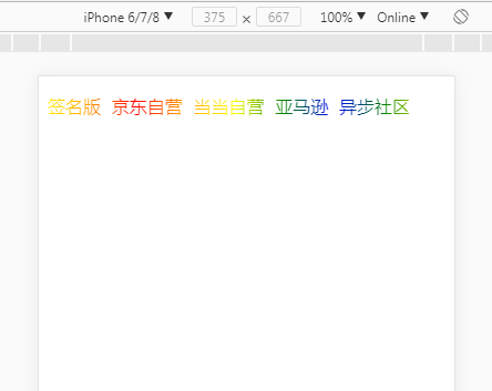
显示效果如上图所示,此外还包含颜色滚动效果。代码如下:
HTML:
<p class="colorful ovh">
        <a href="https://weidian.com/?userid=1302830717&code=081hokh32X0I3M0FH6i32J14h32hokh1" class="btn" target="_blank">签名版</a>
        <a href="https://item.jd.com/12262251.html" class="btn" target="_blank">京东自营</a>
        <a href="http://product.dangdang.com/25206611.html" class="btn" target="_blank">当当自营</a>
        <a href="https://www.amazon.cn/dp/B0788XRYGF/" class="btn" target="_blank">亚马逊</a>
        <a href="http://www.epubit.com.cn/book/details/4767" class="btn" target="_blank">异步社区</a>
</p> .colorful{
/* 偶数个 */
/*background-image: linear-gradient(to right, red, yellow, purple, purple, yellow, red, yellow, purple, purple, yellow, red); */
/* 奇数个 */
background-image: linear-gradient(to right, red, orange, yellow, green, blue, green, yellow, orange, red, orange, yellow, green, blue, green, yellow, orange, red);
-webkit-text-fill-color: transparent;
-webkit-background-clip: text;
-webkit-background-size: 200% 100%;
animation: bgp 5s infinite linear;
}
@-webkit-keyframes bgp{
0%{
background-position: 0 0;
}
100%{
background-position: -100% 0;
}
}
.colorful a {
margin-right: 5px;
text-decoration: none;
padding: 3px 0;
}1、background-position: -100% 0; 当为 -100% 时,向右滚动;为 100% 时,向左。
2、这一点非常重要:
linear-gradient 中的颜色值个数最好有不少于 3 个;
颜色值需要从中间颜色两边对称,并且去掉第一个再重复 1 遍。
当值为奇数个的时候:
你要设置 红 黄 紫 3个颜色,需要写成: 红 黄 紫 黄 红 黄 紫 黄 红;
如果要写 红橙黄绿紫 5个颜色,需要写成: 红 橙黄绿 紫 绿黄橙 红 橙黄绿 紫 绿黄橙 红。
当值为偶数个的时候:
你要设置 红 黄 紫 绿 4个颜色,需要写成: 红黄紫绿 绿紫黄红黄紫绿 绿紫黄红;
否则,动画的每一轮循环之间都会发生颜色跳跃,影响美感。