需求:
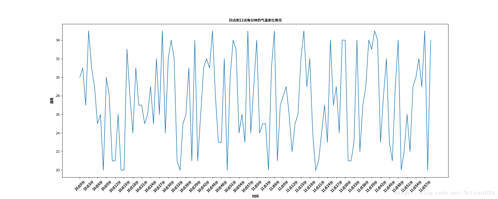
列表a表示10点到12点的每一分钟的气温,如何绘制折线图观察每分钟气温的变化情况?
a= [random.randint(20,35) for i in range(120)]Example:
from matplotlib import pyplot as plt
from matplotlib import font_manager
import random

x = range(0,120)
y = [random.randint(20,35) for i in range(120)]

# 设置字体
my_font = font_manager.FontProperties(fname="/usr/share/fonts/opentype/noto/NotoSansCJK-Bold.ttc")

# 设置图片的大小
plt.figure(figsize=(20, 8), dpi=80)

# 绘制图片
plt.plot(x, y)

# 设置x州的刻度
# 调整x轴的刻度
_xtick_labels = ["10点{}分".format(i) for i in range(60)] + ["11点{}分".format(i) for i in range(60)]
# 取步长,数字和字符一一对应,数据的长度一样
plt.xticks(list(x)[::3], _xtick_labels[::3], rotation=45, fontproperties=my_font)

# 设置添加描述信息
plt.xlabel('时间', fontproperties=my_font)
plt.ylabel('温度', fontproperties=my_font)
plt.title("10点到12点每分钟的气温变化情况", fontproperties=my_font)


# 展示图片
plt.show()