问题描述
在训练神经网络的时候会产生大量的数据,包括但是不止包括train_loss,test_accuracy。这些数据一般会保存在.csv文件中,但是每次手动绘制曲线真的很麻烦,而每周做汇报用的图不需要那么那么精致,只要能看趋势就可以。在模型训练好的时候自动画图并保存到指定文件夹,真的太方便了。
解决办法
1.将每个epoch训练的数据都保存到一个list里面。
2.绘图。
import matplotlib
matplotlib.use('Agg')
import matplotlib.pyplot as plt

x1 = range(0, T, 1)
y1 = final_train_loss#final_train_loss是一个list
y2 = final_test_loss
y3 = final_train_accuracy
y4 = final_test_accuracy

#########huitu#########
plt.figure()
plt.plot(x1, y1, '.-',label='train_loss')
plt.plot(x1, y2, '--',label='test_loss')
plt.title('loss & communication round')
plt.ylabel('loss')
plt.xlabel('T')
plt.xticks(rotation=45)
plt.legend()
plt.grid(True)
plt.savefig('./SimulationData/FL_Dynamic/Weight/%s_Dynamic_fed_weight%s_%s_%sUEs_%s_T%s_epoch%s_iid%s_%s_%s_LOSS.png'\
            %(Time,weight,have_classifier, args.num_users, args.dataset,T,args.set_local_ep,args.iid, args.degree_noniid,timeslot))


plt.figure()
# plt.style.use('ggplot') #给图片换不同的风格
plt.plot(x1, y3, '.-',label='train_acc')
plt.plot(x1, y4,'--',label='test_acc')
plt.title('accuracy & communication round')#设置图片标题
plt.ylabel('accuracy')#纵坐标
plt.xlabel('T') #横坐标
plt.xticks(rotation=45)#坐标轴旋转45度
plt.legend()#显示图例
plt.grid(True)
#将图片保存指定文件夹下并命名为指定名字
plt.savefig('./SimulationData/FL_Dynamic/Weight/%s_Dynamic_fed_weight%s_%s_%sUEs_%s_T%s_epoch%s_iid%s_%s_%s_ACCURACY.png'\
            %(Time,weight,have_classifier, args.num_users, args.dataset,T,args.set_local_ep,args.iid, args.degree_noniid,timeslot))
# plt.show()
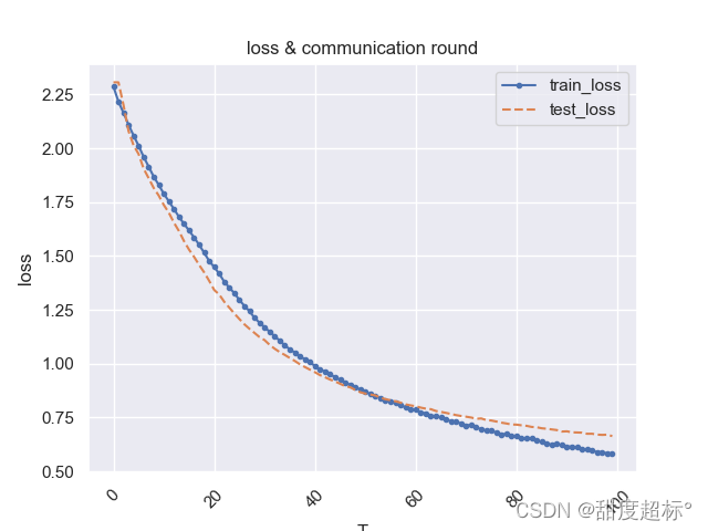
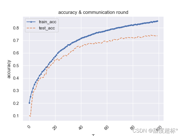
好吧,事实证明模型过拟合,但是这个图好像还可以,挺美的~
参考链接:https://zhuanlan.zhihu.com/p/24675460