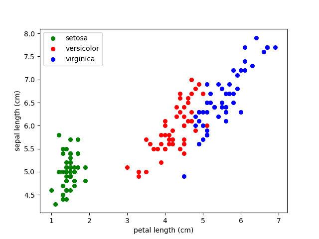
iris数据集导入有好几种方式,本文采用的是从sklearn包中直接导入使用,并选取期中两列的属性,用散点图分析,
代码参考了《机器学习实战》
# import numpy as np
# from numpy import *
# import  operator
from sklearn.datasets import load_iris
# import matplotlib
import matplotlib.pyplot as plt
def huitu(a,b):
    #加载数据,获取数据的特征属性列表、数据、分类信息
    dataSet=load_iris()
    #获取属性标签
    labels=dataSet.feature_names
    #获取属性数据
    features=dataSet.data
    #获取分类信息
    classInfo=dataSet.target

    #分别获取对应类的a和b的属性数据
    type1_x=[]
    type1_y=[]
    type2_x=[]
    type2_y=[]
    type3_x=[]
    type3_y=[]
    fig=plt.figure()
    ax=fig.add_subplot(111)
    for i in range(len(classInfo)):
        if classInfo[i]==0:
            type1_x.append(features[i][a])
            type1_y.append(features[i][b])
        if classInfo[i]==1:
            type2_x.append(features[i][a])
            type2_y.append(features[i][b])
        if classInfo[i]==2:
            type3_x.append(features[i][a])
            type3_y.append(features[i][b])
#数据绘图
   type1=ax.scatter(type1_x,type1_y,s=30,c='g')
    type2=ax.scatter(type2_x, type2_y, s=30, c='r')
    type3=ax.scatter(type3_x, type3_y, s=30, c='b')
    #设置横坐标和纵坐标
    ax.set_xlabel(labels[a])
    ax.set_ylabel(labels[b])
    ax.legend((type1,type2,type3),(u'setosa',u'versicolor',u'virginica'),loc='best')
    plt.show()
huitu(2,0)
【结果展示】