单选框样式更改
以前的单选框的样式都很普通,不太好看
所以就有了css样式的改进,可以通过加一个span标签,对它进行更改,就可以调整单选框的样式。当然了就要把原来input上的单选框样式利用绝对定位的方法,移动到-left大数值,就可以隐藏看不出来了。
下面是一个自制的单选框样式:
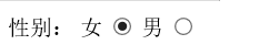
性别:
<label>
	女
	<input type="radio" name="sex"/>
    <span></span>
</label>
<label>
	男
	<input type="radio" name="sex"/>
    <span></span>
</label>
span{display:block; width:30px; height:30px; border-radius:25%; background-color:#fff; border:1px #C66 solid;}
input:checked+span{background:url(pic.png) no-repeat 0 center;border:1px #3CC solid}
label{position:relative;}
input{position:absolute; left:-9999px;}
多选框样式更改
它的方法和单选框的相同。
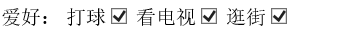
下面是一个自制的多选框样式:
爱好:
	<label>

    	打球<input type="checkbox" />
        <span></span>

    </label>
    <label>
    看电视<input type="checkbox" />
        <span></span>
    </label>
    <label>
     逛街<input type="checkbox" />
        <span></span>
    </label>
span{display:block;width:50px;height:50px;background-color:#09F;border-radius:50%;}
input:checked+span{background:url(pic1.png) no-repeat 0px center;border:1px yellow solid}
label{position:relative}
input{position:absolute;left:-99999px;}
盒模型阴影
语法:box-shadow:[inset] x y blur [spread] color
[inset]:投影方式,默认为外投影,inset表示内投影;
x元素:是指阴影水平偏移量其值可以是正负值可以取正负值,如果值为正值,则阴影在对象的右边,反之其值为负值时,阴影在对象的左边;
y元素:是指阴影的垂直偏移量,其值也可以是正负值,如果为正值,阴影在对象的底部,反之其值为负值时,阴影在对象的顶部;
blur:模糊半径
[spread]:扩展阴影半径(先扩展原有形状,再开始画阴影)
color:颜色
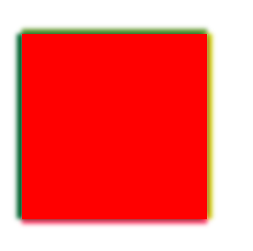
下面就是一个普通div块的阴影:
<div></div>div{width:150px; height:150px; background-color:red; margin:200px auto; box-shadow:-4px -4px 2px 0px #333;}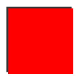
给每个边设置不同的效果:
div{width:150px; height:150px; background-color:red; margin:200px auto; box-shadow:-4px 0 5px #063,0 -4px 5px #693,0 4px 5px #F36,4px 0 5px #CC0;}效果图:
使用多层阴影时:
.div1{width:100px; height:100px; background-color:red; box-shadow:0 0 20px blue,0 0 10px yellow;margin-right:50px;float:left;}
.div2{width:100px; height:100px; background-color:red; box-shadow:0 0 10px blue,0 0 20px yellow;float:left;}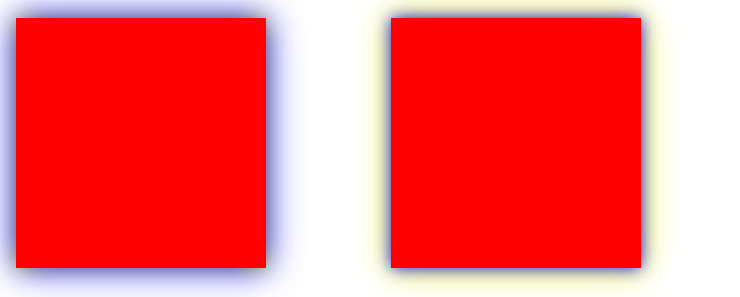
结论:如果前面的阴影模糊值小于后面的阴影模糊值,那么前面的显示在后面之上,如果前面阴影的模糊值大于后面的阴影模糊值,那么前面的阴影将遮住后面的阴影效果。