input多选框checkbox单选框radio的样式修改-------CSS
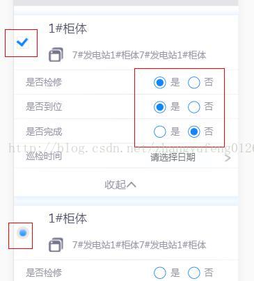
效果图
HTML代码
1.多选
       <div class="hy-check hlyw-fg-pandect-l">
                            <input type="checkbox"   ng-model="item.checked1"  ng-change="selectOne()"/>
                            <label class="abs-cell"></label>
                        </div>
2单选
              <div class="hlyw-dx-main-c"> <input type="radio" class="hy-radio" ng-model="stateJX" value="1"  name="selectStateJX"> 是</div>
              <div class="hlyw-dx-main-c"> <input type="radio" class="hy-radio"  ng-model="stateJX" value="0" name="selectStateJX"> 否</div>
CSS样式
/* 多选 方框 自定义*/
.hy-check {
	width: 30px;
	height: 100%;
	top: 0;
	left: 0;
	right: 0;
}
.hy-check label {
	width: 20px;
	height: 20px;
	position: absolute;
	left: 0;
	top: 50%;
	margin-top: -10px;
	margin-left: 5px;
	background: #fff;
    border: 1px solid #e7e7e7;
	border-radius: 20px;
}
.hy-check  label:after {
    content: '';
    width: 12px;
    height: 12px;
    position: absolute;
    top: 3px;
    left: 3px;
    border-top: none;
    border-right: none;
    opacity: 0;
    border-radius: 20px;
    box-shadow: 0 0 10px rgba(0,0,0,0.5), inset 0 0 1px 1px rgba(255,255,255,.3);
    background-image: linear-gradient(to top, rgba(20,133,255,1), rgba(139,195,255,1));
}
.hy-check input[type=checkbox]:checked + label:after {
	opacity: 1;
}
.hy-check input[type=checkbox] {
    opacity: 0;
    position: absolute;
    z-index: 999;
    left: 0;
    top: 50%;
    width: 30px;
    height: 30px;
    margin: 0;
    margin-top: -15px;
    cursor: pointer;
}
/* 多选 对勾 自定义*/
.hy-checkk {
	width: 30px;
	height: 100%;
	top: 0;
	left: 0;
	right: 0;
}
.hy-checkk label {
	width: 20px;
	height: 20px;
	position: absolute;
	left: 0;
	top: 50%;
	margin-top: -10px;
	margin-left: 5px;
	background: #fff;
	border: 1px solid #e7e7e7;
}
.hy-checkk  label:after {
	content: '\00a0';
/*	display: inline-block;*/
	border: 4px solid   rgba(20,133,255,1);
	width: 12px;
	height: 8px;
	position: absolute;
/*	top: 3px;
	left: 3px*/;
	border-top-width: 0;
	border-right-width: 0;
	opacity: 0;
	-webkit-transform: rotate(-50deg);


/*	content: '\00a0';
	display: inline-block;
	border: 4px solid #fff;
	border-top-width: 0;
	border-right-width: 0;
	width: 18px;
	height: 10px;
	-webkit-transform: rotate(-50deg);
	position: absolute;
	top:6px;
	left:4px;*/
	/*content: '';
	width: 12px;
	height: 12px;
	position: absolute;
	top: 3px;
	left: 3px;
	border-top: none;
	border-right: none;
	opacity: 0;
	box-shadow: 0 0 10px rgba(0,0,0,0.5), inset 0 0 1px 1px rgba(255,255,255,.3);
	background-image: linear-gradient(to top, rgba(20,133,255,1), rgba(139,195,255,1));*/
}
.hy-checkk input[type=checkbox]:checked + label:after {
	opacity: 1;
}
.hy-checkk input[type=checkbox] {
	opacity: 0;
	position: absolute;
	z-index: 999;
	left: 0;
	top: 50%;
	width: 30px;
	height: 30px;
	margin: 0;
	margin-top: -15px;
	cursor: pointer;
}
/**  单选按钮*/
.hy-radio {
    width: 20px;
    height: 0px;
    background-color: #000;
    /*margin-right: 30px;*/
    border-radius: 50%;
    position: relative;
    top: -15px;
}
.hy-radio:before,.hy-radio:after {
    content: '';
    display: block;
    position: absolute;
    border-radius: 50%;
    transition: .3s ease;
}
.hy-radio:before {
    top: 0px;
    left: 0px;
    width: 18px;
    height: 18px;
    background-color: #fff;
    border: 1px solid #1485FD;
}
.hy-radio:after {
    top: 6px;
    left: 6px;
    width: 8px;
    height: 8px;
    background-color: #fff;
}
.hy-radio:checked:after {
    top: 4px;
    left: 4px;
    width: 12px;
    height: 12px;
    background-color: #1485FD;
}
.hy-radio:checked:before {
    border-color:#1485FD;
}