一、移动端基础
0x1 Viewport
1、介绍
移动设备上的viewport是指设备的屏幕上能用来显示网
页的区域,一般来讲,移动设备上的viewport都要大于浏览
器的可视区域。
2、用法
<meta name="viewport" content="width=device-width,
initial-scale=1.0, maximum-scale=1.0, user-scalable=0">
//属性
width : 设置layout viewport 宽度,值为一个正整数,或字符串"width-device"
height:设置layout viewport 高度,这个属性很少使用
initial-scale:设置页面初始缩放值,值为一个数字,可以是小数
minimum-scale : 设置页面最小缩放值,值为一个数字,可以是小数
maximum-scale : 设置页面最大缩放值,值为一个数字,可以是小数
user-scalable : 是否允许用户进行缩放,值为"no"或"yes"
0x2 CSS度量单位
| 单位 | 说明 | 兼容性 |
|---|---|---|
| em | 相对长度单位,相对于当前对象内文本的字体尺寸, 根据父元素的大小变化而变化 | 良好 |
| rem | 相对长度单位,相对于跟元素( 即 html 元素)font-size 的倍数, 不会被它的父元素影响 | IE9+、火狐 3.6+、 safari5.0+ |
| vw | 相对于视口的宽度, 视口被均分为 100 单位的vw | 高版本浏览器均支持 |
| vh | 相对于视口的宽度, 视口被均分为 100 单位的vh | 高版本浏览器均支持 |
详情移步这里点击查看
二、响应式布局
0x1 响应式布局(@media)
优点:
- 针对不同的屏幕尺寸设置不同的样式
- 响应式布局是解决移动端设备屏幕尺寸不同的问题
- 面对不同分辨率设备灵活性强
- 能够快捷解决多设备显示适应问题
缺点:
- 兼容各种设备工作量大,效率低下
- 代码累赘,会出现隐藏无用的元素,加载时间加长
- 是一种折衷性质的设计解决方案,多方面因素影响而达不到最佳效果
0x2 媒体查询
写法:
@media mediatype and|not|only  (media feature) {
    //and且 not不是 only仅仅
    CSS-Code;
}

//也可以针对不同的媒体使用不同 stylesheets :
<link rel="stylesheet" media="mediatype and|not|only (media feature)"
href="mystylesheet.css">
理解:媒体查询是响应式布局的方法之一,扩展了 Media 属性。
作用:使网页适配于各种设备(为不同设备提供不同样式)。
核心:当屏幕改变到一定的大小,页面中的模块样式设置发生改变。
media feature:
- max-width:定义输出设备中的页面最大可见区域宽度。
- min-width:定义输出设备中的页面最小可见区域宽度。
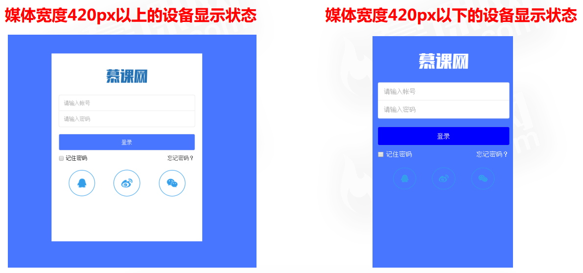
0x3 实战@media案例
效果图:
Demo
//CSS样式
body,html{
background: #4876FF;
}
#wrapper{
width: 400px;
height: 500px;
position: absolute;
top: 50%;
left: 50%;
margin-left: -200px;
margin-top: -250px;
background: white;
overflow: hidden;
}
header{
width: 100%;
height: 91px;
display: -webkit-box;
-webkit-box-pack: center;
}
header img{
position: relative;
top: -30px;
}
.count{
width: 100%;
margin-top: 20px;
}
.count form{
width: 90%;
display: -webkit-box;
-webkit-box-orient: vertical;
margin: 0 auto;
}
.count form input{
display: block;
padding: 13px;
border: 0;
box-shadow: 0 0 1px #999999;
}
.count form input:first-child{
border-radius: 3px 3px 0 0;
}
.count form input:nth-child(2){
border-radius: 0 0 3px 3px;
}
.count form input:nth-child(3){
margin-top: 20px;
background: #4876FF;
color: white;
border-radius: 3px;
}
.count div{
width: 90%;
margin: 10px auto;
display: -webkit-box;
-webkit-box-pack: justify;
}
.count div span{
display: block;
color: black;
}
footer{
width: 100%;
}
footer ul{
width: 100%;
display: -webkit-box;
-webkit-box-pack: center;
}
footer ul li{
display: -webkit-box;
}
footer ul li a{
display: block;
}
footer ul li a img{
display: block;
width: 60%;
margin: 10px auto;
}
@media screen and (max-width:420px ){
#wrapper{
width: 100%;
height: 100%;
position: absolute;
top: 0;
left: 0;
margin: 0;
background: #4876FF;
overflow: hidden;
}
header{
width: 100%;
height: 91px;
display: -webkit-box;
-webkit-box-pack: center;
overflow: hidden;
}
header img{
position: relative;
top: 31px;
}
.count form input:nth-child(3){
margin-top: 20px;
background:blue;
color: white;
border-radius: 3px;
}
.count div span{
display: block;
color: white;
}
.count div span a{
color: white;
}
footer{
width: 90%;
margin:auto;
}
footer ul{
width: 100%;
display: -webkit-box;
-webkit-box-pack: center;
}
footer ul li{
display: -webkit-box;
width:30%;
}
}
//HTML
<body>
<div id="wrapper">
<header><img src="img/1a.png" /></header>
<article class="count">
<form>
<input type="text" placeholder="请输入帐号" />
<input type="password" placeholder="请输入密码" />
<input type="submit" value="登录"/>
</form>
<div>
<span>
<label>
<input type="checkbox" /> 记住密码
</label>
</span>
<span>
<a href="#">忘记密码?</a>
</span>
</div>
</article>
<footer>
<ul>
<li><a href="#"><img src="img/2.png"/></a></li>
<li><a href="#"><img src="img/3.png"/></a></li>
<li><a href="#"><img src="img/4.png"/></a></li>
</ul>
</footer>
</div>
</body>下面附上比较全面的reset.css
/**
 * Eric Meyer's Reset CSS v2.0 (http://meyerweb.com/eric/tools/css/reset/)
 * http://cssreset.com
 */
html, body, div, span, applet, object, iframe,
h1, h2, h3, h4, h5, h6, p, blockquote, pre,
a, abbr, acronym, address, big, cite, code,
del, dfn, em, img, ins, kbd, q, s, samp,
small, strike, strong, sub, sup, tt, var,
b, u, i, center,
dl, dt, dd, ol, ul, li,
fieldset, form, label, legend,
table, caption, tbody, tfoot, thead, tr, th, td,
article, aside, canvas, details, embed,
figure, figcaption, footer, header, hgroup,
menu, nav, output, ruby, section, summary,
time, mark, audio, video {
    margin: 0;
    padding: 0;
    border: 0;
    font-size: 100%;
    font: inherit;
    vertical-align: baseline;
}
/* HTML5 display-role reset for older browsers */
article, aside, details, figcaption, figure,
footer, header, hgroup, menu, nav, section {
    display: block;
}
html {
    height:100% !important;
    min-height:100% !important;
}
body {
    margin:0;
    padding:0;
    height:100%;
    min-height:100%;
    width:100%;
    background: #FFFFFF;
    font: 14px/22px "ralewayregular", Helvetica Neue, Helvetica, Arial, sans-serif;
    color: #888888;
    -webkit-font-smoothing: antialiased; /* Fix for webkit rendering */
    -webkit-text-size-adjust: 100%;
    letter-spacing:0.5px;
}

ol, ul {
    list-style: none;
}
nav ul {
    list-style:none;
}
li{
    list-style:none;
}
blockquote, q {
    quotes: none;
}
blockquote:before, blockquote:after,
q:before, q:after {
    content: '';
    content: none;
}
a {
    margin:0;
    padding:0;
    font-size:100%;
    vertical-align:baseline;
    background:transparent;
    text-decoration:none;
    outline:none;
    color: #333;
}
a:hover{
    cursor:pointer;
}

/* change colours to suit your needs */
mark {
    background-color:#ff9;
    color:#000;
    font-style:italic;
    font-weight:bold;
}

del {
    text-decoration: line-through;
}

abbr[title], dfn[title] {
    border-bottom:1px dotted;
    cursor:help;
}

table {
    border-collapse:collapse;
    border-spacing:0;
}

/* change border colour to suit your needs */
hr {
    display:block;
    height:1px;
    border:0;
    border-top:1px solid #cccccc;
    margin:1em 0;
    padding:0;
}


button,
input,
select,
textarea {
  margin: 0;
  font-size: 100%;
  vertical-align: middle;
}

button,
input {
  *overflow: visible;
  line-height: normal;
}

button::-moz-focus-inner,
input::-moz-focus-inner {
  padding: 0;
  border: 0;
}

button,
html input[type="button"],
input[type="reset"],
input[type="submit"] {
  cursor: pointer;
  -webkit-appearance: button;
}

label,
select,
button,
input[type="button"],
input[type="reset"],
input[type="submit"],
input[type="radio"],
input[type="checkbox"] {
  cursor: pointer;
}

input[type="search"] {
  -webkit-box-sizing: content-box;
     -moz-box-sizing: content-box;
          box-sizing: content-box;
  -webkit-appearance: textfield;
}

input[type="search"]::-webkit-search-decoration,
input[type="search"]::-webkit-search-cancel-button {
  -webkit-appearance: none;
}

textarea {
  overflow: auto;
  vertical-align: top;
}
.outline[type=text]:focus,.outline[type=submit]:focus,
.outline[type=radio]:focus,.outline[type=checkbox]:focus,.outline[type=password]:focus,button:focus{
    outline:none;
}

input[type=text]:focus,input[type=submit]:focus,
input[type=radio]:focus,input[type=checkbox]:focus,input[type=password]:focus{
    outline:none;
}
button[type=button]:focus,button[type=submit]:focus,
input[type=reset]:focus{
    outline:none;
}
.ch{display: none;}