在前端开发中页面布局总是最开始的工作,就像盖楼时,先搭框架,然后再填砖,前端也是一样的,先做好页面的布局工作。
通过浏览不同的网站发现,页面的布局都是大同小异,总结下来大概就几种:
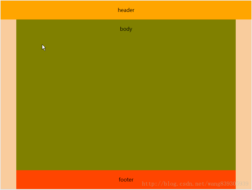
第一种:
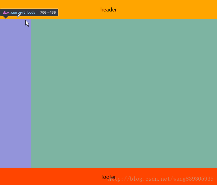
单列布局,这是最简洁的一种。整个页面感觉很干净。目前主流的电商网站基本上都是使用这种布局。
代码:
<!DOCTYPE html>
<html>
    <head>
        <meta charset="UTF-8">
        <title>页面布局</title>
        <style>
            .box{
                width:800px;
                height: 600px;
                text-align: center;
                line-height: 60px;
            }
            .container{
                width: 805px;
                margin:0 auto;
            }
            .header{
                width:100%;
                height:60px;
                background: orange;
            }
            .content{
                position: relative;
                width:700px;
                margin:0 auto;
            }
            .content_body{
                position: relative;
                width:100%;
                height:480px;
                background: olive;
            }
            .content_footer{
                position: relative;
                height:60px;
                background: orangered;
                width:100%
            }
        </style>
    </head>
    <body>
         <div class="container">
             <div class="box">
                <div class="header">header</div>
                <div class="content">
                    <div class="content_body">body</div>
                    <div class="content_footer">footer</div>
                </div>
             </div>
         </div>
    </body>
</html>
第二种:
两列布局:
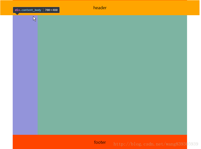
这中布局在一般的技术分享站点比较常见
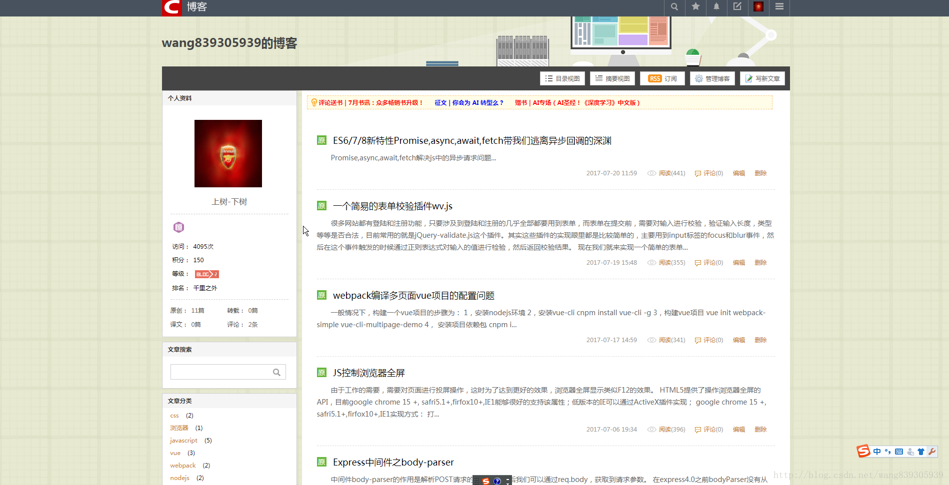
上面是csdn博客的首页,布局就是两列布局,只是有一点变化而已,但是万变不离其中,都是从两列布局演变而来的。
代码:
<!DOCTYPE html>
<html>
    <head>
        <meta charset="UTF-8">
        <title>页面布局</title>
        <style>
            .box{
                width:800px;
                height: 600px;
                text-align: center;
                line-height: 60px;
            }
            .container{
                width: 805px;
                margin:0 auto;
            }
            .header{
                width:100%;
                height:60px;
                background: orange;
            }
            .content{
                position: relative;
                width:700px;
                margin:0 auto;
            }
            .content_body{
                position: relative;
                width:100%;
                height:480px;
                background: olive;
            }
            .content_footer{
                position: relative;
                height:60px;
                background: orangered;
                width:100%
            }
            .left{
                height:100%;
                width:100px;
                float: left;
                background: orchid;
            }
            .right{
                height:100%;
                width:100px;
                float: right;
                background:yellowgreen;
            }
        </style>
    </head>
    <body>
         <div class="container">
             <div class="box">
                <div class="header">header</div>
                <div class="content">
                    <div class="content_body">
                         <div class="left"></div>
                         <div class="right"></div>
                    </div>
                    <div class="content_footer">footer</div>
                </div>
             </div>
         </div>
    </body>
</html>
第三种:
有两列布局就有三列布局:
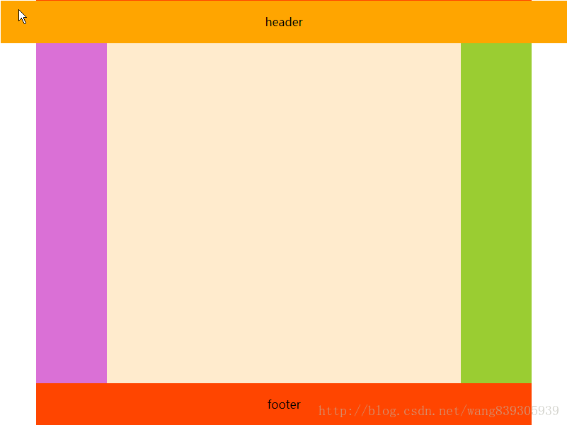
单列,两列,三列都有,那有没有四列…,我们说这只是常见的布局,并不是所有的布局,如果你需要,可以有无数列,只是这些布局是小众而已。
<!DOCTYPE html>
<html>
    <head>
        <meta charset="UTF-8">
        <title>页面布局</title>
        <style>
            .box{
                width:800px;
                height: 600px;
                text-align: center;
                line-height: 60px;
            }
            .container{
                width: 805px;
                margin:0 auto;
            }
            .header{
                width:100%;
                height:60px;
                background: orange;
            }
            .content{
                position: relative;
                width:700px;
                margin:0 auto;
            }
            .content_body{
                position: relative;
                width:100%;
                height:480px;
                background: olive;
            }
            .content_footer{
                position: relative;
                height:60px;
                background: orangered;
                width:100%
            }
            .left{
                height:100%;
                width:100px;
                float: left;
                background: orchid;
            }
            .center{
                float: left;
                width: 500px;
                height: 100%;
                background: blanchedalmond;
            }
            .right{
                height:100%;
                width:100px;
                float: right;
                background:yellowgreen;
            }
        </style>
    </head>
    <body>
         <div class="container">
             <div class="box">
                <div class="header">header</div>
                <div class="content">
                    <div class="content_body">
                         <div class="left"></div>
                         <div class="center"></div>
                         <div class="right"></div>
                    </div>
                    <div class="content_footer">footer</div>
                </div>
             </div>
         </div>
    </body>
</html>
上面的中三种常见的布局都是内容居中的列式布局。这种方式一般内容区的大小是固定的,所以当浏览器窗口大小改变的时候,页面的布局不会改变,只是距离两边的距离会改变。这也是这种布局比较受欢迎的原因之一。
但是我们在一些管理类网站的时候,他也是列式布局,但是内容不是居中的,而是铺满屏幕:
这种布局内容区的宽度是不定的,这个时候就需要做自适应了。一般这种布局左边的菜单列宽度是固定的,但是右边的内容区域的宽度是不固定的。
实现方式一:
.left{
   float:left;
}
.right{
   width:100%;
}
这种方式比较简单,但是是有缺陷的,这种布局右边其实是填充满整个一行的,left只是浮动在他上面,造成了左右布局的现象,我们还需要给右边加上左边距,如果左边的菜单栏收缩时,还要动态的去改变右侧内容的左边距。这样是比较麻烦的。
实现方式二:
采用flex:
.content{
  display:flex;
}
.left:{
  width:100px;
}
.right:{
  flex:1
}
这种方式最简单,完全符合我们的需求,但是他用的是弹性布局,兼容性你懂得。
实现方式三
css样式计算calc();
.left:{
  float:left;
  width:100px;
}
.right:{
  float:right;
  width:100%-100px;
}
calc这个属性也是css3提供的。所以兼容性…….
实现方式四:
宽度采用百分比的方式:
.left{
  width:10%
}
.right{
  height:85%;
}
这种方式的优势是兼容性好,但是,当页面宽度变化时,页面内容会被压缩变形。
实现方式五:
就是通过计算,浏览器宽度减去左边菜单宽度,当浏览器宽度改变的时候,再计算,这种方式比较耗浏览器性能,如果一定要兼容到低版本IE,一般不考虑这种方式。
如果有更好的布局方式,欢迎大家来交流交流