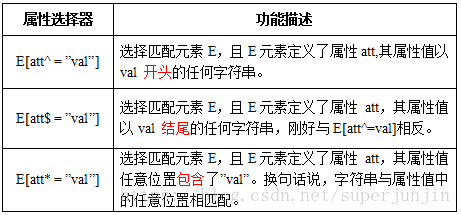
六,CSS3选择器(上)
1,属性选择器
新增了3个属性选择器,使得属性选择器有了通配符的概念
示例代码
<!DOCTYPE html>
<html>
<head>
<meta charset="utf-8">
<title>属性选择器</title>
<style>
    a[class^="column"]{background:red;}

    a[href$="doc"]{background:green;}

    a[title*="box"]{background:blue;}
</style>
</head>
<body>
<a href="##" class="columnNews">我的背景想变成红色</a>
<a href="##" class="columnVideo">我的背景想变成红色</a>
<a href="##" class="columnAboutUs">我的背景想变成红色</a><br/>
<a href="1.doc">我的背景想变成绿色</a>
<a href="2.doc">我的背景想变成绿色</a><br/>
<a href="##" title="this is a box">我的背景想变成蓝色</a>
<a href="##" title="box1">我的背景想变成蓝色</a>
<a href="##" title="there is two boxs">我的背景想变成蓝色</a>
</body>
</html>
2,结构性伪类选择器—root
:root选择器,从字面上我们就可以很清楚的理解是根选择器,他的意思就是匹配元素E所在文档的根元素。在HTML文档中,根元素始终是<html>。
“:root”选择器等同于<html>元素,简单点说:
:root{background:orange}

html {background:orange;}
得到的效果等同。
建议使用:root方法。
3,结构性伪类选择器—not
:not选择器称为否定选择器,和jQuery中的:not选择器一模一样,可以选择除某个元素之外的所有元素。就拿form元素来说,比如说你想给表单中除submit按钮之外的input元素添加红色边框,CSS代码可以写成:
form {
  width: 200px;
  margin: 20px auto;
}
div {
  margin-bottom: 20px;
}
input:not([type="submit"]){
  border:1px solid red;
}
4,结构性伪类选择器—empty
:empty选择器表示的就是空。用来选择没有任何内容的元素,这里没有内容指的是一点内容都没有,哪怕是一个空格。
比如说,你的文档中有三个段落p元素,你想把没有任何内容的P元素隐藏起来。我们就可以使用“:empty”选择器来控制。
HTML代码:
<p>我是一个段落</p>
<p> </p>
<p></p>CSS代码:
p{
background: orange;
min-height: 30px;
}
p:empty {
display: none;
}5,结构性伪类选择器—target
:target选择器称为目标选择器,用来匹配文档(页面)的url的某个标志符的目标元素。我们先来上个例子,然后再做分析。
示例展示
点击链接显示隐藏的段落。
HTML代码:
<h2><a href="#brand">Brand</a></h2>
<div class="menuSection" id="brand">
    content for Brand
</div>
CSS代码:
.menuSection{
  display: none;
}
:target{/*这里的:target就是指id="brand"的div对象*/
  display:block;
}
分析:
1、具体来说,触发元素的URL中的标志符通常会包含一个#号,后面带有一个标志符名称,上面代码中是:#brand
2、:target就是用来匹配id为“brand”的元素(id=”brand”的元素),上面代码中是那个div元素。
多个url(多个target)处理:
就像上面的例子,#brand与后面的id=”brand”是对应的,当同一个页面上有很多的url的时候你可以取不同的名字,只要#号后对的名称与id=""中的名称对应就可以了。
如下面例子:
html代码:
<h2><a href="#brand">Brand</a></h2>
<div class="menuSection" id="brand">
  content for Brand
</div>
<h2><a href="#jake">Brand</a></h2>
<div class="menuSection" id="jake">
 content for jake
</div>
<h2><a href="#aron">Brand</a></h2>
<div class="menuSection" id="aron">
    content for aron
</div>
css代码:
#brand:target {
  background: orange;
  color: #fff;
}
#jake:target {
  background: blue;
  color: #fff;
}
#aron:target {
  background: red;
  color: #fff;
}
上面的代码可以对不同的target对象分别设置不同的样式。
任务:在CSS编辑器中的第一行输入正确的代码,当你点击链接后,段落p将添加橙色背景和白色文字。
html:
<!DOCTYPE html>
<html>
<head>
<meta charset="utf-8">
<title>结构性伪类选择器—target</title>
<link href="style.css" rel="stylesheet" type="text/css">
</head>
<body>
    <div class="menuSection" id="brand">
        <h2><a href="#brand">Brand</a></h2>
        <p>content for Brand</p>
    </div>
</body>
</html>css:(确定了目标元素,再找到p元素)
#brand:target p {
  background: orange;
  color: #fff;
}
6,结构性伪类选择器—first-child
“:first-child”选择器表示的是选择父元素的第一个子元素的元素E。简单点理解就是选择元素中的第一个子元素,记住是子元素,而不是后代元素。
示例演示
通过“:first-child”选择器定位列表中的第一个列表项,并将序列号颜色变为红色。
HTML代码:
<ol>
  <li><a href="##">Link1</a></li>
  <li><a href="##">Link2</a></li>
  <li><a href="##">link3</a></li>
</ol>
CSS代码:
ol > li{
  font-size:20px;
  font-weight: bold;
  margin-bottom: 10px;
}

ol a {
  font-size: 16px;
  font-weight: normal;
}

ol > li:first-child{
  color: red;
}
7,结构性伪类选择器—last-child
“:last-child”选择器与“:first-child”选择器作用类似,不同的是“:last-child”选择器选择的是元素的最后一个子元素。例如,需要改变的是列表中的最后一个“li”的背景色,就可以使用这个选择器,
ul>li:last-child{background:blue;}示例演示
在博客的排版中,每个段落都有15px的margin-bottom,假设不想让博客“post”中最后一个段落不需要底部的margin值,可以使用“:last-child”选择器。
HTML代码:
<div class="post">
<p>第一段落</p>
<p>第二段落</p>
<p>第三段落</p>
<p>第四段落</p>
<p>第五段落</p>
</div>CSS代码:
.post {
  padding: 10px;
  border: 1px solid #ccc;
  width: 200px;
  margin: 20px auto;
}
.post p {
  margin:0 0 15px 0;
}

.post p:last-child {
  margin-bottom:0;
}
8,结构性伪类选择器—nth-child(n)
“:nth-child(n)”选择器用来定位某个父元素的一个或多个特定的子元素。其中“n”是其参数,而且可以是整数值(1,2,3,4),也可以是表达式(2n+1、-n+5)和关键词(odd、even)
当“:nth-child(n)”选择器中的n为一个表达式时,其中n是从0开始计算,当表达式的值为0或小于0的时候,不选择任何匹配的元素。
“:nth-child(n)”,n的起始值始终是1,而不是0。
案例演示
通过“:nth-child(n)”选择器,并且参数使用表达式“2n”,将偶数行列表背景色设置为橙色。
HTML代码:
<ol>
<li>item1</li>
<li>item2</li>
<li>item3</li>
<li>item4</li>
<li>item5</li>
<li>item6</li>
<li>item7</li>
<li>item8</li>
<li>item9</li>
<li>item10</li>
</ol>CSS代码:
ol > li:nth-child(2n){
  background: orange;
}(ol > li:nth-child(2n) 或 li:nth-child(2n) 或 ol :nth-child(2n)效果一样)
9,结构性伪类选择器—nth-last-child(n)
“:nth-last-child(n)”选择器和前面的“:nth-child(n)”选择器非常的相似,只是这里多了一个“last”,所起的作用和“:nth-child(n)”选择器有所区别,从某父元素的最后一个子元素开始计算,来选择特定的元素。
10,first-of-type选择器(last-of-type选择器)
“:first-of-type”选择器类似于“:first-child”选择器,不同之处就是指定了元素的类型,其主要用来定位一个父元素下的某个类型的第一个子元素。
示例演示:
通过“:first-of-type”选择器,定位div容器中的第一个p元素(p不一定是容器中的第一个子元素),并设置其背景色为橙色。
HTML代码:
<div class="wrapper">
  <div>我是一个块元素,我是.wrapper的第一个子元素</div>
  <p>我是一个段落元素,我是不是.wrapper的第一个子元素,但是他的第一个段落元素</p>
  <p>我是一个段落元素</p>
  <div>我是一个块元素</div>
</div>
CSS代码:
.wrapper {
  width: 500px;
  margin: 20px auto;
  padding: 10px;
  border: 1px solid #ccc;
  color: #fff;
}
.wrapper > div {
  background: green;
}
.wrapper > p {
  background: blue;
}
/*我要改变第一个段落的背景为橙色*/
.wrapper > p:first-of-type {
  background: orange;
}
11,nth-of-type(n)选择器(nth-last-of-type(n)选择器)
“:nth-of-type(n)”选择器和“:nth-child(n)”选择器非常类似,不同的是它只计算父元素中指定的某种类型的子元素。当某个元素中的子元素不单单是同一种类型的子元素时,使用“:nth-of-type(n)”选择器来定位于父元素中某种类型的子元素是非常方便和有用的。在“:nth-of-type(n)”选择器中的“n”和“:nth-child(n)”选择器中的“n”参数也一样,可以是具体的整数,也可以是表达式,还可以是关键词。
示例演示
通过“:nth-of-type(2n)”选择器,将容器“div.wrapper”中偶数段数p的背景设置为橙色。
HTML代码:
<div class="wrapper">
  <div>我是一个Div元素</div>
  <p>我是一个段落元素</p>
  <div>我是一个Div元素</div>
  <p>我是一个段落</p>
  <div>我是一个Div元素</div>
  <p>我是一个段落</p>
  <div>我是一个Div元素</div>
  <p>我是一个段落</p>
  <div>我是一个Div元素</div>
  <p>我是一个段落</p>
  <div>我是一个Div元素</div>
  <p>我是一个段落</p>
  <div>我是一个Div元素</div>
  <p>我是一个段落</p>
  <div>我是一个Div元素</div>
  <p>我是一个段落</p>
</div>
CSS代码:
.wrapper > p:nth-of-type(2n){
  background: orange;
}
12,only-child选择器
“:only-child”选择器选择的是父元素中有且只有唯一的子元素。
通过“:only-child”选择器,来控制仅有一个子元素的背景样式,为了更好的理解,我们这个示例通过对比的方式来向大家演示。
HTML代码:
<div class="post">
  <p>我是一个段落</p>
  <p>我是一个段落</p>
</div>
<div class="post">
  <p>我是一个段落</p>
</div>
CSS代码:
.post p {
  background: green;
  color: #fff;
  padding: 10px;
}
.post p:only-child {
  background: orange;
}
13,only-of-type选择器
“:only-of-type”是表示一个元素他有很多个子元素,而其中只有一种类型的子元素是唯一的,使用“:only-of-type”选择器就可以选中这个元素中的唯一一个类型子元素。
示例演示
通过“:only-of-type”选择器来修改容器中仅有一个div元素的背景色为橙色。
HTML代码:
<div class="wrapper">
  <p>我是一个段落</p>
  <p>我是一个段落</p>
  <p>我是一个段落</p>
  <div>我是一个Div元素</div>
</div>
<div class="wrapper">
  <div>我是一个Div</div>
  <ul>
    <li>我是一个列表项</li>
  </ul>
  <p>我是一个段落</p>
</div>
CSS代码:
.wrapper > div:only-of-type {
  background: orange;
}
七,CSS3选择器(下)
1,:enabled选择器(:disabled选择器)
在Web的表单中,有些表单元素有可用(“:enabled”)和不可用(“:disabled”)状态,比如输入框,密码框,复选框等。在默认情况之下,这些表单元素都处在可用状态。那么我们可以通过伪选择器“:enabled”对这些表单元素设置样式。
html:
<!DOCTYPE html>
<html>
<head>
<meta charset="utf-8">
<title>属性选择器</title>
<link href="style.css" rel="stylesheet" type="text/css">
</head>
<body>
<form action="#">

  <div>
    <label for="enabled">可用输入框:</label>
    <input type="text" id="enabled" />
  </div>

  <div>
    <label for="disabled">禁用输入框:</label>
    <input type="text" id="disabled" disabled />
  </div>

 </form>
 </body>
 </html>
css:
div {
  margin: 30px;
}
input[type="text"]:enabled {
  border: 1px solid #f36;
  box-shadow: 0 0 5px #f36;
}

input[type="text"]:disabled{
  box-shadow: none;
}
2,:checked选择器
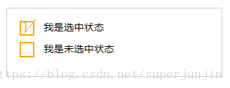
在表单元素中,单选按钮和复选按钮都具有选中和未选中状态。(大家都知道,要覆写这两个按钮默认样式比较困难)。在CSS3中,我们可以通过状态选择器“:checked”配合其他标签实现自定义样式。而“:checked”表示的是选中状态。
示例演示:
通过“:checked”状态来自定义复选框效果。
HTML代码
<form action="#">
  <div class="wrapper">
    <div class="box">
      <input type="checkbox" checked="checked" id="usename" /><span>√</span>
    </div>
    <lable for="usename">我是选中状态</lable>
  </div>

  <div class="wrapper">
    <div class="box">
      <input type="checkbox"  id="usepwd" /><span>√</span>
    </div>
    <label for="usepwd">我是未选中状态</label>
  </div>
</form>
CSS代码:
form {
  border: 1px solid #ccc;
  padding: 20px;
  width: 300px;
  margin: 30px auto;
}

.wrapper {
  margin-bottom: 10px;
}

.box {
  display: inline-block;
  width: 20px;
  height: 20px;
  margin-right: 10px;
  position: relative;
  border: 2px solid orange;
  vertical-align: middle;
}

.box input {
  opacity: 0;
  position: absolute;
  top:0;
  left:0;
}

.box span {
  position: absolute;
  top: -10px;
  right: 3px;
  font-size: 30px;
  font-weight: bold;
  font-family: Arial;
  -webkit-transform: rotate(30deg);
  transform: rotate(30deg);
  color: orange;
}

input[type="checkbox"] + span {
  opacity: 0;
}

input[type="checkbox"]:checked + span {
  opacity: 1;
}
结果演示
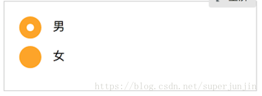
示例演示2:
html:
<!DOCTYPE html>
<html>
<head>
<meta charset="utf-8">
<title>属性选择器</title>
<link href="style.css" rel="stylesheet" type="text/css">
</head>
<body>
<form action="#">
  <div class="wrapper">
    <div class="box">
      <input type="radio" checked="checked"  id="boy" name="1" /><span></span>
    </div>
    <label for="boy">男</label>
  </div>

  <div class="wrapper">
    <div class="box">
      <input type="radio"  id="girl" name="1"  /><span></span>
    </div>
    <label for="girl">女</label>
  </div>
</form>
</body>
</html>
css:
form {
  border: 1px solid #ccc;
  padding: 20px;
  width: 300px;
  margin: 30px auto;
}
.wrapper {
  margin-bottom: 10px;
}
.box {
  display: inline-block;
  width: 30px;
  height: 30px;
  margin-right: 10px;
  position: relative;
  background: orange;
  vertical-align: middle;
  border-radius: 100%;
}
.box input {
  opacity: 0;
  position: absolute;
  top:0;
  left:0;
  width: 100%;
  height:100%;
  z-index:100;/*使input按钮在span的上一层,不加点击区域会出现不灵敏*/
}

.box span {
  display: block;
  width: 10px;
  height: 10px;
  border-radius: 100%;
  position: absolute;
  background: #fff;
  top: 50%;
  left:50%;
  margin: -5px 0  0 -5px;
  z-index:1;
}

input[type="radio"] + span {
  opacity: 0;

}
input[type="radio"]:checked + span {
  opacity: 1;
}
结果演示
3,::selection选择器
“::selection”伪元素是用来匹配突出显示的文本(用鼠标选择文本时的文本)。浏览器默认情况下,用鼠标选择网页文本是以“深蓝的背景,白色的字体”显示的。
将鼠标选中的文本时的背景变成 orange,文本变成 white。
html:
<!DOCTYPE html>
<html>
<head>
<meta charset="utf-8">
<title>::selection选择器</title>
<link href="style.css" rel="stylesheet" type="text/css">
</head>
<body>
<p>“::selection”伪元素是用来匹配突出显示的文本。浏览器默认情况下,选择网站文本是深蓝的背景,白色的字体,
有的设计要求不使用上图那种浏览器默认的突出文本效果,需要一个与众不同的效果,此时“::selection”伪元素就非常的实用。不过在Firefox浏览器还需要添加前缀。</p>
</body>
</html>
css:
::selection{
  background: orange;
  color: white;
}
::-moz-selection{
  background: orange;
  color: white;
}
4,:read-only选择器(:read-write选择器)
“:read-only”伪类选择器用来指定处于只读状态元素的样式。简单点理解就是,元素中设置了“readonly=’readonly’”
“:read-write”选择器刚好与“:read-only”选择器相反,主要用来指定当元素处于非只读状态时的样式。
html:
<!DOCTYPE html>
<html>
<head>
<meta charset="utf-8">
<title>属性选择器</title>
<link href="style.css" rel="stylesheet" type="text/css">
</head>
<body>
<form action="#">
  <div>
    <label for="name">姓名:</label>
    <input type="text" name="name" id="name" placeholder="大漠" />
  </div>
  <div>
    <label for="address">地址:</label>
    <input type="text" name="address" id="address" placeholder="中国上海" readonly="readonly" />
  </div>
</form>
</body>
</html>
css:
form {
  width: 300px;
  padding: 10px;
  border: 1px solid #ccc;
  margin: 50px auto;
}
form > div {
  margin-bottom: 10px;
}
input[type="text"]{
  border: 1px solid orange;
  padding: 5px;
  background: #fff;
  border-radius: 5px;
}
input[type="text"]:-moz-read-only{
  border-color: #ccc;
}
input[type="text"]:read-only{
  border-color: #ccc;
}
input[type="text"]:-moz-read-write{
  border:2px solid red;
}
input[type="text"]:read-write{
  border:2px solid red;
}
5,::before和::after
::before和::after这两个主要用来给元素的前面或后面插入内容,这两个常和”content”配合使用,使用的场景最多的就是清除浮动。
.clearfix::before,
.clearfix::after {
    content: ".";
    display: block;
    height: 0;
    visibility: hidden;
}
.clearfix:after {clear: both;}
.clearfix {zoom: 1;}
当然可以利用他们制作出其他更好的效果,比如右侧中的阴影效果,也是通过这个来实现的。
<!DOCTYPE html>
<html>
<head>
<meta charset=utf-8 />
<title>before、after</title>
<style>
.box h3{
  text-align:center;
  position:relative;
  top:80px;
}
.box {
  width:70%;
  height:200px;
  background:#FFF;
  margin:40px auto;
}

.effect{
  position:relative;
    -webkit-box-shadow:0 1px 4px rgba(0, 0, 0, 0.3), 0 0 40px rgba(0, 0, 0, 0.1) inset;
       -moz-box-shadow:0 1px 4px rgba(0, 0, 0, 0.3), 0 0 40px rgba(0, 0, 0, 0.1) inset;
            box-shadow:0 1px 4px rgba(0, 0, 0, 0.3), 0 0 40px rgba(0, 0, 0, 0.1) inset;
}
.effect::before, .effect::after{
    content:"";
    position:absolute;
    z-index:-1;
    -webkit-box-shadow:0 0 20px rgba(0,0,0,0.8);
    -moz-box-shadow:0 0 20px rgba(0,0,0,0.8);
    box-shadow:0 0 20px rgba(0,0,0,0.8);
    top:50%;
    bottom:0;
    left:10px;
    right:10px;
    -moz-border-radius:100px / 10px;
    border-radius:100px / 10px;
}
</style>
</head>
<body>
  <div class="box effect">
  <h3>Shadow Effect </h3>
</div>
</body>
</html>
上面代码作用在class名叫.effect上的div的前(before)后(after)都添加一个空元素,然后为这两个空元素添加阴影特效。