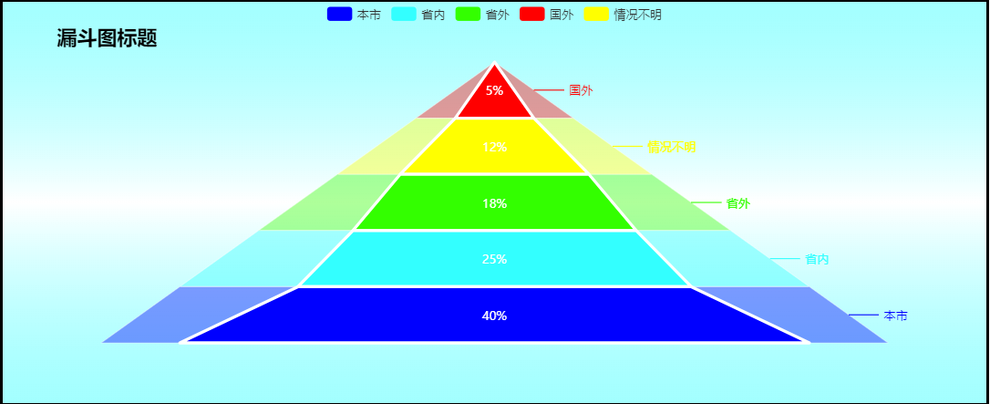
图表效果如下:
代码如下:
-
-
<html>
-
<head>
-
<meta charset="UTF-8">
-
<title>(金字塔)漏斗图案例 </title>
-
<!-- 引入 ECharts 文件 -->
-
<script src="js/echarts4.0.js" type="text/javascript" charset="utf-8"> </script>
-
</head>
-
<body>
-
<!-- 为 ECharts 准备一个具备大小(宽高)的 容器 -->
-
<div id="chart1" style="width: 80%;height: 400px;top: 50px;left: 10%;border: 3px solid #000;"> </div>
-
</body>
-
</html>
-
<script type="text/javascript">
-
// 基于准备好的容器(这里的容器是id为chart1的div),初始化echarts实例
-
var chart1 = echarts.init( document.getElementById( "chart1"));
-
-
// 指定图表的配置项和数据
-
var option = {
-
backgroundColor: { // 背景颜色
-
type: 'linear',
-
x: 0,
-
y: 0,
-
x2: 0,
-
y2: 1,
-
colorStops: [{
-
offset: 0, color: 'rgba(102,255,255,0.6)' // 0% 处的颜色
-
}, {
-
offset: 0.5, color: '#fff' // 50% 处的颜色
-
}, {
-
offset: 1, color: 'rgba(102,255,255,0.6)' // 100% 处的颜色
-
}],
-
globalCoord: false // 缺省为 false
-
},
-
title: { // 图表标题
-
text: '漏斗图标题', // 标题文本内容
-
link: 'https://blog.csdn.net/gray_key', // 标题链接地址
-
target: 'blank', // 链接在新窗口打开
-
left: '5%', // 标题距容器左侧5%
-
top: '5%', // 标题距容器顶部5%
-
textStyle: { // 标题文本样式
-
color: '#000', // 字体颜色
-
fontSize: 20, // 字体大小
-
}
-
},
-
// 弹框提示
-
tooltip: {
-
trigger: 'item',
-
formatter: "{a} <br/>{b} : {c}%" // a对应系列名称,b对应数据项名称,c对应数据项值.
-
},
-
// 图例
-
legend: {
-
data: [ '本市', '省内', '省外', '国外', '情况不明']
-
},
-
// 金字塔块的颜色
-
color: [ '#FF0000', '#FFFF00', '#33ff00', '#33ffff', '#0000ff', ],
-
// 系列
-
series: [
-
// 系列1 (外部)
-
{
-
name: '就业范围分析',
-
type: 'funnel',
-
left: '10%',
-
width: '80%',
-
sort : 'ascending', // 金字塔形:'ascending', 漏斗图形:'descending'
-
label: {
-
normal: {
-
formatter: '{b}' // 金字塔外标签
-
},
-
/* emphasis: {
-
position:'inside',
-
formatter: '{b}预期: {c}%'
-
}*/
-
},
-
labelLine: { // 标签的视觉引导线样式
-
normal: {
-
show: true, // 是否显示引导线
-
length: 30 // 视觉引导线第一段的长度。
-
}
-
},
-
itemStyle: { // 图形样式
-
normal: {
-
opacity: 0.4 // 系列1图形透明度
-
}
-
},
-
tooltip: {
-
show: false // 让系列一(金字塔外层图形的提示框不显示)
-
},
-
// 系列1数据(数据项值和数据项名称)
-
// 系列1(外金字塔)的数据项值一般固定为:20、40、60、80、100,这种有规律的数值,
-
// 这样外金字塔才能是一个正三角形.
-
data: [
-
{ value: 20, name: '国外'},
-
{ value: 40, name: '情况不明'},
-
{ value: 60, name: '省外'},
-
{ value: 80, name: '省内'},
-
{ value: 100, name: '本市'}
-
]
-
},
-
// 系列2 (内部)
-
{
-
name: '就业范围分析',
-
type: 'funnel',
-
left: '10%',
-
width: '80%',
-
maxSize: '80%',
-
sort : 'ascending',
-
label: {
-
normal: {
-
position: 'inside', // 标签的位置:'left'漏斗图的左侧)、'right'(右侧)、'inside'(内部) [ default: 'outside' ]
-
formatter: '{c}%', // 标签文本
-
textStyle: {
-
color: '#fff'
-
}
-
},
-
emphasis: { // 本系列每个数据项中特定的 tooltip 设定
-
position: 'inside',
-
formatter: '{b}: {c}%'
-
}
-
},
-
itemStyle: {
-
normal: {
-
opacity: 08, // 系列2图形透明度
-
borderColor: '#fff', // 图形边框颜色
-
borderWidth: 3 // 图形边框宽度大小
-
}
-
},
-
// 系列2数据(数据项值和数据项名称)
-
// 系列2(内金字塔)的数据项值才是真实的数据值,通过ajax请求获取数据后展示.
-
// 至于系列1和系列2的数据项名一般相同或是相关联的.
-
data: [
-
{ value: 5, name: '国外'},
-
{ value: 12, name: '情况不明'},
-
{ value: 18, name: '省外'},
-
{ value: 25, name: '省内'},
-
{ value: 40, name: '本市'}
-
]
-
}
-
]
-
};
-
-
// 使用刚指定的配置项和数据显示图表
-
chart1.setOption(option)
-
</script>
想要使用该图表,只需要 复制以上代码 ,再下载 echarts.js 在页面文件中引入即可.
注:想要让图表由金字塔转变为漏斗图,只需建将代码中图表配置项中的 sort : 'ascending' 改为 sort : 'descending' 即可。
echarts.js 下载链接: http://echarts.baidu.com/download.html