前言:大家肯定都试过给元素添加背景background,并且用的绝对不少,但是其中的background-position,你真的了解吗?
我们往往要把页面的中的众多图标合并成一张雪碧图,已减少对服务器的图片请求次数。pc端处理雪碧图是很好处理,但是移动端如果不熟悉background-size跟background-position,处理起来还是有很大麻烦的。
一、例子①
测试图片:

<body>
<style>
.box1 { width:200px; height:200px; background:#ccc url(test.png) no-repeat; background-position:20px 20px;
 margin-bottom:10px; }
.box2 { width:200px; height:200px; background:#ccc; position:relative; }
.box2 .child { width:100px; height:100px; background:#d01123; position:absolute; top:20px; left:20px; }
</style>
<div class="box1">

</div>
<div class="box2 ">
	<div class="child"></div>
</div>
</body>
运行结果:
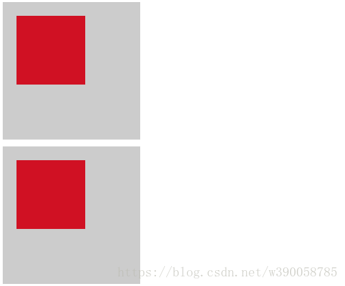
这个毫无问题,第一个是用测试图片做的背景图,而第二个是用div进行定位的。.child的top跟left都是20px;
二、例子②
让背景图的position为20% 30%
<body>
<style>
.box1 { width:200px; height:200px; background:#ccc url(test.png) no-repeat; background-position:20% 30%;
 margin-bottom:10px; }
.box2 { width:200px; height:200px; background:#ccc; position:relative; }
.box2 .child { width:100px; height:100px; background:#d01123; position:absolute; left:20%; top:30%; }
</style>
<div class="box1">

</div>
<div class="box2 ">
	<div class="child"></div>
</div>
</body>
运行结果:

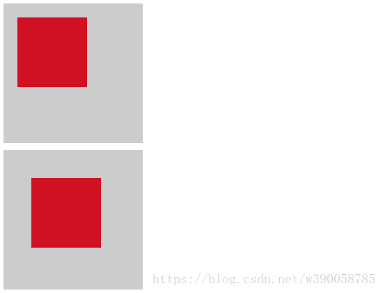
问题出现了。background-position:20% 20%;设置的背景图片,水平垂直居中了。而box2中的div定位是top:20%; left:20%; 效果上出现了很大差异。
三、问题原因
①上个例子中的box2 下div的postion定位的值为百分比,是根据父级的宽度高度来计算的。
box2的宽度为200px, child的left为20%; 既转化为200*20%=40px;
box2的高度为200px, child的top为50%; 既转化为200*30%=60px;
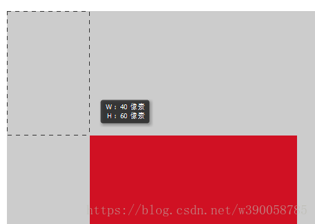
②background-position的百分比计算就大大的不同了,他是用
水平偏移量 = (容器的宽度 - 图片宽度)*百分比
垂直偏移量 = (容器的高度 - 图片高度)*百分比
即上面例子中的
水平偏移量 = (200 - 100)*20% = 20px;
垂直偏移量 = (200 - 100)*30% = 30px;

所以在使用百分比的时候要特别小心这问题,特别是处理移动端的雪碧图的时候。
四、pc端雪碧图处理
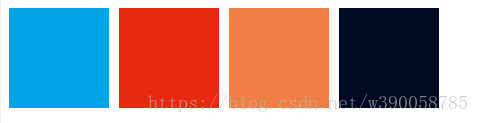
测试图片:四个长宽为100px的小方块

测试代码:四个长宽为100px,margin-right为10px 的小div块。
①(background-position:的值为非百分比的时候)
<body>
<style>
div { width:100px; height:100px; float:left; margin-right:10px;
background:url(test.png) no-repeat; }
div:nth-of-type(1) { background-position:0 0; }
div:nth-of-type(2) { background-position:-100px 0; }
div:nth-of-type(3) { background-position:-200px 0; }
div:nth-of-type(4) { background-position:-300px 0; }
</style>
<div></div>
<div></div>
<div></div>
<div></div>
</body>
运行结果:
这样,就通过雪碧图,给不同的div块添加了不同的背景啦。而我们要做的是,就是给背景图添加水平方向的偏移量就可以了。
②(background-position:的值为百分比的时候)
因为div容器为100px,而背景图的大小为400*100;(即设置百分比的时候只需(100-400)*%)
-100/(100-400) = 33.33%
-200/(100-400) = 66.67%
-300/(100-400) = 100%
<body>
<style>
div { width:100px; height:100px; float:left; margin-right:10px;
background:url(test.png) no-repeat; }
div:nth-of-type(1) { background-position:0 0; }
div:nth-of-type(2) { background-position:33.33% 0; }
div:nth-of-type(3) { background-position:66.67% 0; }
div:nth-of-type(4) { background-position:100% 0; }
</style>
<div></div>
<div></div>
<div></div>
<div></div>
</body>
运行结果:
这样就可以实现一样的效果了。
五、移动端雪碧图处理
测试图片:(四个长宽为48px的小图标)

处理过移动端的雪碧图的都知道,因为容器的宽度高度是自适应的或者是响应式的。如果不设置background-size:图片会出现溢出的情况。
例如:

background-size:该怎么去设置呢?
如例子中的测试图片。因为测试图片的长宽为192*48,那我们直接用rem设置background-size:就好了。
background-size:1.92rem auto; 图片高度让他根据宽度自适应就好了。
因为容器的宽度为48px; 也可以直接用百分比给宽度设值。background-size:400% auto;
如果对rem,移动度自适应不熟悉的建议看下我以前的文章【css】移动端自适应布局与字体大小自适应
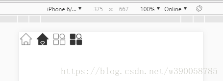
①(background-position:的值为非百分比的时候)
<!DOCTYPE html PUBLIC "-//W3C//DTD XHTML 1.0 Transitional//EN" "http://www.w3.org/TR/xhtml1/DTD/xhtml1-transitional.dtd">
<html xmlns="http://www.w3.org/1999/xhtml">
<head>
<meta http-equiv="Content-Type" content="text/html; charset=utf-8" />
<meta name="viewport" content="width=device-width, initial-scale=1.0,maximum-scale=1.0,user-scalable=0">
<title>移动端处理雪碧图</title>
<style>
html { font-size:100px; }
body { margin:0; }
.content { width:100%; max-width:640px; min-width:320px; margin:0 auto; overflow:hidden;  }
.content div { width:.48rem; height:.48rem; float:left; margin-right:.1rem;
background:url(test2.png) no-repeat; background-size:1.92rem auto; }
.content div:nth-of-type(1) { background-position:0 0; }
.content div:nth-of-type(2) { background-position:-.48rem 0; } /*这里要用rem去设置偏移值*/
.content div:nth-of-type(3) { background-position:-.96rem 0; }
.content div:nth-of-type(4) { background-position:-1.44rem 0; }
</style>
</head>

<body>
<div class="content">
	<div></div>
    <div></div>
    <div></div>
    <div></div>
</div>
<script>

//100是html的原始字体大小
//640是原始设计果图大小
selfAuto(100,640)();
window.onresize = selfAuto(100,640);

function selfAuto(fontSize,oriWidth){
    var oHtml = document.querySelector('html');
    return function(){
        var fixedFontSize = fontSize;
        var htmlWidth= oHtml.offsetWidth;
        if(htmlWidth>oriWidth){ htmlWidth = oriWidth;}
        if(htmlWidth<320){ htmlWidth = 320;}
        fixedFontSize = fixedFontSize*(htmlWidth/oriWidth);
        oHtml.style.fontSize = fixedFontSize +'px';
    }
}
</script>
</body>
</html>
这样就可以实现,背景图也跟着容器自适应了。这里的偏移值也要用rem去设置。
②(background-position:的值为百分比的时候)
因为div容器为48px,而背景图的大小为192*48;(即设置百分比的时候只需(48-192)*%)
-48/(48-192)= 33.33%
-92/(48-192) = 66.67%
-144/(48-192)= 100%
.content div:nth-of-type(1) { background-position:0 0; }
.content div:nth-of-type(2) { background-position:33.33% 0; }
.content div:nth-of-type(3) { background-position:66.67% 0; }
.content div:nth-of-type(4) { background-position:100% 0; }