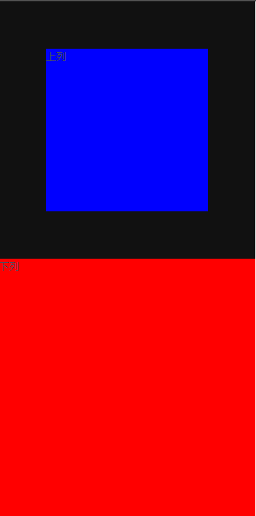
(1)未加任何修饰的盒模型
 1 <template>
 2   <div>
 3     <div class="top">上列</div>
 4     <div class="bottom">下列</div>

 5   </div>
 6 </template>
 7
 8 <script>
 9 export default {
10   name: 'Home'
11 }
12 </script>
13
14 <style scoped>
15   .top{
16     background: blue;
17     width: 300px;
18     height: 300px;
19   }
20   .bottom{
21     background: red;
22     height: 300px;
23     width: 300px;
24   }
25 </style>
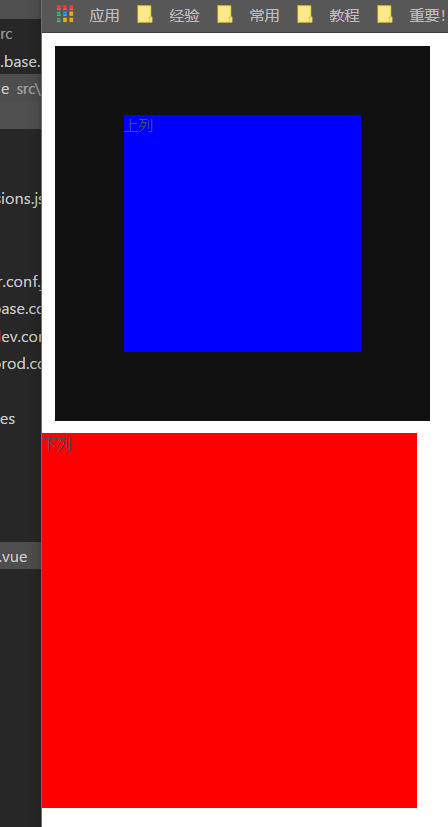
(2)在上列中加入border,即:
 1 <template>
 2   <div>
 3     <div class="top">上列</div>
 4     <div class="bottom">下列</div>
 5   </div>
 6 </template>
 7
 8 <script>
 9 export default {
10   name: 'Home'
11 }
12 </script>
13
14 <style scoped>
15   .top{
16     background: blue;
17     width: 300px;
18     height: 300px;
19     border: 55px solid #111;
20   }
21   .bottom{
22     background: red;
23     height: 300px;
24     width: 300px;
25   }
26 </style>
可见,并没有使整体变大,而是让里面的内容变小了;
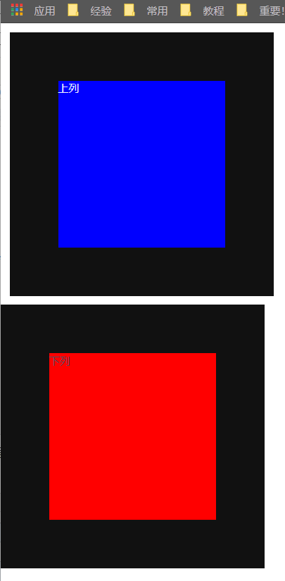
(3)给上列中加1个margin,即:
 1 <template>
 2   <div>
 3     <div class="top">上列</div>
 4     <div class="bottom">下列</div>
 5   </div>
 6 </template>
 7
 8 <script>
 9 export default {
10   name: 'Home'
11 }
12 </script>
13
14 <style scoped>
15   .top{
16     background: blue;
17     width: 300px;
18     height: 300px;
19     border: 55px solid #111;
20     margin: 10px;
21   }
22   .bottom{
23     background: red;
24     height: 300px;
25     width: 300px;
26   }
27 </style>
可以看出,上列的大小不变,但位置进行了移动,且保持与其它元素一定的距离;
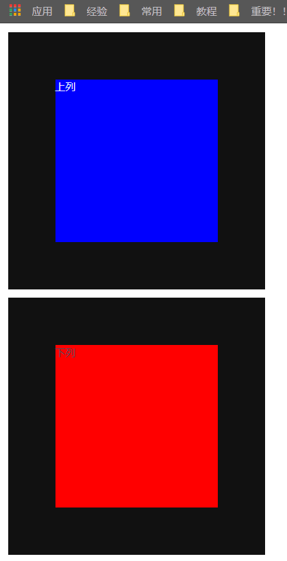
(4)给上列加1个padding,即:
 1 <template>
 2   <div>
 3     <div class="top">上列</div>
 4     <div class="bottom">下列</div>

 5   </div>
 6 </template>
 7
 8 <script>
 9 export default {
10   name: 'Home'
11 }
12 </script>
13
14 <style scoped>
15   .top{
16     background: blue;
17     width: 300px;
18     height: 300px;
19     border: 55px solid #111;
20     margin: 10px;
21     padding: 20px;
22     color: aliceblue;
23   }
24   .bottom{
25     background: red;
26     height: 300px;
27     width: 300px;
28   }
29 </style>
可以看出,上列两个字往内进行了收缩。
(5)上下margin叠加的问题
 1 <template>
 2   <div>
 3     <div class="top">上列</div>
 4     <div class="bottom">下列</div>
 5   </div>
 6 </template>
 7
 8 <script>
 9 export default {
10   name: 'Home'
11 }
12 </script>
13
14 <style scoped>
15   .top{
16     background: blue;
17     width: 300px;
18     height: 300px;
19     border: 55px solid #111;
20     margin: 10px;
21     color: aliceblue;
22   }
23   .bottom{
24     background: red;
25     height: 300px;
26     width: 300px;
27     border: 55px solid #111;
28     margin: 10px; //这里margin作为对比,前者不加,后者加
29   }
30 </style>
从对比效果图可以看出,上下列的margin被抵消了1个10px;同时,若二者大小不同,以较大的margin值为准。
当某个元素设置了float属性,那么它们将不再进行空白边叠加;如下:
 1 <template>
 2   <div>
 3     <div class="top">上列</div>
 4     <div class="bottom">下列</div>
 5   </div>
 6 </template>
 7
 8 <script>
 9 export default {
10   name: 'Home'
11 }
12 </script>
13
14 <style scoped>
15   .top{
16     background: blue;
17     width: 300px;
18     height: 300px;
19     border: 55px solid #111;
20     margin: 10px;
21     color: aliceblue;
22     float: left;
23   }
24   .bottom{
25     background: red;
26     height: 300px;
27     width: 300px;
28     border: 55px solid #111;
29     margin: 10px;
30     float: left;
31     clear: left;
32   }
33 </style>
可以看出,这时二者中间的宽度为20px;
(6)左右浮动margin加倍问题
按照书上的写法会报错,以后再来验证吧!