最近经常碰到要垂直居中的问题,所以想着总结一下:关于如何设置小盒子在大盒子里面水平垂直方向同时居中的实现方法有很多种,下面仅列举了常用的几种。
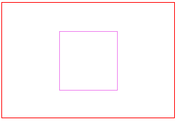
首先看一下要实现的效果图及对应的html代码:
<div class="parent">
    <div class="child">
    </div>
</div>
1、使用定位的方法
.parent {
    width: 300px;
    height: 200px;
    border: 1px solid red;
    position:relative;
}
.child {
    width: 100px;
    height: 100px;
    border: 1px solid violet;
    position:absolute;
    top: 50%;
    left:50%;
    margin-top: -50px;     /*这里是小盒子高的一半*/
    margin-left: -50px;    /*这里是小盒子宽的一半*/
}
还有就是子元素宽高不固定时
//vertical center
.vertical-center{
  position absolute
  top 50%
  transform translate(0,-50%)
}
.vertical-horizontal{
  position absolute
  left 50%
  top 50%
  transform translate(-50%,-50%)
}
2、利用定位及margin:auto实现
.parent {
    width: 300px;
    height: 200px;
    border: 1px solid red;
    position:relative;
}
.child {
    width: 100px;
    height: 100px;
    border: 1px solid violet;
    position: absolute;
    margin: auto;
    top: 0;
    left: 0;
    right: 0;
    bottom: 0;
}
实现原理是设置margin自动适应,然后设置定位的上下左右都为0,就如四边均衡受力从而实现盒子的居中;
3、使用display:table-cell;
.parent {
  width: 300px;
  height: 200px;
  border: 1px solid red;
  display: table-cell;
  vertical-align: middle;
  text-align: center;
}
.child {
  width: 100px;
  height: 100px;
  border: 1px solid violet;
  display: inline-block;
}
实现原理:display:table-cell属性指让标签元素以表格单元格的形式呈现,类似于td标签;组合使用vertical-align、text-align,可以使父元素内的所有行内元素水平垂直居中(也就是将内部的元素设置display:inline-block)
4、使用伸缩布局display:flex
.parent {
  width: 300px;
  height: 200px;
  border: 1px solid red;
  display: flex;
  justify-content: center;  /*水平居中*/
  align-items: center;      /*垂直居中*/
}
.child {
  width: 100px;
  height: 100px;
  border: 1px solid violet;
}