数据聚类然后展示聚类热图是生物信息中组学数据分析的常用方法,在R语言中有很多函数可以实现,譬如heatmap,kmeans等,除此外还有一个用得比较多的就是heatmap.2。最近在网上看到一个笔记文章关于《一步一步学heatmap.2函数》,在此与大家分享。由于原作者不详,暂未标记来源,请原作者前来认领哦,O(∩_∩)O哈哈~
数据如下:
- library(gplots)
- data(mtcars)
- x <- as.matrix(mtcars)
- rc <- rainbow(nrow(x), start=0, end=.3)
- cc <- rainbow(ncol(x), start=0, end=.3)

X就是一个矩阵,里面是我们需要画热图的数据。
Rc是一个调色板,有32个颜色,渐进的
Cc也是一个调色板,有11个颜色,也是渐进的
首先画一个默认的图:
- heatmap.2(x)
然后可以把聚类数可以去掉:就是控制这个dendrogram参数
- heatmap.2(x, dendrogram=“none”)

然后我们控制一下聚类树
- heatmap.2(x, dendrogram=“row”) # 只显示行向量的聚类情况
- heatmap.2(x, dendrogram=“col”) #只显示列向量的聚类情况
下面还是在调控聚类树,但是我没看懂跟上面的参数有啥子区别!
- heatmap.2(x, keysize=2) ## default - dendrogram plotted and reordering done.
- heatmap.2(x, Rowv=FALSE, dendrogram=“both”) ## generate warning!
- heatmap.2(x, Rowv=NULL, dendrogram=“both”) ## generate warning!
- heatmap.2(x, Colv=FALSE, dendrogram=“both”) ## generate warning!
接下来我们可以调控行列向量的label的字体大小方向
首先我们调控列向量,也就是x轴的label
- heatmap.2(x, srtCol=NULL)
- heatmap.2(x, srtCol=0, adjCol = c(0.5,1) )
- heatmap.2(x, srtCol=45, adjCol = c(1,1) )
- heatmap.2(x, srtCol=135, adjCol = c(1,0) )
- heatmap.2(x, srtCol=180, adjCol = c(0.5,0) )
- heatmap.2(x, srtCol=225, adjCol = c(0,0) ) ## not very useful
- heatmap.2(x, srtCol=270, adjCol = c(0,0.5) )
- heatmap.2(x, srtCol=315, adjCol = c(0,1) )
- heatmap.2(x, srtCol=360, adjCol = c(0.5,1) )

然后我们调控一下行向量,也就是y轴的label
- heatmap.2(x, srtRow=45, adjRow=c(0, 1) )
- heatmap.2(x, srtRow=45, adjRow=c(0, 1), srtCol=45, adjCol=c(1,1) )
- heatmap.2(x, srtRow=45, adjRow=c(0, 1), srtCol=270, adjCol=c(0,0.5) )

设置 offsetRow/offsetCol 可以把label跟热图隔开!
- ## Show effect of offsetRow/offsetCol (only works when srtRow/srtCol is
- ## not also present) heatmap.2(x, offsetRow=0, offsetCol=0)
- heatmap.2(x, offsetRow=1, offsetCol=1)
- heatmap.2(x, offsetRow=2, offsetCol=2)
- heatmap.2(x, offsetRow=-1, offsetCol=-1)
- heatmap.2(x, srtRow=0, srtCol=90, offsetRow=0, offsetCol=0)
- heatmap.2(x, srtRow=0, srtCol=90, offsetRow=1, offsetCol=1)
- heatmap.2(x, srtRow=0, srtCol=90, offsetRow=2, offsetCol=2)
- heatmap.2(x, srtRow=0, srtCol=90, offsetRow=-1, offsetCol=-1)

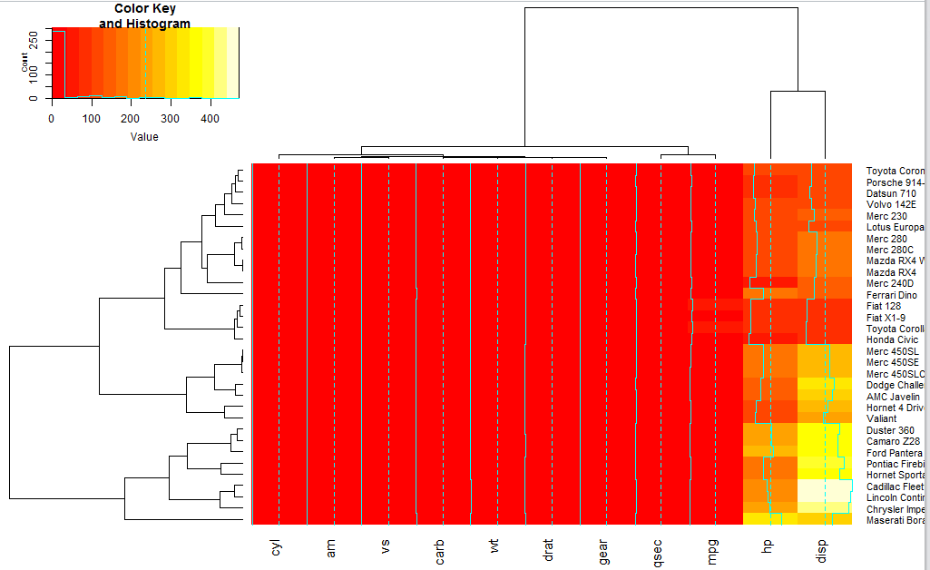
- ## Show effect of z-score scaling within columns, blue-red color scale
- hv <- heatmap.2(x, col=bluered, scale=“column”, tracecol=“#303030”)
hv是一个热图对象!!!
- > names(hv) # 可以看到hv对象里面有很多子对象
- > “rowInd” “colInd” “call” “colMeans” “colSDs” “carpet” “rowDendrogram” “colDendrogram” “breaks” “col” “vline” “colorTable” ## Show the mapping of z-score values to color bins hvKaTeX parse error: Expected 'EOF', got '#' at position 638: …an class="com">#̲# Extract the r…colorTable[hvKaTeX parse error: Expected 'EOF', got '#' at position 124: …n class="str">"#̲FFFFFF"</span><…colorTable[hvKaTeX parse error: Expected 'EOF', got '#' at position 124: …n class="str">"#̲FFFFFF"</span><…colSDs + hv c o l M e a n s < / s p a n > < s p a n c l a s s = " p u n " > , < / s p a n > < s p a n c l a s s = " p l n " > w h i t e B i n < / s p a n > < s p a n c l a s s = " p u n " > [ < / s p a n > < s p a n c l a s s = " l i t " > 2 < / s p a n > < s p a n c l a s s = " p u n " > ] < / s p a n > < s p a n c l a s s = " p l n " > < / s p a n > < s p a n c l a s s = " p u n " > ∗ < / s p a n > < s p a n c l a s s = " p l n " > h v colMeans</span><span class="pun">,</span><span class="pln"> whiteBin</span><span class="pun">[</span><span class="lit">2</span><span class="pun">]</span><span class="pln"> </span><span class="pun">*</span><span class="pln"> hv colMeans</span><spanclass="pun">,</span><spanclass="pln">whiteBin</span><spanclass="pun">[</span><spanclass="lit">2</span><spanclass="pun">]</span><spanclass="pln"></span><spanclass="pun">∗</span><spanclass="pln">hvcolSDs + hvKaTeX parse error: Expected 'EOF', got '#' at position 1148: …n class="str">"#̲303030"</span><…Type)],
- xlab=‘CellLines’,
- ylab=‘Probes’,
- main=Cluster_Method[i],
- col=greenred(64))
- dev.off()
- }
这样就可以一下子把七种cluster的方法依次用到heatmap上面来。而且通过对cluster树的比较,我们可以从中挑选出最好、最稳定到cluster方法,为后续分析打好基础!
对下面这个数据聚类:

- require(graphics)
- hc <- hclust(dist(USArrests), “ave”)
- plot(hc)
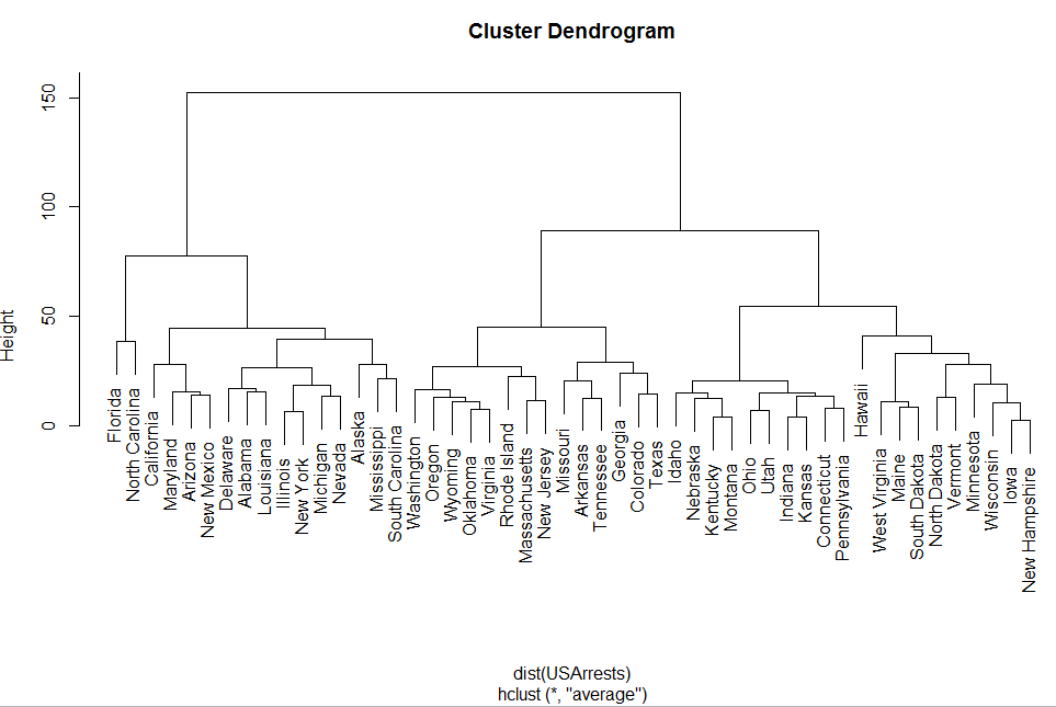
首先对一个数据框用dist函数处理得到一个dist对象!

Dist对象比较特殊,专门为hclust函数来画聚类树的!
