option = {
color: [‘#3398DB’],
tooltip: {
trigger: ‘axis’,
axisPointer: { // 坐标轴指示器,坐标轴触发有效
type: ‘shadow’ // 默认为直线,可选为:‘line’ | ‘shadow’
}
},
grid: {
left: ‘3%’,
right: ‘4%’,
bottom: ‘3%’,
containLabel: true
},
xAxis: [
{
type: ‘category’,
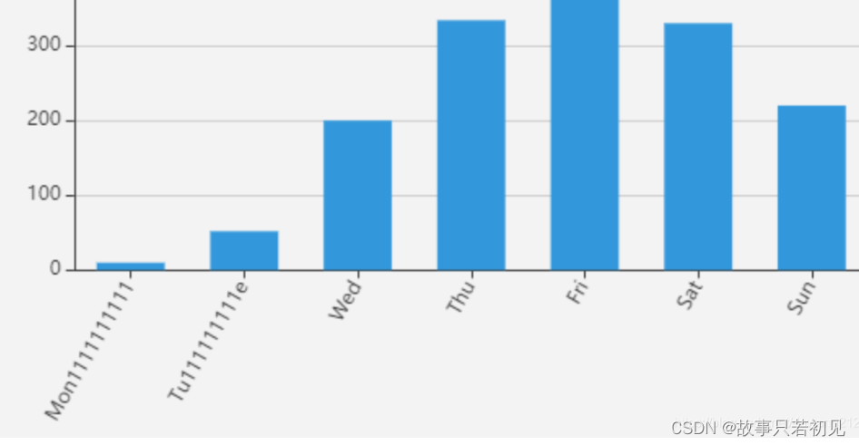
data: [‘Mon1111111111’, ‘Tu111111111e’, ‘Wed’, ‘Thu’, ‘Fri’, ‘Sat’, ‘Sun’],
axisLabel:{ //展示角度
rotate:60
},
axisTick: {
alignWithLabel: true
}
}
],
yAxis: [
{
type: ‘value’
}
],
series: [
{
name: ‘直接访问’,
type: ‘bar’,
        barWidth: '60%',
        data: [10, 52, 200, 334, 390, 330, 220]
    }
]
};