目录
一:什么是流式布局
流式布局就是通过盒子的宽度设置成百分比的形式,来根据屏幕的宽度进行伸缩,不受固定像素的限制。
二:如何使用流式布局
1、首先要明确一点,pc端页面也好,以及移动端页面也好,都是由一个一个小的盒子构成的。当我们为这一个一个的小盒子宽度设置成百分比的形式时,页面被拉伸,盒子也会随着页面进行拉伸。
2、其次,流式布局并不是全部百分比布局的形式,只是盒子设置成百分比布局的形式。相对于盒子中的图片、文字都是固定px或者rem的形式。网页拉伸时,文字、图片(在没有设置百分比的前提下),会根据盒子的伸缩变化进行一定程度的拉伸。
三:流式布局案例
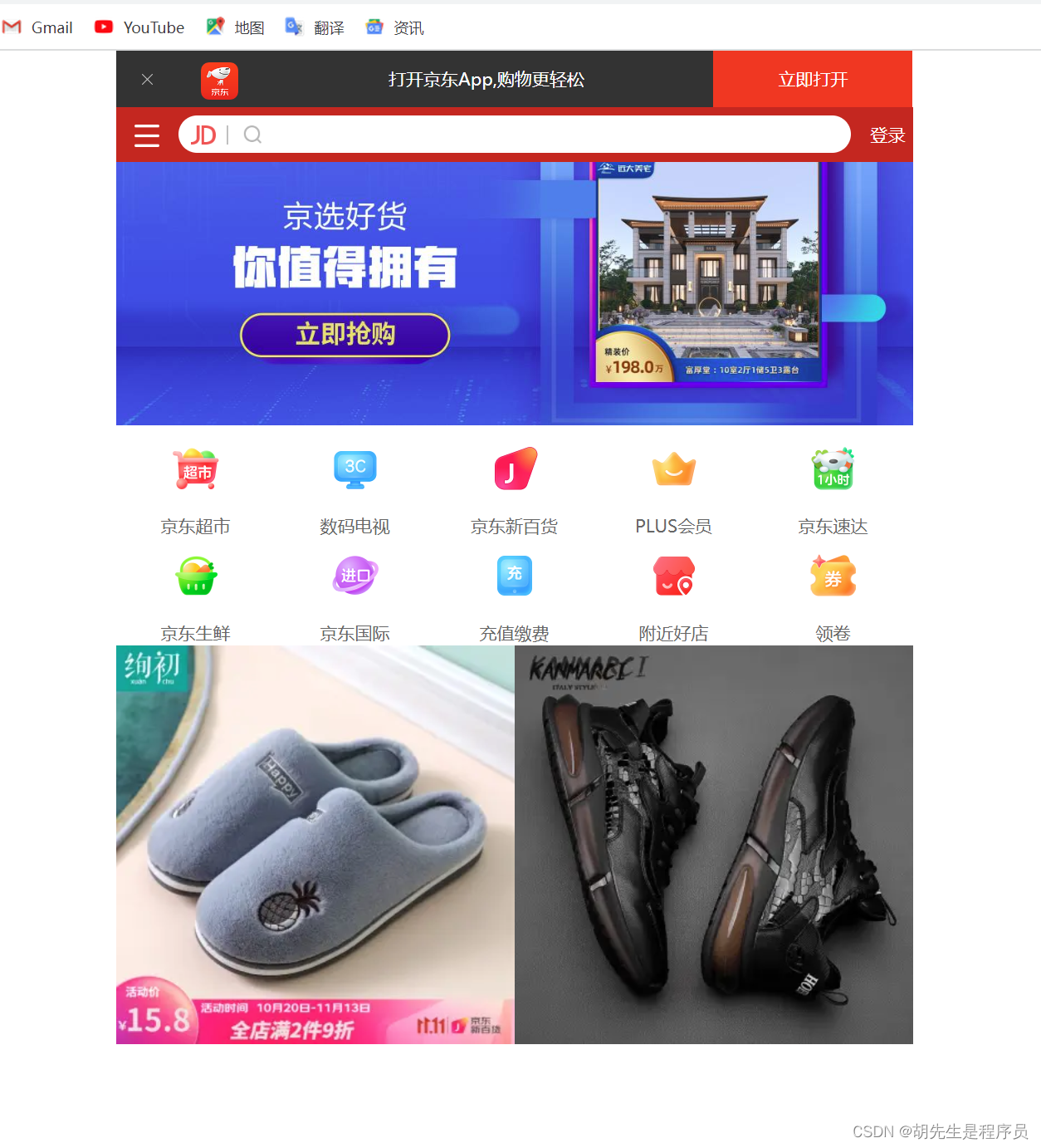
本案例京东移动端首页
结构:
<!DOCTYPE html>
<html>
	<head>
		<meta name="viewport" content="width=device-width,user-scalable=no,initial-scale=1.0,maximum-scale=1.0,
			minimum-scale=1.0"/>
		<meta charset="utf-8" />
		<link rel="stylesheet" type="text/css" href="css/normalize.css"/>
		<link rel="stylesheet" type="text/css" href="css/index.css"/>
		<title></title>
	</head>
	<body>
		<!--顶部-->
		<header class="app">
			<ul>
				<li><img src="img/叉号.png"/></li>
				<li><img src="img/JD.png"/></li>
				<li>打开京东App,购物更轻松</li>
				<li>立即打开</li>
			</ul>
		</header>
		<!--搜索-->
		<div class="search-wrap">
			<div class="search-btn"></div>
			<div class="search">
				<div class="jd-icon"></div>
				<div class="fdj"></div>
			</div>
			<div class="search-login">登录</div>
		</div>
		<!--主体内容部分-->
		<div class="main-content">
				<div class="banner">
					<img src="img/q70.jpg"/>
				</div>
				<!--蔡康永品牌日-->
				<!--<div class="brand">
					<div></div>
					<div></div>
					<div></div>
				</div>-->
				<!--nav部分-->
				<nav>
					<a href="">
						<img src="img/超市.png"/>
						<span>京东超市</span>
					</a>
					<a href="">
						<img src="img/数码电视.png"/>
						<span>数码电视</span>
					</a>
					<a href="">
						<img src="img/京东新百货.png"/>
						<span>京东新百货</span>
					</a>
					<a href="">
						<img src="img/PLUS会员.png"/>
						<span>PLUS会员</span>
					</a>
					<a href="">
						<img src="img/jd速达.png"/>
						<span>京东速达</span>
					</a>
					<a href="">
						<img src="img/jd生鲜.png"/>
						<span id="">
							京东生鲜
						</span>
					</a>
					<a href="">
						<img src="img/jd国际.png"/>
						<span>京东国际</span>
					</a>
					<a href="">
						<img src="img/充值缴费.png"/>
						<span>充值缴费</span>
					</a>
					<a href="">
						<img src="img/附近好店.png"/>
						<span>附近好店</span>
					</a>
					<a href="">
						<img src="img/领卷.png"/>
						<span>领卷</span>
					</a>
				</nav>

		</div>
		<div class="foods">
			<div class="food_cols">
				<div class="foods_one">
					<img src="img/拖鞋.jpg!q70.dpg.webp"/>
				</div>
				<div class="foods_two">
					<img src="img/皮鞋.jpg!q70.dpg.webp"/>
				</div>
			</div>

		</div>
	</body>
</html>
样式:
*{
	margin: 0;
	padding: 0;
}
/*ctrl+g可以跳转到想要到的行数*/
a{
	text-decoration: none;
	color:#666666;
}
body{
	width:100%;
	min-width:320px;
	max-width: 640px;
	margin: 0 auto;
	background-color: #FFFF;
	font-size: 14px;
	line-height: 1.5;
	color: #666;
	/*background-color: gray;*/
}
.app{
	height: 45px;
}
.app ul li{
	height: 45px;
	background-color: #333333;
	float: left;
	list-style: none;
	line-height: 45px;
	text-align: center;
	color: #fff;
}
.app ul li:nth-child(1){
	width: 8%;
}
.app ul li:nth-child(1) img{
	width: 10px;
	height: 10px;
}
.app ul li:nth-child(2){
	width: 10%;
}
.app ul li:nth-child(2) img{
	width: 30px;
	vertical-align: middle;
}
.app ul li:nth-child(3){
	width: 57%;
}
.app ul li:nth-child(4){
	width: 25%;
	background-color:#F3361C ;
}
.search-wrap{
	height: 44px;
	position: fixed;
	/*position: absolute;*/
	/*注意,子元素添加了margin-top,但没有起作用,为父元素添加0verflow-hiddn,
	以实现作用*/
	overflow: hidden;
	background-color: #C6261D;
	min-width: 320px;
	max-width: 640px;
	width: 100%;
}
.search{
	height: 30px;
	background-color: white;
	margin: 0 50px;
	border-radius: 15px;
	margin-top: 7px;
	position: relative;
}
.search-btn{
	position: absolute;
	left: 0;
	top: 0;
	/*background-color: pink;*/
	width: 40px;
	height: 44px;
}
.search-btn:before{
	content: " ";
	display: block;
	width: 20px;
	height: 18px;
	background: url(../img/下载.png) no-repeat;
	background-size: 20px 18px;
	margin: 14px 0 0 15px;
}
.search-login{
	position: absolute;
	right: 0;
	top: 0;
	/*background-color: red;*/
	width: 40px;
	height: 44px;
	text-align: center;
	line-height: 44px;
	color: white;
}
.jd-icon{
	width: 20px;
	height: 15px;
	position: absolute;
	left: 10px;
	top: 8px;
	background: url(../img/jd-sprites.png) no-repeat;
	background-size:200px auto ;
}
.jd-icon::after{
	position: absolute;
	right:-10px;
	top: 0;
	content: "";
	display: block;
	width: 1px;
	height: 15px;
	background-color: #C0C0C0;
}
.fdj{
	position: absolute;
	width:18px;
	height: 15px;
	/*background-color: pink;*/
	top: 8px;
	left: 50px;
	background: url(../img/jd-sprites.png) no-repeat -81px 0;
	background-size:200px auto;
}
.banner img{
	width: 100%;
	/*height: 146px;*/
}
nav a{
	float: left;
	width: 20%;
	text-align: center;
}
nav a img{
	width: 40px;
	margin: 10px 0;
}
nav a span{
	display: block;
}
.foods .food_cols img{
	width: 100%;
}
.foods_one,.foods_two{
	width: 50%;
	float: left;
}
四:流式布局的优缺点
优点:会根据页面宽度的变化进行一定程度的拉伸
缺点:图片、文字设置成固定宽度,对于大屏幕的手机或这pc端显示器来说,图片、文字会被过分拉长。因此,在页面中灵活使用不同的布局方式,是每一个程序员都应该思考的问题。