1、依赖安装
$ npm i --save @vue-flow/core
# or
$ yarn add @vue-flow/core
# 其他根据需要安装,例如:
$ npm i --save @vue-flow/additional-components
2、局部引入
//样式引入
import '@vue-flow/core/dist/style.css';
import '@vue-flow/core/dist/theme-default.css';
//根据使用情况,引入相关组件
import { Background, Panel, PanelPosition, Controls } from '@vue-flow/additional-components'
import { VueFlow, useVueFlow } from '@vue-flow/core'
3、组件使用
<VueFlow fit-view-on-init class="my-flow" v-model="elements">
  <Background />
  <Panel :position="PanelPosition.TopRight">
    <div>
      <label for="ishidden">
        hidden
        <input id="ishidden" v-model="isHidden" type="checkbox" />
      </label>
    </div>
  </Panel>
  <Controls />
</VueFlow>
4、vue3、elementui完整代码
<style lang="less" scoped>
.my-flow {
margin: 10px;
height: 400px;
:deep(.node-light) {
background: none;
}
:deep(.node-dark) {
background: #eeeeee;
}
}
</style>
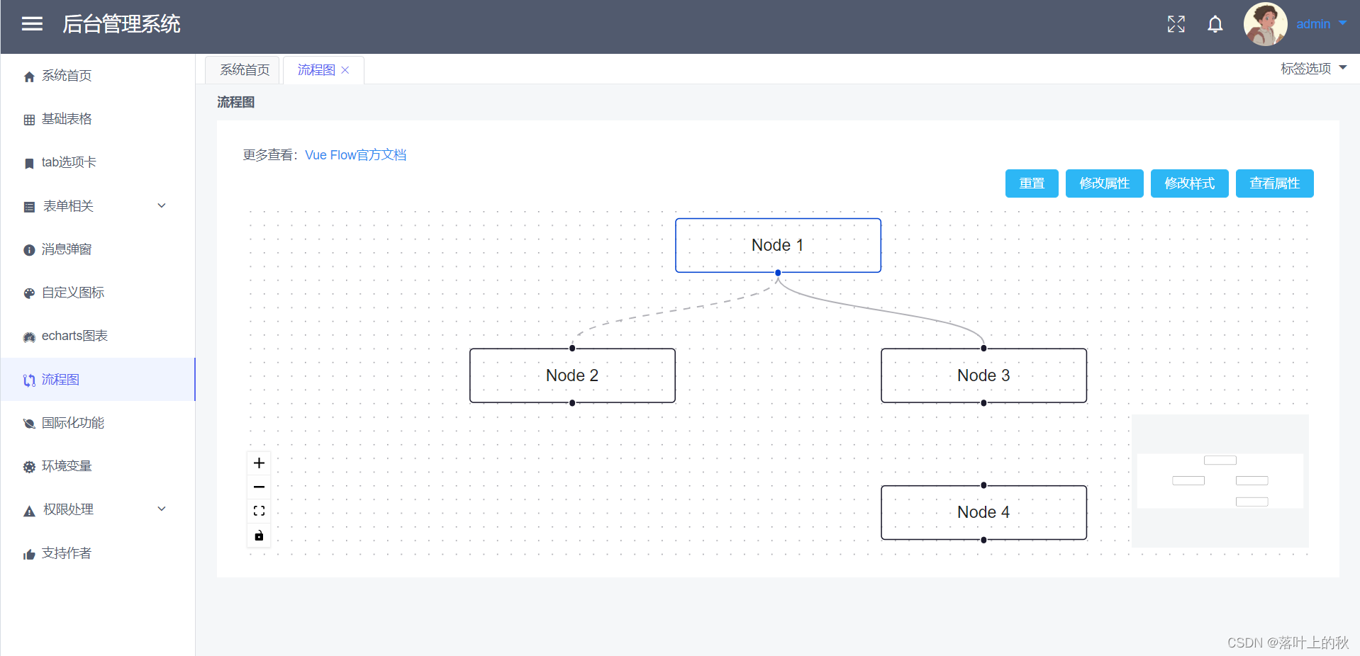
<template>
<div class="container">
<el-row :gutter="24">
<el-col :xs="24" :sm="24" :md="24" :lg="24" :xl="24">
相关文档:
<a href="https://vueflow.dev/" target="_blank">Vue Flow官方文档</a>
</el-col>
</el-row>
<el-divider content-position="left">Vue Flow</el-divider>
<el-row class="mb-4">
<el-button type="primary" @click="resetTransform">重置</el-button>
<el-button type="primary" @click="updatePos">修改属性</el-button>
<el-button type="primary" @click="toggleclass">修改样式</el-button>
<el-button type="primary" @click="logToObject">查看属性</el-button>
</el-row>
<VueFlow fit-view-on-init class="my-flow" v-model="elements">
<Background />
<Panel :position="PanelPosition.TopRight">
<div>
<label for="ishidden">
hidden
<input id="ishidden" v-model="isHidden" type="checkbox" />
</label>
</div>
</Panel>
<Controls />
</VueFlow>
</div>
</template>
<script lang="ts" setup name="DemoBpmn">
import '@vue-flow/core/dist/style.css';
/* import the default theme (optional) */
import '@vue-flow/core/dist/theme-default.css';
import { Background, Panel, PanelPosition, Controls } from '@vue-flow/additional-components'
import { VueFlow, useVueFlow } from '@vue-flow/core'
import { ref, watch } from 'vue'
import { ElMessage } from 'element-plus';
const data = [
{ id: '1', type: 'input', label: 'Node 1', position: { x: 250, y: 5 } },
{ id: '2', label: 'Node 2', position: { x: 100, y: 100 } },
{ id: '3', label: 'Node 3', position: { x: 400, y: 100 } },
{ id: '4', label: 'Node 4', position: { x: 400, y: 200 } },
{ id: 'e1-2', source: '1', target: '2', animated: true },
{ id: 'e1-3', source: '1', target: '3' },
]
let elements = ref(data)
const isHidden = ref(false)
let { onPaneReady, onNodeDragStop, onConnect, addEdges, setTransform, toObject, nodes, edges } = useVueFlow()
watch(isHidden, () => {
nodes.value.forEach((n) => (n.hidden = isHidden.value))
edges.value.forEach((e) => (e.hidden = isHidden.value))
})
onPaneReady(({ fitView }) => {
fitView()
})
onNodeDragStop((e) => console.log('drag stop', e))
onConnect((params) => addEdges([params]))
const updatePos = () => {
nodes.value.forEach((el) => {
el.position = {
x: Math.random() * 400,
y: Math.random() * 400,
}
})
};
const logToObject = () => {
ElMessage.info(JSON.stringify(toObject()));
};
const resetTransform = () => {
elements.value = data
setTransform({ x: 0, y: 0, zoom: 1 })
};
const toggleclass = () => nodes.value.forEach((el) => (el.class = el.class === 'node-light' ? 'node-dark' : 'node-light'))
</script>
官方文档:https://vueflow.dev/
旧版本vue-flow代码例子:https://gitee.com/huanglgln/vue-sys-manage
新版本vue-flow代码例子:https://gitee.com/huanglgln/vue-sys-manage-el