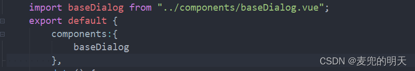
baseDialog组件代码:
<template>
	<view class="base-dialog" v-if="show">
		<view class="mask"></view>
		<view class="Popmenu" :style="{ width }">
			<view class="header">{

   { title }}</view>

			<view class="content">
				<slot></slot>
			</view>

			<view v-if="cancelShow || confirmShow" class="btns">
				<myButton :type='cancelType' style="margin-right: 24rpx" v-if="cancelShow" @click.stop="cancel">{

   { cancelText }}</myButton>
				<myButton :type='confirmType' v-if="confirmShow" @click.stop="confirm">{

   { confirmText }}</myButton>
			</view>
		</view>
	</view>
</template>

<script>
	import myButton from '../components/myButton.vue'
	export default {
		props: {
			title: {
				type: String,
				default: ''
			},
			show: {
				type: Boolean,
				default: false
			},
			cancelText: {
				type: String,
				default: '取消'
			},
			confirmText: {
				type: String,
				default: '确定'
			},
			cancelShow: {
				type: Boolean,
				default: true
			},
			confirmShow: {
				type: Boolean,
				default: true
			},
			cancelDisabled: Boolean,
			confirmDisabled: Boolean,
			width: {
				type: [String | Number],
				default: '100%'
			},

			cancelType: String,
			confirmType: String
		},
		components: {
			myButton
		},
		computed: {
			_show: {
				get() {
					return this.show;
				},
				set(v) {
					console.log(v)
					this.$emit('update:show', v);
				}
			}
		},
		methods: {
			confirm() {
				if(this.confirmDisabled) return;

				this.$emit('confirm');
				this._show = false;
			},
			cancel() {
				if(this.cancelDisabled) return;
				this.$emit('cancel');
				this._show = false;
			}
		}
	}
</script>

<style lang='scss'>
.base-dialog {
	position: fixed;
	width: 100%;
	height: 100%;
	left: 0;
	top: 0;
	z-index: 20;
	transition:opacity 1s linear;
	.mask{
		background-color:rgba(0, 0, 0, 0.9);
		opacity: 0.5;
		position: absolute;
		width: 100%;
		height: 100%;
		left: 0;
		top:0;
	}

	.Popmenu {
		border-radius: 24rpx;
		padding: 40rpx;
		box-sizing: border-box;
		background: white;
		position: absolute;
		left: 50%;
		top: 45%;
		transform: translate(-50%, -50%);

		.header {
			text-align: center;
			margin-bottom: 24rpx;
			font-size: 40rpx;
		}

		.content {
			margin-bottom: 40rpx;
		}
	}

	.btns {
		display: flex;
		align-items: center;
		justify-content: center;
	}
}
</style>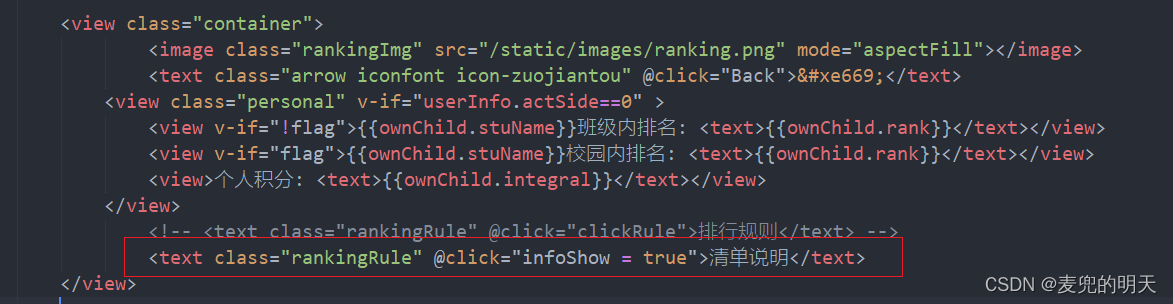
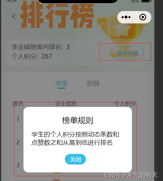
在data定义弹框显示与隐藏 infoShow: false, // 榜单规则
<!-- 排行规则 -->
            <baseDialog
              cancel-text="关闭"
              :confirm-show="false"
              width="534rpx"
              :show.sync="infoShow"
              title="榜单规则"
            >
              <view class="info-content">
                <text>学生的个人积分按照动态条数和点赞数之和从高到低进行排名</text>
              </view>
            </baseDialog>
引入组件: