文章目录
引入matpltlib库
matplotlib是一种优秀的python数据可视化第三方库
使用matpltlib库画图时,先将它引入,加载里面的pyplot,并命名为plt,然后使用plot函数画图
import matplotlib.pyplot as plt #plt是引入模块的别名
pyplot基础图标函数总结
| 函数 | 作用 |
|---|---|
| plt.plot(x,y,format) | 绘制坐标图 |
| plt.plot(data,notch,position) | 绘制箱型图 |
| plt.bar(left,height,width,bottom) | 绘制条形图 |
| plt.barh(width,bottom,left,height) | 绘制横向条形图 |
| plt.polar(theta,r) | 绘制极坐标图 |
| plt.pie(data,explode) | 绘制饼图 |
| plt.hist(x,bins,normed) | 绘制直方图 |
| plt.scatter(x,y) | 绘制散点图 |
还有很多哈哈哈,不再注意列举
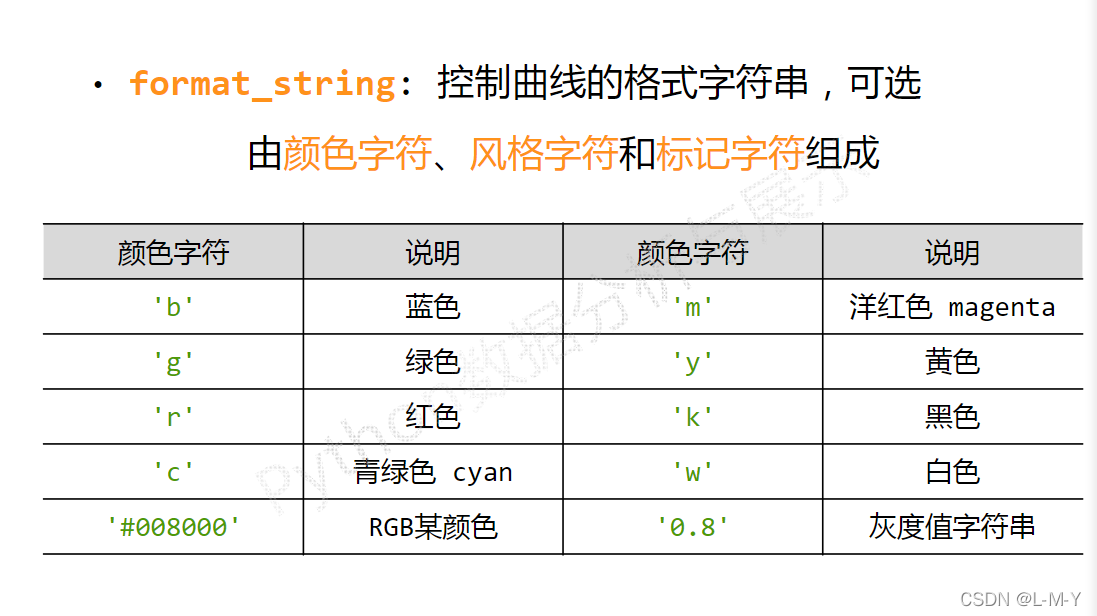
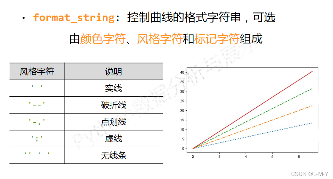
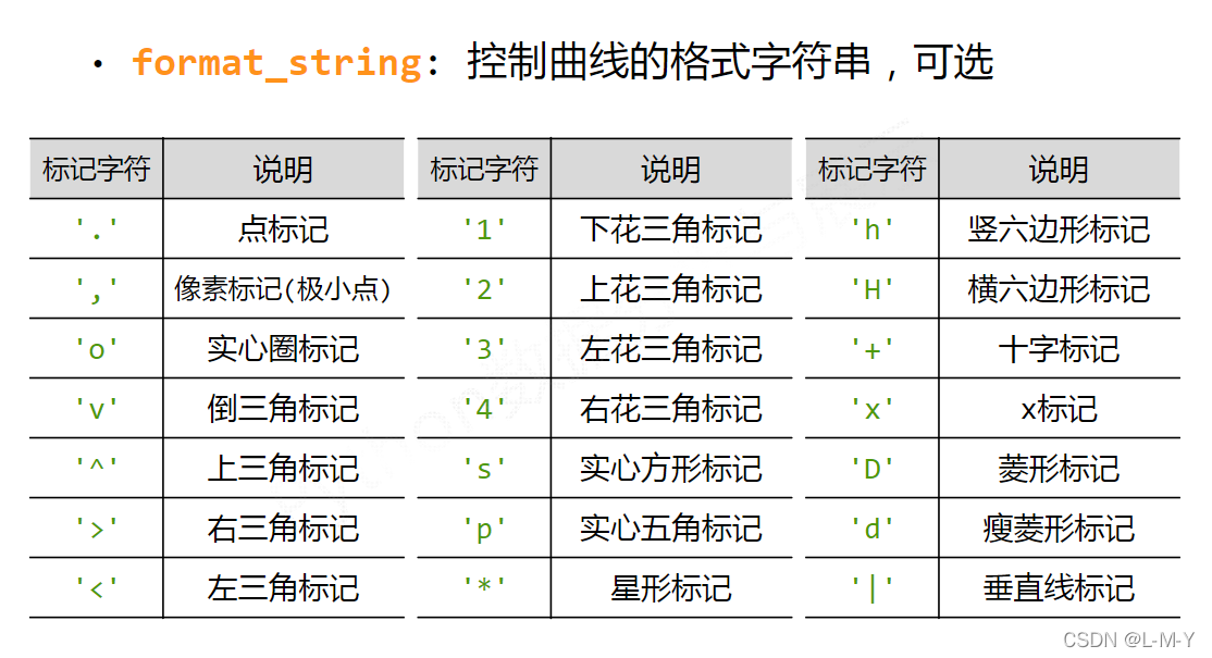
plot函数画图语法规则
plot函数参数:plot([x],y,[format],**kwargs)
| 参数 | 用途 |
|---|---|
| x | x轴的数据,列表或者数组 |
| y | y轴数据,列表或数组 |
| format | 控制曲线的格式字符串 |
| **kwargs | 第二组或更多(x,y,string) |
各类语法太多啦,偷几张MOOC的图放上来~

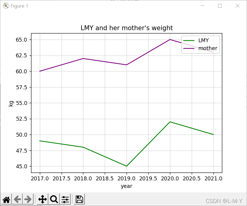
折线图
from matplotlib import pyplot as plt

#生成数据
#横坐标数据从2017到2022,第三个参数可控制步长,可写可不写
x = range(2017, 2022)
#y对应纵坐标的值
y1 = [49, 48, 45, 52, 50]
y2 = [60, 62, 61, 65, 63]
#生成图形
plt.title("LMY and her mother's weight")
plt.xlabel('year')
plt.ylabel('kg')
plt.plot(x, y1, color='green', label='LMY')
plt.plot(x, y2, color='purple', label='mother')
plt.grid(alpha=0.5)
plt.legend(loc='upper right')
#显示图形
plt.show()
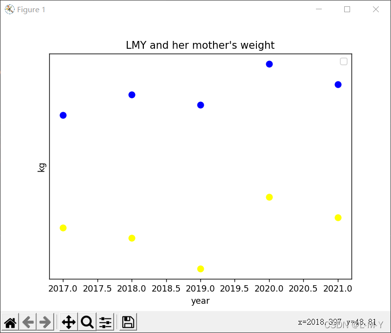
散点图
from matplotlib import pyplot as plt
import numpy as np

# 生成数据
# 横坐标数据从2017到2022,第三个参数可控制步长,可写可不写
x = range(2017, 2022)
# y对应纵坐标的值
y1 = [49, 48, 45, 52, 50]
y2 = [60, 62, 61, 65, 63]
# 生成图形
plt.title("LMY and her mother's weight")
plt.xlabel('year')
plt.ylabel('kg')
# 点的大小
area = np.pi*4**2
plt.scatter(x, y1, s=area, c='yellow', alpha=1)
plt.scatter(x, y2, s=area, c='blue', alpha=1)
plt.legend()
plt.yticks(())
plt.show()
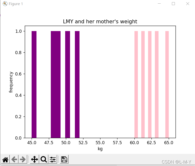
直方图
from matplotlib import pyplot as plt
import numpy as np

# 生成数据
# 横坐标数据从2017到2022,第三个参数可控制步长,可写可不写
x = [2017, 2018, 2019, 2020, 2021]
# y对应纵坐标的值
y1 = [49, 48, 45, 52, 50]
y2 = [60, 62, 61, 65, 63]
# 生成图形
plt.title("LMY and her mother's weight")
plt.ylabel('frequency')
plt.xlabel('kg')
# 点的大小
plt.hist(y1, bottom=None, color='purple')
plt.hist(y2, bottom=None, color='pink')
plt.show()

# n, bins, patches = plt.hist(arr, bins=50, normed=1, facecolor='green', alpha=0.75)
'''
arr:需要计算直方图的一维数组
bins:直方图的柱数,可选项,默认为10
normed:是否将得到的直方图向量归一化,默认为0
facecolor:直方图颜色
alpha:透明度
'''
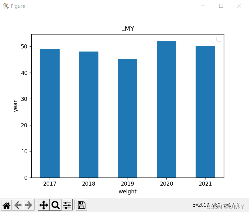
条形图
纵向
from matplotlib import pyplot as plt
import numpy as np

arr = np.arange(2017, 2022)
x = [49, 48, 45, 52, 50]  # x轴
y = [2017, 2018, 2019, 2020, 2021]
rect = plt.bar(arr, x, width=0.5)
plt.title('LMY')
plt.xlabel('weight')
plt.ylabel('year')
plt.legend()

plt.show()
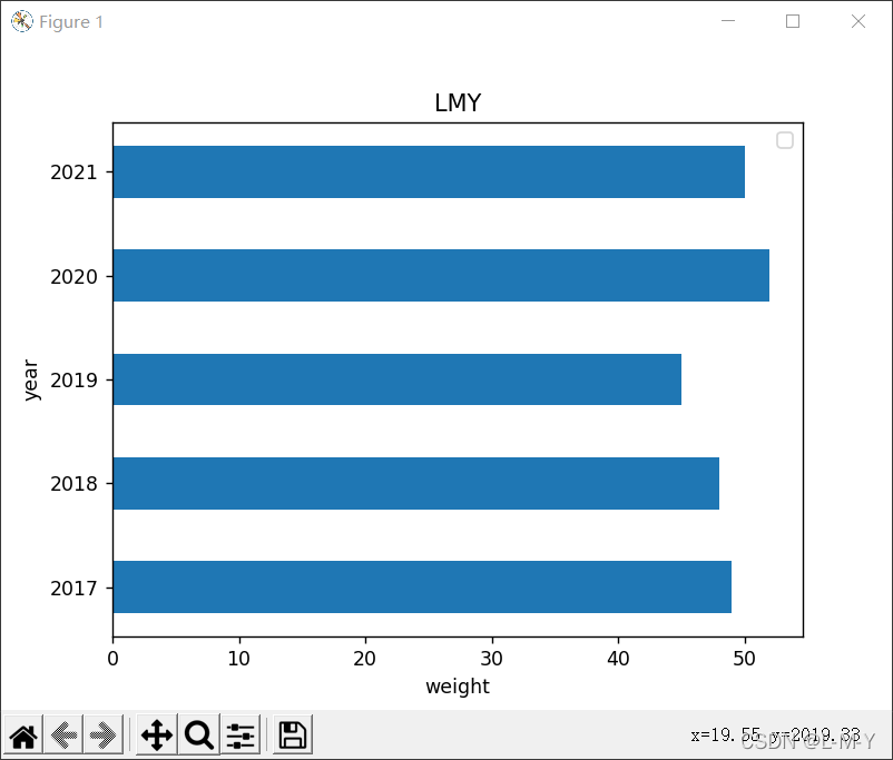
横向
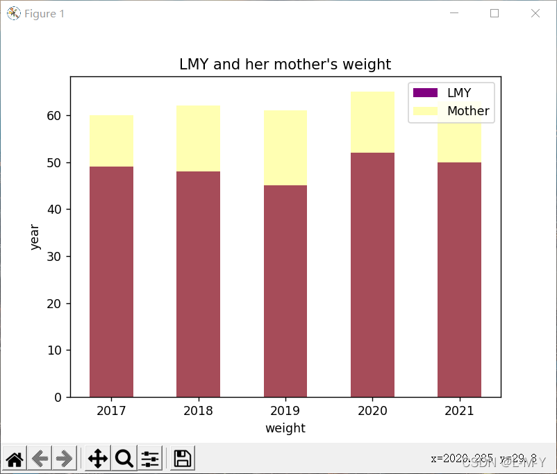
多条
from matplotlib import pyplot as plt
import numpy as np

arr = np.arange(2017, 2022)
x1 = [49, 48, 45, 52, 50]  # x轴
x2 = [60, 62, 61, 65, 63]
y = [2017, 2018, 2019, 2020, 2021]
rects1 = plt.bar(arr, x1, 0.5, color='purple', label='LMY')
rects2 = plt.bar(arr, x2, 0.5, color='yellow', label='Mother', alpha=0.3)
plt.title("LMY and her mother's weight")
plt.xlabel('weight')
plt.ylabel('year')
plt.legend()

plt.show()
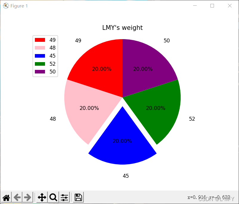
饼图
from matplotlib import patches, pyplot as plt
import numpy as np

label_list = ['49', '48', '45', '52', '50']
size = [20, 20, 20, 20, 20]
# 各部分的颜色
color = ['red', 'pink', 'blue', 'green', 'purple']
explode = [0, 0, 0.15, 0, 0]

patches, l_text, p_text = plt.pie(size, explode=explode, colors=color, labels=label_list,
                                  labeldistance=1.2, autopct="%1.2f%%", shadow=False, startangle=90, pctdistance=0.6)
plt.axis('equal')
plt.title("LMY's weight")
plt.legend(loc='upper left')
plt.show()