当从后端一次性取到成千条数据进行页面渲染,再对页面进行操作很可能导致页面崩溃,这时就可以用虚拟列表的方法,进行页面的渲染。
虚拟列表不会一次性将所有数据都渲染到页面中,而是只渲染可视区域的内容,当鼠标滚动时,再渲染下一波内容,即虚拟列表中的dom元素始终是指定数目的。
以下是一个简单虚拟列表的实现
<html>
    <head>

    </head>
    <body ref="parent">
        <div id="divWrap" ref="wrap" class="divWrap">
            <div id="container" ref="container" :style="{height:this.list.length*150+'px'}">
                <div class="box" :style="{top:(startIndex*boxHeight+'px')}">
                    <div class="item" v-for="(item,index) in sliceList" >{

    {item}}</div>
                </div>
            </div>
        </div>
    </body>
    <script src="../../vue.js"></script>
    <script>
       new Vue({
        el:'#container',
        data:{
            list:Array(100).fill('').map((e,i)=>i),
            startIndex:0,
            endIndex:5,
            pageSize:6,
            boxHeight:150
        },
        computed:{
            sliceList(){
                return this.list.slice(this.startIndex,this.endIndex)
            }
        },
        mounted(){
            let that=this
            document.getElementById('divWrap').addEventListener('scroll',function(e){
                console.log(that,'this')
                that.startIndex=Math.floor(e.target.scrollTop/150)
                that.endIndex=that.startIndex+that.pageSize-1
            },true)
        }
       })
    </script>
    <style>
        .divWrap{
            overflow-y: auto;
            height: 500px;
            background-color: blanchedalmond;
        }
        .divWrap>div{
            position: relative;
        }
        .box{
            /* 相对于设置了定位的父元素进行绝对定位 */
            position: absolute;
        }
        .item{
            height: 100px;
            width: 100%;
            background-color: pink;
            margin:0 300px 50px 300px;
            text-align: center;
            vertical-align: middle;
            line-height: 150px;
        }
    </style>
</html>
效果


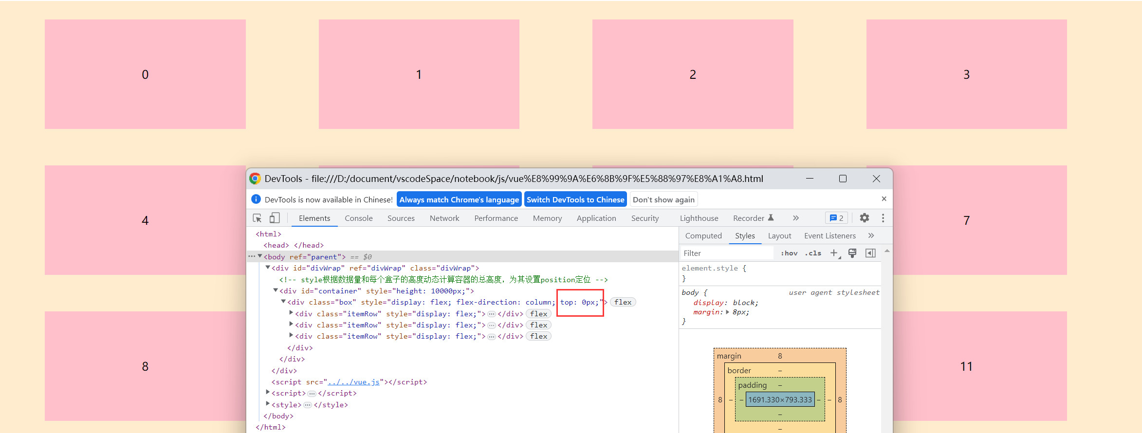
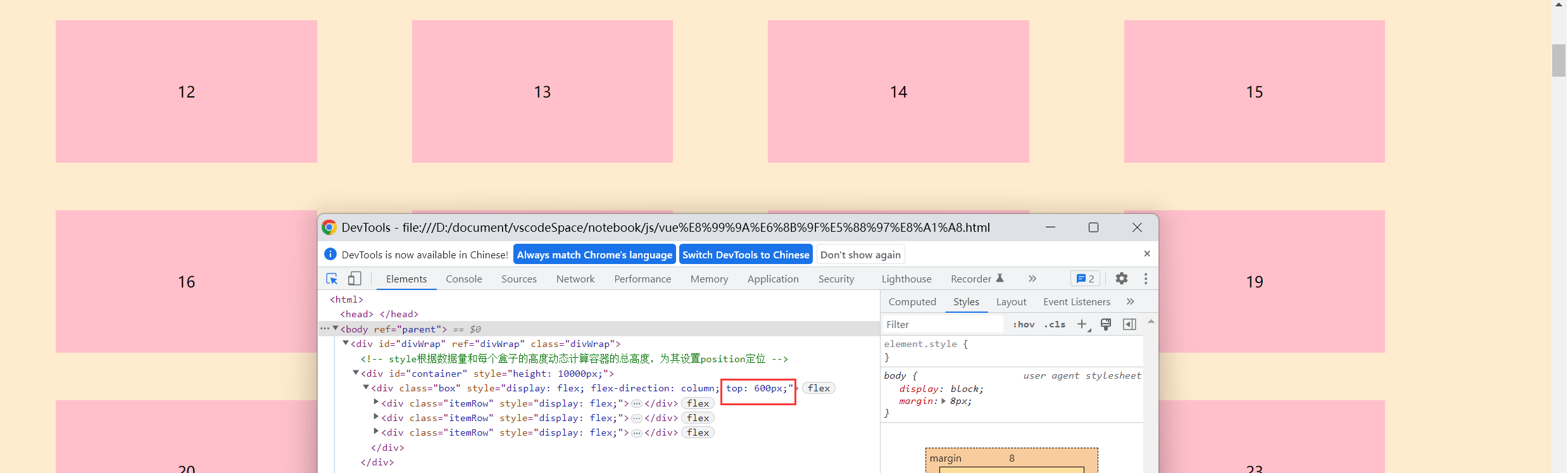
以下是一个3行4列布局的虚拟列表的实现
<html>
    <head>

    </head>
    <body ref="parent">
        <div id="divWrap" ref="divWrap" class="divWrap">
            <!-- style根据数据量和每个盒子的高度动态计算容器的总高度,为其设置position定位 -->
            <div id="container" ref="container" :style="{height:(this.list.length/showColNum)*boxHeightwithMargin+'px'}">
                <!-- 将盒子position定位设置为absolute,使其基于有position定位的父盒子进行定位 -->
                <!--startIndex/showColNum为当前行数  -->
                <!-- display: flex实现三行四列的布局 -->
                <div class="box" :style="{top:((startIndex/showColNum)*boxHeightwithMargin+'px')}" style="display: flex;flex-direction: column" >
                    <!-- 行 -->
                    <div class="itemRow" v-for="indexRow of showRowNum"  style="display: flex;">
                        <!-- 列 -->
                        <div v-for="indexCol of showColNum" class="itemCol">{

    {sliceList[(indexRow-1)*4+(indexCol-1)]}}</div>
                    </div>
                </div>
            </div>
        </div>
    </body>
    <script src="../../vue.js"></script>
    <script>
       new Vue({
        el:'#container',
        data:{
            list:Array(200).fill('').map((e,i)=>i),
            startIndex:0,
            endIndex:12,
            pageSize:12,
            boxHeightwithMargin:200,
            // 3行4列
            showRowNum:3,
            showColNum:4,
        },
        computed:{
            sliceList(){
                // 返回当前要渲染的内容
                return this.list.slice(this.startIndex,this.endIndex)
            }
        },
        mounted(){
            let that=this
            document.getElementById('divWrap').addEventListener('scroll',function(e){
                that.startIndex=Math.floor(e.target.scrollTop/that.boxHeightwithMargin)*that.showColNum
                that.endIndex=that.startIndex+that.pageSize
            },true)
        }
       })
    </script>
    <style>
        .divWrap{
            overflow-y: auto;
            height: 600px;
            background-color: blanchedalmond;
        }
        .divWrap>div{
            position: relative;
        }
        .box{
            position: absolute;
        }
        .itemRow{
            height: 150px;
            width: 1500px;
            margin:25px 50px 25px 50px;
        }
        .itemCol{
            height: 150px;
            width: 300px;
            background-color: pink;
            margin:0 50px 0 50px;
            text-align: center;
            vertical-align: middle;
            line-height: 150px;
        }
    </style>
</html>
效果