flutter_screenutil
flutter_screenutil是一个用于在Flutter应用程序中进行屏幕适配的工具包。它旨在帮助开发者在不同屏幕尺寸和密度的设备上创建响应式的UI布局。
`flutter_screenutil``提供了一些用于处理尺寸和间距的方法,使得开发者可以根据设备的屏幕尺寸和密度来动态调整UI元素的大小和位置。它提供了以下功能:
-
屏幕适配:
flutter_screenutil可以根据设备的屏幕尺寸和密度,将设计稿上的尺寸转换为适合当前设备的实际尺寸。这样,无论是在小屏幕手机上还是在大屏幕平板电脑上运行应用,UI元素都能正确地适配屏幕。 -
尺寸适配:
flutter_screenutil提供了setWidth()和setHeight()方法,通过传入设计稿上的尺寸,可以根据设备的屏幕宽度进行动态调整,返回适配后的实际宽度。 -
字体适配:
flutter_screenutil提供了setSp()方法,可以根据设备的屏幕密度进行字体大小的适配。通过传入设计稿上的字体大小,可以根据当前设备的屏幕密度动态调整字体大小。
官方文档
https://pub-web.flutter-io.cn/packages/flutter_screenutil
安装
flutter pub add flutter_screenutil
原理
UI 设计的时候一般会按照一个固定的尺寸进行设计,如 360 x 690 ,实际设备分辨率可能是 Google Pixel: 1080 x 1920 等。开发时如果直接按照设计图写死数值则会出现最后实现的效果跟设计效果不一致的情况。这个时候就可以用比例的方式来进行适配。
将设计图分为固定单位并给这个单位定义一个标识,例如就叫 w,然后通过获取设备分辨率,使用设备真实宽度除以设计图宽度 ,就得到了 1w 代表的真实宽度:
1w = 设备真实宽度 / 设计图宽度
如设计图尺寸是 360 x 690 ,则宽度为 360w ,真实设备宽度为 1080 则 1w = 1080 / 360 = 3。
示例
class MyApp extends StatelessWidget {
const MyApp({
super.key});
// This widget is the root of your application.
Widget build(BuildContext context) {
return ScreenUtilInit(
// 设计尺寸
designSize: const Size(360, 690),
// 是否根据最小宽度和高度调整文本
minTextAdapt: true,
builder: (context, child) {
return MaterialApp(
title: 'Flutter Demo',
theme: ThemeData(
colorScheme: ColorScheme.fromSeed(seedColor: Colors.deepPurple),
useMaterial3: true,
),
home: child,
);
},
child: const MyHomePage(title: '适配'),
);
}
}
class MyHomePage extends StatefulWidget {
const MyHomePage({
super.key, required this.title});
final String title;
State<MyHomePage> createState() => _MyHomePageState();
}
class _MyHomePageState extends State<MyHomePage> {
Widget build(BuildContext context) {
return Scaffold(
appBar: AppBar(
backgroundColor: Theme.of(context).colorScheme.inversePrimary,
title: Text(widget.title),
),
body: Column(
children: [
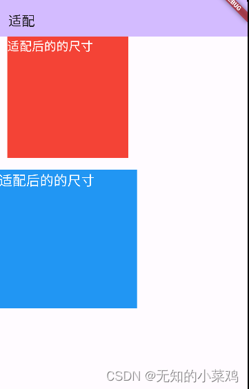
Container(
width: 200,
height: 200,
color: Colors.red,
child: const Text(
"适配后的的尺寸",
style: TextStyle(fontSize: 20, color: Colors.white),
),
),
const SizedBox(
height: 20,
),
Container(
width: ScreenUtil().setWidth(200),
height: ScreenUtil().setWidth(200),
color: Colors.blue,
child: Text(
"适配后的的尺寸",
style: TextStyle(
fontSize: ScreenUtil().setSp(20), color: Colors.white),
),
),
],
),
);
}
}
常用方法
ScreenUtil().setWidth(540)  //根据屏幕宽度适配尺寸
ScreenUtil().setHeight(200) //根据屏幕高度适配尺寸(一般根据宽度适配即可)
ScreenUtil().radius(200)    //根据宽度或高度中的较小者进行调整
ScreenUtil().setSp(24)      //字体大小适配
为了方便使用,还支持简写
ScreenUtil().setWidth(540)  =>  540.h
ScreenUtil().setHeight(200) =>  200.w
ScreenUtil().radius(200)    =>  200.r
ScreenUtil().setSp(24)      =>  24.sp
注意:
一般情况下 1.w != 1.h ,除非刚好屏幕分辨率比例与设计图比例一致,所以如果要设置正方形,切记使用相同的单位,如都设置相同的 w 或者 h ,否则可能显示为长方形。