0. 介绍
pyecharts是百度开源的数据可视化工具,交互性良好,图表设计精巧,非常适合用于数据处理。
- 支持30+常见图表
- 支持notebook环境(jupyter)
- 集成Flask、Django等主流框架
- 400+地图文件
- ……
echarts官网https://echarts.apache.org/zh/index.html
pyecharts首页https://pyecharts.org/#/
1. 快速开始
1.1 安装
1.1.1 pip安装
pip install pyecharts
1.1.2 源码安装
git clone https://github.com/pyecharts/pyecharts.git
cd pyecharts
pip install -r requirements.txt
python setup.py install# 或者执行 python install.py
1.2 快速上手
1.2.1 柱状图
from pyecharts.charts import Bar

bar = Bar()
bar.add_xaxis(["衬衫", "羊毛衫", "雪纺衫", "裤子", "高跟鞋", "袜子"])
bar.add_yaxis("商家A", [5, 20, 36, 10, 75, 90])
# render 会生成本地 HTML 文件,默认会在当前目录生成 render.html 文件
# 也可以传入路径参数,如 bar.render("mycharts.html")
bar.render()
1.2.2 链式调用
from pyecharts.charts import Bar

bar = (
    Bar()
    .add_xaxis(["衬衫", "羊毛衫", "雪纺衫", "裤子", "高跟鞋", "袜子"])
    .add_yaxis("商家A", [5, 20, 36, 10, 75, 90])
)
bar.render()
1.2.3 使用options选项配置参数(一切皆options)
from pyecharts.charts import Bar
from pyecharts import options as opts

# V1 版本开始支持链式调用
# 你所看到的格式其实是 `black` 格式化以后的效果
# 可以执行 `pip install black` 下载使用
bar = (
    Bar()
    .add_xaxis(["衬衫", "羊毛衫", "雪纺衫", "裤子", "高跟鞋", "袜子"])
    .add_yaxis("商家A", [5, 20, 36, 10, 75, 90])
    .set_global_opts(title_opts=opts.TitleOpts(title="主标题", subtitle="副标题"))
    # 或者直接使用字典参数
    # .set_global_opts(title_opts={"text": "主标题", "subtext": "副标题"})
)
bar.render()

# 不习惯链式调用的开发者依旧可以单独调用方法
bar = Bar()
bar.add_xaxis(["衬衫", "羊毛衫", "雪纺衫", "裤子", "高跟鞋", "袜子"])
bar.add_yaxis("商家A", [5, 20, 36, 10, 75, 90])
bar.set_global_opts(title_opts=opts.TitleOpts(title="主标题", subtitle="副标题"))
bar.render()
1.2.4 渲染成图片文件
通常是html文件,可以使用snapshot-selenium渲染成图片文件
from pyecharts.charts import Bar
from pyecharts.render import make_snapshot

# 使用 snapshot-selenium 渲染图片 pip install snapshot-selenium
from snapshot_selenium import snapshot

bar = (
    Bar()
    .add_xaxis(["衬衫", "羊毛衫", "雪纺衫", "裤子", "高跟鞋", "袜子"])
    .add_yaxis("商家A", [5, 20, 36, 10, 75, 90])
)
make_snapshot(snapshot, bar.render(), "bar.png")
1.2.5 使用主题
如:
from pyecharts.charts import Bar
from pyecharts import options as opts
# 内置主题类型可查看 pyecharts.globals.ThemeType
from pyecharts.globals import ThemeType

bar = (
    Bar(init_opts=opts.InitOpts(theme=ThemeType.LIGHT))
    .add_xaxis(["衬衫", "羊毛衫", "雪纺衫", "裤子", "高跟鞋", "袜子"])
    .add_yaxis("商家A", [5, 20, 36, 10, 75, 90])
    .add_yaxis("商家B", [15, 6, 45, 20, 35, 66])
    .set_global_opts(title_opts=opts.TitleOpts(title="主标题", subtitle="副标题"))
)
2. 全局配置项
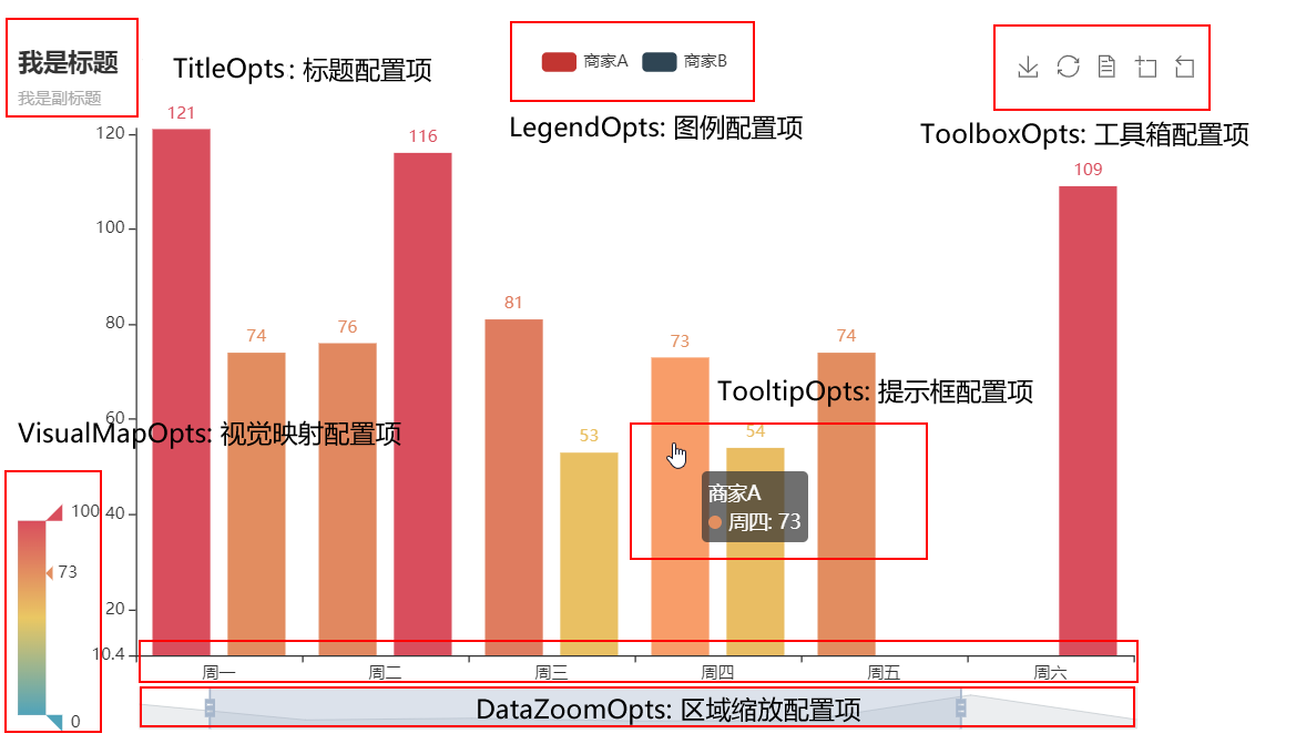
2.1 使用指南
创建图表对象后,可以设置全局配置项
# 导入折线图
from pyecharts.charts import Line
# 创建折线对象
line=Line()
# 设置全局配置项
line.set_global_opts(
		# 设置标题
	    title_opts=opts.TitleOpts(
            # 是否显示标题
            is_show=True,
            # 显示主标题
            title="a test of abc",# subtitle是次标题
            # 标题距左侧10%距离
            pos_left="10%",
            # 标题距上测1%的距离
            pos_top="1%")
    )
)
2.2 常用全局配置项
2.2.1 TitleOpts:标题配置项
class TitleOpts(
    # 是否显示标题组件。
    is_show: bool = True,

    # 主标题文本,支持使用 \n 换行。
    title: Optional[str] = None,

    # 主标题跳转 URL 链接
    title_link: Optional[str] = None,

    # 主标题跳转链接方式
    # 默认值是: blank
    # 可选参数: 'self', 'blank'
    # 'self' 当前窗口打开; 'blank' 新窗口打开
    title_target: Optional[str] = None,

    # 副标题文本,支持使用 \n 换行。
    subtitle: Optional[str] = None,

    # 副标题跳转 URL 链接
    subtitle_link: Optional[str] = None,

    # 副标题跳转链接方式
    # 默认值是: blank
    # 可选参数: 'self', 'blank'
    # 'self' 当前窗口打开; 'blank' 新窗口打开
    subtitle_target: Optional[str] = None,

    # title 组件离容器左侧的距离。
    # left 的值可以是像 20 这样的具体像素值,可以是像 '20%' 这样相对于容器高宽的百分比,
    # 也可以是 'left', 'center', 'right'。
    # 如果 left 的值为'left', 'center', 'right',组件会根据相应的位置自动对齐。
    pos_left: Optional[str] = None,

    # title 组件离容器右侧的距离。
    # right 的值可以是像 20 这样的具体像素值,可以是像 '20%' 这样相对于容器高宽的百分比。
    pos_right: Optional[str] = None,

    # title 组件离容器上侧的距离。
    # top 的值可以是像 20 这样的具体像素值,可以是像 '20%' 这样相对于容器高宽的百分比,
    # 也可以是 'top', 'middle', 'bottom'。
    # 如果 top 的值为'top', 'middle', 'bottom',组件会根据相应的位置自动对齐。
    pos_top: Optional[str] = None,

    # title 组件离容器下侧的距离。
    # bottom 的值可以是像 20 这样的具体像素值,可以是像 '20%' 这样相对于容器高宽的百分比。
    pos_bottom: Optional[str] = None,

    # 标题内边距,单位px,默认各方向内边距为5,接受数组分别设定上右下左边距。
    # // 设置内边距为 5
    # padding: 5
    # // 设置上下的内边距为 5,左右的内边距为 10
    # padding: [5, 10]
    # // 分别设置四个方向的内边距
    # padding: [
    #     5,  // 上
    #     10, // 右
    #     5,  // 下
    #     10, // 左
    # ]
    padding: Union[Sequence, Numeric] = 5,

    # 主副标题之间的间距。
    item_gap: Numeric = 10,

    # 整体(包括 text 和 subtext)的水平对齐。
    # 可选值:'auto'、'left'、'right'、'center'。
    text_align: str = "auto",

    # 整体(包括 text 和 subtext)的垂直对齐。
    # 可选值:'auto'、'left'、'right'、'center'。
    text_vertical_align: str = "auto",

    # 是否触发事件。
    is_trigger_event: bool = False,

    # 主标题字体样式配置项,参考 `series_options.TextStyleOpts`
    title_textstyle_opts: Union[TextStyleOpts, dict, None] = None,

    # 副标题字体样式配置项,参考 `series_options.TextStyleOpts`
    subtitle_textstyle_opts: Union[TextStyleOpts, dict, None] = None,
)
2.2.2 ToolBoxFeatureSaveAsImagesOpts:工具箱保存图片配置项
class ToolBoxFeatureSaveAsImageOpts(
    # 保存的图片格式。支持 'png' 和 'jpeg'。
    type_: str = "png",

    # 保存的文件名称,默认使用 title.text 作为名称。
    name: Optional[str] = None,

    # 保存的图片背景色,默认使用 backgroundColor,如果backgroundColor不存在的话会取白色。
    background_color: str = "auto",

    # 如果图表使用了 echarts.connect 对多个图表进行联动,则在导出图片时会导出这些联动的图表。该配置项决定了图表与图表之间间隙处的填充色。
    connected_background_color: str = "#fff",

    # 保存为图片时忽略的组件列表,默认忽略工具栏。
    exclude_components: Optional[Sequence[str]] = None,

    # 是否显示该工具。
    is_show: bool = True,

    # 提示语
    title: str = "保存为图片",

    # 可以通过 'image://url' 设置为图片,其中 URL 为图片的链接,或者 dataURI。
    icon: Optional[JSFunc] = None,

    # 保存图片的分辨率比例,默认跟容器相同大小,如果需要保存更高分辨率的,可以设置为大于 1 的值,例如 2。
    pixel_ratio: Numeric = 1,
)
2.2.3 ToolBoxFeatureMagicTypeOpts:工具箱动态类型切换配置项
class ToolBoxFeatureMagicTypeOpts(
    # 是否显示该工具。
    is_show: bool = True,

    # 启用的动态类型
    # 包括'line'(切换为折线图), 'bar'(切换为柱状图),
    # 'stack'(切换为堆叠模式), 'tiled'(切换为平铺模式)。
    type_: Optional[Sequence] = None,

    # 各个类型的标题文本,可以分别配置。
    line_title: str = "切换为折线图",

    # 各个类型的标题文本,可以分别配置。
    bar_title: str = "切换为柱状图",

    # 各个类型的标题文本,可以分别配置。
    stack_title: str = "切换为堆叠",

    # 各个类型的标题文本,可以分别配置。
    tiled_title: str = "切换为平铺",

    # 各个类型的 icon path,可以分别配置。
    line_icon: Optional[JSFunc] = None,

    # 各个类型的 icon path,可以分别配置。
    bar_icon: Optional[JSFunc] = None,

    # 各个类型的 icon path,可以分别配置。
    stack_icon: Optional[JSFunc] = None,

    # 各个类型的 icon path,可以分别配置。
    tiled_icon: Optional[JSFunc] = None,
)
2.2.4 VisualMapOpts:视觉映射配置项
class VisualMapOpts(
    # 是否显示视觉映射配置
    is_show: bool = True,

    # 映射过渡类型,可选,"color", "size"
    type_: str = "color",

    # 指定 visualMapPiecewise 组件的最小值。
    min_: Union[int, float] = 0,

    # 指定 visualMapPiecewise 组件的最大值。
    max_: Union[int, float] = 100,

    # 两端的文本,如['High', 'Low']。
    range_text: Union[list, tuple] = None,

    # visualMap 组件过渡颜色
    range_color: Union[Sequence[str]] = None,

    # visualMap 组件过渡 symbol 大小
    range_size: Union[Sequence[int]] = None,

    # visualMap 图元以及其附属物(如文字标签)的透明度。
    range_opacity: Optional[Numeric] = None,

    # 如何放置 visualMap 组件,水平('horizontal')或者竖直('vertical')。
    orient: str = "vertical",

    # visualMap 组件离容器左侧的距离。
    # left 的值可以是像 20 这样的具体像素值,可以是像 '20%' 这样相对于容器高宽的百分比,
    # 也可以是 'left', 'center', 'right'。
    # 如果 left 的值为'left', 'center', 'right',组件会根据相应的位置自动对齐。
    pos_left: Optional[str] = None,

    # visualMap 组件离容器右侧的距离。
    # right 的值可以是像 20 这样的具体像素值,可以是像 '20%' 这样相对于容器高宽的百分比。
    pos_right: Optional[str] = None,

    # visualMap 组件离容器上侧的距离。
    # top 的值可以是像 20 这样的具体像素值,可以是像 '20%' 这样相对于容器高宽的百分比,
    # 也可以是 'top', 'middle', 'bottom'。
    # 如果 top 的值为'top', 'middle', 'bottom',组件会根据相应的位置自动对齐。
    pos_top: Optional[str] = None,

    # visualMap 组件离容器下侧的距离。
    # bottom 的值可以是像 20 这样的具体像素值,可以是像 '20%' 这样相对于容器高宽的百分比。
    pos_bottom: Optional[str] = None,

    # 对于连续型数据,自动平均切分成几段。默认为5段。连续数据的范围需要 max 和 min 来指定
    split_number: int = 5,

    # 指定取哪个系列的数据,默认取所有系列。
    series_index: Union[Numeric, Sequence, None] = None,

    # 组件映射维度
    dimension: Optional[Numeric] = None,

    # 是否显示拖拽用的手柄(手柄能拖拽调整选中范围)。
    is_calculable: bool = True,

    # 是否为分段型
    is_piecewise: bool = False,

    # 是否反转 visualMap 组件
    is_inverse: bool = False,

    # 数据展示的小数精度。
    # 连续型数据平均分段,精度根据数据自动适应。
    # 连续型数据自定义分段或离散数据根据类别分段模式,精度默认为0(没有小数)。
    precision: Optional[int] = None,

    # 自定义的每一段的范围,以及每一段的文字,以及每一段的特别的样式。例如:
    # pieces: [
    #   {"min": 1500}, // 不指定 max,表示 max 为无限大(Infinity)。
    #   {"min": 900, "max": 1500},
    #   {"min": 310, "max": 1000},
    #   {"min": 200, "max": 300},
    #   {"min": 10, "max": 200, "label": '10 到 200(自定义label)'},
    #   {"value": 123, "label": '123(自定义特殊颜色)', "color": 'grey'}, //表示 value 等于 123 的情况
    #   {"max": 5}     // 不指定 min,表示 min 为无限大(-Infinity)。
    # ]
    pieces: Optional[Sequence] = None,

    # 定义 在选中范围外 的视觉元素。(用户可以和 visualMap 组件交互,用鼠标或触摸选择范围)
    #  可选的视觉元素有:
    #  symbol: 图元的图形类别。
    #  symbolSize: 图元的大小。
    #  color: 图元的颜色。
    #  colorAlpha: 图元的颜色的透明度。
    #  opacity: 图元以及其附属物(如文字标签)的透明度。
    #  colorLightness: 颜色的明暗度,参见 HSL。
    #  colorSaturation: 颜色的饱和度,参见 HSL。
    #  colorHue: 颜色的色调,参见 HSL。
    out_of_range: Optional[Sequence] = None,

    # 图形的宽度,即长条的宽度。
    item_width: int = 0,

    # 图形的高度,即长条的高度。
    item_height: int = 0,

    # visualMap 组件的背景色。
    background_color: Optional[str] = None,

    # visualMap 组件的边框颜色。
    border_color: Optional[str] = None,

    # visualMap 边框线宽,单位px。
    border_width: int = 0,

    # 文字样式配置项,参考 `series_options.TextStyleOpts`
    textstyle_opts: Union[TextStyleOpts, dict, None] = None,
)
2.3 系列配置项
详见文档:https://pyecharts.org/#/zh-cn/series_options
3. 常用图表
3.1 简单图表
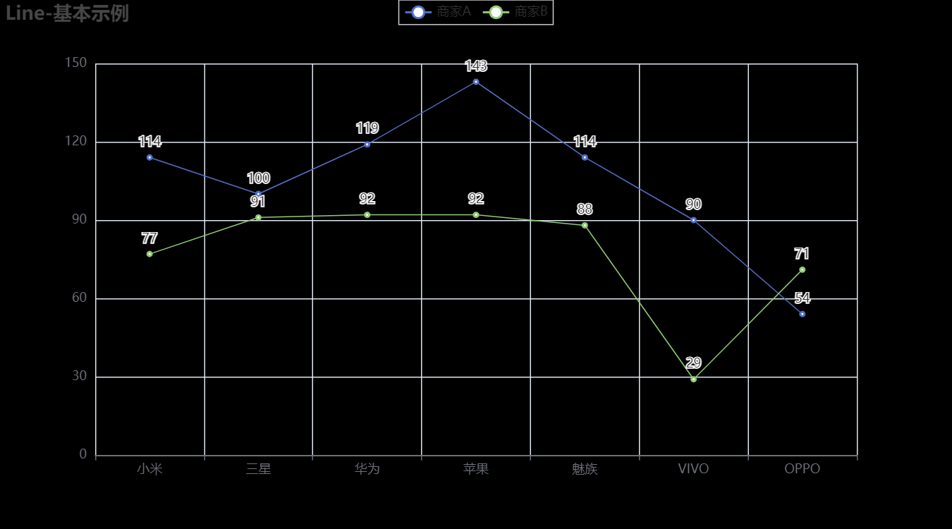
3.1.1 折线图Line
import pyecharts.options as opts
from pyecharts.charts import Line
from pyecharts.faker import Faker

c = (
    Line()
    .add_xaxis(Faker.choose())
    .add_yaxis("商家A", Faker.values())
    .add_yaxis("商家B", Faker.values())
    .set_global_opts(title_opts=opts.TitleOpts(title="Line-基本示例"))
    .render("line_base.html")
)
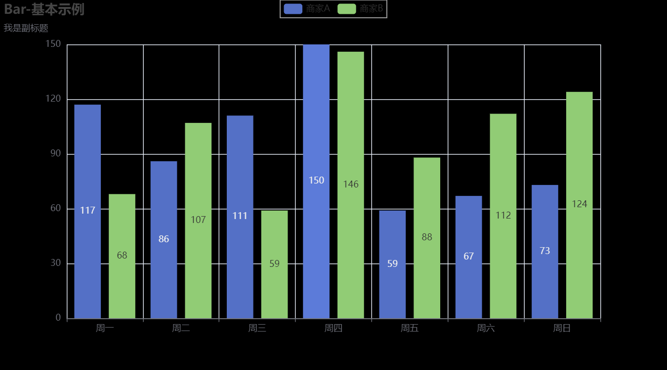
3.1.2 柱状图Bar
from pyecharts import options as opts
from pyecharts.charts import Bar
from pyecharts.faker import Faker


c = (
    Bar()
    .add_xaxis(Faker.choose())
    .add_yaxis("商家A", Faker.values())
    .add_yaxis("商家B", Faker.values())
    .set_global_opts(title_opts=opts.TitleOpts(title="Bar-基本示例", subtitle="我是副标题"))
    .render("bar_base.html")
)
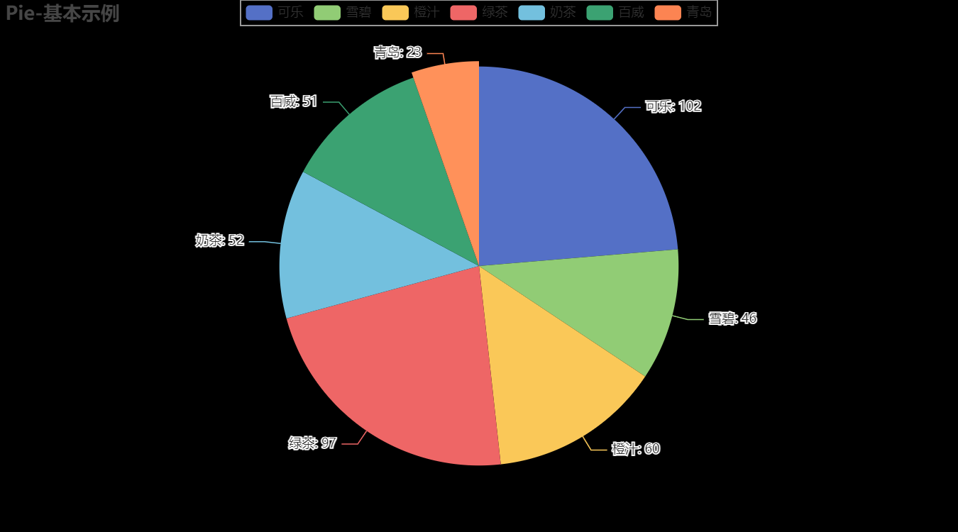
3.1.3 饼图Pie
from pyecharts import options as opts
from pyecharts.charts import Pie
from pyecharts.faker import Faker

c = (
    Pie()
    .add("", [list(z) for z in zip(Faker.choose(), Faker.values())])
    .set_global_opts(title_opts=opts.TitleOpts(title="Pie-基本示例"))
    .set_series_opts(label_opts=opts.LabelOpts(formatter="{b}: {c}"))
    .render("pie_base.html")
)
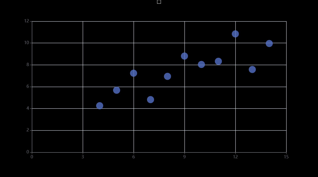
3.1.4 散点图Scatter
import pyecharts.options as opts
from pyecharts.charts import Scatter

"""
Gallery 使用 pyecharts 1.1.0
参考地址: https://echarts.apache.org/examples/editor.html?c=scatter-simple

目前无法实现的功能:

1、暂无
"""

data = [
    [10.0, 8.04],
    [8.0, 6.95],
    [13.0, 7.58],
    [9.0, 8.81],
    [11.0, 8.33],
    [14.0, 9.96],
    [6.0, 7.24],
    [4.0, 4.26],
    [12.0, 10.84],
    [7.0, 4.82],
    [5.0, 5.68],
]
data.sort(key=lambda x: x[0])
x_data = [d[0] for d in data]
y_data = [d[1] for d in data]

(
    Scatter()
    .add_xaxis(xaxis_data=x_data)
    .add_yaxis(
        series_name="",
        y_axis=y_data,
        symbol_size=20,
        label_opts=opts.LabelOpts(is_show=False),
    )
    .set_series_opts()
    .set_global_opts(
        xaxis_opts=opts.AxisOpts(
            type_="value", splitline_opts=opts.SplitLineOpts(is_show=True)
        ),
        yaxis_opts=opts.AxisOpts(
            type_="value",
            axistick_opts=opts.AxisTickOpts(is_show=True),
            splitline_opts=opts.SplitLineOpts(is_show=True),
        ),
        tooltip_opts=opts.TooltipOpts(is_show=False),
    )
    .render("basic_scatter_chart.html")
)
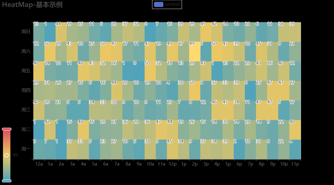
3.1.5 热力图HeatMap
import random

from pyecharts import options as opts
from pyecharts.charts import HeatMap
from pyecharts.faker import Faker

value = [[i, j, random.randint(0, 50)] for i in range(24) for j in range(7)]
c = (
    HeatMap()
    .add_xaxis(Faker.clock)
    .add_yaxis(
        "series0", Faker.week, value, label_opts=opts.LabelOpts(position="middle")
    )
    .set_global_opts(
        title_opts=opts.TitleOpts(title="HeatMap-基本示例"),
        visualmap_opts=opts.VisualMapOpts(),
    )
    .render("heatmap_base.html")
)
3.1.6 树图Tree
from pyecharts import options as opts
from pyecharts.charts import Tree


data = [
    {


        "children": [
            {

    "name": "B"},
            {


                "children": [{

    "children": [{

    "name": "I"}], "name": "E"}, {

    "name": "F"}],
                "name": "C",
            },
            {


                "children": [
                    {

    "children": [{

    "name": "J"}, {

    "name": "K"}], "name": "G"},
                    {

    "name": "H"},
                ],
                "name": "D",
            },
        ],
        "name": "A",
    }
]
c = (
    Tree()
    .add("", data)
    .set_global_opts(title_opts=opts.TitleOpts(title="Tree-基本示例"))
    .render("tree_base.html")
)

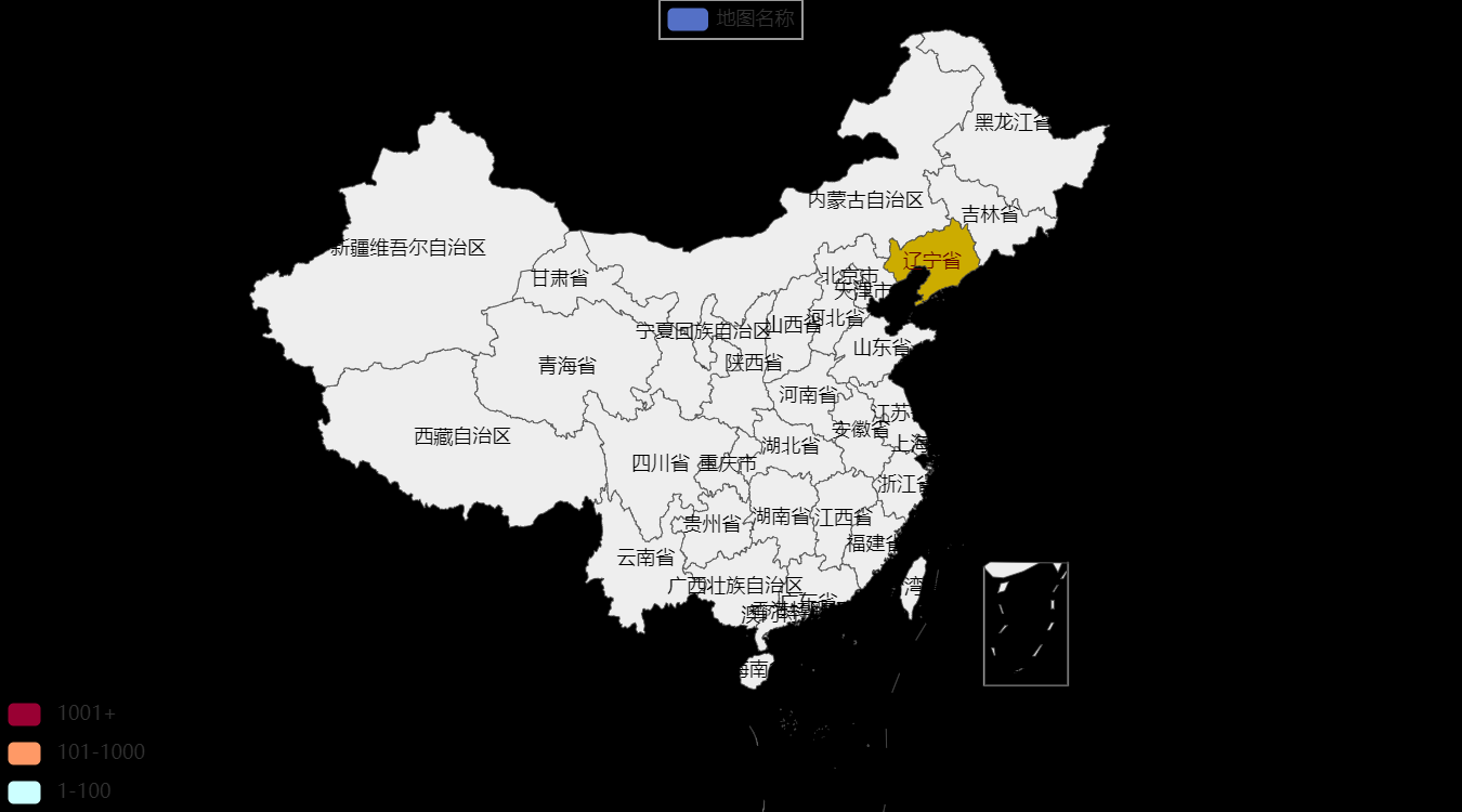
3.1.7 地图Map
from pyecharts import options as opts
from pyecharts.charts import Map
from pyecharts.faker import Faker

c = (
    Map()
    .add("商家A", [list(z) for z in zip(Faker.provinces, Faker.values())], "china")
    .set_global_opts(title_opts=opts.TitleOpts(title="Map-基本示例"))
    .render("map_base.html")
)
3.2 高级图表
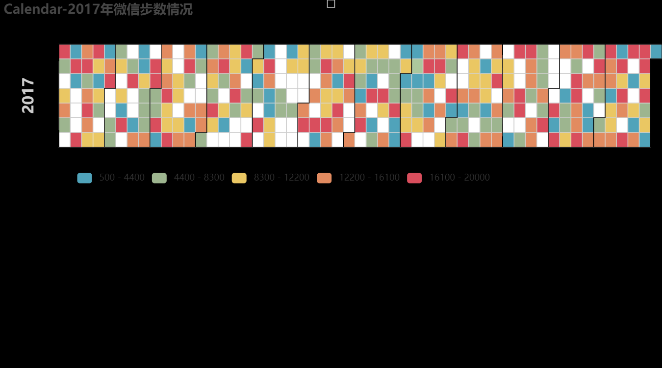
3.2.1 日历图Calendar
import datetime
import random

from pyecharts import options as opts
from pyecharts.charts import Calendar


begin = datetime.date(2017, 1, 1)
end = datetime.date(2017, 12, 31)
data = [
    [str(begin + datetime.timedelta(days=i)), random.randint(1000, 25000)]
    for i in range((end - begin).days + 1)
]

c = (
    Calendar()
    .add("", data, calendar_opts=opts.CalendarOpts(range_="2017"))
    .set_global_opts(
        title_opts=opts.TitleOpts(title="Calendar-2017年微信步数情况"),
        visualmap_opts=opts.VisualMapOpts(
            max_=20000,
            min_=500,
            orient="horizontal",
            is_piecewise=True,
            pos_top="230px",
            pos_left="100px",
        ),
    )
    .render("calendar_base.html")
)
3.2.2 极坐标图Polar
import random

from pyecharts import options as opts
from pyecharts.charts import Polar

data = [(i, random.randint(1, 100)) for i in range(101)]
c = (
    Polar()
    .add("", data, type_="scatter", label_opts=opts.LabelOpts(is_show=False))
    .set_global_opts(title_opts=opts.TitleOpts(title="Polar-Scatter0"))
    .render("polar_scatter_0.html")
)

3.2.3 词云图WordCloud
import pyecharts.options as opts
from pyecharts.charts import WordCloud

"""
Gallery 使用 pyecharts 1.1.0
参考地址: https://gallery.echartsjs.com/editor.html?c=xS1jMxuOVm

目前无法实现的功能:

1、暂无
"""

data = [
    ("生活资源", "999"),
    ("供热管理", "888"),
    ("供气质量", "777"),
    ("生活用水管理", "688"),
    ("一次供水问题", "588"),
    ("交通运输", "516"),
    ("城市交通", "515"),
    ("环境保护", "483"),
    ("房地产管理", "462"),
    ("城乡建设", "449"),
    ("社会保障与福利", "429"),
    ("社会保障", "407"),
    ("文体与教育管理", "406"),
    ("公共安全", "406"),
    ("公交运输管理", "386"),
    ("出租车运营管理", "385"),
    ("供热管理", "375"),
    ("市容环卫", "355"),
    ("自然资源管理", "355"),
    ("粉尘污染", "335"),
    ("噪声污染", "324"),
    ("土地资源管理", "304"),
    ("物业服务与管理", "304"),
    ("医疗卫生", "284"),
    ("粉煤灰污染", "284"),
    ("占道", "284"),
    ("供热发展", "254"),
    ("农村土地规划管理", "254"),
    ("生活噪音", "253"),
    ("供热单位影响", "253"),
    ("城市供电", "223"),
    ("房屋质量与安全", "223"),
    ("大气污染", "223"),
    ("房屋安全", "223"),
    ("文化活动", "223"),
    ("拆迁管理", "223"),
    ("公共设施", "223"),
    ("供气质量", "223"),
    ("供电管理", "223"),
    ("燃气管理", "152"),
    ("教育管理", "152"),
    ("医疗纠纷", "152"),
    ("执法监督", "152"),
    ("设备安全", "152"),
    ("政务建设", "152"),
    ("县区、开发区", "152"),
    ("宏观经济", "152"),
    ("教育管理", "112"),
    ("社会保障", "112"),
    ("生活用水管理", "112"),
    ("物业服务与管理", "112"),
    ("分类列表", "112"),
    ("农业生产", "112"),
    ("二次供水问题", "112"),
    ("城市公共设施", "92"),
    ("拆迁政策咨询", "92"),
    ("物业服务", "92"),
    ("物业管理", "92"),
    ("社会保障保险管理", "92"),
    ("低保管理", "92"),
    ("文娱市场管理", "72"),
    ("城市交通秩序管理", "72"),
    ("执法争议", "72"),
    ("商业烟尘污染", "72"),
    ("占道堆放", "71"),
    ("地上设施", "71"),
    ("水质", "71"),
    ("无水", "71"),
    ("供热单位影响", "71"),
    ("人行道管理", "71"),
    ("主网原因", "71"),
    ("集中供热", "71"),
    ("客运管理", "71"),
    ("国有公交(大巴)管理", "71"),
    ("工业粉尘污染", "71"),
    ("治安案件", "71"),
    ("压力容器安全", "71"),
    ("身份证管理", "71"),
    ("群众健身", "41"),
    ("工业排放污染", "41"),
    ("破坏森林资源", "41"),
    ("市场收费", "41"),
    ("生产资金", "41"),
    ("生产噪声", "41"),
    ("农村低保", "41"),
    ("劳动争议", "41"),
    ("劳动合同争议", "41"),
    ("劳动报酬与福利", "41"),
    ("医疗事故", "21"),
    ("停供", "21"),
    ("基础教育", "21"),
    ("职业教育", "21"),
    ("物业资质管理", "21"),
    ("拆迁补偿", "21"),
    ("设施维护", "21"),
    ("市场外溢", "11"),
    ("占道经营", "11"),
    ("树木管理", "11"),
    ("农村基础设施", "11"),
    ("无水", "11"),
    ("供气质量", "11"),
    ("停气", "11"),
    ("市政府工作部门(含部门管理机构、直属单位)", "11"),
    ("燃气管理", "11"),
    ("市容环卫", "11"),
    ("新闻传媒", "11"),
    ("人才招聘", "11"),
    ("市场环境", "11"),
    ("行政事业收费", "11"),
    ("食品安全与卫生", "11"),
    ("城市交通", "11"),
    ("房地产开发", "11"),
    ("房屋配套问题", "11"),
    ("物业服务", "11"),
    ("物业管理", "11"),
    ("占道", "11"),
    ("园林绿化", "11"),
    ("户籍管理及身份证", "11"),
    ("公交运输管理", "11"),
    ("公路(水路)交通", "11"),
    ("房屋与图纸不符", "11"),
    ("有线电视", "11"),
    ("社会治安", "11"),
    ("林业资源", "11"),
    ("其他行政事业收费", "11"),
    ("经营性收费", "11"),
    ("食品安全与卫生", "11"),
    ("体育活动", "11"),
    ("有线电视安装及调试维护", "11"),
    ("低保管理", "11"),
    ("劳动争议", "11"),
    ("社会福利及事务", "11"),
    ("一次供水问题", "11"),
]


(
    WordCloud()
    .add(series_name="热点分析", data_pair=data, word_size_range=[6, 66])
    .set_global_opts(
        title_opts=opts.TitleOpts(
            title="热点分析", title_textstyle_opts=opts.TextStyleOpts(font_size=23)
        ),
        tooltip_opts=opts.TooltipOpts(is_show=True),
    )
    .render("basic_wordcloud.html")
)

3.3 3D图表
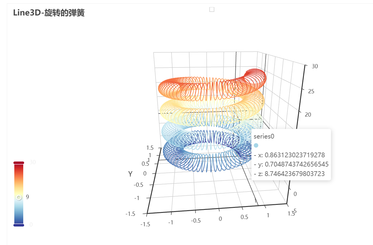
3.3.1 3D折线图Line3D
import math

from pyecharts import options as opts
from pyecharts.charts import Line3D
from pyecharts.faker import Faker

data = []
for t in range(0, 25000):
    _t = t / 1000
    x = (1 + 0.25 * math.cos(75 * _t)) * math.cos(_t)
    y = (1 + 0.25 * math.cos(75 * _t)) * math.sin(_t)
    z = _t + 2.0 * math.sin(75 * _t)
    data.append([x, y, z])
c = (
    Line3D()
    .add(
        "",
        data,
        xaxis3d_opts=opts.Axis3DOpts(Faker.clock, type_="value"),
        yaxis3d_opts=opts.Axis3DOpts(Faker.week_en, type_="value"),
        grid3d_opts=opts.Grid3DOpts(
            width=100, depth=100, rotate_speed=150, is_rotate=True
        ),
    )
    .set_global_opts(
        visualmap_opts=opts.VisualMapOpts(
            max_=30, min_=0, range_color=Faker.visual_color
        ),
        title_opts=opts.TitleOpts(title="Line3D-旋转的弹簧"),
    )
    .render("line3d_autorotate.html")
)
3.3.2 3D柱状图Bar3D
import random

from pyecharts import options as opts
from pyecharts.charts import Bar3D
from pyecharts.faker import Faker


data = [(i, j, random.randint(0, 12)) for i in range(6) for j in range(24)]
c = (
    Bar3D()
    .add(
        "",
        [[d[1], d[0], d[2]] for d in data],
        xaxis3d_opts=opts.Axis3DOpts(Faker.clock, type_="category"),
        yaxis3d_opts=opts.Axis3DOpts(Faker.week_en, type_="category"),
        zaxis3d_opts=opts.Axis3DOpts(type_="value"),
    )
    .set_global_opts(
        visualmap_opts=opts.VisualMapOpts(max_=20),
        title_opts=opts.TitleOpts(title="Bar3D-基本示例"),
    )
    .render("bar3d_base.html")
)

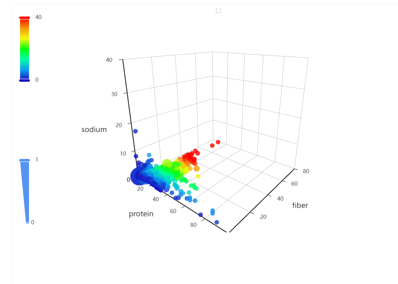
3.3.3 3D散点图Scatter3D
import asyncio
from aiohttp import TCPConnector, ClientSession

import pyecharts.options as opts
from pyecharts.charts import Scatter3D

"""
Gallery 使用 pyecharts 1.1.0
参考地址: https://echarts.apache.org/examples/editor.html?c=scatter3d&gl=1&theme=dark

目前无法实现的功能:

1、暂时无法对 Grid3D 设置 轴线和轴坐标的 style (非白色背景下有问题)
"""


async def get_json_data(url: str) -> dict:
    async with ClientSession(connector=TCPConnector(ssl=False)) as session:
        async with session.get(url=url) as response:
            return await response.json()


# 获取官方的数据
data = asyncio.run(
    get_json_data(
        url="https://echarts.apache.org/examples/data/asset/data/nutrients.json"
    )
)

# 列名映射
field_indices = {


    "calcium": 3,
    "calories": 12,
    "carbohydrate": 8,
    "fat": 10,
    "fiber": 5,
    "group": 1,
    "id": 16,
    "monounsat": 14,
    "name": 0,
    "polyunsat": 15,
    "potassium": 7,
    "protein": 2,
    "saturated": 13,
    "sodium": 4,
    "sugars": 9,
    "vitaminc": 6,
    "water": 11,
}

# 配置 config
config_xAxis3D = "protein"
config_yAxis3D = "fiber"
config_zAxis3D = "sodium"
config_color = "fiber"
config_symbolSize = "vitaminc"

# 构造数据
data = [
    [
        item[field_indices[config_xAxis3D]],
        item[field_indices[config_yAxis3D]],
        item[field_indices[config_zAxis3D]],
        item[field_indices[config_color]],
        item[field_indices[config_symbolSize]],
        index,
    ]
    for index, item in enumerate(data)
]

(
    Scatter3D()  # bg_color="black"
    .add(
        series_name="",
        data=data,
        xaxis3d_opts=opts.Axis3DOpts(
            name=config_xAxis3D,
            type_="value",
            # textstyle_opts=opts.TextStyleOpts(color="#fff"),
        ),
        yaxis3d_opts=opts.Axis3DOpts(
            name=config_yAxis3D,
            type_="value",
            # textstyle_opts=opts.TextStyleOpts(color="#fff"),
        ),
        zaxis3d_opts=opts.Axis3DOpts(
            name=config_zAxis3D,
            type_="value",
            # textstyle_opts=opts.TextStyleOpts(color="#fff"),
        ),
        grid3d_opts=opts.Grid3DOpts(width=100, height=100, depth=100),
    )
    .set_global_opts(
        visualmap_opts=[
            opts.VisualMapOpts(
                type_="color",
                is_calculable=True,
                dimension=3,
                pos_top="10",
                max_=79 / 2,
                range_color=[
                    "#1710c0",
                    "#0b9df0",
                    "#00fea8",
                    "#00ff0d",
                    "#f5f811",
                    "#f09a09",
                    "#fe0300",
                ],
            ),
            opts.VisualMapOpts(
                type_="size",
                is_calculable=True,
                dimension=4,
                pos_bottom="10",
                max_=2.4 / 2,
                range_size=[10, 40],
            ),
        ]
    )
    .render("scatter3d.html")
)
3.3.4 3D地图Map3D
from pyecharts import options as opts
from pyecharts.charts import Map3D
from pyecharts.globals import ChartType

c = (
    Map3D()
    .add_schema(
        itemstyle_opts=opts.ItemStyleOpts(
            color="rgb(5,101,123)",
            opacity=1,
            border_width=0.8,
            border_color="rgb(62,215,213)",
        ),
        map3d_label=opts.Map3DLabelOpts(
            is_show=True,
            text_style=opts.TextStyleOpts(
                color="#fff", font_size=16, background_color="rgba(0,0,0,0)"
            ),
        ),
        emphasis_label_opts=opts.LabelOpts(is_show=True),
        light_opts=opts.Map3DLightOpts(
            main_color="#fff",
            main_intensity=1.2,
            is_main_shadow=False,
            main_alpha=55,
            main_beta=10,
            ambient_intensity=0.3,
        ),
    )
    .add(series_name="", data_pair="", maptype=ChartType.MAP3D)
    .set_global_opts(
        title_opts=opts.TitleOpts(title="全国行政区划地图-Base"),
        visualmap_opts=opts.VisualMapOpts(is_show=False),
        tooltip_opts=opts.TooltipOpts(is_show=True),
    )
    .render("map3d_china_base.html")
)

3.4 组合图表
3.4.1 并行多图Grid
from pyecharts import options as opts
from pyecharts.charts import Bar, Grid, Line

x_data = ["{}月".format(i) for i in range(1, 13)]
bar = (
    Bar()
    .add_xaxis(x_data)
    .add_yaxis(
        "蒸发量",
        [2.0, 4.9, 7.0, 23.2, 25.6, 76.7, 135.6, 162.2, 32.6, 20.0, 6.4, 3.3],
        yaxis_index=0,
        color="#d14a61",
    )
    .add_yaxis(
        "降水量",
        [2.6, 5.9, 9.0, 26.4, 28.7, 70.7, 175.6, 182.2, 48.7, 18.8, 6.0, 2.3],
        yaxis_index=1,
        color="#5793f3",
    )
    .extend_axis(
        yaxis=opts.AxisOpts(
            name="蒸发量",
            type_="value",
            min_=0,
            max_=250,
            position="right",
            axisline_opts=opts.AxisLineOpts(
                linestyle_opts=opts.LineStyleOpts(color="#d14a61")
            ),
            axislabel_opts=opts.LabelOpts(formatter="{value} ml"),
        )
    )
    .extend_axis(
        yaxis=opts.AxisOpts(
            type_="value",
            name="温度",
            min_=0,
            max_=25,
            position="left",
            axisline_opts=opts.AxisLineOpts(
                linestyle_opts=opts.LineStyleOpts(color="#675bba")
            ),
            axislabel_opts=opts.LabelOpts(formatter="{value} °C"),
            splitline_opts=opts.SplitLineOpts(
                is_show=True, linestyle_opts=opts.LineStyleOpts(opacity=1)
            ),
        )
    )
    .set_global_opts(
        yaxis_opts=opts.AxisOpts(
            name="降水量",
            min_=0,
            max_=250,
            position="right",
            offset=80,
            axisline_opts=opts.AxisLineOpts(
                linestyle_opts=opts.LineStyleOpts(color="#5793f3")
            ),
            axislabel_opts=opts.LabelOpts(formatter="{value} ml"),
        ),
        title_opts=opts.TitleOpts(title="Grid-多 Y 轴示例"),
        tooltip_opts=opts.TooltipOpts(trigger="axis", axis_pointer_type="cross"),
    )
)

line = (
    Line()
    .add_xaxis(x_data)
    .add_yaxis(
        "平均温度",
        [2.0, 2.2, 3.3, 4.5, 6.3, 10.2, 20.3, 23.4, 23.0, 16.5, 12.0, 6.2],
        yaxis_index=2,
        color="#675bba",
        label_opts=opts.LabelOpts(is_show=False),
    )
)

bar.overlap(line)
grid = Grid()
grid.add(bar, opts.GridOpts(pos_left="5%", pos_right="20%"), is_control_axis_index=True)
grid.render("grid_multi_yaxis.html")
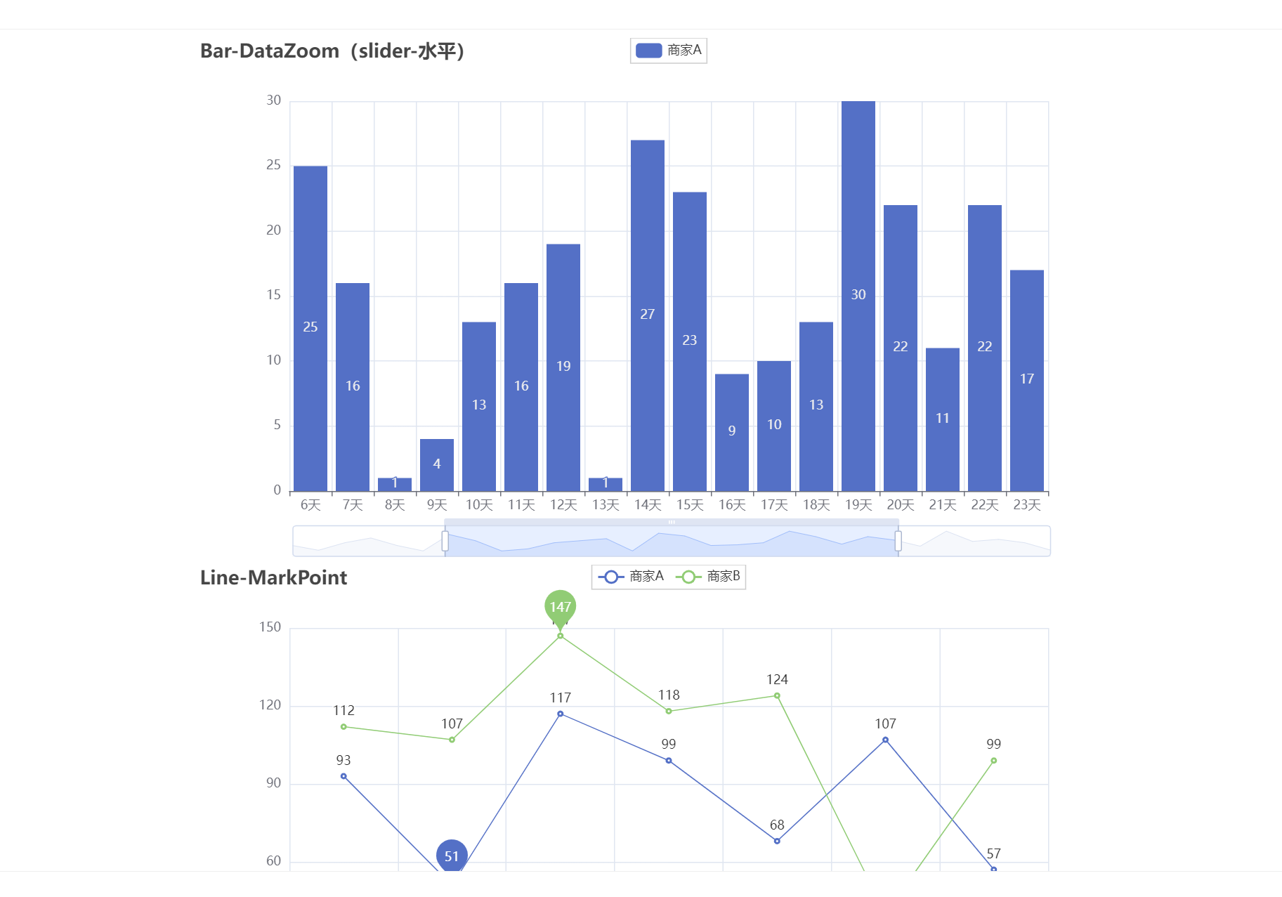
3.4.2 顺序多图Page
from pyecharts import options as opts
from pyecharts.charts import Bar, Grid, Line, Liquid, Page, Pie
from pyecharts.commons.utils import JsCode
from pyecharts.components import Table
from pyecharts.faker import Faker


def bar_datazoom_slider() -> Bar:
    c = (
        Bar()
        .add_xaxis(Faker.days_attrs)
        .add_yaxis("商家A", Faker.days_values)
        .set_global_opts(
            title_opts=opts.TitleOpts(title="Bar-DataZoom(slider-水平)"),
            datazoom_opts=[opts.DataZoomOpts()],
        )
    )
    return c


def line_markpoint() -> Line:
    c = (
        Line()
        .add_xaxis(Faker.choose())
        .add_yaxis(
            "商家A",
            Faker.values(),
            markpoint_opts=opts.MarkPointOpts(data=[opts.MarkPointItem(type_="min")]),
        )
        .add_yaxis(
            "商家B",
            Faker.values(),
            markpoint_opts=opts.MarkPointOpts(data=[opts.MarkPointItem(type_="max")]),
        )
        .set_global_opts(title_opts=opts.TitleOpts(title="Line-MarkPoint"))
    )
    return c


def pie_rosetype() -> Pie:
    v = Faker.choose()
    c = (
        Pie()
        .add(
            "",
            [list(z) for z in zip(v, Faker.values())],
            radius=["30%", "75%"],
            center=["25%", "50%"],
            rosetype="radius",
            label_opts=opts.LabelOpts(is_show=False),
        )
        .add(
            "",
            [list(z) for z in zip(v, Faker.values())],
            radius=["30%", "75%"],
            center=["75%", "50%"],
            rosetype="area",
        )
        .set_global_opts(title_opts=opts.TitleOpts(title="Pie-玫瑰图示例"))
    )
    return c


def grid_mutil_yaxis() -> Grid:
    x_data = ["{}月".format(i) for i in range(1, 13)]
    bar = (
        Bar()
        .add_xaxis(x_data)
        .add_yaxis(
            "蒸发量",
            [2.0, 4.9, 7.0, 23.2, 25.6, 76.7, 135.6, 162.2, 32.6, 20.0, 6.4, 3.3],
            yaxis_index=0,
            color="#d14a61",
        )
        .add_yaxis(
            "降水量",
            [2.6, 5.9, 9.0, 26.4, 28.7, 70.7, 175.6, 182.2, 48.7, 18.8, 6.0, 2.3],
            yaxis_index=1,
            color="#5793f3",
        )
        .extend_axis(
            yaxis=opts.AxisOpts(
                name="蒸发量",
                type_="value",
                min_=0,
                max_=250,
                position="right",
                axisline_opts=opts.AxisLineOpts(
                    linestyle_opts=opts.LineStyleOpts(color="#d14a61")
                ),
                axislabel_opts=opts.LabelOpts(formatter="{value} ml"),
            )
        )
        .extend_axis(
            yaxis=opts.AxisOpts(
                type_="value",
                name="温度",
                min_=0,
                max_=25,
                position="left",
                axisline_opts=opts.AxisLineOpts(
                    linestyle_opts=opts.LineStyleOpts(color="#675bba")
                ),
                axislabel_opts=opts.LabelOpts(formatter="{value} °C"),
                splitline_opts=opts.SplitLineOpts(
                    is_show=True, linestyle_opts=opts.LineStyleOpts(opacity=1)
                ),
            )
        )
        .set_global_opts(
            yaxis_opts=opts.AxisOpts(
                name="降水量",
                min_=0,
                max_=250,
                position="right",
                offset=80,
                axisline_opts=opts.AxisLineOpts(
                    linestyle_opts=opts.LineStyleOpts(color="#5793f3")
                ),
                axislabel_opts=opts.LabelOpts(formatter="{value} ml"),
            ),
            title_opts=opts.TitleOpts(title="Grid-多 Y 轴示例"),
            tooltip_opts=opts.TooltipOpts(trigger="axis", axis_pointer_type="cross"),
        )
    )

    line = (
        Line()
        .add_xaxis(x_data)
        .add_yaxis(
            "平均温度",
            [2.0, 2.2, 3.3, 4.5, 6.3, 10.2, 20.3, 23.4, 23.0, 16.5, 12.0, 6.2],
            yaxis_index=2,
            color="#675bba",
            label_opts=opts.LabelOpts(is_show=False),
        )
    )

    bar.overlap(line)
    return Grid().add(
        bar, opts.GridOpts(pos_left="5%", pos_right="20%"), is_control_axis_index=True
    )


def liquid_data_precision() -> Liquid:
    c = (
        Liquid()
        .add(
            "lq",
            [0.3254],
            label_opts=opts.LabelOpts(
                font_size=50,
                formatter=JsCode(
                    """function (param) {
                        return (Math.floor(param.value * 10000) / 100) + '%';
                    }"""
                ),
                position="inside",
            ),
        )
        .set_global_opts(title_opts=opts.TitleOpts(title="Liquid-数据精度"))
    )
    return c


def table_base() -> Table:
    table = Table()

    headers = ["City name", "Area", "Population", "Annual Rainfall"]
    rows = [
        ["Brisbane", 5905, 1857594, 1146.4],
        ["Adelaide", 1295, 1158259, 600.5],
        ["Darwin", 112, 120900, 1714.7],
        ["Hobart", 1357, 205556, 619.5],
        ["Sydney", 2058, 4336374, 1214.8],
        ["Melbourne", 1566, 3806092, 646.9],
        ["Perth", 5386, 1554769, 869.4],
    ]
    table.add(headers, rows).set_global_opts(
        title_opts=opts.ComponentTitleOpts(title="Table")
    )
    return table


def page_simple_layout():
    page = Page(layout=Page.SimplePageLayout)
    page.add(
        bar_datazoom_slider(),
        line_markpoint(),
        pie_rosetype(),
        grid_mutil_yaxis(),
        liquid_data_precision(),
        table_base(),
    )
    page.render("page_simple_layout.html")


if __name__ == "__main__":
    page_simple_layout()
3.4.3 选项卡多图Tab
from pyecharts import options as opts
from pyecharts.charts import Bar, Grid, Line, Pie, Tab
from pyecharts.faker import Faker
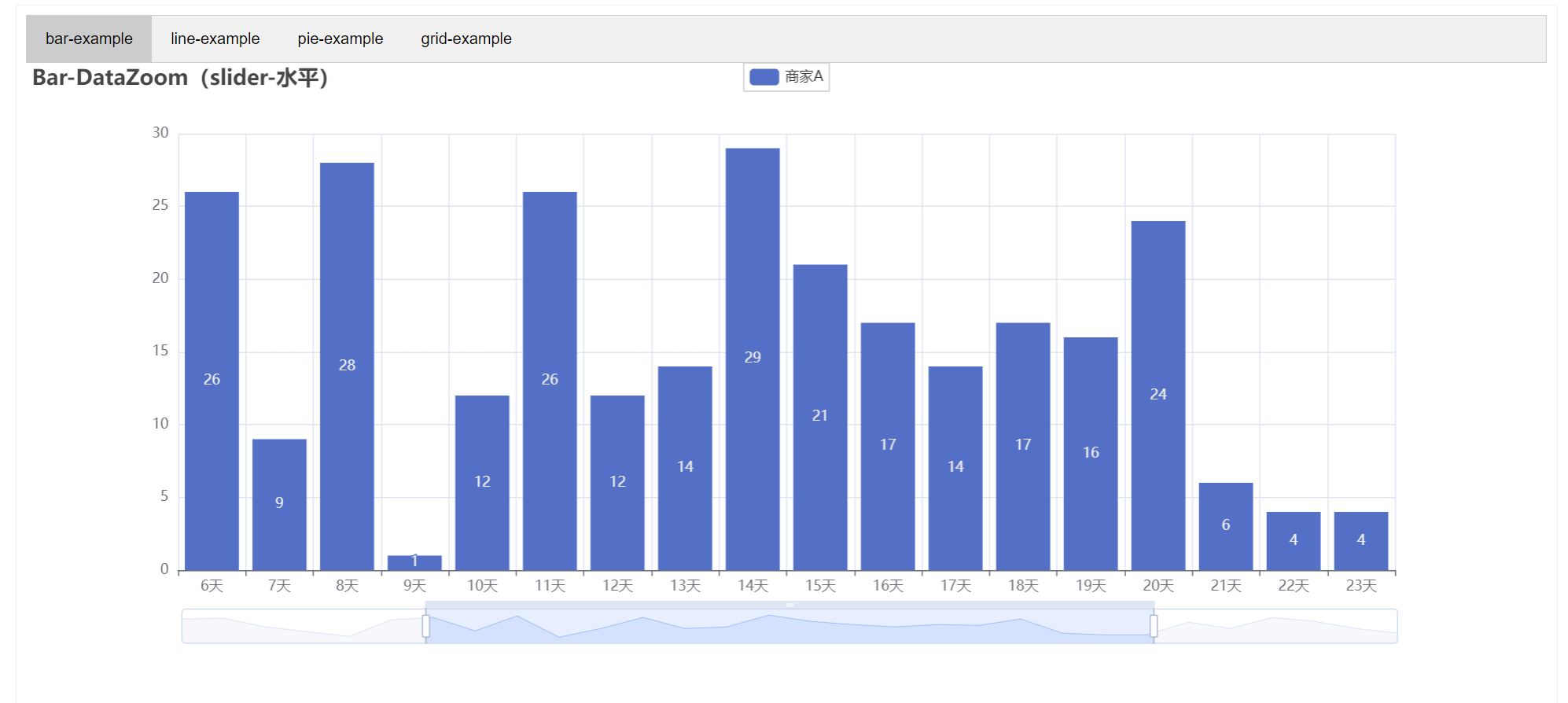
def bar_datazoom_slider() -> Bar:
c = (
Bar()
.add_xaxis(Faker.days_attrs)
.add_yaxis("商家A", Faker.days_values)
.set_global_opts(
title_opts=opts.TitleOpts(title="Bar-DataZoom(slider-水平)"),
datazoom_opts=[opts.DataZoomOpts()],
)
)
return c
def line_markpoint() -> Line:
c = (
Line()
.add_xaxis(Faker.choose())
.add_yaxis(
"商家A",
Faker.values(),
markpoint_opts=opts.MarkPointOpts(data=[opts.MarkPointItem(type_="min")]),
)
.add_yaxis(
"商家B",
Faker.values(),
markpoint_opts=opts.MarkPointOpts(data=[opts.MarkPointItem(type_="max")]),
)
.set_global_opts(title_opts=opts.TitleOpts(title="Line-MarkPoint"))
)
return c
def pie_rosetype() -> Pie:
v = Faker.choose()
c = (
Pie()
.add(
"",
[list(z) for z in zip(v, Faker.values())],
radius=["30%", "75%"],
center=["25%", "50%"],
rosetype="radius",
label_opts=opts.LabelOpts(is_show=False),
)
.add(
"",
[list(z) for z in zip(v, Faker.values())],
radius=["30%", "75%"],
center=["75%", "50%"],
rosetype="area",
)
.set_global_opts(title_opts=opts.TitleOpts(title="Pie-玫瑰图示例"))
)
return c
def grid_mutil_yaxis() -> Grid:
x_data = ["{}月".format(i) for i in range(1, 13)]
bar = (
Bar()
.add_xaxis(x_data)
.add_yaxis(
"蒸发量",
[2.0, 4.9, 7.0, 23.2, 25.6, 76.7, 135.6, 162.2, 32.6, 20.0, 6.4, 3.3],
yaxis_index=0,
color="#d14a61",
)
.add_yaxis(
"降水量",
[2.6, 5.9, 9.0, 26.4, 28.7, 70.7, 175.6, 182.2, 48.7, 18.8, 6.0, 2.3],
yaxis_index=1,
color="#5793f3",
)
.extend_axis(
yaxis=opts.AxisOpts(
name="蒸发量",
type_="value",
min_=0,
max_=250,
position="right",
axisline_opts=opts.AxisLineOpts(
linestyle_opts=opts.LineStyleOpts(color="#d14a61")
),
axislabel_opts=opts.LabelOpts(formatter="{value} ml"),
)
)
.extend_axis(
yaxis=opts.AxisOpts(
type_="value",
name="温度",
min_=0,
max_=25,
position="left",
axisline_opts=opts.AxisLineOpts(
linestyle_opts=opts.LineStyleOpts(color="#675bba")
),
axislabel_opts=opts.LabelOpts(formatter="{value} °C"),
splitline_opts=opts.SplitLineOpts(
is_show=True, linestyle_opts=opts.LineStyleOpts(opacity=1)
),
)
)
.set_global_opts(
yaxis_opts=opts.AxisOpts(
name="降水量",
min_=0,
max_=250,
position="right",
offset=80,
axisline_opts=opts.AxisLineOpts(
linestyle_opts=opts.LineStyleOpts(color="#5793f3")
),
axislabel_opts=opts.LabelOpts(formatter="{value} ml"),
),
title_opts=opts.TitleOpts(title="Grid-多 Y 轴示例"),
tooltip_opts=opts.TooltipOpts(trigger="axis", axis_pointer_type="cross"),
)
)
line = (
Line()
.add_xaxis(x_data)
.add_yaxis(
"平均温度",
[2.0, 2.2, 3.3, 4.5, 6.3, 10.2, 20.3, 23.4, 23.0, 16.5, 12.0, 6.2],
yaxis_index=2,
color="#675bba",
label_opts=opts.LabelOpts(is_show=False),
)
)
bar.overlap(line)
return Grid().add(
bar, opts.GridOpts(pos_left="5%", pos_right="20%"), is_control_axis_index=True
)
tab = Tab()
tab.add(bar_datazoom_slider(), "bar-example")
tab.add(line_markpoint(), "line-example")
tab.add(pie_rosetype(), "pie-example")
tab.add(grid_mutil_yaxis(), "grid-example")
tab.render("tab_base.html")
3.4.4 时间线轮播多图Timeline
from pyecharts import options as opts
from pyecharts.charts import Bar, Timeline
from pyecharts.faker import Faker

tl = Timeline()
for i in range(2015, 2020):
    bar = (
        Bar()
        .add_xaxis(Faker.choose())
        .add_yaxis("商家A", Faker.values())
        .add_yaxis("商家B", Faker.values())
        .set_global_opts(title_opts=opts.TitleOpts("某商店{}年营业额".format(i)))
    )
    tl.add(bar, "{}年".format(i))
tl.render("timeline_multi_axis.html")