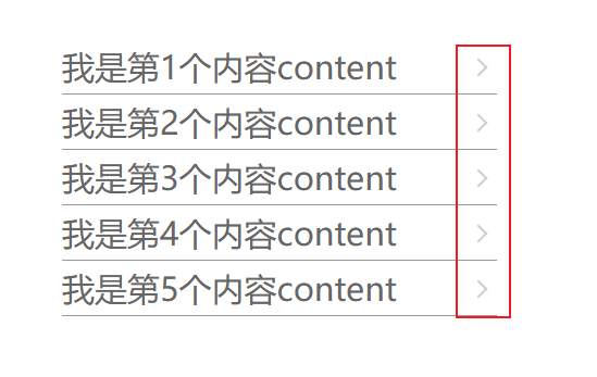
一般在列表中会经常用到末尾处右箭头,出了写元素定位外还有一个方法特别简单,利用css中的伪元素进行列表每个li的一个向右箭头的显示。
<!DOCTYPE html>
<html lang="en">

<head>
    <meta charset="UTF-8">
    <meta http-equiv="X-UA-Compatible" content="IE=edge">
    <meta name="viewport" content="width=device-width, initial-scale=1.0">
    <title>Document</title>
    <style>
        ul {
            list-style: none;
            color: #666;
            margin: 100px auto;
            padding: 0;
        }

        li {
            width: 400px;
            font-size: 30px;
            height: 50px;
            border-bottom: 1px solid #999;
            line-height: 50px;
            margin: 0 auto;
            position: relative;
        }

        li::after {
            width: 10px;
            height: 10px;
            border-top: 2px solid;
            border-right: 2px solid;
            border-color: #ccc;
            content: '';
            position: absolute;
            right: 11px;
            top: 20px;
            transform: rotate(45deg);
        }
    </style>
</head>

<body>
    <ul>
        <li>我是第1个内容content</li>
        <li>我是第2个内容content</li>
        <li>我是第3个内容content</li>
        <li>我是第4个内容content</li>
        <li>我是第5个内容content</li>
    </ul>
</body>

</html>
特殊情况
如果设置向上、向左、向下箭头控制li的transform的rotate属性的角度即可,切记rotate的单位为deg