前言
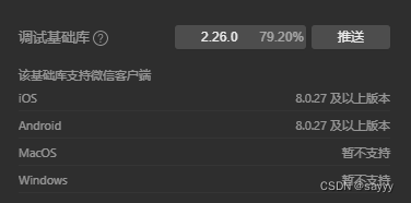
- 调试基础库:2.26.0
swiper
    <view class="swiper">
      <swiper indicator-dots="{

     {indicatorDots}}" autoplay="{

     {autoplay}}" interval="{

     {interval}}" duration="{

     {duration}}">
        <block wx:for="{

     {background}}" wx:key="*this">
          <swiper-item>
            <view class="swiper-item {

     {item}}"></view>
          </swiper-item>
        </block>
      </swiper>
    </view>
swiper 样式
.wx-swiper-dots: 指示点容器样式.wx-swiper-dots-horizontal: 水平滑动的指示点容器样式,其在.wx-swiper-dots内。.wx-swiper-dot:指示点样式.wx-swiper-dot-active: 当前指示点样式
指示点颜色
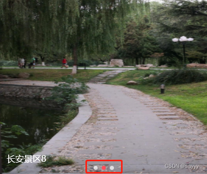
默认指示点颜色

改变指示点颜色
.swiper .wx-swiper-dot {


  background-color: rgba(255,255,255,0.7);
}
.swiper .wx-swiper-dot-active {


  background-color:#ff4e5b;
}
指示点形状
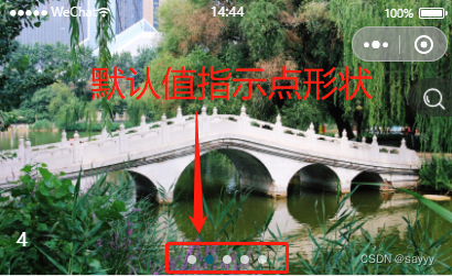
默认指示点形状
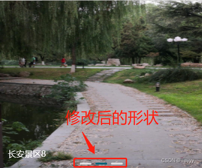
改变指示点形状
.swiper .wx-swiper-dots-horizontal .wx-swiper-dot {


  width: 45rpx;
  height: 8rpx;
  border-radius: 5rpx;
}
指示点位置
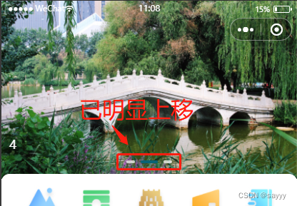
默认指示点位置贴近底部
改变指示点位置
.swiper .wx-swiper-dots.wx-swiper-dots-horizontal {


  position: absolute;
  bottom: 40rpx;
}
.wx-swiper-dots.wx-swiper-dots-horizontal,注意中间,没有空格
或者
.swiper .wx-swiper-dots.wx-swiper-dots-horizontal {


  margin-bottom: 40rpx;
}
.wx-swiper-dots.wx-swiper-dots-horizontal,注意中间,没有空格
参考
https://developers.weixin.qq.com/miniprogram/dev/component/swiper.html
https://blog.csdn.net/qq_39399966/article/details/113342668
https://blog.csdn.net/IT_iosers/article/details/123922736
https://wangjiabin.blog.csdn.net/article/details/108194235
https://blog.csdn.net/weixin_42063951/article/details/111059699