实现一个小程序swiper指示点在下方的一个demo,并且在每张图片上有对应的文字释义。
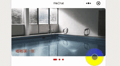
效果图:
注意:代码是用mpvue框架写的,跟原生的有所不同,但是原理是一样的,都是用小程序提供的一个事件。原生也就是设置值和绑定动态样式不一样。

原生使用的注意点
最开始本来打算用css控制样式来实现,然后发现超出swiper元素内容会被隐藏,然后试了下,感觉有点麻烦,发现组件有提供一个事件给我,然后可以利用这一个事件,直接定义一个指示点。感觉这样更加直接,所以用的这个方式。
上代码
<template>
  <div>
    <swiper
      autoplay="true"
      circular="true"
      @change="swiperChange"
    >
      <template v-for="(item, i) in swiperData">
        <swiper-item>
          <img
            @change="imgChange"
            :src="item.img"
            class="indexItem"
            mode="aspectFill"
          />
          <p class="swiper-itemText">{

   {item.text}}</p>
        </swiper-item>
      </template>
    </swiper>
    <!-- 自定义指示点dot -->
    <div class="customDots">
      <template v-for="(item, index) in swiperData">
        <div class="customDots-item" :class="{ active: swiperCurrent == index }"></div>
      </template>
    </div>
  </div>
</template>
js
<script>
export default {


  data() {


    return {


      swiperData: [        {


          img: "https://cdn.pixabay.com/photo/2020/03/18/05/29/swimming-pool-4942724__340.jpg",
          text: '嘟嘟第一张'
        },
         {


          img: "https://cdn.pixabay.com/photo/2020/04/02/11/20/fungus-4994622__340.jpg",
          text: '啦啦第二张啦啦第二张啦啦第二张啦啦第二张啦啦第二张'
        },
         {


          img: "https://cdn.pixabay.com/photo/2017/12/29/10/23/nature-3047194__340.jpg",
          text: '嘿嘿第三张'
        }
      ],
      swiperCurrent: 0,
    };
  },
  methods: {


     //自动滑动时,获取当前的轮播对象  原生的这里设置值不一样
    swiperChange(e) {


      this.swiperCurrent = e.mp.detail.current
    },
    //图片手动滑动时,获取当前的轮播对象
    imgChange(e) {


      this.swiperCurrent = e.mp.detail.current
    }
  },
};
</script>
css
<style scoped>
swiper {


  width: 100%;
  height: 388rpx;
}

swiper-item {


  border-radius: 14rpx;
  overflow: hidden;
  position: relative;
  width: 100%;
  height: 388rpx;
}
.indexItem {


  width: 100%;
  height: 388rpx;
}

.swiper-itemText {


  position: absolute;
  left: 34rpx;
  bottom: 24rpx;
  font-size: 32rpx;
  width: 80%;
  color: red;
  overflow: hidden;
  text-overflow:ellipsis;
  white-space: nowrap;
}
.customDots {


  margin-top: 20rpx;
  display: flex;
  justify-content: center;
}
/* 不是当前状态的点 */
.customDots .customDots-item {


  margin: 0 8rpx;
  width: 14rpx;
  height: 14rpx;
  background-color: transparent;
  border-radius: 8rpx;
  background:red;
  transition: all 0.6s ease-in-out;
}
/* 当前显示点 */
.customDots .customDots-item.active {


  width: 30rpx;
  background: red;
}
</style>
做完后发现还有一种思路,让img的高小点,swiper-item的高高些,然后原本的指示点自热而然好像也变成这个效果。不过后面没去试下了,有兴趣的可以试下。可以的话留言下,感觉这个好像更简单些。还不需要写这么多,尴尬。
个人水平有限,有问题欢迎大家留言指导,仅供学习和参考。
学海无涯!努力二字,共勉!