前言
上下固定,中间可以上下滑动是移动端中非常常见的布局,实现的过程在本篇记录一下
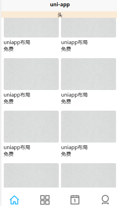
效果展示:
实现过程
在移动端中布局主要以flex布局为主,如果不太清楚可以去看看学习一下flex布局
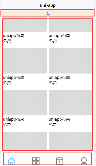
要实现样式,我们先要学会分析布局:
上面是头部,中间是内容,最下面是尾部
要实现中间可上线滑动,官方给我们提供了scroll-view标签来实现
下面我将实现过程中的关键点和简化版代码附上:
- 首先是最外层(头,中间,尾)要实现flex布局,从上往下
- 其次是中间内容要实现flex布局,横向排列,自动换行
- 然后就是中间部分要实现绝对定位和相对定位,不会对尾部造成影响
实现源码:复制到页面就能查看效果,底部的标签图片我就不放了
<template>
	<view class="body">
		<view class="head">
			头
		</view>
		<view class="list-wrap">
			<scroll-view scroll-y="true" class="list">
				<view class="list-scroll-view">
					<view class="course-card">
						<view>
							<image src="@/static/bg.jpg" mode="widthFix"></image>
						</view>
						<view>uniapp布局</view>
						<view>免费</view>
					</view>
					<view class="course-card">
						<view>
							<image src="@/static/bg.jpg" mode="widthFix"></image>
						</view>
						<view>uniapp布局</view>
						<view>免费</view>
					</view>
					<view class="course-card">
						<view>
							<image src="@/static/bg.jpg" mode="widthFix"></image>
						</view>
						<view>uniapp布局</view>
						<view>免费</view>
					</view>
					<view class="course-card">
						<view>
							<image src="@/static/bg.jpg" mode="widthFix"></image>
						</view>
						<view>uniapp布局</view>
						<view>免费</view>
					</view>
					<view class="course-card">
						<view>
							<image src="@/static/bg.jpg" mode="widthFix"></image>
						</view>
						<view>uniapp布局</view>
						<view>免费</view>
					</view>
					<view class="course-card">
						<view>
							<image src="@/static/bg.jpg" mode="widthFix"></image>
						</view>
						<view>uniapp布局</view>
						<view>免费</view>
					</view>
					<view class="course-card">
						<view>
							<image src="@/static/bg.jpg" mode="widthFix"></image>
						</view>
						<view>uniapp布局</view>
						<view>免费</view>
					</view>
					<view class="course-card">
						<view>
							<image src="@/static/bg.jpg" mode="widthFix"></image>
						</view>
						<view>uniapp布局</view>
						<view>免费</view>
					</view>
					<view class="course-card">
						<view>
							<image src="@/static/bg.jpg" mode="widthFix"></image>
						</view>
						<view>uniapp布局</view>
						<view>免费</view>
					</view>
					<view class="course-card">
						<view>
							<image src="@/static/bg.jpg" mode="widthFix"></image>
						</view>
						<view>uniapp布局</view>
						<view>免费</view>
					</view>
				</view>
			</scroll-view>
		</view>

		<view class="tools">
			<view class="tools-item">
				<image src="@/static/icon/index-active.png" mode="widthFix"></image>
				<view>首页</view>
			</view>
			<view class="tools-item">
				<image src="@/static/icon/sort.png" mode="widthFix"></image>
				<view>分类</view>
			</view>
			<view class="tools-item">
				<image src="@/static/icon/cal.png" mode="widthFix"></image>
				<view>课表</view>
			</view>
			<view class="tools-item">
				<image src="@/static/icon/head.png" mode="widthFix"></image>
				<view>我的</view>
			</view>
		</view>
	</view>
</template>

<script>
</script>

<style>
	.body {


		display: flex;
		flex-direction: column;
		height: 100vh;
	}
	.head {


		text-align: center;
		margin-top: 10px;
	}
	.list-wrap {


		/* height: 500px; */
		flex-grow: 1;
		position: relative;
	}
	.list {


		position: absolute;
		top: 0;
		left: 0;
		right: 0;
		bottom: 0;
	}
	.list-scroll-view {


		display: flex;
		flex-direction: row;
		flex-wrap: wrap;
		justify-content: space-between;
		margin-left: 2vw;
		margin-right: 2vw;
	}
	.course-card {


		width: 47vw;
		margin-top: 10px;
		margin-bottom: 10px;
	}
	.course-card image {


		width: 100%;
		border-radius: 5px;
	}
	.tools {


		display: flex;
		flex-direction: row;
		justify-content: space-between;
	}
	.tools-item {


		width: 45px;
		text-align: center;
		font-size: 14px;
		padding: 20px;
	}
	.tools-item image {


		width: 39px;
	}
</style>