本篇开始介绍Jetpack Compose 中常用的组件。有一部分之前的文章中也出现过,今天详细说明一下。
1. Text
日常最常用的应该就是显示文字,所以有必要说一下Text控件。首先源码如下:
@Composable
fun Text(
    text: String,
    modifier: Modifier = Modifier,
    color: Color = Color.Unspecified,
    fontSize: TextUnit = TextUnit.Unspecified,
    fontStyle: FontStyle? = null,
    fontWeight: FontWeight? = null,
    fontFamily: FontFamily? = null,
    letterSpacing: TextUnit = TextUnit.Unspecified,
    textDecoration: TextDecoration? = null,
    textAlign: TextAlign? = null,
    lineHeight: TextUnit = TextUnit.Unspecified,
    overflow: TextOverflow = TextOverflow.Clip,
    softWrap: Boolean = true,
    maxLines: Int = Int.MAX_VALUE,
    onTextLayout: (TextLayoutResult) -> Unit = {

    },
    style: TextStyle = LocalTextStyle.current
)
部分属性,见名知意,所以就不多说了。
text:要显示的文字。显示资源使用stringResource(R.string.xxx)modifier上一篇有介绍,这里略过。color:文字的颜色。如果颜色未指定,并且style也没有设置颜色,则使用LocalContentColor的黑色。textDecoration:文字上绘制的装饰(例如下划线TextDecoration.Underline)。textAlign:文字在容器内的对齐方式,例如左对齐(TextAlign.Left),居中(TextAlign.Center)。比较特别的是TextAlign.Justify,表示在换行时拉伸所在行文字,以填充容器的宽度。
	Column {


        Text(
            "Hello Compose Hello Compose",
            modifier = Modifier.width(120.dp)
        )
        Text(
            "Hello Compose Hello Compose",
            modifier = Modifier.width(120.dp),
            textAlign = TextAlign.Justify,
        )
    }
效果图:
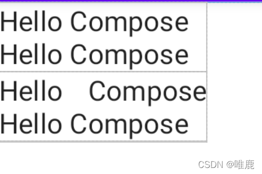
其实这个属性不太适应于中文,如果你要拉伸需要文字间添加空格。不要误以为是在指定宽度内文字均匀显示。
overflow:文字在显示不下溢出时的显示方式。TextOverflow.Clip直接截断,TextOverflow.Ellipsis显示省略号,TextOverflow.Visible继续超出边界显示。
	Column {


        Text(
            "Hello Compose Hello Compose Hello Compose",
            modifier = Modifier.size(120.dp, 50.dp),
        )
        Text(
            "Hello Compose Hello Compose Hello Compose",
            modifier = Modifier.size(120.dp, 50.dp),
            overflow = TextOverflow.Visible,
        )
    }
效果图:
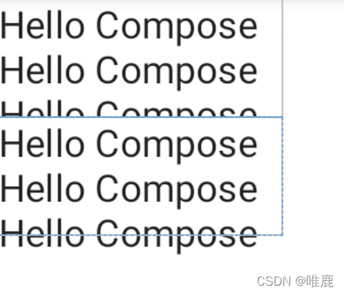
注意:无法避免被其他修饰符(如Modifier.clipToBounds)剪切。
softWrap:文字是否自动换行。onTextLayout:Text布局时执行的回调,返回的TextLayoutResult对象包含段落、文字大小等信息。style:文字样式配置,包含上面提到的一些属性,还有一些例如文字阴影,背景色等属性。默认使用上层中最近的配置。
2. Image
Image的源码如下:
@Composable
fun Image(
    painter: Painter,// 或ImageBitmap,ImageVector
    contentDescription: String?,
    modifier: Modifier = Modifier,
    alignment: Alignment = Alignment.Center,
    contentScale: ContentScale = ContentScale.Fit,
    alpha: Float = 1.0f,
    colorFilter: ColorFilter? = null
)
painter:绘制的图片,加载本地资源使用painterResource(id = R.drawable.xxx)contentDescription:描述此图像所代表的内容,用于可访问性服务。modifier上一篇有介绍,这里略过。alignment就是图片在固定大小中的对齐方式。一共是八个方位加一个居中九种类型。alpha:图片透明度。colorFilter:颜色过滤器,基本和ImageVIew的一致。比如ColorFilter.lighting(multiply: Color, add: Color)用法和LightingColorFilter一样,ColorFilter.colorMatrix(colorMatrix: ColorMatrix)和ColorMatrixColorFilter一样。这里放一个着色的小例子:
	Column {


        Image(
            painter = painterResource(id = R.drawable.intercom_snooze),
            modifier = Modifier.size(220.dp, 60.dp).background(Color.Yellow),
            contentDescription = null
        )
        Image(
            painter = painterResource(id = R.drawable.intercom_snooze),
            modifier = Modifier.size(220.dp, 60.dp).background(Color.Yellow),
            contentDescription = null,
            colorFilter = ColorFilter.tint(color = Color.Green)
        )
    }
效果图:

contentScale就是图片的在固定大小中的缩放类型,和ImageView的scaleType一样。这里分为以下七种类型:
(1). ContentScale.Crop 等比缩放到完全填充整个控件,如果结合Alignment.Center就和ImageView的ScaleType.CENTER_CROP一致。
(2). ContentScale.Fit 等比缩放到自适应整个控件,如果结合Alignment.Center就和ImageView的ScaleType.FIT_CENTER一致。此模式为Image默认值。对于ImageView的ScaleType.FIT_START和ScaleType.FIT_END其实就是调整alignment属性。
(3). ContentScale.FillHeight 等比缩放到图片高度填满控件高度。
(4). ContentScale.FillWidth 等比缩放到图片宽度填满控件宽度。
(5). ContentScale.Inside 如果宽高大于控件宽高,则等比缩放展示。如果图片宽高小于等于控件宽高,则不缩放直接展示。结合Alignment.Center就和ImageView的ScaleType.CENTER_INSIDE一致。
(6). ContentScale.None 不缩放,原图大小展示。结合Alignment.Center就和ImageView的ScaleType.CENTER一致。
(7). ContentScale.FillBounds拉伸图片宽高填满控件,和ImageView的ScaleType.FIT_XY一致。
因为基本上和原生ImageView类似,这里就简单示例一下:
	Column {


        Image(
            painter = painterResource(id = R.drawable.intercom_snooze),
            modifier = Modifier.size(220.dp, 60.dp).background(Color.Yellow),
            contentDescription = null
        )
        Image(
            painter = painterResource(id = R.drawable.intercom_snooze),
            modifier = Modifier.size(220.dp, 60.dp).background(Color.Yellow),
            contentDescription = null,
            alignment = Alignment.TopStart
        )
        Image(
            painter = painterResource(id = R.drawable.intercom_snooze),
            modifier = Modifier.size(220.dp, 60.dp).background(Color.Yellow),
            contentDescription = null,
            contentScale = ContentScale.Crop,
        )
        Image(
            painter = painterResource(id = R.drawable.intercom_snooze),
            modifier = Modifier.size(220.dp, 60.dp).background(Color.Yellow),
            contentDescription = null,
            contentScale = ContentScale.FillBounds,
        )
    }
效果图:

最后补充一下如何加载网络图片。目前Coil这个图片加载框架支持了Jetpack Compose,使用时添加Coil依赖:
	implementation("io.coil-kt:coil:1.4.0")
    implementation("io.coil-kt:coil-compose:1.4.0")
用法:
Image(
    painter = rememberImagePainter("https://xxx"),
    contentDescription = null,
)
具体的功能用法可以参看文档,这里就不说明了。
对于我们习惯使用的Glide、Fresco截止本文发布前官方没有支持,但是可以使用Github上开源的landscapist,里面功能很完善,也同时支持Coil。
3.LazyColumn
系统会对所有列表项进行组合和布局,无论它们是否可见,因此如果您需要显示大量列表项(或长度未知的列表),则使用
Column等布局可能会导致性能问题。
Compose提供了一组组件,这些组件只会对在组件视口中可见的列表项进行组合和布局。这些组件包括LazyColumn和LazyRow。
你可以理解为一个是垂直方向滚动的RecyclerView,一个是水平方向滚动的RecyclerView。网格是LazyVerticalGrid,不过目前还是实验性(当前compose 1.1)。
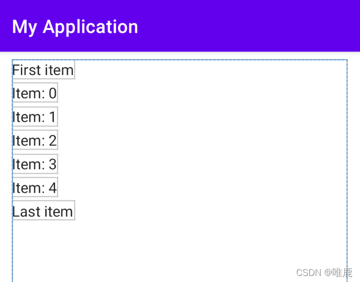
直接上示例:
	LazyColumn(
        contentPadding = PaddingValues(horizontal = 16.dp, vertical = 8.dp),
    ) {


        // Add a single item
        item {


            Text(text = "First item")
        }
        // Add 5 items
        items(5) {

     index ->
            Text(text = "Item: $index")
        }
        // Add another single item
        item {


            Text(text = "Last item")
        }
    }
contentPadding:内容区域的内间距。verticalArrangement:列表项之间在垂直方向上的间距。item:添加一个列表项。items:添加多个列表项。
效果图:
还有其他一些方法:
itemsIndexed:用法同items,不过它会同时返回索引。stickyHeader:粘性标题,也就是平时见到的吸顶效果。目前为实验性API,详细用法见文末链接。
rememberLazyListState:列表的状态,提供了firstVisibleItemIndex和firstVisibleItemScrollOffset属性,可以实现滚动位置的监听。scrollToItem()和animateScrollToItem()方法,可以实现将列表滚动到指定item。用法:
	val listState = rememberLazyListState()
    val coroutineScope = rememberCoroutineScope()
    LazyColumn(
        state = listState,
    ) {


       ...
    }

	Button(
        onClick = {


        	// 挂起函数,需要在协程中调用。
            coroutineScope.launch {


                listState.animateScrollToItem(index = 0)
            }
        }
    ) {


        ...
    }
对于按钮(Button)、输入框(TextField)等组件,因为篇幅有限就不一一说明了,大体用法差不太多,结合文档相信你也可以快速理解。
对于ViewPager,SwipeRefreshLayout这类常用组件,可以使用Google开源的Accompanist。当然里面不止这些,有兴趣的可以看一下。
随着Compose的普及,开源社区上已经有了很多的组件供我们使用,对于日常开发来说已经没有什么问题了。
那么本篇到此结束,坚持看到这里的你,帮忙点个赞~给作者一点鼓励,你也可以收藏起来以备不时之需。