css3实现三叶扇旋转
说明:
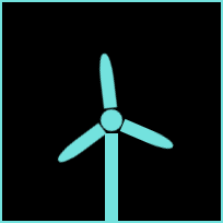
最近在做一个大数据可视化的项目,因为公司经营业务范围是风力发电这方面的,所以大数据可视化风扇旋转也是必不可少的,我写了一个简单的demo,希望可以帮到有需要的人。话不多说直接上代码
<!DOCTYPE html>
<html lang="en">

<head>
    <meta charset="UTF-8">
    <meta name="viewport" content="width=device-width, initial-scale=1.0">
    <meta http-equiv="X-UA-Compatible" content="ie=edge">
    <title>css 扇叶</title>
    <style lang="less">
        body {


            background-color: #000;
        }

        .page_box {


            width: 200px;
            height: 200px;
            border: 2px solid #73e2de;
            position: relative;
        }

        .tatong {


            position: absolute;
            bottom: 0;
            left: 94px;
        }

        .box {


            /* padding-top: 10px; */
            width: 124px;
            height: 124px;
            position: absolute;
            left: 38PX;
            top: 46px;
            /* border: 1px solid red; */
            /* transform-origin: center; */
            /* 主要代码:实现旋转的动画 */
            animation: rotate 3s linear infinite;

        }

        .yuanxin {


            width: 20px;
            height: 20px;
            background-color: #73e2de;
            /* border: 1px solid red; */
            border-radius: 50%;
            position: absolute;
            top: 52px;
            left: 52px;
            z-index: 888;

        }

        .tatong {


            width: 12px;
            height: 80px;
            background: #73e2de;

        }

        .turn {


            width: 12px;
            height: 50px;
            background: #73e2de;
            transform-origin: right bottom;
            position: fixed;

            border-top-left-radius: 45%;
            border-top-right-radius: 45%;

        }

        .turn1 {


            margin-left: 56px;
            margin-top: 1px;
            transform: rotate(0deg);
        }

        .turn2 {


            margin-left: 57px;
            margin-top: 22px;
            transform: rotate(120deg);
        }

        .turn3 {


            margin-left: 37px;
            margin-top: 12px;
            transform: rotate(240deg);
        }

        /* //数值越大,转速越缓慢(30s) */
        /* animation: rotate 30s linear infinite; */

        @keyframes rotate {


            0% {


                -webkit-transform: rotate(0deg);
            }

            25% {


                -webkit-transform: rotate(90deg);
            }

            50% {


                -webkit-transform: rotate(180deg);
            }

            75% {


                -webkit-transform: rotate(270deg);
            }

            100% {


                -webkit-transform: rotate(360deg);
            }
        }
    </style>
</head>

<body>
    <div class="page_box">
        <div class="box">
            <div class="yuanxin"></div>
            <div class="turn turn1"></div>
            <div class="turn turn2"></div>
            <div class="turn turn3"></div>
        </div>
        <div class="tatong"></div>
    </div>
</body>
</html>
效果: