CSS 布局是前端最重要的一课,学会了 CSS 布局前端就算入门了。本文总结了常见的布局案例,可以作为 CSS 布局的学习资料,也可以作为开发的参考资料,建议大家先收藏,如果对你有帮助可以考虑点个小小的赞。
水平居中
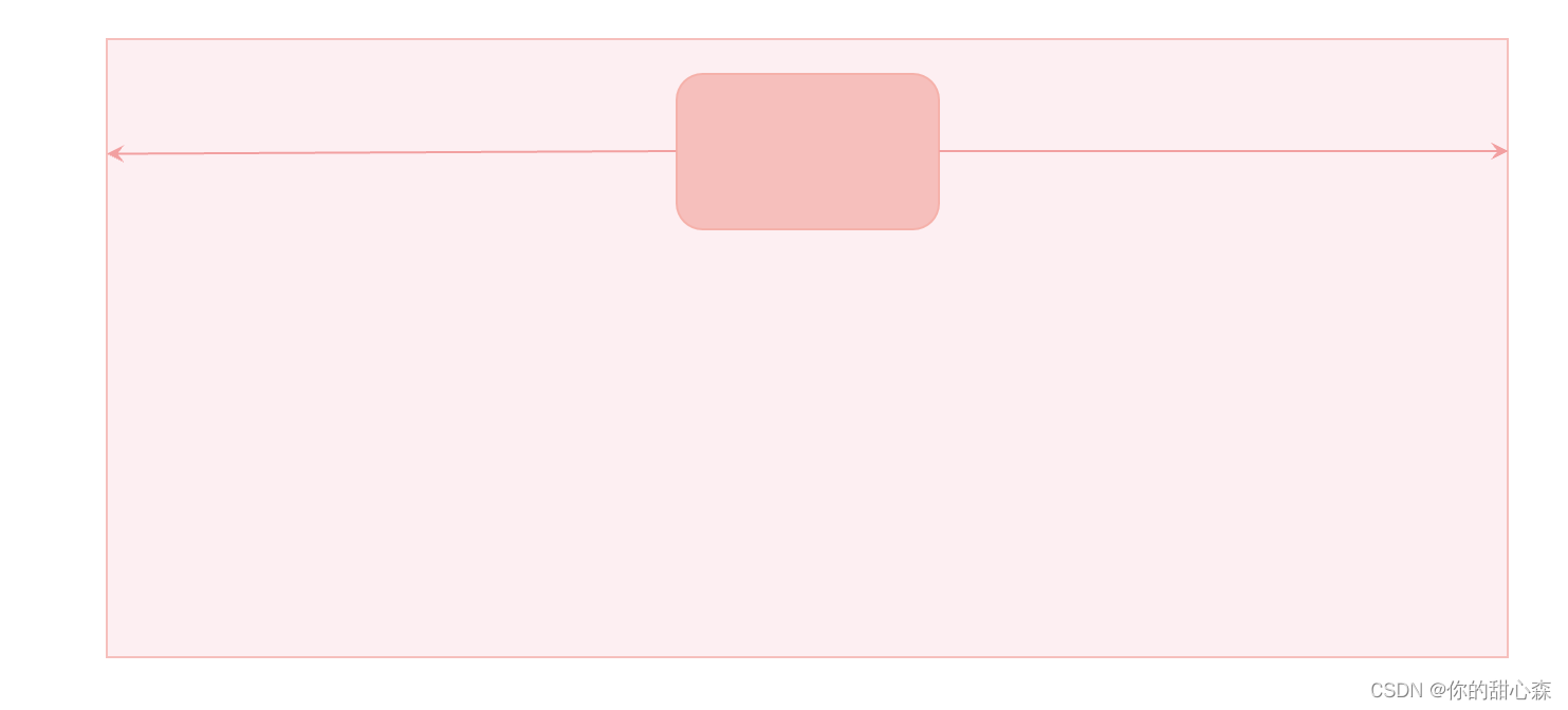
水平居中布局要求:假设容器的宽度为 x x x,中间内容的宽度为 y y y,则左边空余宽度=右边空余宽度= ( x − y ) / 2 (x-y)/2 (x−y)/2,如下图所示:
方法一、margin: auto;
    <style>
      .box {


        height: 50vh;
        background-color: #fdeff2;
      }

      .content {


        width: 150px;
        height: 100px;
        background-color: #f6bfbc;

        margin: 0 auto; /*居中*/
      }
    </style>

    <div class="box">
      <div class="content"></div>
    </div>
【要点解读】水平居中的含义:当容器宽度比内容大的时候,“居中”才有意义,因此使用此方法的前提是内容的宽度比容器的宽度小。
【易错点】对和容器宽度相等的内容使用 margin:auto;,例如容器是浮动盒子时,脱流的定位容器。
【原理】margin 的 auto 值等于剩余空间的宽度,写 margin-left: auto;内容会被顶到右边,如果同时设置左右 margin: 0 auto; 则左右平分剩余空间。
【技巧】margin: 0 auto; 可以简写成:margin: auto; 因为当 margin-top 或 margin-bottom 为 auto 时值为 0 ,除非脱离文档流。
方法二、弹性盒子
    <style>
      .box {


        height: 150px;
        background-color: #fdeff2;
        display: flex;
        justify-content: center; /*居中*/
      }

      .content {


        width: 150px;
        height: 100px;
        background-color: #f6bfbc;
      }
    </style>

    <div class="box">
      <div class="content"></div>
    </div>
【解读】弹性盒子有专门的居中方案:即在主轴与交叉轴方向设置 center。
方法三、text-align: center
当内容是非块级元素时,使用 text-align:center; 可以实现居中效果:
    <style>
      ul {


        text-align: center;

        /* 其他样式 */
        line-height: 40px;
        list-style: none;
        margin: 0;
        padding: 0;
        background-color: #fdeff2;
      }

      ul li {


        display: inline-block;

        /* 其他样式 */
        background-color: #f6bfbc;
        padding: 8px 16px;
      }
    </style>
    <ul>
      <li>首页</li>
      <li>关于</li>
      <li>产品</li>
    </ul>

【要点解读】text-align 的方法经常在文本居中时使用,并且该属性具有继承性,使用起来非常方便。用于布局时,常用语导航条内的链接居中,把 li 设置成 inline-block 然后居中即可。
【易错点】没有分清容器与内容,把 inline-block 设置到容器元素上了。
【易错点】对宽度与内容相等的容器使用,例如浮动的容器。
方法四、定位实现
    <style>
      .box {


        height: 200px;
        background-color: #fdeff2;

        position: relative;
      }

      .content {


        width: 150px;
        height: 100px;
        background-color: #f6bfbc;

        /* 定位实现水平居中
        1. left=right
        2. 剩余空间的宽度大于零
        3. 内容宽度已知
        */
        position: absolute;
        left: 0;
        right: 0;
        margin: auto;
      }
    </style>

    <div class="box">
      <div class="content"></div>
    </div>
【要点解读】设置左右距离相等,然后设置 margin: auto;
【易错点】需要知道内容的宽度,如果不设置内容的宽度,则铺满容器。
小结
这么多水平居中的方法,你学会了了吗?
【练习】请说出几种水平居中的方法,各有何优缺点?
垂直居中
方法一、line-height 实现文字垂直居中
思路:把 line-height 设置成容器的高度,即可实现文字居中。
<style>
  .box {


    height: 50px;
    background-color: #fdeff2;
  }

  .content {


    line-height: 50px;
    background-color: #f6bfbc;
    color: #b94047;
  }
</style>

<div class="box">
  <div class="content">你猜我居中了没</div>
</div>

方法二、vertical-align 实现图片文字居中
    <style>
      .box {


        line-height: 50px;
        background-color: #fdeff2;
        color: #b94047;
      }

      .box img {


        height: 30px;
        vertical-align: middle;
      }

      .box span {


        vertical-align: middle;
      }
    </style>

    <div class="box">
      <img src="https://s1.52poke.wiki/wiki/thumb/5/53/054Psyduck.png/300px-054Psyduck.png" alt="图不见了" />
      <span>这可怎么居中呀</span>
    </div>

【要点】该方法只能用于具有行内性质的元素,并且内容的高度小于 line-height 的时候有效。
方法三、弹性盒子
弹性盒子轻轻松松就能实现垂直居中:
    <style>
      .box {


        height: 50px;
        display: flex;
        align-items: center;

        background-color: #fdeff2;
        color: #b94047;
      }

      .box img {


        height: 30px;
      }
    </style>

    <div class="box">
      <img src="https://s1.52poke.wiki/wiki/thumb/5/53/054Psyduck.png/300px-054Psyduck.png" alt="图不见了" />
      <span>这可怎么居中鸭</span>
    </div>

【要点解读】使用 align-items:center; 可实现垂直居中,使用 justify-content:center; 可以实现水平居中。更为准确的说法是:align-items:center; 实现交叉轴方向的居中,justify-content:center; 实现主轴方向的居中,主轴方向由 flex-direction声明,默认为从左到右。
【易错点】只有容器的高度比内容大时,才能实现垂直居中。
方法四、定位实现垂直居中
    <style>
      .box {


        height: 100px;
        background-color: #fdeff2;

        position: relative;
      }

      .content {


        width: 20px;
        height: 50px;
        background-color: #f6bfbc;

        /* 定位实现垂直居中
        1. top=bottom, 设置 margin: auto;
        2. 剩余空间的高度大于零
        3. 内容高度已知
        */
        position: absolute;
        right: 20px;
        top: 0;
        bottom: 0;
        margin: auto;
      }
    </style>

    <div class="box">
      <div class="content"></div>
    </div>

【要点解读】设置上下距离相等,然后设置 margin: auto; 即可实现,这种方法多用于右侧工具栏布局。
定位还有另外一种方法,平移法:
    <style>
      .box {


        height: 100px;
        background-color: #fdeff2;

        position: relative;
      }

      .content {


        width: 20px;
        height: 50px;
        background-color: #f6bfbc;

        /* 定位实现垂直居中
        1. 先让上边界居中,然后用平移调整
        2. 剩余空间的高度大于零
        3. 内容高度已知
        */
        position: absolute;
        right: 20px;
        top: 50%;
        transform: translateY(-50%);
      }
    </style>

    <div class="box">
      <div class="content"></div>
    </div>
小结
垂直居中是网页布局常用的方法,垂直居中比水平居中会麻烦一点点。不过有了弹性盒子之后,一切都变得简单了,毕竟弹性盒子专门为布局而生。
【练习】请说出几种垂直居中的方法,并说说各有何优缺点?
两栏布局
如下图所示,两栏布局要求:
1)左侧宽度固定
2)右侧占据剩余宽度
3)左侧不随着右侧内容滚动

两栏布局常用于后台管理系统,左侧是多级导航菜单,右侧是系统详情。也常用于文档系统,左侧是多级目录,右侧是文档内容。
方法一、使用定位实现两栏布局
    <style>
      body {


        margin: 0;
      }

      .home-side {


        /* 实现固定侧边栏
         * 必须同时设置 top 和 bottom
        */
        position: fixed;
        top: 0;
        bottom: 0;

        /* 设置侧边栏宽度 */
        width: 200px;

        /* 设置内容溢出滚动效果 */
        overflow-y: auto;
      }

      .side-content {


        width: 100%;
        height: 120vh;
        background-color: #e9dfe5;
      }

      .home-main {


        /* 使用左外边距留出侧边栏宽度 */
        margin-left: 200px;

        background-color: #f5b1aa;
        height: 200vh;
      }
    </style>
    <div class="home">
      <aside class="home-side">
        <div class="side-content"></div>
      </aside>
      <main class="home-main"></main>
    </div>
【要点】
1)使用固定定位使得侧边栏固定在左侧,要让侧边栏可以滚动,还必须同时设置 top 与 bottom 与 overflow 属性。
2)使用 margin 或 paddding 为内容留出侧边栏的内容。
实现效果:

如果放弃第三个条件:即侧边栏可以随着内容滚动,那么布局的方法就会很多:
方法二、弹性布局
    <style>
      body {


        margin: 0;
      }

      .home {


        display: flex;
      }

      .home-side {


        width: 200px;
        flex-shrink: 0; /*不允许收缩*/
      }

      .home-main {


        flex-grow: 1; /*占据剩余空间*/

        background-color: #f5b1aa;
        height: 200vh;
      }

      .side-content {


        width: 100%;
        height: 120vh;
        background-color: #e9dfe5;
      }
    </style>

    <div class="home">
      <aside class="home-side">
        <div class="side-content"></div>
      </aside>
      <main class="home-main"></main>
    </div>
【要点解读】关键代码就四行:
      .home {


        display: flex;
      }

      .home-side {


        width: 200px;
        flex-shrink: 0; /*不允许收缩*/
      }

      .home-main {


        flex-grow: 1; /*占据剩余空间*/
	  }
【优点】简单易懂。
【缺点】不能实现侧边栏固定。
【技巧】flex:1; 等价于 flex-grow:1;
可改变宽度的侧边栏布局
不用 JavaScript 无法实现可改变宽度的固定侧边栏,这里贴一个案例仅供参考:
    <style>
      body {


        margin: 0;
      }

      :root {


        --sidebar-width: 200px;
      }

      .home-side {


        /* 实现固定侧边栏
         * 必须同时设置 top 和 bottom
        */
        position: fixed;
        top: 0;
        bottom: 0;

        box-sizing: border-box;
        /* 设置侧边栏宽度 */
        width: var(--sidebar-width);
      }

      .side-resizer {


        position: absolute;
        right: 0;
        top: 0;
        bottom: 0;

        cursor: ew-resize;
        background-color: transparent;
        width: 5px;
      }

      .side-resizer:hover,
      .side-resizer:active {


        border-right: 1px dashed #43676b;
      }

      .side-scroll-box {


        position: absolute;
        top: 0;
        bottom: 0;
        left: 0;
        right: 0;
        overflow-y: auto;

        /* 火狐浏览器滚动条样式 */
        scrollbar-color: #bfbfbf rgb(239, 239, 239);
        scrollbar-width: thin;
      }

      /*滚动条样式*/
      .side-scroll-box::-webkit-scrollbar {


        width: 5px;
      }

      .side-scroll-box::-webkit-scrollbar-track {


        background: rgb(239, 239, 239);
        border-radius: 2px;
      }

      .side-scroll-box::-webkit-scrollbar-thumb {


        background: #bfbfbf;
        border-radius: 10px;
      }

      /* 拖动的时候禁用选择 */
      .sidebar-resizing {


        -moz-user-select: none;
        -webkit-user-select: none;
        -ms-user-select: none;
        user-select: none;
      }

      .side-content {


        height: 120vh;
        background-color: #e9dfe5;
      }

      .home-main {


        /* 使用左外边距留出侧边栏宽度 */
        margin-left: var(--sidebar-width);

        background-color: #f5b1aa;
        height: 200vh;
      }
    </style>

    <div class="home">
      <aside class="home-side" id="sidebar">
        <div class="side-scroll-box">
          <div class="side-content"></div>
        </div>
        <div class="side-resizer" id="sidebar-resizer"></div>
      </aside>
      <main class="home-main"></main>
    </div>

    <script>
      const html = document.querySelector("html");
      const sidebarResizer = document.getElementById("sidebar-resizer");
      const sidebar = document.getElementById("sidebar");
      sidebarResizer.addEventListener("mousedown", initResize, false);

      function initResize(e) {


        window.addEventListener("mousemove", resize, false);
        window.addEventListener("mouseup", stopResize, false);
        html.classList.add("sidebar-resizing");
      }

      function resize(e) {


        var pos = e.clientX - sidebar.offsetLeft;
        pos = Math.min(pos, window.innerWidth - 100);
        document.documentElement.style.setProperty("--sidebar-width", pos + "px");
      }

      //on mouseup remove windows functions mousemove & mouseup
      function stopResize(e) {


        html.classList.remove("sidebar-resizing");
        window.removeEventListener("mousemove", resize, false);
        window.removeEventListener("mouseup", stopResize, false);
      }
    </script>
【要点解读】可调节宽度的侧边栏表面上看起来挺难的,但涉及到的技术细节还是挺多的:
-
固定双栏布局
-
CSS 变量:
--sidebar-width -
滚动条样式调整
-
调整宽度的相关事件。
三栏布局与粘性定位
三栏布局的使用场景一般是文章详情,一边是分享、点赞等操作,另一边是推荐,目录,广告等内容。其实三栏布局也不难:可以先实现两栏布局,然后再实现三栏布局。本案例除了给大家展示三栏布局效果,还给大家展示粘性布局的效果,这个功能你用上了根本就停不下来:
    <style>
      .home {


        display: flex;
        align-items: flex-start;
      }

      .left {


        width: 200px;
        flex-shrink: 0;

        background-color: #b98c46;
        height: 80vh;
        margin-right: 20px;
      }

      .right {


        width: 200px;
        flex-shrink: 0;
      }

      .main {


        flex: 1;
        display: flex;
      }

      .content {


        flex: 1;
        background-color: #8b968d;
        height: 300vh;
      }

      .box1 {


        width: 200px;
        flex-shrink: 0;
        height: 50vh;
        background-color: #aa4c8f;
        margin: 20px 20px;
      }

      .box2 {


        width: 200px;
        flex-shrink: 0;
        height: 30vh;
        background-color: #7a4171;
        margin: 20px 20px;

        position: sticky;
        top: 20px;
      }
    </style>

    <div class="home">
      <div class="left"></div>
      <div class="main">
        <div class="content"></div>
        <div class="right">
          <div class="box1"></div>
          <div class="box2"></div>
        </div>
      </div>
    </div>
效果:

【要点解读】
- 结构:中间是很长的内容,右边是广告(淡紫色)和目录(深紫色)
- 滚动条向下滑动的时候目录区域会吸附在顶部。吸附效果使用
position: sticky;实现,目前主流的浏览器支持良好1。
瀑布流布局
瀑布流布局常用于图片类型的网站,例如:堆糖网。瀑布流布局有一个专业的英文名称 Masonry Layouts。瀑布流又称瀑布流式布局,是比较流行的一种网站页面布局方式。2。
瀑布流布局特点:
1、因为瀑布流有吸引力,瀑布流会在它的页面底部给你不断地加载新的信息,,通过给出不完整的视觉图片去吸引你的好奇心,让你停不下来想要不断的向下探索。采用这种方案的产品,往往可以通过瀑布流加强用户的停留时间,提高用户的使用粘度。
2、用户一扫而过的快速阅读模式,短时间内可以看到大量的信息,瀑布流的懒加载模式,又避免点击的的翻页操作,在最小的操作成本下能够获得最多的内容体验,瀑布流的视觉方式,让人容易沉浸其中,不容易被打断。
3、另外瀑布流的主要特质就是:定宽而不定高,这样的页面设计区别于传统的矩阵式图片布局模式,巧妙的利用视觉层级,视线的任意流动来缓解视觉的疲劳。
瀑布流更适合那些随意浏览,不带目的性的使用场景,就像是在逛街一样,边走边看,同时被街边琳琅满目的商品吸引着,所以比较适合的图片、小说、资讯类的场景,以现有的成功案例来说,以 UGC 为主的相关网站很多在使用瀑布流进行承载。

方法一、JavaScript 实现
目前还没有完美的纯CSS实现方法,成熟的解决方案需要 JavaScript 参与实现3。
<style>
      .waterfall {


        position: relative;
      }
      .waterfall-item {


        position: absolute;
        width: 23%;
        height: 100px;
        background: rgb(236, 146, 10);
        margin-bottom: 10px;
        display: flex;
        justify-content: center;
        align-items: center;
        transition: all 0.1s;
      }

      .num {


        font-size: 18px;
        color: #fff;
        border-radius: 100%;
        width: 25px;
        height: 25px;
        line-height: 25px;
        text-align: center;
        border: 1px solid #fff;
      }
      .btn {


        text-align: center;
        font-size: 15px;
        color: #400eff;
        cursor: pointer;
        position: absolute;
        bottom: 10px;
        left: 50%;
      }
    </style>
    <div id="waterfall" class="waterfall"></div>
    <script>
      class WaterFall {


        constructor(container, options) {


          this.gap = options.gap || 0;
          this.container = container;
          this.items = container.children || [];
          this.heightArr = [];
          this.renderIndex = 0;
          window.addEventListener("resize", () => {


            this.renderIndex = 0;
            this.heightArr = [];
            this.layout();
          });
          this.container.addEventListener("DOMSubtreeModified", () => {


            this.layout();
          });
        }

        layout() {


          if (this.items.length === 0) return;
          const gap = this.gap;
          const pageWidth = this.container.offsetWidth;
          const itemWidth = this.items[0].offsetWidth;
          const columns = Math.floor(pageWidth / (itemWidth + gap)); // 总共有多少列

          while (this.renderIndex < this.items.length) {


            let top, left;
            if (this.renderIndex < columns) {


              // 第一行
              top = 0;
              left = (itemWidth + gap) * this.renderIndex;
              this.heightArr.push(this.items[this.renderIndex].offsetHeight);
            } else {


              const minIndex = this.getMinIndex(this.heightArr);
              top = this.heightArr[minIndex] + gap;
              left = this.items[minIndex].offsetLeft;
              this.heightArr[minIndex] += this.items[this.renderIndex].offsetHeight + gap;
            }
            this.container.style.height = this.getMaxHeight(this.heightArr) + "px";
            this.items[this.renderIndex].style.top = top + "px";
            this.items[this.renderIndex].style.left = left + "px";
            this.renderIndex++;
          }
        }

        getMinIndex(heightArr) {


          let minIndex = 0;
          let min = heightArr[minIndex];
          for (let i = 1; i < heightArr.length; i++) {


            if (heightArr[i] < min) {


              min = heightArr[i];
              minIndex = i;
            }
          }
          return minIndex;
        }

        getMaxHeight(heightArr) {


          let maxHeight = heightArr[0];
          for (let i = 1; i < heightArr.length; i++) {


            if (heightArr[i] > maxHeight) {


              maxHeight = heightArr[i];
            }
          }
          return maxHeight;
        }
      }

      window.onload = function () {


        const waterfall = document.getElementById("waterfall");
        const water = new WaterFall(waterfall, {

       gap: 10 });
        water.layout();
      };
    </script>

    <script>
      var index = 0;
      const waterfall = document.getElementById("waterfall");
      function getData(num = 5) {


        return new Promise((resolve, reject) => {


          setTimeout(() => {


            const fragment = document.createDocumentFragment();
            for (let i = 0; i < num; i++) {


              const div = document.createElement("div");
              const numDiv = document.createElement("div");
              div.className = "waterfall-item";
              numDiv.className = "num";
              numDiv.textContent = index + 1;
              index++;
              div.appendChild(numDiv);
              div.style.height = getRandomHeight(4, 1) + "px";
              fragment.appendChild(div);
            }
            waterfall.appendChild(fragment);
            resolve();
          }, 1000);
        });
      }

      getData(20);

      var loading = false;
      window.onscroll = async function () {


        const scrollTop = document.documentElement.scrollTop; // 滚动条位置
        const clientHeight = document.documentElement.clientHeight;
        const scrollHeight = document.body.scrollHeight; // 完整高度
        if (scrollTop + clientHeight >= scrollHeight && !loading) {


          loading = true;
          await getData();
          loading = false;
        }
      };

      function getRandomHeight(max = 5, min = 1) {


        return (Math.floor(Math.random() * (max - min + 1)) + min) * 100;
      }
    </script>
方法二、未来的方法4
.container {


  display: grid;
  grid-template-columns: repeat(4, 1fr);
  grid-template-rows: masonry;
}
参考文章
♥ 我是前端工程师:你的甜心森。非常感谢大家的点赞与关注,欢迎大家参与讨论或协作,QQ交流群:233589794。
★ 本文开源,采用 CC BY-SA 4.0 协议,转载请注明出处:前端工程师的自我修养. GitHub.com@xiayulu.
★ 创作合作或招聘信息请发私信或邮件:[email protected],注明主题:创作合作或招聘前端工程师。
古兰精. 浅析瀑布流布局原理及实现方式. 博客园. ↩︎
高级前端小白. 干货!纯js封装瀑布流布局插件. 稀土掘金. ↩︎
MDN. Masonry layout. ↩︎