heml和body元素的默认高度
html与body都是块元素,它们的默认宽度是浏览器可视区域的宽度,而它们的默认高度则有两种:
1.在带DOCTYPE声明的html文档中,html与body的默认高度为0,它们的高度来自于它们包含的内容。常见
<!DOCTYPE html>
<html id="html">
<head>
<style>
* {
padding: 0;
margin: 0;
}
html{
background:black;
}
p{
height:20px;
background:red;
}
</style>
</head>
<body id="body">
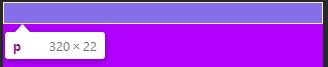
<p></p>
</body>
</html>
<html id="html">
<head>
<style>
* {
padding: 0;
margin: 0;
}
html{
background:black;
}
p{
height:20px;
background:red;
}
</style>
</head>
<body id="body">
<p></p>
</body>
</html>
<script>
window.onload = function () {
console.log(window.getComputedStyle(document.querySelector("#html")).height);//20px
console.log(window.getComputedStyle(document.querySelector("#body")).height);//20px
}
</script>
window.onload = function () {
console.log(window.getComputedStyle(document.querySelector("#html")).height);//20px
console.log(window.getComputedStyle(document.querySelector("#body")).height);//20px
}
</script>
2.在不带DOCTYPE声明的html文档中,html与body的默认高度是浏览器客户区可见的高度。不常见
p{
height:20px;
background:red;
}
height:20px;
background:red;
}
window.onload = function () {
console.log(window.getComputedStyle(document.querySelector("#html")).height);//635px
console.log(window.getComputedStyle(document.querySelector("#body")).height);//635px
}
但是如果内容的高度大于html与body的默认高度,那么html与body的高度来自于它们包含的内容。
p{
height:2000px;
background:red;
}
window.onload = function () {
console.log(window.getComputedStyle(document.querySelector("#html")).height);//2000px
console.log(window.getComputedStyle(document.querySelector("#body")).height);//2000px
}
height:2000px;
background:red;
}
window.onload = function () {
console.log(window.getComputedStyle(document.querySelector("#html")).height);//2000px
console.log(window.getComputedStyle(document.querySelector("#body")).height);//2000px
}
body的background属性
body{
background:#b200ff;
}
p{
height:20px;
border:1px solid #fff;
}
<body id="body">
<p></p>
</body>
background:#b200ff;
}
p{
height:20px;
border:1px solid #fff;
}
<body id="body">
<p></p>
</body>
body的背景色很特殊,它的背景色是应用给整个文档而不是自己,它的高度只有它所包含的内容那么高

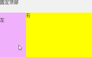
全屏幕布局
全屏幕布局指的是浏览器只显示在客户区可视区域内的内容,其它不在可视区的元素全部隐藏,这样就不会出现滚动条,然后通过js插件(isicroll)的上推下拉、左右滑动来控制余下内容的显示。像这种全屏幕布局,首先就需要用css控制html与body的高度。在DOCTYPE声明的html文档中,html节点的高度来自于它的内容,但你可以手动设定它的高=屏幕可视区域的高。
<!DOCTYPE html>
<html>
<head>
<meta charset="utf-8" />
<title></title>
<meta name="viewport" content="width=device-width,initial-scale=1.0,user-scalable=0" />
<style>
* {
margin: 0;
padding: 0;
-webkit-box-sizing: border-box;
}
html, body {
height: 100%;
}
.containner-box {
width: 100%;
height: 100%;
background: #bceafe;
}
/*顶部搜索栏脱离标准流,containner-box的高度不再包含搜索栏的高度*/
.product-search-box {
width: inherit;
height: 45px;
position: fixed;
background: #F1F1F1;
}
.product-search-box a:first-child {
position: absolute;
top: 22.5px;
margin-top: -8px;
left: 5px;
}
.product-search-box a:last-child {
position: absolute;
top: 22.5px;
margin-top: -8px;
right: 8px;
}
.product-search-box form {
width: inherit;
height: inherit;
padding: 0 30px;
}
.product-search-box input {
width: inherit;
height: 32px;
margin-top: 6.5px;
border-radius: 3px;
border: 1px solid #DDDDDD;
}
.product-content {
width: 100%;
height: 100%; /*跟文档区域一样高*/
background: #ff6a00;
padding-top: 45px; /*padding一下避免被搜索栏挡住*/
}
.product-content .f_left, .product-content .f_right {
height: 100%;
}
/*左部导航浮动后脱离正常文档流*/
.product-content .left {
width: 90px;
height: 100%;
float: left;
overflow:hidden;
background: #f0b0fc;
}
/*左部因为浮动,此元素宽度默认占满父元素,*/
.product-content .right {
height: 100%;
overflow: hidden; /*设hidden,以便是浮动元素不会覆盖住当前元素*/
background: yellow;
}
</style>
</head>
<body>
<div class="containner-box">
<div class="product-search-box">
固定顶部
</div>
<div class="product-content">
<div class="left">
<div style="height:2000px;width:1000px;">
左
</div>
</div>
<div class="right">
<div style="height:2000px;width:1000px;">右</div>
</div>
</div>
</div>
</body>
</html>
<script src="Scripts/iscroll.js"></script> 需要用到这个插件
<script>
window.onload = function () {
var leftBox = document.querySelector('.left');
console.log(leftBox);
leftBox.addEventListener('touchmove', function (e) {
e.preventDefault();
});
var rightBox = document.querySelector('.right');
rightBox.addEventListener('touchmove', function (e) {
e.preventDefault();
});
//容器内上下左右滚动
//子容器尺寸大于父容器,哪怕只大1px也支持滚动,子元素必须大于
new IScroll(leftBox, {
scrollX: true,
scrollY: true
});
new IScroll(rightBox, {
scrollX: true,
scrollY: true
});
}
</script>
扫描二维码关注公众号,回复:
6570088 查看本文章
