如果对3D转换不熟悉可以先看:CSS – CSS3中3D转换相关属性讲解(translate3d,rotate3d,perspective,transform-style)
两面翻转的盒子,鼠标悬浮盒子自动翻转效果
<!DOCTYPE html>
<html lang="en">
<head>
<meta charset="UTF-8" />
<meta http-equiv="X-UA-Compatible" content="IE=edge" />
<meta name="viewport" content="width=device-width, initial-scale=1.0" />
<title>Document</title>
<style>
body {
/* perspective: 300px; */
}
.box {
position: relative;
margin: 100px auto;
width: 200px;
height: 200px;
/* perspective: 300px; */
transition: all 0.7s;
transform-style: preserve-3d;
}
.box:hover {
transform: rotateY(180deg);
}
.box div {
position: absolute;
top: 0px;
left: 0px;
width: 100%;
height: 100%;
border-radius: 50%;
font-size: 30px;
color: #fff;
text-align: center;
line-height: 200px;
}
.box .front {
background-color: orange;
transform: translateZ(1px);
}
.box .back {
background-color: rgb(96, 131, 206);
transform: rotateY(180deg);
}
</style>
</head>
<body>
<div class="box">
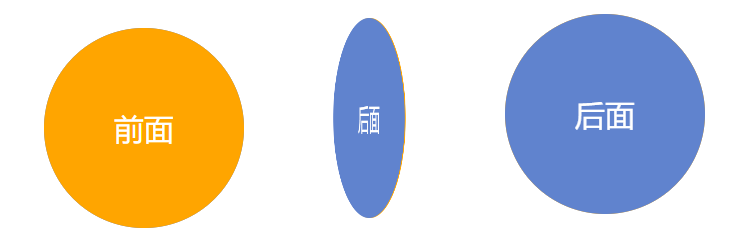
<div class="front">前面</div>
<div class="back">后面</div>
</div>
</body>
</html>