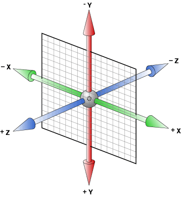
3D transform中有下面这几个属性:
- rotateX(deg),rotateY(deg),rotateZ(deg)分别代表围绕X轴,Y轴,Z轴旋转。
- translateX(px), translateY(px), translateZ(px)分别代表围绕X轴,Y轴,Z轴位移。
- transform-style: 使被转换的子元素保留其 3D 转换。
- perspective:定义 3D 元素距视图的距离,以像素计。当为元素定义 perspective 属性时,其子元素会获得透视效果,而不是元素本身。
旋转木马实现
1. 搭建舞台,加个视距 perspective: 600px;
<style>
    .stage {
        height: 200px;
        width: 200px;
        margin: 0 auto;
        position: relative;
        margin-top: 300px;
        perspective: 600px;
        perspective-origin: 50%;
    }
</style>
<div class="stage"></div>
2. 添加容器,加个3D视图声明。
transform-style: preserve-3d;
3. 添加图片,这里用div代替图片位置。我们让所有图片position:absolute,公用同一个中心点。
.stage div.wrap {
        width: 100%;
        height: 100%;
        transform-style: preserve-3d;
        position: absolute;
    }
    .stage div.wrap div {
        width: 200px;
        height: 100%;
        background: #E00808;
        position: absolute;
    }
    .stage div.wrap div:nth-child(1) {
        background: #333;
        transform: rotateY(0deg);
    }
    .stage div.wrap div:nth-child(2) {
        background: #555;
        transform: rotateY(60deg);
    }
    .stage div.wrap div:nth-child(3) {
        background: #777;
        transform: rotateY(120deg);
    }
    .stage div.wrap div:nth-child(4) {
        background: #999;
        transform: rotateY(180deg);
    }
    .stage div.wrap div:nth-child(5) {
        background: #101010;
        transform: rotateY(240deg);
    }
    .stage div.wrap div:nth-child(6) {
        background: #001afe;
        transform: rotateY(300deg);
    }
4. 加上translateZ拉开空间
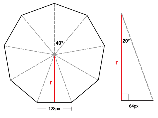
上图中红色标注的r就是的demo页面中图片要translateZ的理想值(该值可以让所有图片无缝围成一个圆)!
r的计算很简单:
r = (div的一半宽度)/ Math.tan(角度 / 180 * Math.PI) 如上图则 r = 64 / Math.tan(20 / 180 * Math.PI) = 175
因为我用了6个div,div宽度为200px,所以本例的 r 计算为
100 / Math.tan(30 / 180 * Math.PI) = 173所以最终为:
.stage div.wrap div {
        width: 200px;
        height: 100%;
        background: #E00808;
        position: absolute;
    }
    .stage div.wrap div:nth-child(1) {
        background: #333;
        transform: rotateY(0deg) translateZ(193px);
    }
    .stage div.wrap div:nth-child(2) {
        background: #555;
        transform: rotateY(60deg) translateZ(193px);
    }
    .stage div.wrap div:nth-child(3) {
        background: #777;
        transform: rotateY(120deg) translateZ(193px);
    }
    .stage div.wrap div:nth-child(4) {
        background: #999;
        transform: rotateY(180deg) translateZ(193px);
    }
    .stage div.wrap div:nth-child(5) {
        background: #101010;
        transform: rotateY(240deg) translateZ(193px);
    }
    .stage div.wrap div:nth-child(6) {
        background: #001afe;
        transform: rotateY(300deg) translateZ(193px);
    }
整合代码
<!DOCTYPE html>
<html lang="en">
<head>
    <meta charset="UTF-8">
    <title>carousel</title>
</head>
<style>
    .stage {
        height: 200px;
        width: 200px;
        margin: 0 auto;
        position: relative;
        margin-top: 300px;
        perspective: 600px;
        perspective-origin: 50%;
    }
    .stage div.wrap {
        width: 100%;
        height: 100%;
        transform-style: preserve-3d;
        position: absolute;
    }
    .stage div.wrap div {
        width: 200px;
        height: 100%;
        background: #E00808;
        position: absolute;
    }
    .stage div.wrap div:nth-child(1) {
        background: #333;
        transform: rotateY(0deg) translateZ(193px);
    }
    .stage div.wrap div:nth-child(2) {
        background: #555;
        transform: rotateY(60deg) translateZ(193px);
    }
    .stage div.wrap div:nth-child(3) {
        background: #777;
        transform: rotateY(120deg) translateZ(193px);
    }
    .stage div.wrap div:nth-child(4) {
        background: #999;
        transform: rotateY(180deg) translateZ(193px);
    }
    .stage div.wrap div:nth-child(5) {
        background: #101010;
        transform: rotateY(240deg) translateZ(193px);
    }
    .stage div.wrap div:nth-child(6) {
        background: #001afe;
        transform: rotateY(300deg) translateZ(193px);
    }

</style>
<body>
<div class="stage">
    <div class="wrap">
        <div></div>
        <div></div>
        <div></div>
        <div></div>
        <div></div>
        <div></div>
    </div>
</div>
</body>
</html>