最近组长要我研究一个开源网站的前端效果,其中有一个弧形旋转的动画,研究了下可以使用css里面的transform+animation组合实现。
先上效果图(忽略水印。。。视频转gif免费版的都有好大的水印)

就是这样一个外圈有渐变移动的动画
实现步骤:
一、html代码:
<div class="bj">
      <div class="bjzhuan"></div>//旋转的盒子
      <div class="hidBox"></div>//遮蔽的盒子
</div>
二、css代码:
1、先设置最外层盒子的背景
.bj {
  width: 600px;
  height: 600px;
  background-image: url("../../../public/bj.svg");
  background-repeat: no-repeat;
  background-size: 100%;
  display: flex;
  align-items: center;
  position: relative;
}
就是这样一个svg的图片

2、设置需要旋转的盒子
.bjzhuan {
  position: absolute;//设置绝对定位
  width: 600px;
  height: 300px;
  top: 0;
  left: 0;
  will-change: transform;//提高浏览器的页面渲染性能
  transform-origin: 50% 100%;//设置旋转中心,这里设置成该盒子(bjzhuan)宽的一半,高的全部,刚好就是父盒子(bj)的中心
  border-radius: 50% 50% 0 0/100% 100% 0 0;//为元素添加圆角边框,前的四个数值表示圆角的水平半径,后面四个值表示圆角的垂直半径
  background-image: linear-gradient(
    60deg,
    rgba(109, 207, 251, 0) 0%,
    rgba(109, 207, 251, 0.2) 40%,
    rgba(109, 207, 251, 0) 100%
  );//实现渐变效果,60度
  clip-path: polygon(100% 0, 20% 0%, 50% 100%, 0 100%, 0 0);//实现不规则图形,这里是四个坐标点,用逗号分隔开
  -webkit-transform: rotate(360deg);//实现360度旋转
  animation: rotation 3s linear infinite;
  -moz-animation: rotation 3s linear infinite;
  -webkit-animation: rotation 3s linear infinite;
  -o-animation: rotation 3s linear infinite;
}
@-webkit-keyframes rotation {
  from {
    -webkit-transform: rotate(0deg);
  }

  to {
    -webkit-transform: rotate(360deg);
  }
}
此时的效果:
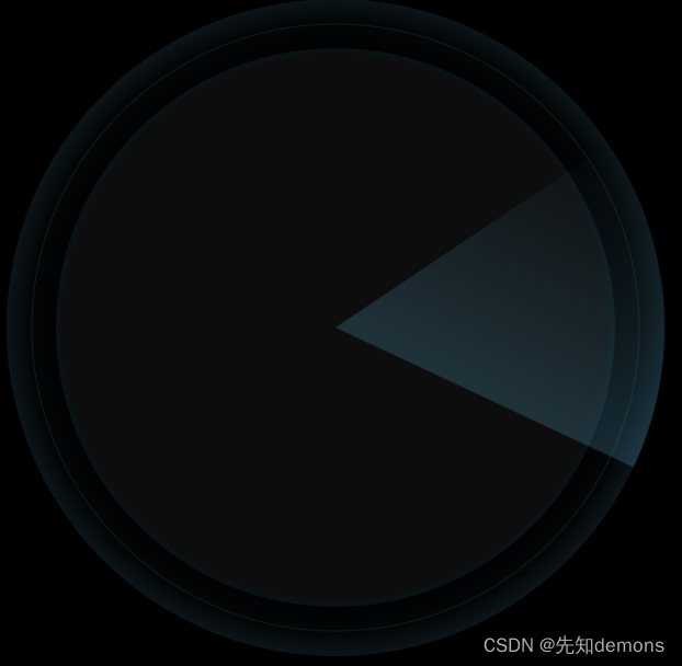
这样一个圆弧三角,并且是360度旋转的。(我这里只截了个图,转成gif又得注册。。)
3、最后再设置遮蔽盒子的css
.hidBox {
  height: 500px;
  width: 500px;
  position: absolute;
  background-color: #12131b;
  left: 50%;
  top: 50%;
  transform: translate(-50%, -50%);
  border-radius: 50%;
  z-index: 1;
}
这样里面的三角部分就被挡住了,就会实现想要的效果
大家有什么配置不懂的可以评论区留言,一起探讨