目录
概要
悬浮窗、悬浮按钮是项目中常见的一种交互设计,特别是在移动端上有着广泛的使用,可以进行一些重要信息展示或者提供便捷的交互操作,比如手机网速内存信息显示的悬浮窗,联系客服悬浮按钮,录制视频的开始或结束悬浮按钮,快速到页面顶部或者底部悬浮按钮等。本文将手把手教你封装一个可移动的悬浮框组件,利用悬浮窗在进阶封装一个可展开可移动的扇形悬浮按钮组件。本案例将以移动端为背景采用uniapp技术实现一个三端(H5、小程序、APP)通用的悬浮组件。
功能设计
- 悬浮窗在页面可视区域内根据手指触摸自由移动
- 悬浮窗各边缘跟可视区域边界相切,不能移出屏幕外
- 悬浮窗样式布局可自定义(按钮、长条风格等),内容可自定义(展示内容),初始化位置可自定义
H5、小程序、APP三端通用

技术实现分析
1.如何实现悬浮可移动,并禁止移出屏幕
答:首先悬浮框使用fixed布局,通过监听touchmove触摸移动事件实时获取当前位置坐标(x,y)动态设置组件的top和left值,组件就能跟着手触摸移动而移动。禁止移出屏幕需要结合组件本身宽高、屏幕宽高、计算出最大可移动距离,限制 top和left值范围。
<template>
	<view class="supenpopup"
		:style="{top:`${elTop}px`,left:`${elLeft}px`,width:`${width}rpx`,height:`${height}rpx`,zIndex}"
		@touchmove.prevent.stop="onTouchMove" @touchstart="onTouchStart">
      <!-- 插槽-自定义内容 -->
		<slot></slot>
	</view>
</template>
data() {
return {
elTop: 0, //组件距离顶部距离
elLeft: 0, //组件距离左边距离
windowHeight: 0, //窗口高度
windowWidth: 0, //窗口宽度
rate: 0, //px和rpx换算比例
windowTop: 0, //窗口距离屏幕顶部距离
startX: 0, //开始移动触摸点x坐标,相对页面左上角
startY: 0, //开始移动点触摸点y坐标,,相对页面左上角
startTop: 0, //悬浮框顶部距离顶部距离,小程序相对页面顶部,h5和app相对屏幕顶部
startLeft: 0, //悬浮窗左边距离页面左边距离
}
}, //开始移动
onTouchStart(e) {
//记录开始时候触摸点坐标
this.startX = e.touches[0].clientX;
this.startY = e.touches[0].clientY
//记录移动前组件位置
this.startTop = this.elTop
this.startLeft = this.elLeft
},
//移动中
onTouchMove(e) {
let x = e.touches[0].clientX;
let y = e.touches[0].clientY;
//忽略触摸屏幕最左边外面
if (x < 0) {
x = 0;
}
//当前组件距离左边位置=开始位置(x轴)+(当前触摸点x坐标-开始移动触摸点x坐标)
let elLeft = this.startLeft + (x - this.startX);
//悬浮窗右边限制移出屏幕外 this.rate单位换算比例,windowWidth单位px,width单位rpx
//屏幕宽度-组件宽度=组件最大向左可移动距离(elLeft)
//可移动范围elLeft值限制在0~(this.windowWidth - this.width / this.rate)范围内
elLeft = Math.min(elLeft, this.windowWidth - this.width / this.rate)
this.elLeft = elLeft > 0 ? elLeft : 0
//忽略触摸屏幕最顶部外面
if (y < 0) {
y = 0;
}
let elTop = this.startTop + (y - this.startY);
//悬浮窗限制移出屏幕底部
//可移动范围elTop值限制在this.windowTop~(this.windowHeight - this.height / this.rate + this.windowTop)范围内
elTop = Math.min(elTop, this.windowHeight - this.height / this.rate + this.windowTop)
//悬浮窗限制移到导航栏上或移出屏幕顶部
this.elTop = Math.max(elTop, this.windowTop)
},
2.悬浮窗自定义
答:通过组件的prop属性定义宽高、起始位置top和left值以及层级(z-index)可按需传入设置,内容样式(按钮风格、方形等)通过插槽保留自定义入口
props: {
//组件高,单位rpx
height: {
type: [String, Number],
default: 100
},
//组件宽,单位rpx
width: {
type: [String, Number],
default: 100
},
//起始位置距离顶部距离,单位rpx,auto:自动设置,将位于页面最顶端
top: {
type: [String, Number],
default: 'auto'
},
//起始位置距离左边距离,单位rpx,auto:自动设置,将位于页面最左边
left: {
type: [String, Number],
default: 'auto'
},
//层级
zIndex: {
type: Number,
default: 999
}
},3.多端兼容性
答:fixed布局在不同端相对基点位置是不一样的,H5、APP基点是在屏幕左上角(导航栏上)而小程序是页面左上角(导航栏下面)。而不管哪端touchmove获取到的坐标(clientX,clientY)相对基点是页面左上角,所以在设置H5、APP端的top值时候需要在加上导航栏底部到屏幕顶部距离而这个距离我们可以通过uni.getSystemInfo返回的windowTop字段获取(小程序该值为0),所以动态设置top值时候可以=组件当前位置+windowTop
fixed布局,top=60rpx在不同端的效果


created() {
uni.getSystemInfo({
success: res => {
this.windowWidth = res.windowWidth;//页面可视区域宽度
this.rate = 750 / this.windowWidth;//rpx和px转换比例
this.windowHeight = res.windowHeight;//页面可是区域高度
this.windowTop = res.windowTop;//页面距离窗口顶部距离
//设置初始位置,APP端和H5将基于屏幕最顶部定位,而小程序windowTop为0基于页面顶部
this.elTop = this.top === 'auto' ? this.windowTop : this.top / this.rate;
this.elLeft = this.left === 'auto' ? 0 : this.left / this.rate;
},
});
},技术细节-API回顾
@touchstart 事件
手指开始触摸元素触发
element.touchstart(options: Object): Promise<void>
options 字段定义如下:
| 字段 | 类型 | 说明 |
|---|---|---|
| touches | array | 触摸事件,当前停留在屏幕中的触摸点信息的数组 |
| changedTouches | array | 触摸事件,当前变化的触摸点信息的数组 |
touches对象定义如下:
| 字段 | 类型 | 说明 |
|---|---|---|
| identifier | Number | 触摸点的标识符 |
| pageX, pageY | Number | 距离文档左上角的距离,文档的左上角为原点 ,横向为X轴,纵向为Y轴 |
| clientX, clientY | Number | 距离页面可显示区域(屏幕除去导航条)左上角距离,横向为X轴,纵向为Y轴 |
@touchmove事件
手指在屏幕上滑动时候连续触发
element.touchmove(options: Object): Promise<void>
options 字段同 touchstart。
两个事件都会冒泡,取消冒泡可通过修饰符设置例如:@touchmove.prevent.stop
完整的代码实现(悬浮窗)
suspenPopup.vue
组件文件:
<!-- 悬浮窗 -->
<template>
<view class="supenpopup"
:style="{top:`${elTop}px`,left:`${elLeft}px`,width:`${width}rpx`,height:`${height}rpx`,zIndex}"
@touchmove.prevent.stop="onTouchMove" @touchstart="onTouchStart">
<!-- 插槽-自定义内容 -->
<slot></slot>
</view>
</template>
<script>
export default {
props: {
//组件高,单位rpx
height: {
type: [String, Number],
default: 100
},
//组件宽,单位rpx
width: {
type: [String, Number],
default: 100
},
//起始位置距离顶部距离,单位rpx,auto:自动设置,将位于页面最顶端
top: {
type: [String, Number],
default: 'auto'
},
//起始位置距离左边距离,单位rpx,auto:自动设置,将位于页面最左边
left: {
type: [String, Number],
default: 'auto'
},
//层级
zIndex: {
type: Number,
default: 999
}
},
data() {
			return {
				elTop: 0, //组件距离顶部距离
				elLeft: 0, //组件距离左边距离
				windowHeight: 0, //窗口高度
				windowWidth: 0, //窗口宽度
				rate: 0, //px和rpx换算比例
				windowTop: 0, //窗口距离屏幕顶部距离
				startX: 0, //开始移动触摸点x坐标,相对页面左上角
				startY: 0, //开始移动点触摸点y坐标,,相对页面左上角
				startTop: 0, //悬浮框顶部距离顶部距离,小程序相对页面顶部,h5和app相对屏幕顶部
				startLeft: 0, //悬浮窗左边距离页面左边距离
			}
		},
created() {
uni.getSystemInfo({
success: res => {
this.windowWidth = res.windowWidth;//页面可视区域宽度
this.rate = 750 / this.windowWidth;//rpx和px转换比例
this.windowHeight = res.windowHeight;//页面可是区域高度
this.windowTop = res.windowTop;//页面距离窗口顶部距离
//设置初始位置,APP端和H5将基于屏幕最顶部定位,而小程序windowTop为0基于页面顶部
this.elTop = this.top === 'auto' ? this.windowTop : this.top / this.rate;
this.elLeft = this.left === 'auto' ? 0 : this.left / this.rate;
},
});
},
methods: {
	//开始移动
			onTouchStart(e) {
			   //记录开始时候触摸点坐标
				this.startX = e.touches[0].clientX;
				this.startY = e.touches[0].clientY

				//记录移动前组件位置
				this.startTop = this.elTop
				this.startLeft = this.elLeft
			},
			//移动中
			onTouchMove(e) {
				let x = e.touches[0].clientX;
				let y = e.touches[0].clientY;
				//忽略触摸屏幕最左边外面
				if (x < 0) {
					x = 0;
				}

				//当前组件距离左边位置=开始位置(x轴)+(当前触摸点x坐标-开始移动触摸点x坐标)
				let elLeft = this.startLeft + (x - this.startX);

				//悬浮窗右边限制移出屏幕外 this.rate单位换算比例,windowWidth单位px,width单位rpx
				//屏幕宽度-组件宽度=组件最大向左可移动距离(elLeft)
				//可移动范围elLeft值限制在0~(this.windowWidth - this.width / this.rate)范围内
				elLeft = Math.min(elLeft, this.windowWidth - this.width / this.rate)
				this.elLeft = elLeft > 0 ? elLeft : 0

				//忽略触摸屏幕最顶部外面
				if (y < 0) {
					y = 0;
				}
				let elTop = this.startTop + (y - this.startY);

				//悬浮窗限制移出屏幕底部
				//可移动范围elTop值限制在this.windowTop~(this.windowHeight - this.height / this.rate + this.windowTop)范围内
				elTop = Math.min(elTop, this.windowHeight - this.height / this.rate + this.windowTop)
				//悬浮窗限制移到导航栏上或移出屏幕顶部
				this.elTop = Math.max(elTop, this.windowTop)

			},
},
}
</script>
<style lang="scss" scoped>
.supenpopup {
position: fixed;
z-index: 999;
}
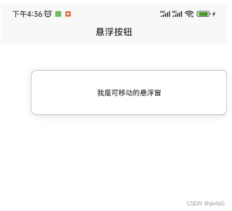
</style>index.vue
页面调用:
<template>
	<view>
         <!-- 悬浮窗 -->
		<suspenPopup top="auto" left="40" height="150" width="650">
			<view class="supen-popup">我是可移动的悬浮窗</view>
		</suspenPopup>
	</view>
</template>

<script>
	import suspenPopup from './component/suspenPopup.vue'
	export default {
		components: {
			suspenPopup,
		},


	}
</script>
<style lang="scss" scoped>
	.supen-popup {
		display: flex;
		justify-content: center;
		align-items: center;
		border-radius: 20rpx;
		box-sizing: border-box;
		background: white;
		box-shadow: 0 2px 12px 0 rgba(0, 0, 0, 0.1);
		border: 1px solid #aaa;
		font-size: 24rpx;
		width: 100%;
		height: 100%;
	}
</style>
运行效果

进阶封装——可移动扇形展开悬浮按钮
实现效果演示

需求分析
可以看到在未展开状态下就是一个悬浮窗,我们可以在之前封装好的悬浮窗基础上进行内容自定义。
整个组件一共由4个部分组成,中心按钮、顶部按钮、底部按钮、左边按钮,当未展开时候4个按钮重叠在一起中心按钮在最上面,
当点击中心按钮时候中心按钮不移动动只旋转一定角度,其他三个按钮类似发射效果,同时分别沿着不同角度做平移运动并且自身也在旋转,而再次点击中心按钮关闭时候跟打开是个逆过程。
扇形展开效果实际上就是一个简单的动画特效,以顶部按钮分析它的动画,移动轨迹分解为往上移动y距离,往左移动x距离,整个过程发射角度是不变的大约30-45度之间。实现这个动画我们很容易想到css属性transition,在配合绝对或者相对布局设置top和left即可
代码实现
<template>
	<suspenPopup >
		<!-- top按钮 -->
		<view :class="['button','top',btnClass]">
			<image class="icon" src="/static/top.png" mode="widthFix"></image>
		</view>
		<!-- bottom按钮 -->
		<view :class="['button','bottom',btnClass]">
			<image  class="icon" src="/static/bottom.png" mode="widthFix"></image>
		</view>
		<!-- left按钮 -->
		<view :class="['button ','left',btnClass]">
			<image  class="icon" src="/static/left.png" mode="widthFix"></image>
		</view>
		<!-- 中心按钮 -->
		<view :class="['button','center',btnClass]" @click="handleOpen">
			<image  class="icon" src="/static/center.png" mode="widthFix"></image>
		</view>
	</suspenPopup>
</template>

<script>
	import suspenPopup from './suspenPopup.vue' //悬浮窗组件
	export default {
		components: {
			suspenPopup
		},
		data() {
			return {
				isOpen: null, //是否打开
			}
		},
		computed: {
			//中心按钮class
			btnClass() {
				return this.isOpen === true ? 'open' : this.isOpen === false ? 'close' : null
			}
		},
		methods: {
			handleOpen() {
				this.isOpen = !this.isOpen
			}

		}
	}
</script>

<style lang="scss" scoped>
	.button {
		border-radius: 50%;
		position: absolute;
		left: 0;
		top: 0;
		height: 80rpx;
		width: 80rpx;
		background: rgb(235, 155, 50);
		display: flex;
		flex-direction: column;
		justify-content: center;
		align-items: center;
		z-index: 99999;
		overflow: hidden;
		transition: all 0.5s ease;
		font-size: 24rpx;
		.icon{
			width: 100%;
		}

		/**中心按钮**/
		&.center {

			&.open {
				transform: rotate(315deg);

			}

			&.close {
				transform: rotate(0deg);

			}
		}

		/**顶部按钮**/
		&.top {
			opacity: 0;

			&.open {
				top: -100rpx;
				left: -120rpx;
				transform: rotate(360deg);
				opacity: 1
			}

			&.close {
				top: 0rpx;
				left: 0rpx;
				transform: rotate(360deg);
				opacity: 0
			}
		}

		/**底部按钮**/
		&.bottom {
			opacity: 0;

			&.open {
				top: 100rpx;
				left: -120rpx;
				transform: rotate(360deg);
				opacity: 1
			}

			&.close {
				top: 0rpx;
				left: 0rpx;
				transform: rotate(360deg);
				opacity: 0
			}
		}

		/**左边按钮**/
		&.left {
			opacity: 0;

			&.open {
				top: 0rpx;
				left: -180rpx;
				transform: rotate(360deg);
				opacity: 1
			}

			&.close {
				top: 0rpx;
				left: 0rpx;
				transform: rotate(360deg);
				opacity: 0
			}
		}
	}
</style>