Qt qml 自定义消息提示框
QtQuick有提供比较传统的信息提示框MessageDialog,但是实际开发过程并不
太能满足我们的需求。下面是根据controls2模块中Dialog控件自定义的简单的信息提示框。
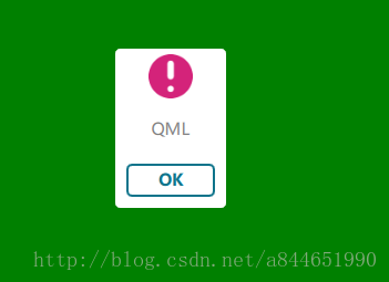
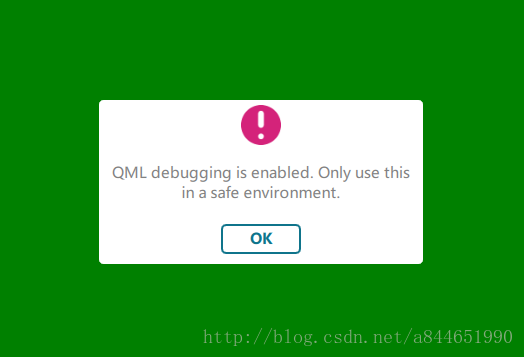
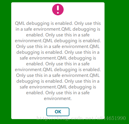
可以根据信息的多少来自动调节信息框的大小:
下面上代码:
MsgDialog.qml
import QtQuick 2.6
import QtQuick.Window 2.2
import QtQuick.Controls 2.2
import QtQuick.Layouts 1.3

Item {
    id: root
    anchors.centerIn: parent
    //提示框内容
    property alias tipText: msg.text
    //提示框颜色
    property string backGroundColor: "white"
    property Item parentItem : Rectangle {}

    //Dialog header、contentItem、footer之间的间隔默认是12
    // 提示框的最小宽度是 100
    width: {
        if(msg.implicitWidth < 100 || msg.implicitWidth == 100)
            return 100;
        else
            return msg.implicitWidth > 300 ? 300 + 24 : (msg.implicitWidth + 24);
    }
    height: msg.implicitHeight + 24 + 100

    Dialog {
        id: dialog
        width: root.width
        height: root.height
        modal: true
        background: Rectangle {
            color: backGroundColor
            anchors.fill: parent
            radius: 5
        }
        header: Rectangle {
            width: dialog.width
            height: 50
            border.color: backGroundColor
            radius: 5
            Image {
                width: 40
                height: 40
                anchors.centerIn: parent
                source: "/images/warning_48.png"
            }
        }
        contentItem: Rectangle {
            border.color: backGroundColor
            color: backGroundColor
            Text {
                anchors.fill: parent
                anchors.centerIn: parent
                font.family: "Microsoft Yahei"
                color: "gray"
                text: tipText
                wrapMode: Text.WordWrap
                verticalAlignment: Text.AlignVCenter
                horizontalAlignment: Text.AlignHCenter

            }
        }
        footer: Rectangle {
            width: msg.width
            height: 50
            border.color: backGroundColor
            color: backGroundColor
            radius: 5
            Button {
                anchors.centerIn: parent
                width: 80
                height: 30
                background: Rectangle {
                    anchors.centerIn: parent
                    width: 80
                    height: 30
                    radius: 5
                    border.color: "#0f748b"
                    border.width: 2
                    color: backGroundColor
                    Text {
                        anchors.centerIn: parent
                        font.family: "Microsoft Yahei"
                        font.bold: true
                        color: "#0f748b"
                        text: "OK"
                    }
                }
                onClicked: {
                    dialog.close();
                }
            }
        }
    }

    //利用Text 的implicitWidth属性来调节提示框的大小
    //该Text的字体格式需要与contentItem中的字体一模一样
    Text {
        id: msg
        visible: false
        width: 300
        wrapMode: Text.WordWrap
        font.family: "Microsoft Yahei"
        verticalAlignment: Text.AlignVCenter
        horizontalAlignment: Text.AlignHCenter
    }

    function openMsg() {
        root.x = (parent.width - dialog.width) * 0.5
        root.y = (parent.height - dialog.height) * 0.5
        dialog.open();
    }
}
在做这个控件的时候发现了一个问题,就是当我们利用Loader加载控件并且该控件使用了controls2模块时,把loader的asynchronous属性设置为true的时候,会报错”Object destroyed during incubation”,目前还没有找到解决的办法,有知道的同学可以交流一下。。。。
注意:作者使用的是Qt5.9版本,文章中使用的有些属性是从Qt5.8才开始有的!