创建一个最简单的饼图
这个没什么好说的,懂的都懂,直接上代码
//安装 Echarts
npm install echarts --save
在 Vue 组件中引入 Echarts 并创建一个简单的饼图,代码如下:
<template>
<div ref="chart" style="width: 50%;height: 400px;"></div>
</template>
<script setup>
import * as echarts from 'echarts'
import {
ref, onMounted } from 'vue'
const chart = ref(null)
onMounted(() => {
const myChart = echarts.init(chart.value)
const option = {
series: [
{
type: 'pie',
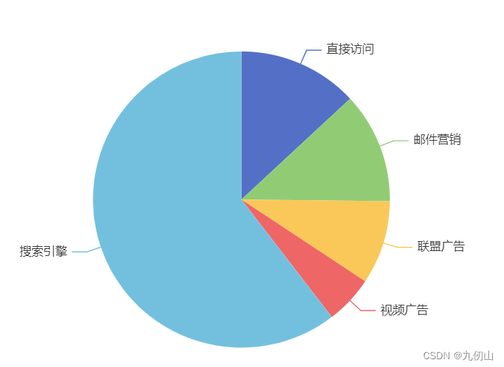
data: [
{
value: 335, name: '直接访问' },
{
value: 310, name: '邮件营销' },
{
value: 234, name: '联盟广告' },
{
value: 135, name: '视频广告' },
{
value: 1548, name: '搜索引擎' }
]
}
]
}
myChart.setOption(option)
})
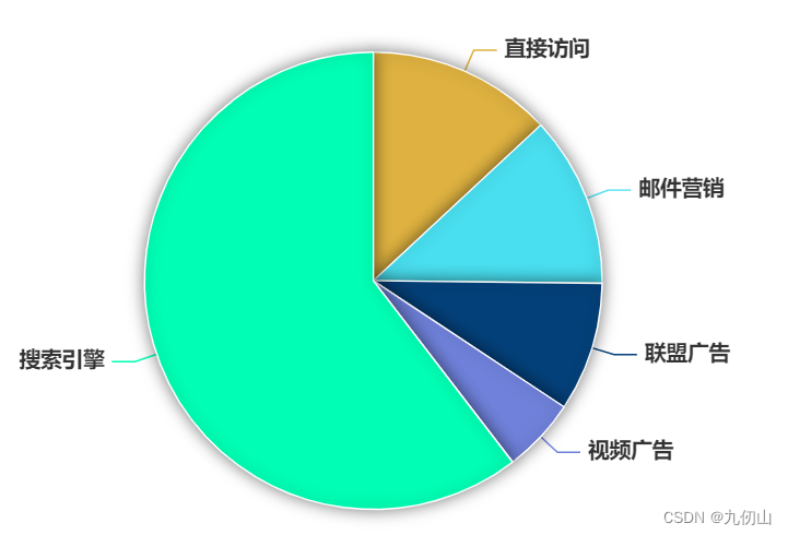
运行代码,效果如下
美化饼图
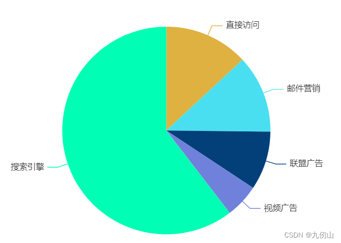
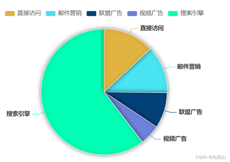
修改颜色
通过设置color属性来修改饼图的颜色
const option = {


    color: ['#deb140', '#49dff0', '#034079', '#6f81da', '#00ffb4'],
    series: [
      {


        type: 'pie',
        data: [
          {

     value: 335, name: '直接访问' },
          {

     value: 310, name: '邮件营销' },
          {

     value: 234, name: '联盟广告' },
          {

     value: 135, name: '视频广告' },
          {

     value: 1548, name: '搜索引擎' }
        ],
      }
    ]
  }
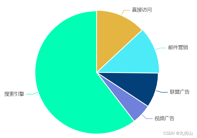
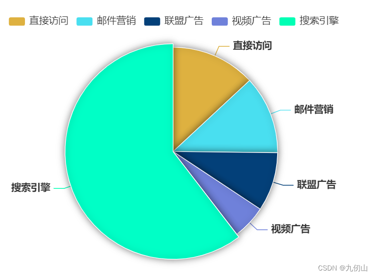
修改饼图的边框线条样式
通过设置 itemStyle 属性中的 borderWidth 和 borderColor 来修改饼图的边框线条样式。
const option = {


    color: ['#deb140', '#49dff0', '#034079', '#6f81da', '#00ffb4'],
    series: [
      {


        type: 'pie',
        data: [
          {

     value: 335, name: '直接访问' },
          {

     value: 310, name: '邮件营销' },
          {

     value: 234, name: '联盟广告' },
          {

     value: 135, name: '视频广告' },
          {

     value: 1548, name: '搜索引擎' }
        ],
        itemStyle: {


          borderWidth: 2,
          borderColor: '#fff'
        }
      }
    ]
  }
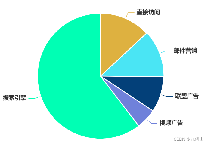
修改饼图的标签样式
通过设置 label 属性中的 color、fontSize、fontWeight 等属性来修改饼图的标签样式。
 series: [
      {


        type: 'pie',
        data: [
          {

     value: 335, name: '直接访问' },
          {

     value: 310, name: '邮件营销' },
          {

     value: 234, name: '联盟广告' },
          {

     value: 135, name: '视频广告' },
          {

     value: 1548, name: '搜索引擎' }
        ],
        itemStyle: {


          borderWidth: 2,
          borderColor: '#fff'
        },
        label: {


          color: '#333',
          fontSize: 14,
          fontWeight: 'bold'
        },
      }
    ]
添加饼图的阴影效果
通过设置 itemStyle 属性中的 shadowBlur、shadowColor 和 shadowOffsetX 等属性来添加饼图的阴影效果。
series: [
      {


        type: 'pie',
        data: [
         //数据
        ],
        label: {


          // label配置项
        },
        itemStyle: {


          borderWidth: 1,
          borderColor: '#fff',
          shadowBlur: 10,
          shadowColor: 'rgba(0, 0, 0, 0.5)',
          shadowOffsetX: 0,
          shadowOffsetY: 0
        }
      }
    ]
添加修改饼图的图例样式
通过设置 legend 属性中的 textStyle 属性来修改饼图的图例样式。
color: ['#deb140', '#49dff0', '#034079', '#6f81da', '#00ffb4'],
legend: {


   textStyle: {


      color: '#333',
      fontSize: 14
   }
},
series: [
  //series代码块
]
添加交互
通过添加emphasis属性实现鼠标悬停高亮效果
series: [
      {


        type: 'pie',
        data: [
          {

     value: 335, name: '直接访问' },
          {

     value: 310, name: '邮件营销' },
          {

     value: 234, name: '联盟广告' },
          {

     value: 135, name: '视频广告' },
          {

     value: 1548, name: '搜索引擎' }
        ],
        emphasis: {


          itemStyle: {


            shadowBlur: 10,
            shadowOffsetX: 0,
            shadowColor: 'rgba(0, 0, 0, 0.5)'
          }
        },
        label: {


          color: '#333',
          fontSize: 14,
          fontWeight: 'bold'
        },
        itemStyle: {


          borderWidth: 1,
          borderColor: '#fff',
          shadowBlur: 10,
          shadowColor: 'rgba(0, 0, 0, 0.5)',
          shadowOffsetX: 0,
          shadowOffsetY: 0
        }
      }
    ]
饼图的变化
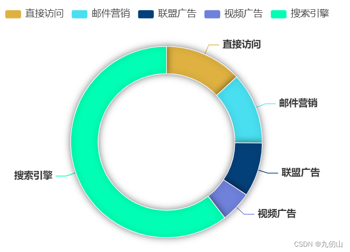
环形图
环形图是一种基于饼图的图表类型,它可以将饼图的中间部分空出来,形成环形的效果。要创建环形图非常简单,只需要在series中添加radius配置项就可以了,代码如下
series: [
      {


        type: 'pie',
        radius: ['50%', '70%'],
       //...其他配置项代码
]
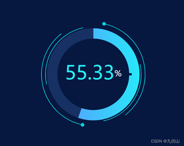
动画装饰仪表盘
动画装饰仪表盘是一种基于饼图的图表类型,它可以将饼图的中间部分空出来,形成仪表盘的效果,并且可以通过动画效果让指针实时移动。以下是动画装饰仪表盘的代码:
<template>
  <div ref="chart" style="width: 50%;height: 400px;"></div>
</template>
<script setup>
import * as echarts from 'echarts'
import {

     ref, onMounted } from 'vue'
const chart = ref(null)
let angle = 0;//角度,用来做简单的动画效果的
let value = 55.33;
let myChart = ''
let option = {

    }
onMounted(() => {
  myChart = echarts.init(chart.value)
  option = {
    backgroundColor: "#061740",
    title: {
      text: '{a|' + value + '}{c|%}',
      x: 'center',
      y: 'center',
      textStyle: {
        rich: {
          a: {
            fontSize: 48,
            color: '#29EEF3'
          },
          c: {
            fontSize: 20,
            color: '#ffffff',
            // padding: [5,0]
          }
        }
      }
    },
    series: [{
      name: "ring5",
      type: 'custom',
      coordinateSystem: "none",
      renderItem: function (params, api) {
        return {
          type: 'arc',
          shape: {
            cx: api.getWidth() / 2,
            cy: api.getHeight() / 2,
            r: Math.min(api.getWidth(), api.getHeight()) / 2 * 0.6,
            startAngle: (0 + angle) * Math.PI / 180,
            endAngle: (90 + angle) * Math.PI / 180
          },
          style: {


            stroke: "#0CD3DB",
            fill: "transparent",
            lineWidth: 1.5
          },
          silent: true
        };
      },
      data: [0]
    }, {


      name: "ring5",
      type: 'custom',
      coordinateSystem: "none",
      renderItem: function (params, api) {


        return {


          type: 'arc',
          shape: {


            cx: api.getWidth() / 2,
            cy: api.getHeight() / 2,
            r: Math.min(api.getWidth(), api.getHeight()) / 2 * 0.6,
            startAngle: (180 + angle) * Math.PI / 180,
            endAngle: (270 + angle) * Math.PI / 180
          },
          style: {


            stroke: "#0CD3DB",
            fill: "transparent",
            lineWidth: 1.5
          },
          silent: true
        };
      },
      data: [0]
    }, {


      name: "ring5",
      type: 'custom',
      coordinateSystem: "none",
      renderItem: function (params, api) {


        return {


          type: 'arc',
          shape: {


            cx: api.getWidth() / 2,
            cy: api.getHeight() / 2,
            r: Math.min(api.getWidth(), api.getHeight()) / 2 * 0.65,
            startAngle: (270 + -angle) * Math.PI / 180,
            endAngle: (40 + -angle) * Math.PI / 180
          },
          style: {


            stroke: "#0CD3DB",
            fill: "transparent",
            lineWidth: 1.5
          },
          silent: true
        };
      },
      data: [0]
    }, {


      name: "ring5",
      type: 'custom',
      coordinateSystem: "none",
      renderItem: function (params, api) {


        return {


          type: 'arc',
          shape: {


            cx: api.getWidth() / 2,
            cy: api.getHeight() / 2,
            r: Math.min(api.getWidth(), api.getHeight()) / 2 * 0.65,
            startAngle: (90 + -angle) * Math.PI / 180,
            endAngle: (220 + -angle) * Math.PI / 180
          },
          style: {


            stroke: "#0CD3DB",
            fill: "transparent",
            lineWidth: 1.5
          },
          silent: true
        };
      },
      data: [0]
    }, {


      name: "ring5",
      type: 'custom',
      coordinateSystem: "none",
      renderItem: function (params, api) {


        let x0 = api.getWidth() / 2;
        let y0 = api.getHeight() / 2;
        let r = Math.min(api.getWidth(), api.getHeight()) / 2 * 0.65;
        let point = getCirlPoint(x0, y0, r, (90 + -angle))
        return {


          type: 'circle',
          shape: {


            cx: point.x,
            cy: point.y,
            r: 4
          },
          style: {


            stroke: "#0CD3DB",//粉
            fill: "#0CD3DB"
          },
          silent: true
        };
      },
      data: [0]
    }, {


      name: "ring5",  //绿点
      type: 'custom',
      coordinateSystem: "none",
      renderItem: function (params, api) {


        let x0 = api.getWidth() / 2;
        let y0 = api.getHeight() / 2;
        let r = Math.min(api.getWidth(), api.getHeight()) / 2 * 0.65;
        let point = getCirlPoint(x0, y0, r, (270 + -angle))
        return {


          type: 'circle',
          shape: {


            cx: point.x,
            cy: point.y,
            r: 4
          },
          style: {


            stroke: "#0CD3DB",      //绿
            fill: "#0CD3DB"
          },
          silent: true
        };
      },
      data: [0]
    }, {


      name: '吃猪肉频率',
      type: 'pie',
      radius: ['58%', '45%'],
      silent: true,
      clockwise: true,
      startAngle: 90,
      z: 0,
      zlevel: 0,
      label: {


          position: "center",
      },
      data: [{


        value: value,
        name: "",
        itemStyle: {


            color: {

     // 完成的圆环的颜色
              colorStops: [{


                offset: 0,
                color: '#4FADFD' // 0% 处的颜色
              }, {


                offset: 1,
                color: '#28E8FA' // 100% 处的颜色
              }]
            },
        }
      },
      {


        value: 100 - value,
        name: "",
        label: {


            show: false
        },
        itemStyle: {


            color: "#173164"
        }
      }
      ]
    },
    {


      name: "",
      type: "gauge",
      radius: "58%",
      center: ['50%', '50%'],
      startAngle: 0,
      endAngle: 359.9,
      splitNumber: 8,
      axisTick: {


        show: false
      },
      splitLine: {


        length: 60,
        lineStyle: {


          width: 5,
          color: "#061740"
        }
      },
      axisLabel: {


        show: false
      },
      pointer: {


        show: false
      },
      axisLine: {


        lineStyle: {


          opacity: 0
        }
      },
      detail: {


        show: false
      },
      data: [{


        value: 0,
        name: ""
      }]
    },
    ]
  }
  myChart.setOption(option)
})
//获取圆上面某点的坐标(x0,y0表示坐标,r半径,angle角度)
function getCirlPoint(x0, y0, r, angle) {


  let x1 = x0 + r * Math.cos(angle * Math.PI / 180)
  let y1 = y0 + r * Math.sin(angle * Math.PI / 180)
  return {


    x: x1,
    y: y1
  }
}
function draw() {


  angle = angle + 3
  myChart.setOption(option, true)
  //window.requestAnimationFrame(draw);
}
setInterval(function () {


  //用setInterval做动画感觉有问题
  draw()
}, 100);
</script>
<style scoped></style>
好了,由于篇幅的原因,饼图的相关内容就介绍到这里,其实关于饼图的变化还有很多,比如断开环形图、进度环形图等,有兴趣的小伙伴可以深入研究下