参考
MaterialApp
Flutter中的MaterialApp是一个基于Material Design风格的顶层Widget,它提供了许多常用的Material Design风格的组件和样式,例如AppBar、BottomNavigationBar、Drawer等。在一个Flutter应用中,通常只需要一个MaterialApp,它是整个应用的根Widget,包含了整个应用的主题、路由、导航等。
这里只简单介绍,详细的等后面学到了会整理
MaterialApp的常用属性包括:
title:应用的标题,通常会显示在AppBar中。theme:应用的主题,包括颜色、字体、形状等。home:应用的首页,通常是一个Scaffold。routes:应用的路由表,用于管理应用的各个页面。initialRoute:应用的初始路由。onGenerateRoute:路由生成函数,用于动态生成路由。navigatorObservers:导航观察器,用于监听路由的变化。
//使用箭头函数简写
main() => runApp(const MyApp());
class MyApp extends StatelessWidget {
//创建widget的唯一标识
const MyApp({
Key? key}) : super(key: key);
//重写build方法
Widget build(BuildContext context) {
//返回一个material类型的app
return MaterialApp(
// 设置区域
localizationsDelegates: const [
GlobalMaterialLocalizations.delegate,
GlobalWidgetsLocalizations.delegate,
GlobalCupertinoLocalizations.delegate,
],
supportedLocales: const [
Locale('zh', 'CN'),
Locale('en', 'US'),
],
//标题
title: "MaterialApp",
// 主题,可以使用提供的默认主题,也可以自定义
theme: ThemeData.light(),
// 默认会在右上角显示一个debugger的标识,下面的代码可以去掉
debugShowCheckedModeBanner: false,
//主页面
home: Scaffold(
appBar: AppBar(
title: const Text("AppBar"),
),
),
);
}
}

Scaffold
Scaffold是一个Material Design风格的基本布局组件,它提供了一个标准的应用程序布局结构,包括应用栏、抽屉菜单、底部导航栏、浮动操作按钮等。Scaffold通常作为应用程序的顶层组件,它可以帮助我们快速构建一个具有标准布局的应用程序。
Scaffold的主要属性包括:
- appBar:应用栏,通常包括标题、操作按钮等。
- body:主体内容,通常是一个Widget。
- floatingActionButton:浮动操作按钮,通常用于执行主要操作。
- drawer:抽屉菜单,通常用于显示应用程序的导航菜单。
- bottomNavigationBar:底部导航栏,通常用于切换不同的页面或功能。
Scaffold(
      //导航条
      appBar: AppBar(
        title: const Text("AppBar组件", style: TextStyle(color: Colors.white)),
      ),
      //页面主题内容
      body: const YcHomeBody(),
      //  浮动按钮
      floatingActionButton: FloatingActionButton(
        onPressed: () {

    },
        child: const Icon(Icons.add),
      ),
      //  左抽屉
      drawer: const Drawer(
        width: 150,
        backgroundColor: Color(0x43ad7f7f),
        child: Center(
          child: Text("左抽屉"),
        ),
      ),
      //  右抽屉
      endDrawer: const Drawer(
        width: 150,
        backgroundColor: Color(0x43ad7f7f),
        child: Center(
          child: Text("右抽屉"),
        ),
      ),
      //  底部导航栏
      bottomNavigationBar: BottomNavigationBar(
        items: const <BottomNavigationBarItem>[
          BottomNavigationBarItem(label: '首页', icon: Icon(Icons.home)),
          BottomNavigationBarItem(label: '书籍', icon: Icon(Icons.book)),
          BottomNavigationBarItem(label: '我的', icon: Icon(Icons.perm_identity)),
        ],
      ),
    );

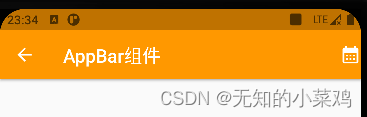
AppBar
AppBar是一个Material Design风格的顶部导航栏,通常用于展示页面的标题、操作按钮和返回按钮等。AppBar可以通过Scaffold组件来使用,也可以单独使用。
AppBar有以下常用属性:
- title:AppBar的标题,通常是一个Text组件。
- actions:AppBar右侧的操作按钮,是一个Widget的数组。
- leading:AppBar左侧的返回按钮,通常是一个IconButton。
- backgroundColor:AppBar的背景颜色。
- elevation:AppBar的阴影高度。
AppBar(
     // 标题
     title: const Text("AppBar组件", style: TextStyle(color: Colors.white)),
     // 右侧操作区
     actions: const [Icon(Icons.calendar_month)],
     // 左侧操作区
     leading: const Icon(Icons.arrow_back),
     //  背景色
     backgroundColor: Colors.orange,
     //  阴影
     elevation: 2,
   ),
Drawer
Drawer是一个抽屉导航组件,导航一般使用底部导航BottomNavigationBar或者抽屉导航。Drawer一般和Scaffold组合使用。
默认图标
如果设置了AppBar,而没有设置AppBar的leading属性,在AppBar的左侧默认出现抽屉的图标
Scaffold(
	appBar: AppBar(),
	drawer: Drawer(),
)
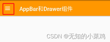
可以通过点击按钮,或者滑动来打开(关闭)抽屉。
代码控制抽屉
- 打开
ElevatedButton(
    onPressed: () {


      // 通过代码打开抽屉,需要获取Scaffold状态
      Scaffold.of(context).openDrawer();
    },
    child: const Text("打开抽屉"),
  )
- 取消
Navigator.of(context).pop();
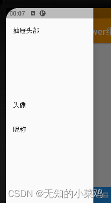
常见用法
Drawer里面可以放置任何组件,但是一般使用ListView,分为DrawerHeader和ListTiles。
DrawerHeader的高度默认为160像素,如果你想改变DrawerHeader的高度,可以使用SizedBox或Container来包装DrawerHeader,并设置自定义的高度。
Drawer(
        width: 200,
        child: ListView(
          children: const <Widget>[
            DrawerHeader(
              child: Text("抽屉头部"),
            ),
            ListTile(
              title: Text("头像"),
            ),
            ListTile(
              title: Text("昵称"),
            ),
          ],
        ),
      ),
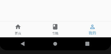
BottomNavigationBar
底部导航条
Scaffold(
      //导航条
      appBar: AppBar(
        // 标题
        title: const Text("AppBar和Drawer组件",
            style: TextStyle(color: Colors.white)),
      ),
      //页面主题内容
      body: const Text("主页"),
      //  底部导航
      bottomNavigationBar: BottomNavigationBar(
        items: const [
          BottomNavigationBarItem(label: '首页', icon: Icon(Icons.home)),
          BottomNavigationBarItem(label: '书籍', icon: Icon(Icons.book)),
          BottomNavigationBarItem(label: '我的', icon: Icon(Icons.perm_identity)),
        ],
        // 当前默认激活像
        currentIndex: _currentIndex,
        onTap: (int index) {


          setState(() {


            _currentIndex = index;
          });
        },
      ),
    );
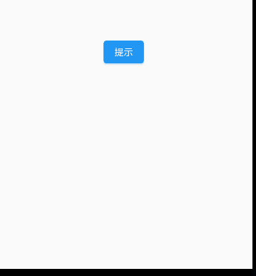
SnackBar
SnackBar是一种轻量级的提示组件,用于向用户显示短暂的消息。SnackBar通常会在屏幕的底部显示,并在一定时间后自动消失。SnackBar可以包含文本、图标或操作按钮等内容,可以通过设置持续时间、背景颜色、字体样式等属性来自定义SnackBar的外观和行为。
通常用于在用户执行某些操作后向用户提供反馈信息,例如:表单提交成功、网络请求失败等。
Center(
        child: ElevatedButton(
      child: const Text('提示'),
      onPressed: () {


        // 移除掉旧的消息,避免快速点击后,每隔4秒弹出一个消息
        ScaffoldMessenger.of(context).removeCurrentSnackBar();
        ScaffoldMessenger.of(context).showSnackBar(SnackBar(
          // 提示的内容
          content: const Text("这是一条提示"),
          //   阴影
          elevation: 8,
          //持续时间,默认4秒
          duration: const Duration(seconds: 4),
          //颜色
          backgroundColor: Colors.orange,
          //  形状
          shape: const RoundedRectangleBorder(
            borderRadius: BorderRadius.all(Radius.circular(20.0)),
          ),
          //  行为
          action: SnackBarAction(
              label: "确定",
              textColor: Colors.blue,
              onPressed: () {


                print("确定");
              }),
        ));
      },
    ));