前言
由于最近作者在学习微前端,web component也是其中一大特性,部分微前端框架使用到,也是深入学习了一下相关的知识,分享出来。
Web Component是什么?
Web Component 实际上一系列技术的组合,主要包含 3 部分:
- 自定义元素。 在 HTML 基础标签外扩展自定义标签元素,也就是我们平时使用框架的"组件";
- Shadow DOM。 主要用于将 Shadow DOM 的内容与外层 document DOM 隔离,可以理解为在document中的一个子容器,放置各种组件;
- HTML 模板。 使用
<template>来定义组件模板,使用<slot>作为插槽使用(Vuer一定不陌生);
在一份html文件中的一个web component看起来是这样的:
<trace-ele name="webComponent" version="0.0.1" desc="原生态自带隔离的组件">
  <div slot="slot-ele">插槽内容</div>
</trace-ele>
看起来很像Vue吧?接下来让我们一个个demo学习web component。
上手
由于Web Component亲和原生,因此无需其他包的依赖,一个index.html和一个index.js即可体验学习。
我们直接写一个html模板,文章的案例组件统称为<trace-ele />
index.html:
<body>
 <template id="trace">
      <div class="container">
        <img
          class="image"
          src="https://pic1.zhimg.com/50/v2-a6d65e05ec8db74369f3a7c0073a227a_200x0.webp"
          alt=""
        />
        <p class="title">学习Web Component</p>
        <p class="desc">Web Component是微前端沙盒隔离原理的重要知识</p>
        <p class="price">¥25.00</p>
      </div>
    </template>
    <trace-ele />
    <script src="./index.js" />
</body>
这里我们写了一个"模板"——template,并在下面声明了<trace-ele />组件。
而实现这一切的原理在index.js中。
class Trace extends HTMLElement {


  constructor() {


    super();
    const templateEle = document.getElementById("trace");
    const cloneEle = templateEle.content.cloneNode(true);
    this.appendChild(cloneEle);
  }
}

customElements.define("trace-ele", Trace);
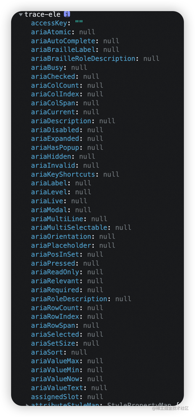
Web Component组件本质是一个类继承于HTMLElement,当customElements.define声明完组件后,类中的this指向于组件本身,打印结果如下:
在初始化时,需要提供给组件一个空壳,并且绑定template元素的id,这样就出现组件效果了。
看到这里是不是感觉和Vue很像呢?接下来我们继续升级组件的功能~
来点样式吧
在上一节基础上,给组件上点样式,很简单,改变index.html即可,在template中加入style:
<body>
 <template id="trace">
      <div class="container">
        <img
          class="image"
          src="https://pic1.zhimg.com/50/v2-a6d65e05ec8db74369f3a7c0073a227a_200x0.webp"
          alt=""
        />
        <p class="title">学习Web Component</p>
        <p class="desc">Web Component是微前端沙盒隔离原理的重要知识</p>
        <p class="price">¥25.00</p>
      </div>

      <style>
        .container {


          display: inline-flex;
          flex-direction: column;
          border-radius: 6px;
          border: 1px solid silver;
          padding: 16px;
          margin-right: 16px;
        }
        .image {


          border-radius: 6px;
        }
        .title {


          font-weight: 500;
          font-size: 16px;
          line-height: 22px;
          color: #222;
          margin-top: 14px;
          margin-bottom: 9px;
        }
        .desc {


          margin-bottom: 12px;
          line-height: 1;
          font-size: 14px;
        }
        .price {


          font-size: 14px;
        }
      </style>
    </template>
    <trace-ele />
    <script src="./index.js" />
</body>
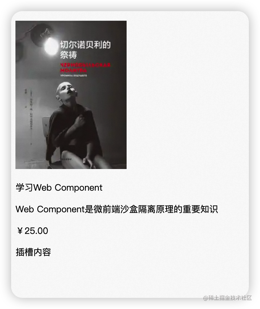
样式生效:
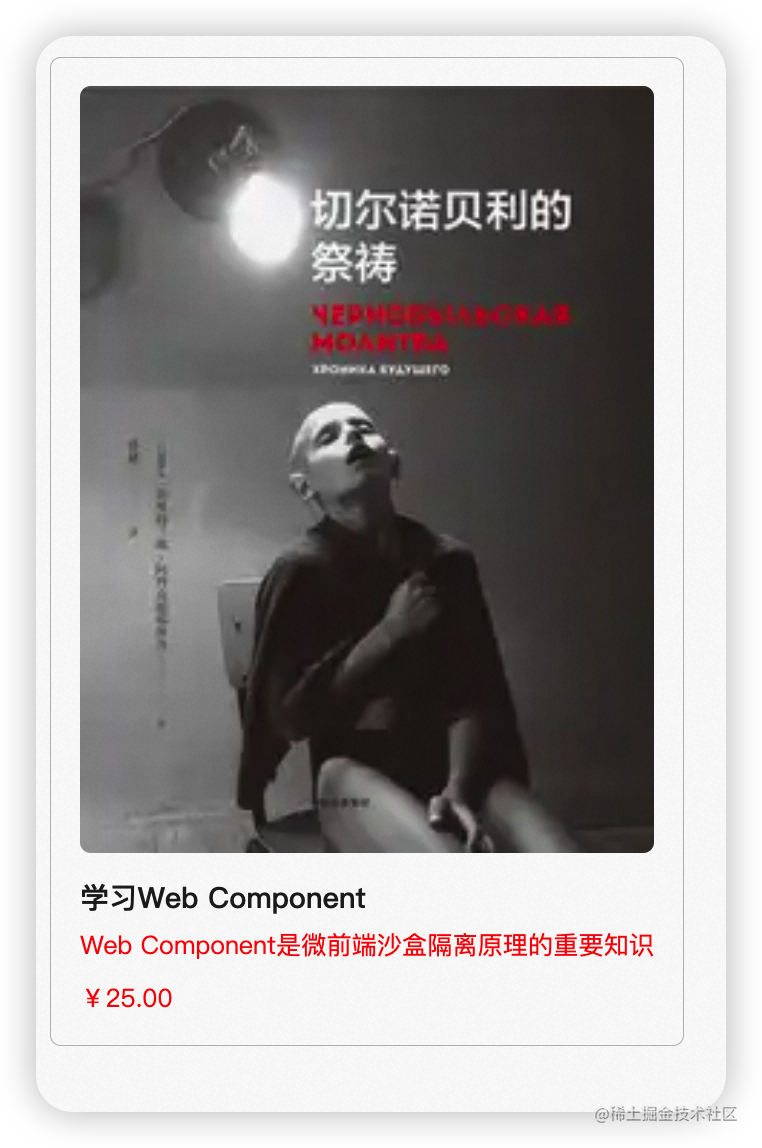
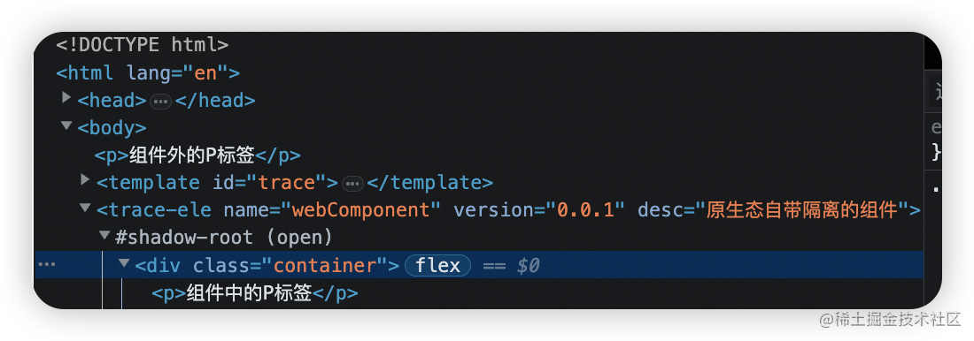
但是这里如果给一个通用标签的样式,就像这样:
<body>
    <p>组件外的P标签</p>
        <template>
        <p>组件中的P标签</p>
        <style>
           p {


             color: red;
           }
            ...
            .container {

      }
        </style>
        </template>
</body>
效果如下:
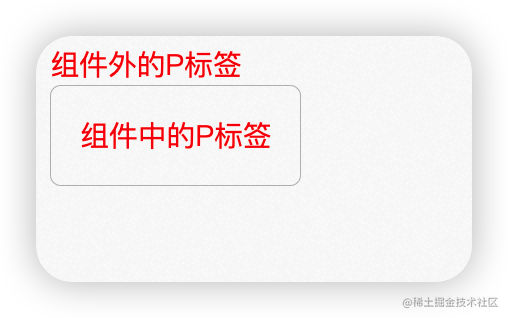
可以看到组件外的p标签也被影响了,颜色变为红色,而在组件概念中这个样式其实只期望作用于组件本身。这也是样式隔离的概念,而很幸运,Web Component提供了开箱即用的样式隔离方案。
为了不让 <template> 里的 <style> CSS 和全局的 CSS 有冲突,我们可以将组件挂在到 Shadow Root 上,再用 Shadow Root 挂到外层的 document DOM 上,这样就可以实现 CSS 的隔离啦:
class Trace extends HTMLElement {


  constructor() {


    super();
    this.attachShadow({

     mode: "open" });

    const templateEle = document.getElementById("trace");
    const cloneEle = templateEle.content.cloneNode(true);

    this.shadowRoot.appendChild(cloneEle);
  }
}

customElements.define("trace-ele", Trace);
从控制台中观察:
而如果有多个组件本质其实就是在document中有多个Shadow Root。
整个DOM架构图是这样的:
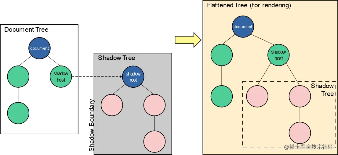
Shadow DOM 的一大优点是能将 DOM 结构、样式、行为与 Document DOM 隔离开,非常适合做组件的封装,因此它能成为 Web Component 的重要组成部分之一。
Props
与Vue、React一样,Web Component也提供了父传子的形式。
index.html:
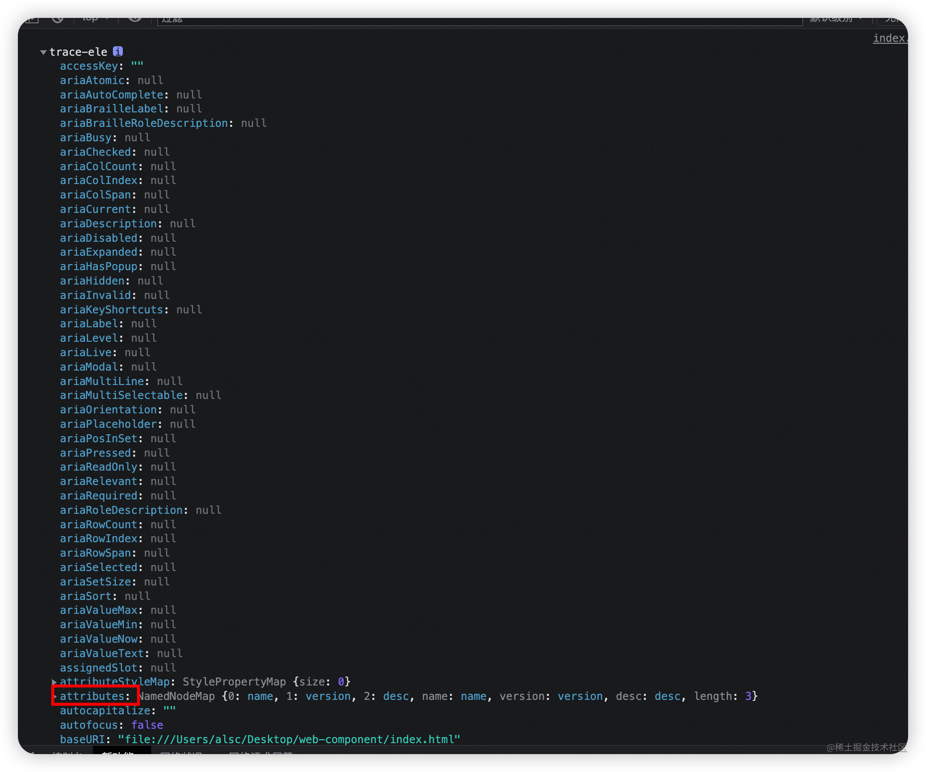
<trace-ele name="webComponent" version="0.0.1" desc="原生态自带隔离的组件">
这里传了3个props给组件,在组件中打印this如下:
火眼金睛的我已经找到了在组件中接受传参的入口:
做一个简单的动态赋值:
class Trace extends HTMLElement {


  constructor() {


    super();

    this.attachShadow({

     mode: "open" });

    const templateEle = document.getElementById("trace");
    const cloneEle = templateEle.content.cloneNode(true);
    cloneEle.querySelector('.container > .title').textContent = this.getAttribute('name');
    cloneEle.querySelector('.container > .price').textContent = this.getAttribute('version');
    cloneEle.querySelector('.container > .desc').textContent = this.getAttribute('desc');

    this.shadowRoot.appendChild(cloneEle);
  }
}

customElements.define("trace-ele", Trace);
搞定~
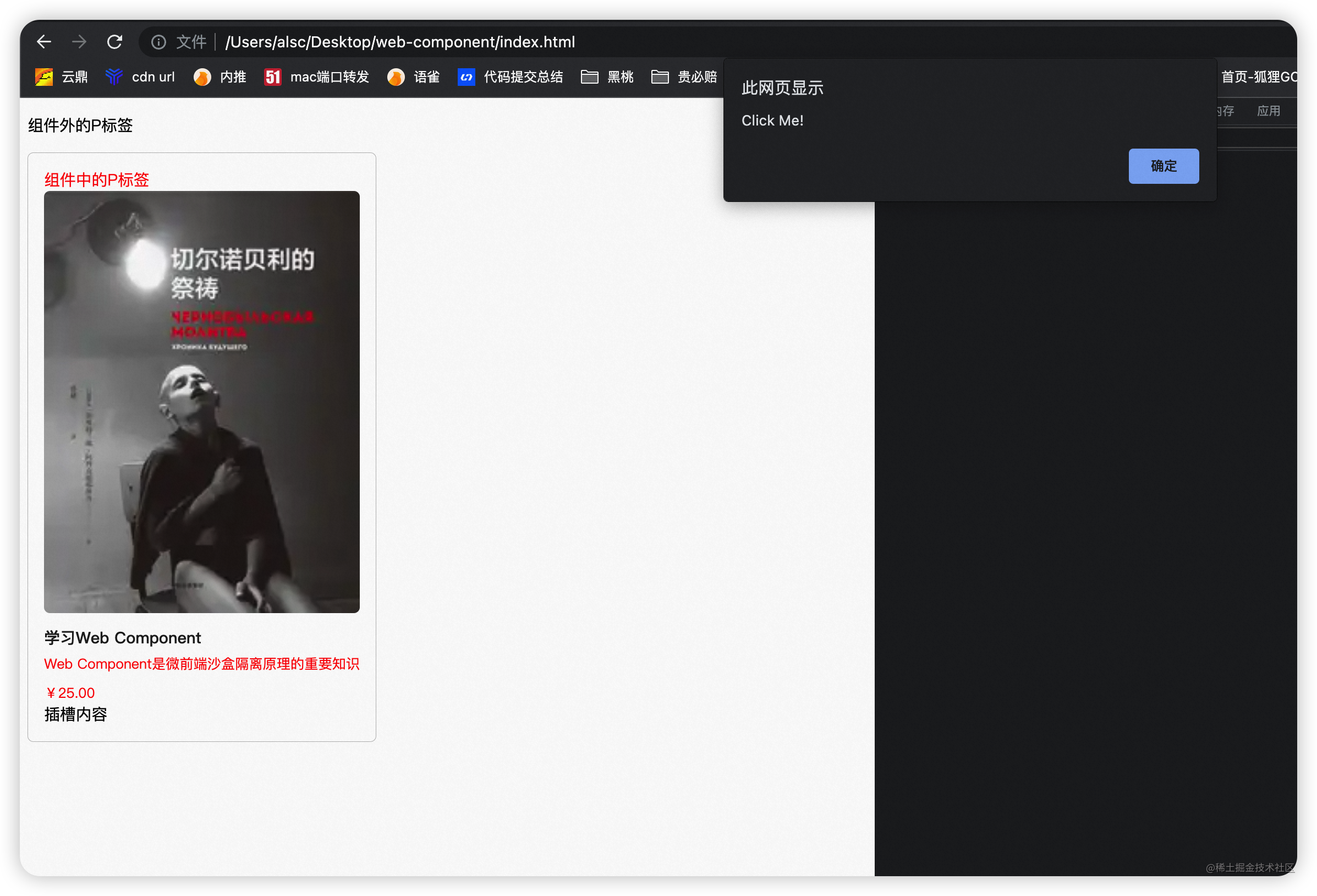
Slot
HTML 模板的另一个好处是可以像 Vue 一样使用 <slot>。比如,现在我们可以在这个 <trace-ele> 最下面添加一个插槽:
<body>
    <template id="trace">
        <div class="container">
            <p>组件中的P标签</p>
            <img
              class="image"
              src="https://pic1.zhimg.com/50/v2-a6d65e05ec8db74369f3a7c0073a227a_200x0.webp"
              alt=""
            />
            <p class="title">学习Web Component</p>
            <p class="desc">Web Component是微前端沙盒隔离原理的重要知识</p>
            <p class="price">¥25.00</p>
            <slot name="slot-ele"></slot>
        </div>
        <style>
        ...
        </style>
    </template>
    <trace-ele name="webComponent" version="0.0.1" desc="原生态自带隔离的组件">
        <div slot="slot-ele">插槽内容</div>
    </trace-ele>
</body>
这样我们就可以实现自定义插槽内容了。
事件绑定
Web Component也可以给组件中元素或者插槽绑定事件。
class Trace extends HTMLElement {


  constructor() {


    super();

    this.attachShadow({

     mode: "open" });

    const templateEle = document.getElementById("trace");
    const cloneEle = templateEle.content.cloneNode(true);
    cloneEle
      .querySelector(".container > .title")
      .addEventListener("click", this.onClick);

    this.shadowRoot.appendChild(cloneEle);
  }

  onClick = () => {


    alert("Click Me!");
  };
}

customElements.define("trace-ele", Trace);
总结
上面主要给大家分享了一下 Web Component 的一些使用方法。总的来说,Web Component 是一系列 API 的组合:
- Custom Element:注册和使用组件
- Shadow DOM:隔离 CSS
- HTML template 和 slot:灵活的 DOM 结构
它看起来仿佛是现在主流框架的基建实现,框架也正是基于原生的能力实现出一整套的解决方案,就比如Vue的响应式以来追踪、模板语法数据绑定,都是我们希望看到的。