同志们,最近发现了一些有趣的CSS玩法,感兴趣的拿走不谢~~~
玩法一
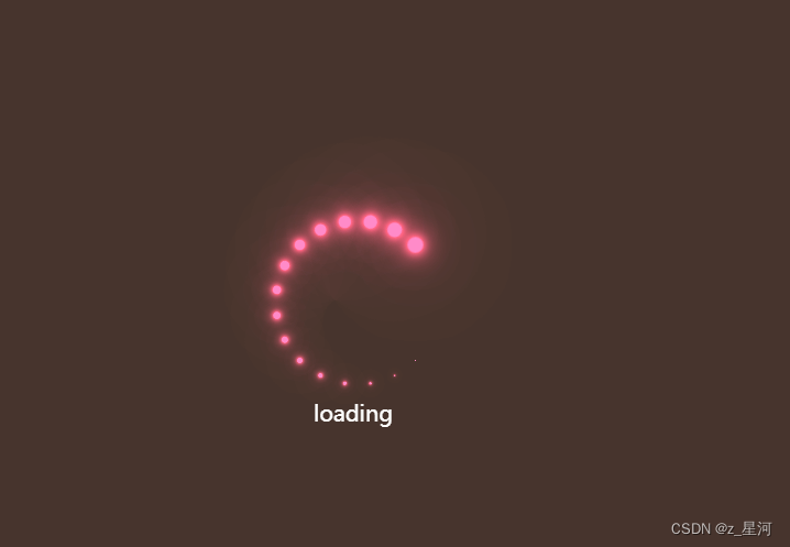
拥有一个炫酷的正在加载
效果展示:
示例代码:
HTML部分
	<body>
		<main>
			<div class="cube">
				<span style="--i:1;"></span>
				<span style="--i:2;"></span>
				<span style="--i:3;"></span>
				<span style="--i:4;"></span>
				<span style="--i:5;"></span>
				<span style="--i:6;"></span>
				<span style="--i:7;"></span>
				<span style="--i:8;"></span>
				<span style="--i:9;"></span>
				<span style="--i:10;"></span>
				<span style="--i:11;"></span>
				<span style="--i:12;"></span>
				<span style="--i:13;"></span>
				<span style="--i:14;"></span>
				<span style="--i:15;"></span>
				<span style="--i:16;"></span>
				<span style="--i:17;"></span>
				<span style="--i:18;"></span>
				<span style="--i:19;"></span>
				<span style="--i:20;"></span>
			</div>
			<div class="loading">
				<p>loading</p>
			</div>

		</main>
	</body>
CSS部分
<style>
	* {
		padding: 0;
		margin: 0;
		box-sizing: border-box;
	}

	main {
		display: flex;
		background-color: #2c3a47;
		/*用于设置图像居中 */
		align-items: center;
		justify-content: center;
		width: 100%;
		height: 1000px;
		animation: animate1 10s linear infinite;
	}

	/* 用于设置动画属性 其中filter用于做利镜其中的hue-rotate属性让图像运用色相旋转*/
	@keyframes animate1 {
		0% {
			filter: hue-rotate(0deg);
		}

		100% {
			filter: hue-rotate(360deg);
		}
	}

	main .cube {
		position: relative;
		height: 120px;
		width: 120px;
	}

	main .cube span {
		position: absolute;
		top: 0;
		left: 0;
		width: 100%;
		height: 100%;
		/* 用于设置一个圆圈被分成几份 */
		transform: rotate(calc(18deg*var(--i)));
	}

	/* :before用于设置在给定的属性之前添加效果 */
	main .cube span::before {
		content: '';
		position: absolute;
		top: 0;
		left: 0;
		width: 15px;
		height: 15px;
		border-radius: 50%;
		background-color: aqua;
		box-shadow: 0 0 10px aqua, 0 0 20px aqua, 0 0 40px aqua, 0 0 80px aqua, 0 0 100px aqua;
		animation: animate 2s linear infinite;
		animation-delay: calc(0.1s*var(--i));
	}

	@keyframes animate {
		0% {
			transform: scale(1);
		}

		80%,
		100% {
			transform: scale(0);
		}
	}

	.loading {
		color: #fff;
		font-size: 20px;
		position: relative;
		top: 100px;
		right: 100px;
	}

	@media (min-width:765px) {}
</style>
玩法二
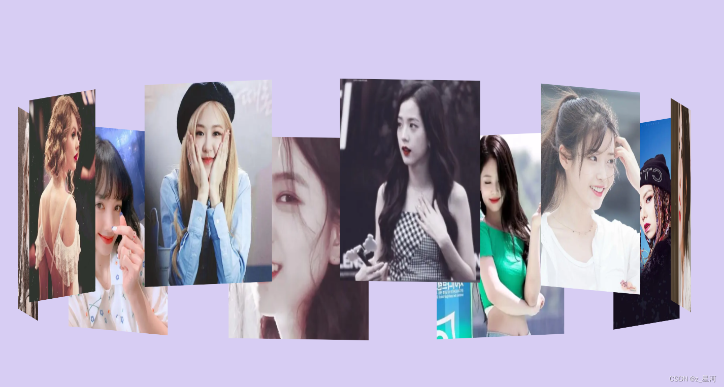
做一个只属于她(他)的旋转相册集
效果展示:
题外话:
在这个安宁美丽且又有无限魅力的大世界里,如果你是一个正在努力奋斗,周九晚五的打工族,想找一个白富美(高富帅),这种剧情一般都会在偶像剧里出现,所以为了体会爱情的苦,你该怎么做,当然是努力想办法俘获他(她)的小心心呐~

作为一个合格的程序员,当然得会一些浪漫的代码啊,用心做一个只属于她(他)的旋转相册集,分分钟让冰冷的代码拥有了感情色彩~~~
示例代码:
HTML部分
<body>
		<div id="box">
			<img src="img/1-1.png" alt="">
			<img src="img/1-3.png" alt="">
			<img src="img/1.png" alt="">
			<img src="img/2-1 (1).png" alt="">
			<img src="img/3-1.png" alt="">
			<img src="img/4-1.png" alt="">
			<img src="img/5-1.png" alt="">
			<img src="img/6-1.png" alt="">
			<img src="img/3.png" alt="">
			<img src="img/4.png" alt="">
		</div>
	</body>
CSS部分
<style>
	* {
		margin: 0;
		padding: 0;
	}

	body {
		height: 100%;
		/* background-image: url("img/1-1.png"); */
		background-color: #d7cdf3;
	}

	/* 动画时长:   例如:50s infinite 循环播放   每多少秒默认循环播放一次
   infinite 循环播放     linear 默认循环一次 */
	/*指定嵌套元素,在3D空间中呈现 */
	#box {
		width: 280px;
		height: 400px;
		transform-style: preserve-3d;
		animation: go 280s linear infinite;
		margin: auto;
		position: fixed;
		left: 0px;
		right: 0px;
		top: 0;
		bottom: 0px;
	}

	#box img {
		width: 280px;
		height: 400px;
		/*绝对定位 */
		position: absolute;
		left: 0px;
		top: 0px;
	}

	/* 让图片向外推出,使用translateZ(650px);
rotateY(0deg):以Y轴0度为盒子的旋转中心点 */
	#box img:nth-child(1) {
		transform: rotateY(0deg) translateZ(650px);
	}

	#box img:nth-child(2) {
		transform: rotateY(36deg) translateZ(650px);
	}

	#box img:nth-child(3) {
		transform: rotateY(72deg) translateZ(650px);
	}

	#box img:nth-child(4) {
		transform: rotateY(108deg) translateZ(650px);
	}

	#box img:nth-child(5) {
		transform: rotateY(144deg) translateZ(650px);
	}

	#box img:nth-child(6) {
		transform: rotateY(180deg) translateZ(650px);
	}

	#box img:nth-child(7) {
		transform: rotateY(216deg) translateZ(650px);
	}

	#box img:nth-child(8) {
		transform: rotateY(252deg) translateZ(650px);
	}

	#box img:nth-child(9) {
		transform: rotateY(288deg) translateZ(650px);
	}

	#box img:nth-child(10) {
		transform: rotateY(324deg) translateZ(650px);
	}

	@keyframes go {
		0% {
			transform: rotateX(0deg) rotateY(0deg);
		}

		25% {
			transform: rotateX(20deg) rotateY(180deg);
		}

		50% {
			transform: rotateX(0deg) rotateY(360deg);
		}

		75% {
			transform: rotateX(0deg) rotateY(540deg);
		}

		100% {
			transform: rotateX(0deg) rotateY(720deg);
		}
	}
</style>
代码在此,,快拿去拿去~~~
希望大家每天开开心心的,也祝大家有情人终成眷属哟~~~