前置
- element-ui官网有一个属性很好看,可以看到,当滚动的时候,文字会被显示白色带阴影背景
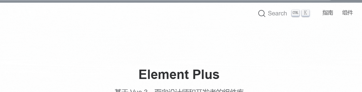
- 你可能有点印象,因为公交车的时候也是类似于这种效果
- 他们是怎么做的呢?我看到源码使用到了
backdrop-filterbackground-sizebackground-image- 就实现了,很少的属性,达到了不错的效果,值得学习
element-ui开始
了解backdrop-filter和filter属性
-
backdrop-filter属性
- 可以让你为一个元素后面区域添加图形效果(如模糊或颜色偏移)。因为它适用于元素背后的所有元素,为了看到效果,必须使元素或其背景至少部分透明。
- 说通俗点就是通过设置A上面的B元素来达到对A模糊或颜色偏移的效果
-
filter属性
- 将模糊或颜色偏移等图形效果应用于元素。滤镜通常用于调整图像、背景和边框的渲染。
-
二者区别
backdrop-filter作用于元素的背景(不直接作用于元素,而是通过另外一层元素来达到效果)- 作用于元素背后的所有元素
filter直接设置在元素身上- 作用于当前元素,并且它的后代元素也会继承这个属性
-
二者支持的滤镜对比(其实filter可以用的,backdrop-filter都可以用)
| filter | backdrop-filter | 备注 | |
|---|---|---|---|
| url | √ | √ | 获取指向SVG过滤器的URI |
| blur(模糊) | √ | √ | 高斯模糊滤镜 |
| brightness(亮度) | √ | √ | 图像明亮度的滤镜 |
| contrast(对比度) | √ | √ | 图像的对比度滤镜 |
| drop-shadow(阴影) | √ | √ | 图像的阴影滤镜 |
| grayscale(灰度) | √ | √ | 图像灰度滤镜 |
| hue-rotate(色相旋转) | √ | √ | 图像色相滤镜 |
| invert(反色) | √ | √ | 反转滤镜 |
| opacity(透明度) | √ | √ | 透明度滤镜 |
| sepia | √ | √ | 深褐色滤镜 |
| saturate(褐色) | √ | √ | 图像饱和度滤镜 |
- element-ui头部栏就是通过设置
blur和saturate属性来达到的
一步步分解
- 找到官网,复制粘贴代码(以将变量全部转化为具体的值)
.navbar-wrapper {


    position: relative;
    border-bottom: 1px solid #dcdfe6;
    height: 55px;
    background-image: radial-gradient(transparent 1px,#ffffff 1px);
    background-size: 4px 4px;
    backdrop-filter: saturate(50%) blur(4px);
    top: 0;
}
- 我们重点关注下面几个属性
background-image: radial-gradient(transparent 1px,#ffffff 1px);background-size: 4px 4px;backdrop-filter: saturate(50%) blur(4px);
为什么设置background-size和background-image
-
background-size:设置背景图片大小,这个不用多说 -
background-image设置背景图片的大小 -
所以我们如果只设置这二个值会发生什么?为了便于观看,我将
background-image换为了一张具体图片,便于查看
<html lang="en">
  <head>
    <meta charset="UTF-8" />
    <title>Document</title>
    <style>
      .wrapper {


        width: 500px;
        height: 300px;
        background: url("../image/26.jpg")
      }
      .content {


        width: 300px;
        height: 150px;
        /* background-image: radial-gradient(transparent 1px, #ffffff 1px); */
        /* background-size: 4px 4px; */
        /* backdrop-filter: saturate(50%) blur(4px); */
        background-image: url('../image/27.jpg');
        background-size: 4px 4px;
      }
    </style>
  </head>
  <body>
    <div class="wrapper">
      <div class="content"></div>
    </div>
  </body>
</html>
初次的时候你可能看到这个效果
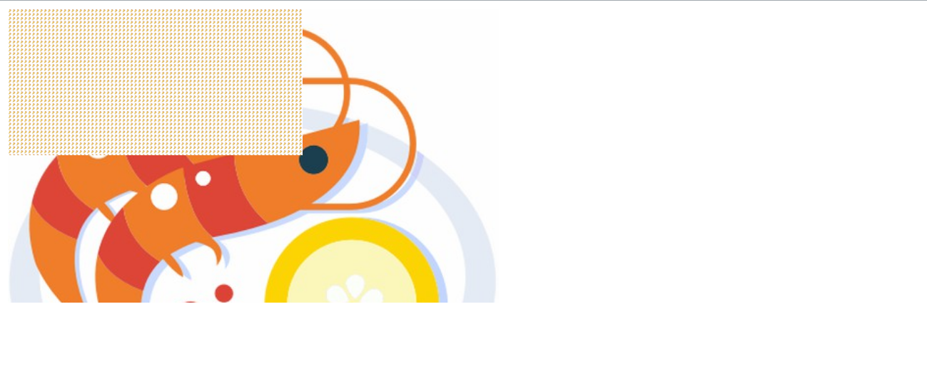
是不是觉得这个点点是什么,我们放大看看
- 原来是一个一个的背景图,因为我们设置了
background-size尺寸,然后默认背景会铺满全部的,所以就导致这效果
- 现在我们讲
background-size和background-image换为element-ui上的属性,看看会发生什么
.content {


width: 300px;
height: 150px;

/* 换为element-ui官网的 */
background-image: radial-gradient(transparent 1px, #ffffff 1px);
background-size: 4px 4px;

/*backdrop-filter:saturate(50%) blur(4px); */
/* background-image: url('../image/27.jpg');
background-size: 4px 4px; */
}
- 可以看到,只不过背景被替换为了一个一个的小渐变圆点
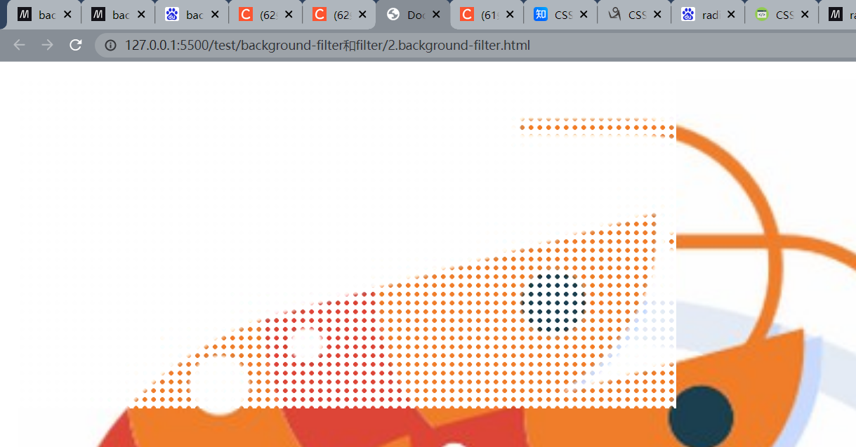
最终
- 我们最后添加上
backdrop-filter样式
<html lang="en">
  <head>
    <meta charset="UTF-8" />
    <title>Document</title>
    <style>
      .wrapper {


        width: 500px;
        height: 300px;
        background: url("../image/26.jpg")
      }
      .content {


        width: 300px;
        height: 150px;

        /* 换为element-ui官网的 */
        background-image: radial-gradient(transparent 1px, #ffffff 1px);
        background-size: 4px 4px;
        backdrop-filter:saturate(50%) blur(4px);

        /* background-image: url('../image/27.jpg');
          background-size: 4px 4px; */
      }
    </style>
  </head>
  <body>
    <div class="wrapper">
      <div class="content"></div>
    </div>
  </body>
</html>
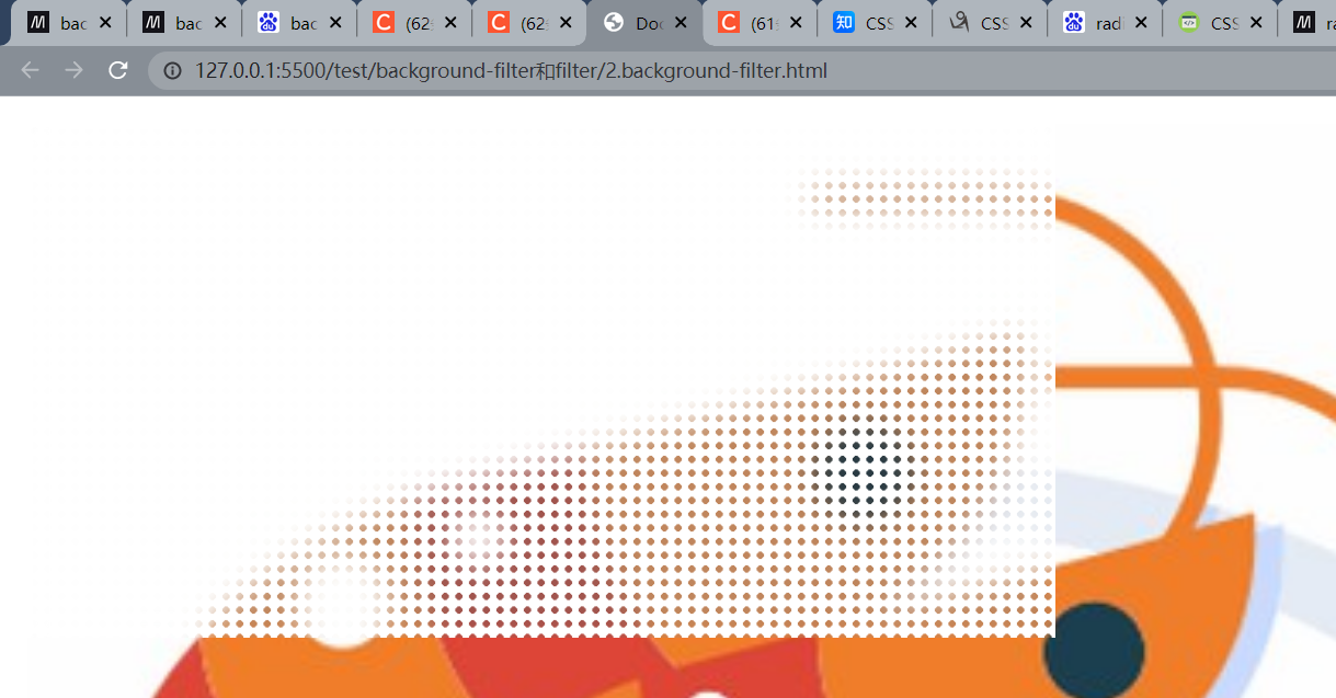
-
你可以对比看看,添加backdrop-filter在这里也就多了一层朦胧的效果
-
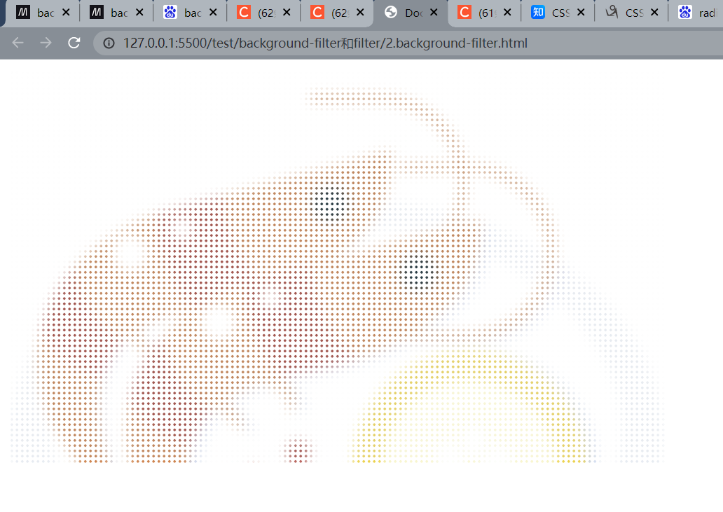
你也可以扩大一点,使得A身上的B元素和A一样宽度,就成了下面这种效果
<html lang="en">
  <head>
    <meta charset="UTF-8" />
    <title>Document</title>
    <style>
      .wrapper {


        width: 500px;
        height: 300px;
        background: url("../image/26.jpg")
      }
      .content {


        width: 500px;
        height: 300px;
        /* 换为element-ui官网的 */
        background-image: radial-gradient(transparent 1px, #ffffff 1px);
        background-size: 4px 4px;
        backdrop-filter:saturate(50%) blur(4px);

        /* background-image: url('../image/27.jpg');
          background-size: 4px 4px; */
      }
    </style>
  </head>
  <body>
    <div class="wrapper">
      <div class="content"></div>
    </div>
  </body>
</html>
毛玻璃效果
- 可以看到,下面这张gif实现了一个很漂亮的gif,那么做的呢?也是通过
backdrop-filter来实现的,由于找不到这张图就源代码,就自己写了下~ - 在线地址@地址

最终完成效果

先编写一个静态页面

<html lang="en">
<head>
  <meta charset="UTF-8">
  <meta http-equiv="X-UA-Compatible" content="IE=edge">
  <meta name="viewport" content="width=device-width, initial-scale=1.0">
  <title>Document</title>
  <style>
    *{


      margin: 0;
      padding: 0;
      background-color: #000000;
    }
    /* 外层-实现居中 */
    #wrapper{


      width: 40%;
      height: 40%;
      position: absolute;
      left: 0;
      right: 0;
      top: 0;
      bottom: 0;
      margin: auto;
    }
    /* 圆点形状 */
    .dot{


      width: 120px;
      height: 120px;
      border-radius: 50%;
      background-color: #00ffc6;
    }
    .dot-wrapper{


      width: 100%;
      height: 100%;
      display: flex;
      flex-direction: column;
      justify-content: space-between;
    }
    .dot-wrapper div:nth-of-type(1){


      animation: dotLeft linear infinite 5s;
    }
    .dot-wrapper div:nth-of-type(2){


      align-self: flex-end;
    }
    /* 模糊背景div */
    .mask-wrapper{


      width: 90%;
      height: 70%;
      position: absolute;
      bottom: 0;
      top: 0;
      left: 0;
      right: 0;
      margin: auto;
      border-radius: 10px;
      background-color: rgba(255, 255, 255, .1);/* 透明背景 */
      backdrop-filter: blur(5px);
      box-shadow: -1px 0px rgba(255, 255, 255, .4);
      color: #e9e9e9;
      font-size: 26px;
    }
  </style>
</head>
<body>
  <div id="wrapper">
    <!-- 圆点的 -->
    <div class="dot-wrapper">
      <div class="dot"></div>
      <div class="dot"></div>
    </div>
    <!-- 模糊背景 -->
    <div class="mask-wrapper">
      <div style="background-color:transparent;height: 100%;text-align: center;transform: translateY(40%);">
        梦洁小站
      </div>
    </div>
  </div>
</body>
</html>
添加一点动画
<html lang="en">
<head>
  <meta charset="UTF-8">
  <meta http-equiv="X-UA-Compatible" content="IE=edge">
  <meta name="viewport" content="width=device-width, initial-scale=1.0">
  <title>Document</title>
  <style>
    *{


      margin: 0;
      padding: 0;
      background-color: #000000;
    }
    /* 外层-实现居中 */
    #wrapper{


      width: 40%;
      height: 40%;
      position: absolute;
      left: 0;
      right: 0;
      top: 0;
      bottom: 0;
      margin: auto;
    }
    /* 圆点形状 */
    .dot{


      width: 120px;
      height: 120px;
      border-radius: 50%;
      background-color: #00ffc6;
    }
    .dot-wrapper{


      width: 100%;
      height: 100%;
      display: flex;
      flex-direction: column;
      justify-content: space-between;
    }
    @keyframes dotLeft {


      0%{


        transform: translate(0,0);
      }
      50%{


        transform: translate(16px,-16px);
      }
      100%{


        transform: translate(0,0);
      }
    }
    .dot-wrapper div:nth-of-type(1){


      animation: dotLeft linear infinite 5s;
    }
    @keyframes dotRight {


      0%{


        transform: translate(0,0);
      }
      50%{


        transform: translate(-20px,20px);
      }
      100%{


        transform: translate(0,0);
      }
    }
    .dot-wrapper div:nth-of-type(2){


      align-self: flex-end;
      animation: dotRight linear infinite 5s;
    }
    @keyframes maskAni{


      0%{


        transform: translate(0,0);
      }
      25%{


        transform: translate(-4px,6px);
      }
      50%{


        transform: translate(4px,0);
      }
      100%{


        transform: translate(0,0);
      }
    }
    /* 模糊背景div */
    .mask-wrapper{


      width: 90%;
      height: 70%;
      position: absolute;
      bottom: 0;
      top: 0;
      left: 0;
      right: 0;
      margin: auto;
      border-radius: 10px;
      background-color: rgba(255, 255, 255, .1);/* 透明背景 */
      backdrop-filter: blur(5px);
      box-shadow: -1px 0px rgba(255, 255, 255, .4);
      color: #e9e9e9;
      font-size: 26px;
      animation: maskAni linear infinite 5s;
    }
  </style>
</head>
<body>
  <div id="wrapper">
    <!-- 圆点的 -->
    <div class="dot-wrapper">
      <div class="dot"></div>
      <div class="dot"></div>
    </div>
    <!-- 模糊背景 -->
    <div class="mask-wrapper">
      <div style="background-color:transparent;height: 100%;text-align: center;transform: translateY(40%);">
        梦洁小站
      </div>
    </div>
  </div>
</body>
</html>
完成效果