文本溢出省略号显示
单行文本溢出省略号显示
语法如下:
 .sin-line {
            /* 第一步:让文字强制一行显示 */
            white-space: nowrap;
            /* 第二步:溢出隐藏 */
            overflow: hidden;
            /* 第三步:溢出的内容省略号显示 */
            text-overflow: ellipsis;
        }
单看文字可能大家不理解,我来用代码解释一下,首先先写一个小米商城的一个卡片如下图:

由于我们给文字的显示区域不够,就有一行文本没有显示出来完,这个叫做单行文字溢出,如何实现这种单行文本溢出用省略号显示,我们来实现一下:
首先没有设置单行文本溢出省略号显示的会是在这样的效果:

设置之后的样式是这样的:

<!DOCTYPE html>
<html lang="en">
<head>
    <meta charset="UTF-8">
    <meta http-equiv="X-UA-Compatible" content="IE=edge">
    <meta name="viewport" content="width=device-width, initial-scale=1.0">
    <title>Document</title>
    <!-- <link rel="stylesheet" href="./css/base.css"> -->
    <style>
        .box {
            width: 234px;
            height: 300px;
            margin: 400px auto ;
            box-shadow: 1px 1px 5px #333;
            padding: 20px 0;

        }
        .box .pic {
            width: 160px;
            height: 160px;
            margin: 0 auto;

        }
        .box .pic img {
            width: 100%;
        }
        .box .txt {
            margin-top: 15px;
        }
        .box .txt h3 {
            font-size: 14px;
            color: #333;
            text-decoration: none;
            text-align: center;
            margin: 0 10px 2px;
        }
        .box .txt p:nth-child(2) {
            font-size: 12px;
            color: #b0b0b0;
            text-decoration: none;
            text-align: center;
            margin: 5px 10px 10px;
             /* 第一步:让文字强制一行显示 */
             white-space: nowrap;
            /* 第二步:溢出隐藏 */
            overflow: hidden;
            /* 第三步:溢出的内容省略号显示 */
            text-overflow: ellipsis;
        }
        .box .txt p:nth-child(3) {
            color: #ff879d;
            text-align: center;
        }
    </style>
</head>
<body>
    <div class="box">

            <div class="pic">
                <img src="./img/02.jpg" alt="图片不见了">

            </div>
            <div class="txt">
                <h3>小米 12 Pro 天玑版</h3>
            <p>全国首发天玑9000+ | 叶脉冷泵敷热系列</p>
            <p>3999元起</span>

            </div>


    </div>
</body>
</html>
只需要选择这一行代码
在css样式里添加以上三句代码就OK了
扫描二维码关注公众号,回复:
14919301 查看本文章

同理
多行文本规定某一行溢出省略号显示
我们把这一行文字多复制一段,显示以下这个效果:

现在我想让它两行显示,多出来的部分用省略号代替,
在我画框的地方用下面这一段代码:
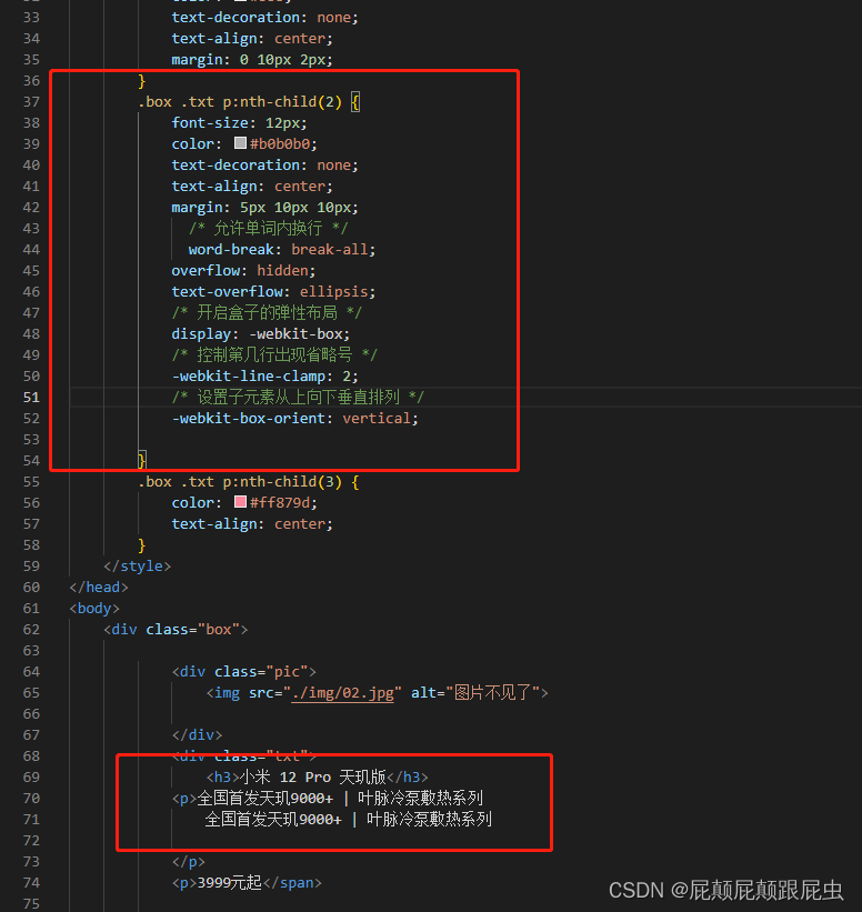
 .mu-row {
            /* 允许单词内换行 */
            word-break: break-all;
            overflow: hidden;
            text-overflow: ellipsis;
            /* 开启盒子的弹性布局 */
            display: -webkit-box;
            /* 控制第几行出现省略号 */
            -webkit-line-clamp: 2;
            /* 设置子元素从上向下垂直排列 */
            -webkit-box-orient: vertical;
        }
大功告成!