可自定义设置以下属性:
-
进度条总宽度(width),类型:number|string,默认 '100%'
-
当前进度百分比(percent),类型:number,默认 '0'
-
进度条的色彩,传入 string 时为纯色,传入 object 时为渐变,进度圈不支持渐变(strokeColor),类型:string | {'0%'?: string, '100%'?: string, from?: string, to?: string, direction?: string},默认 '#1890FF'
-
进度条线的宽度(strokeWidth),类型:number,单位px,默认 8
-
是否显示进度数值或状态图标(showInfo),类型:boolean,默认 true
-
进度条类型(type),类型:string,默认 'line',可选 'line' 'circle'
效果如下图:
①创建进度条组件Progress.vue:
扫描二维码关注公众号,回复: 14864422 查看本文章
<script setup lang="ts">
import { computed } from 'vue'
interface Gradient {
  '0%'?: string,
  '100%'?: string,
  from?: string,
  to?: string,
  direction?: string
}
interface Props {
  width?: number|string, // 进度条总宽度
  percent?: number, // 当前进度百分比
  strokeColor?: string|Gradient, // 进度条的色彩,传入 string 时为纯色,传入 object 时为渐变
  strokeWidth?: number, // 进度条线的宽度,单位px
  showInfo?: boolean, // 是否显示进度数值或状态图标
  type?: string, // 进度条类型 'line' | 'circle'
}
const props = withDefaults(defineProps<Props>(), {
  width: '100%',
  percent: 0,
  strokeColor: '#1890FF',
  strokeWidth: 8,
  showInfo: true,
  type: 'line'
})
const totalWidth = computed(() => { // 进度条总宽度
  if (typeof props.width === 'number') {
    return props.width + 'px'
  } else {
    return props.width
  }
})
const perimeter = computed(() => { // 圆条周长
  return (100 - props.strokeWidth) * Math.PI
})
const path = computed(() => { // 圆条轨道路径指令
  const long = (100 - props.strokeWidth)
  return `M 50,50 m 0,-${(long / 2)}
   a ${(long / 2)},${(long / 2)} 0 1 1 0,${long}
   a ${(long / 2)},${(long / 2)} 0 1 1 0,-${long}`
})
const backgroundColor = computed(() => {
  if (typeof props.strokeColor === 'string') {
    return props.strokeColor
  } else {
    return `linear-gradient(to ${props.strokeColor.direction || 'right'}, ${props.strokeColor['0%'] || props.strokeColor.from}, ${props.strokeColor['100%'] || props.strokeColor.to})`
  }
})
</script>
<template>
  <div v-if="type==='line'" class="m-progress-line" :style="`width: ${totalWidth}; height: ${strokeWidth < 24 ? 24:strokeWidth}px;`">
    <div class="m-progress-inner">
      <div :class="['u-progress-bg', {'u-success-bg': percent >= 100}]" :style="`background: ${backgroundColor}; width: ${percent >= 100 ? 100:percent}%; height: ${strokeWidth}px;`"></div>
    </div>
    <template v-if="showInfo">
      <svg class="u-success" v-if="percent>=100" viewBox="64 64 896 896" data-icon="check-circle" aria-hidden="true" focusable="false"><path d="M512 64C264.6 64 64 264.6 64 512s200.6 448 448 448 448-200.6 448-448S759.4 64 512 64zm193.5 301.7l-210.6 292a31.8 31.8 0 0 1-51.7 0L318.5 484.9c-3.8-5.3 0-12.7 6.5-12.7h46.9c10.2 0 19.9 4.9 25.9 13.3l71.2 98.8 157.2-218c6-8.3 15.6-13.3 25.9-13.3H699c6.5 0 10.3 7.4 6.5 12.7z"></path></svg>
      <p class="u-progress-text" v-else>{

   { percent>=100 ? 100:percent }}%</p>
    </template>
  </div>
  <div v-else class="m-progress-circle" :style="`width: ${totalWidth}; height: ${totalWidth};`">
    <svg class="u-progress-circle" viewBox="0 0 100 100">
      <path :d="path" stroke-linecap="round" class="u-progress-circle-trail" :stroke-width="strokeWidth" :style="`stroke-dasharray: ${perimeter}px, ${perimeter}px;`" fill-opacity="0"></path>
      <path :d="path" stroke-linecap="round" class="u-progress-circle-path" :class="{success: percent >= 100}" :stroke-width="strokeWidth" :style="`stroke: ${backgroundColor}; stroke-dasharray: ${(percent / 100) * perimeter}px, ${perimeter}px;`" :opacity="percent === 0 ? 0:1" fill-opacity="0"></path>
    </svg>
    <template v-if="showInfo">
      <svg class="u-success" v-if="percent>=100" focusable="false" data-icon="check" fill="currentColor" aria-hidden="true" viewBox="64 64 896 896"><path d="M912 190h-69.9c-9.8 0-19.1 4.5-25.1 12.2L404.7 724.5 207 474a32 32 0 00-25.1-12.2H112c-6.7 0-10.4 7.7-6.3 12.9l273.9 347c12.8 16.2 37.4 16.2 50.3 0l488.4-618.9c4.1-5.1.4-12.8-6.3-12.8z"></path></svg>
      <p class="u-progress-text" v-else>{

   { percent>=100 ? 100:percent }}%</p>
    </template>
  </div>
</template>
<style lang="less" scoped>
.m-progress-line {
  display: inline-block;
  &:after {
    content: '';
    height: 100%;
    display: inline-block;
    vertical-align: middle;
  }
  .m-progress-inner {
    display: inline-block;
    vertical-align: middle;
    width: calc(100% - 44px);
    background: #f5f5f5;
    border-radius: 100px;
    .u-progress-bg {
      border-radius: 100px;
      transition: all .3s cubic-bezier(0.78, 0.14, 0.15, 0.86);
    }
    .u-success-bg {
      background: @success !important;
    }
  }
  .u-success {
    display: inline-block;
    vertical-align: middle;
    width: 16px;
    height: 16px;
    fill: @success;
    margin-left: 8px;
  }
  .u-progress-text {
    display: inline-block;
    vertical-align: middle;
    width: 36px;
    font-size: 16px;
    line-height: 1;
    margin-left: 8px;
    color: rgba(0,0,0,.88);
  }
}
.m-progress-circle {
  display: inline-block;
  position: relative;
  .u-progress-circle {
    .u-progress-circle-trail {
      stroke: #f5f5f5;
      stroke-dashoffset: 0px;
      transition: stroke-dashoffset 0.3s,
                  stroke-dasharray 0.3s,
                  stroke 0.3s,
                  stroke-width 0.06s 0.3s,
                  opacity 0.3s;
    }
    .u-progress-circle-path {
      stroke: @themeColor;
      stroke-dashoffset: 0px;
      animation: ant-progress-appear 0.3s;
      transition: stroke-dashoffset 0.3s,
                  stroke-dasharray 0.3s,
                  stroke 0.3s,
                  stroke-width 0.06s 0.3s,
                  opacity .3s;
    }
    .success {
      stroke: @success !important;
    }
  }
  .u-success {
    position: absolute;
    top: 50%;
    left: 50%;
    transform: translate(-50%, -50%);
    width: 30px;
    height: 30px;
    fill: @success;
  }
  .u-progress-text {
    position: absolute;
    top: 50%;
    left: 50%;
    transform: translate(-50%, -50%);
    width: 100%;
    font-size: 27px;
    line-height: 1;
    text-align: center;
    color: rgba(0,0,0,.85);
  }
}
</style>
②在要使用的页面引入:
<script setup lang="ts">
import { Progress } from './Progress.vue'
import { ref } from 'vue'
const percent = ref(60)
function onIncrease (scale: number) {
const res = percent.value + scale
if (res > 100) {
percent.value = 100
} else {
percent.value = res
}
}
function onDecline (scale: number) {
const res = percent.value - scale
if (res < 0) {
percent.value = 0
} else {
percent.value = res
}
}
console.log(Math.PI)
</script>
<template>
<div>
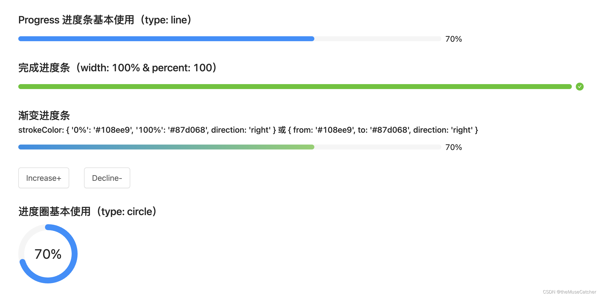
<h2 class="mb10">Progress 进度条基本使用(type: line)</h2>
<Progress :width="900" :percent="percent" :strokeWidth="10" :showInfo="true" />
<h2 class="mt30 mb10">完成进度条(width: 100% & percent: 100)</h2>
<Progress width="100%" :percent="100" :strokeWidth="10" :showInfo="true" />
<h2 class="mt30">渐变进度条</h2>
<h3 class="mb10">strokeColor: { '0%': '#108ee9', '100%': '#87d068', direction: 'right' } 或 { from: '#108ee9', to: '#87d068', direction: 'right' }</h3>
<Progress
:width="900"
:percent="percent"
:strokeWidth="10"
:strokeColor="{
'0%': '#108ee9',
'100%': '#87d068',
direction: 'right'
}"
:showInfo="true" />
<br/>
<Button @click="onIncrease(5)" size="large" class="mt30 mr30">Increase+</Button>
<Button @click="onDecline(5)" size="large">Decline-</Button>
<h2 class="mt30 mb10">进度圈基本使用(type: circle)</h2>
<Progress
:width="120"
:percent="percent"
:strokeWidth="10"
:strokeColor="'#1890FF'"
:showInfo="true"
type="circle" />
</div>
</template>
<style lang="less" scoped>
</style>